 VISUALIZATION OF ALWAYS SAFE NUCLEAR POWER PLANT
Visualization of Always Safe Nuclear Power Plant can be accessed here:
https://public.tableau.com/profile/christine2582#!/vizhome/Assignment2_Christine_V2/Homepage
In this case, a large dataset is provided to the investigator to conduct a deep analysis of the problem in St. Himark. Due to large dataset, numerous analysis is needed in order to provide better insight in detecting the cause of the problem or even propose a solution to the detected problem. As such, it will be impossible to display all analyses in a single dashboard. While these analyses are interrelated to each other hence, there is no sequential order that should be followed. To resolve these issues, flexibility has become the main solution where it should provide users the flexibility to navigate the dashboard from one to another. To do so, the interactive button was created with 5 different categories – Homepage, Density Map, Map Dashboard, Radiation Level Readings, and Cumulative Sum of Sensors Readings. Each of these categories will be a further breakdown and provide the freedom of users to choose the analysis that they interested in.
COMMON INTERACTIVE FEATURES ACROSS ALL PAGES/DASHBOARDS
These interactive features will be available across all pages / dashboards except Homepage Dashboard. Other two common interactive features will be explained in detail in Homepage Dashboard.
| Interactive Technique
|
Rationale
|
Implementation Step
|
Selection of displaying Static or Mobile sensor readings
* Except Density Map
Figure c.0 - Select Mobile / Static
|
To provide users the freedom whether to display static or mobile readings.
|
- Parameter and calculated field are needed to complete this step.
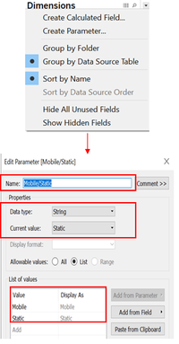
- Create a parameter by clicking on the arrow located at the sidebar under Dimensions section then Create Parameter.
- Name the parameter and specify the value needed with respective Data type and current value.
Figure c.1 - Create Parameter
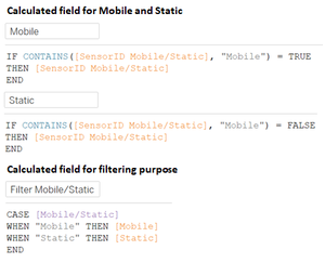
- Create calculated field needed to set up the parameter navigation. It can be accessed through Analysis then Create Calculated Field (Mobile, Static, and Filter Mobile/Staic are needed).
Figure c.2 - Create Calculated Field
- After calculated fields are created, show the parameter to let user accessibility towards the parameter
Figure c.3 - Parameter of Mobile/Static
|
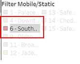
Highlight the selected Sensor
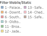
Figure c.4 - Filter of Mobile / Static Sensor
|
To provide user easier reading on specific sensor when needed by highlighting the sensor.
|
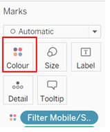
- Drag the attributes that you want to differentiate into the colour marks.
Figure c.5 - Colour Marks
- Wait until the colouring legend appears.
- By clicking on the specific sensor ID / description, it allows user to highlight the selected item.
Figure c.6 - Highlighted Sensor
|
HOMEPAGE DASHBOARD
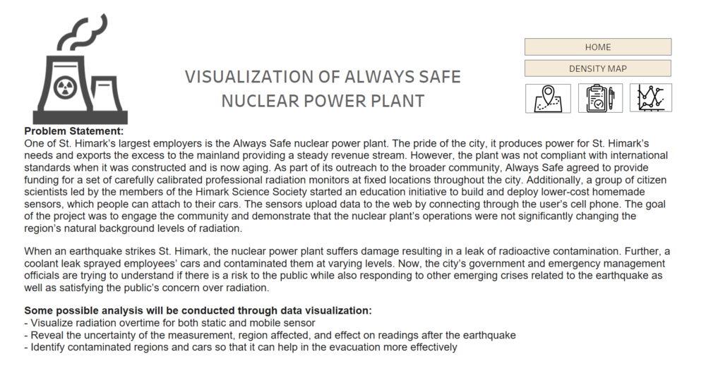
In this page, there will be brief write-up for the problem statement as well as motivation behind this analysis conducted along with the navigation buttons.
Interactive Features in Homepage will be available as well in Density Map Dashboard, Map Dashboard, Radiation Level Readings, and Cumulative Sum Dashboard.
Figure c.7 - Homepage Dashboard
| Interactive Technique
|
Rationale
|
Implementation Step
|
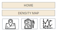
Navigation button (Image & Text)
*Navigation button will be available for every pages/dashboards
Figure c.8 - Navigation Button
|
To provide users the flexibility of navigating from one dashboard to another. With image, it also provides value adding point in terms of aesthetic.
|
- Select / create the image of buttons and place the image in the directory.
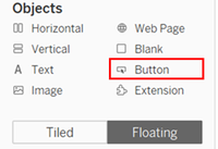
- In dashboard find the Objects section and drag the Button (Floating mode).
Figure c.9 - Objects Attributes
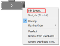
- After button was created click on the arrow beside the button and choose ‘Edit button’.
Figure c.10 - Edit Button
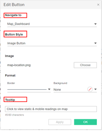
- Dialog box will appear. Set where this button will navigate to; choose whether this button in Text of Image button; choose whether borderline was needed; and input tooltip (optional).
Figure c.11 - Edit Button Dialog Box
|
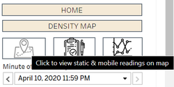
Tooltip
Figure c.1.2 - Tooltip of Navigation Button
|
To provide users with some contextual information about action performed by the navigation button.
|
- Tooltip can be accessed by selecting the arrow beside the button, then click on “Edit button” and provide the information needed under Tooltip textbox.
Figure c.12 - Edit Button
Figure c.13 - Edit Button Dialog Box
|
DENSITY MAP DASHBOARD
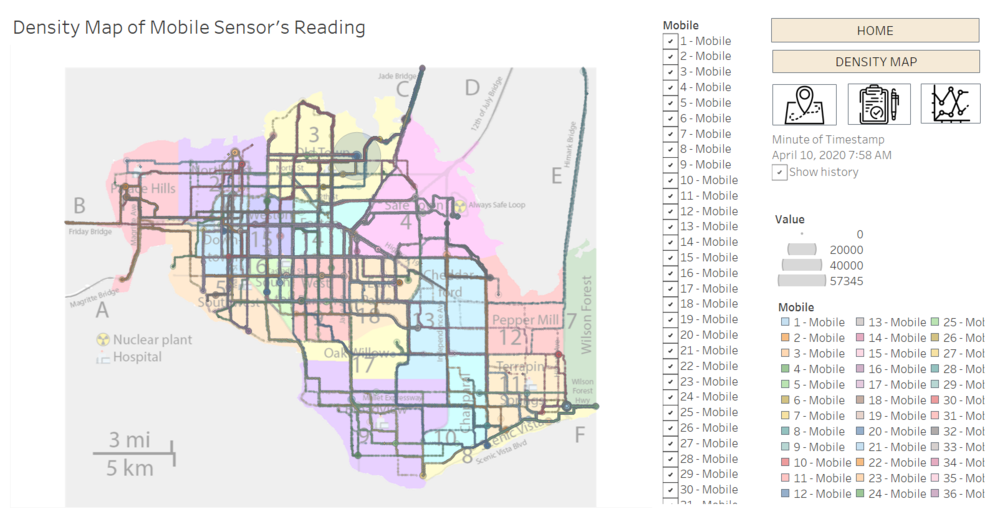
In this section, density map especially for Mobile sensor will be provided so that user could identify the region that have high possibility of getting contaminated.
Figure c.14 - Density Map Dashboard
| Interactive Technique
|
Rationale
|
Implementation Step
|
Traverse through minute time series by click the arrow and show all trails
Figure c.15 - Time Slider
|
To provide user on all readings on one page at the end of period so that user can identify the possible affected area.
|
- Drag attribute needed to the pages section.
Figure c.16 - Timestamp Minute Attribute'
- Wait until the slider appears.
- Dropdown box allows users to select the specific timing that user want to display the result.
- Arrow under the dropdown box will allow users to play the animation when clicked.
Figure c.17 - Button to Play Slider'
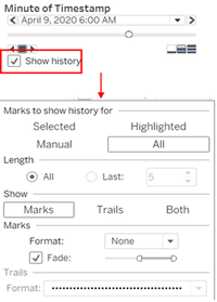
- In order to be able to trace the trails of the mobile sensor, click on the show history checkbox and click on the show history.
- When dialog box appears, select All, All length, and Marks option and choose the desired line format.
Figure c.18 - Setting on Dialog Box
|
Multiple Values (Dropdown) for sensor ID – Sensor ID
Figure c.1.1 - Filter of Sensor ID
|
To provide user on all readings on one page at the end of period so that user can identify the possible affected area.
|
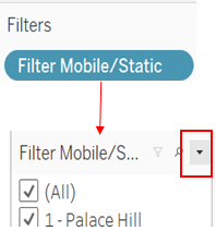
- Drag Filter Mobile/Static to the filters section.
- When the filtering box appear, click on the arrow on the filtering box and choose Multiple Values (list).
Figure c.1.2 - Setting on Creating Filter
|
MAP DASHBOARD
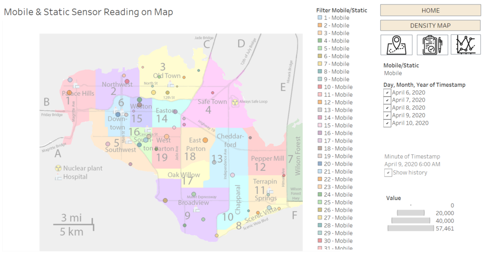
In this dashboard, the size of the dots on map will represent the different level of readings. Additionally, in mobile sensor readings, we will able to monitor the movement of cars on map along with the level of readings.
Figure c.19 - Map Dashboard
| Interactive Technique
|
Rationale
|
Implementation Step
|
Traverse through minute time series by click the arrow
Figure c.20 - Time Slider
|
To provide user the flexibility in selecting timestamp detailed to minutes and let user to play the animation so that the movement of sensor (especially mobile) can be observed.
|
- Drag attribute needed to the pages section.
Figure c.21 - Timestamp Minute Attribute'
- Wait until the slider appears.
- Dropdown box allows users to select the specific timing that user want to display the result.
- Arrow under the dropdown box will allow users to play the animation when clicked.
Figure c.22 - Button to Play Slider'
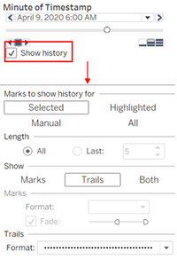
- In order to be able to trace the trails of the mobile sensor, click on the show history checkbox and click on the show history.
- When dialog box appears, select Trails option and choose the desired line format.
Figure c.23 - Setting on Dialog Box
|
Multiple Values filtering on Date
Figure c.24 - Filter of Date
|
To provide user the flexibility in viewing the values for specific day (either one day or all).
|
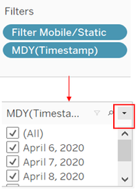
- Drag Timestamp attribute to the filter section.
- When the filtering box appear, click on the arrow on the filtering box and choose Multiple Values (list).
Figure c.25 - How to set Filter
|
RADIATION LEVEL READINGS
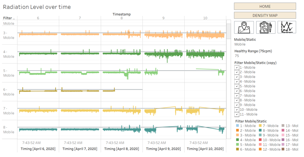
In this section, it will visualize the sensors’ reading over time for both Static and Mobile sensor. Through this graph, the small spikes or even small fluctuation of each reading can be observed so that it will allow users to detect any anomalies within that period of time. When raw data can reveal the spikes and changes over time, but it is not significant enough due to the consistent shift in CPM values (e.g. 8 and 13 showed the elevation in CPM values but when have more subtle changes will become not that obvious). Hence, to show the smaller changes, the log scale of radiation will be used.
Figure c.26 - Radiation Level Dashboard
| Interactive Technique
|
Rationale
|
Implementation Step
|
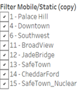
Multiple Values (Dropdown) for sensor ID – Sensor ID
Figure c.27 - Filter Sensor
|
To provide users easier comparison between each reading (especially for Mobile sensor).
|
- Drag Filter Mobile/Static to the filters section.
- When the filtering box appear, click on the arrow on the filtering box and choose Multiple Values (list).
Figure c.28 - How to set Filter'
|
Setting the reference line (in this case will be the healthy level of radiation)
Figure c.29 - Healthy Level
|
To provide users have the freedom to set the healthy range that they believed and compare the result accordingly.
|
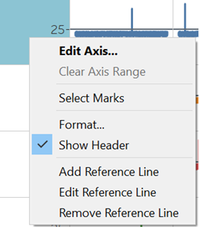
- Right click on the Value axis and choose Add Reference Line.
Figure c.30 - Add Reference Line
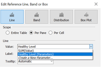
- Under the Value choose Create a New Parameter.
- When the filtering box appear, click on the arrow on the filtering box and choose Multiple Values (list).
Figure c.31 - Create New Parameter
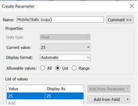
- Insert the healthy level of radiation (e.g. 25) and click ok.
Figure c.32 - Create New Parameter Setting
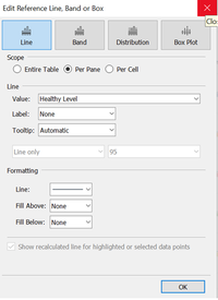
- Choose the line format and colouring scheme for the line as desired.
Figure c.33 - Reference Line Setting
- After creating the reference line, the text box of reference line will appear to let users change the value as desired.
Figure c.34 - Healthy Level
|
CUMULATIVE SUM DASHBOARD
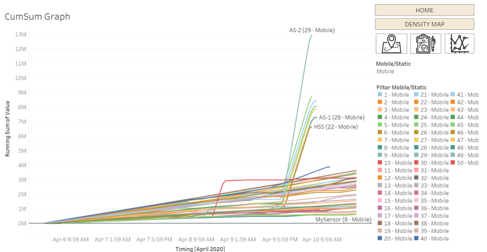
In this cumulative sum graph, it let users to be able to observe the first spikes of radiation level observed which will help in emergency responses if needed.
Figure c.35 - Radiation Level Dashboard
| Major Features
|
Rationale
|
Implementation Step
|
Running Total calculation
|
To let user to view the running total of radiation level readings in purpose to detect the early spike of the readings.
|
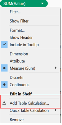
- Click on the arrow on Value attribute and choose Add Table Calculation.
Figure c.36 - Add Table Calculation'
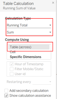
- Choose the calculation type to be Running Total, Sum. And compute by using Table (across).
Figure c.37 - Table Calculation Setting'
|
Tooltip
Figure c.38 - Tooltip Info
|
To provide users a view on the contextual information regarding the readings.
|
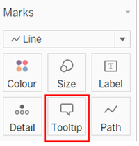
- Click on Tooltip on Marks section.
Figure c.39 - Tooltip Marks
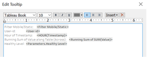
- Freely edit the information that wanted to show during the tooltip.
- When the filtering box appear, click on the arrow on the filtering box and choose Multiple Values (list).
Figure c.40 - Edit Tooltip Info
|

