Difference between revisions of "IS428 AY2019-20T1 Assign Chew Hui Ling Visualization"
Jump to navigation
Jump to search
Hlchew.2017 (talk | contribs) |
Hlchew.2017 (talk | contribs) |
||
| Line 49: | Line 49: | ||
|} | |} | ||
| + | <br/> | ||
| + | <font size="5"><font color="#8B4513">'''Dashboard Explanation'''</font></font> | ||
| + | |||
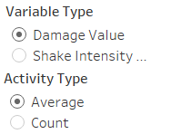
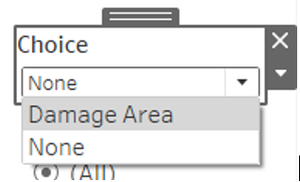
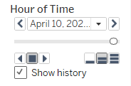
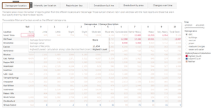
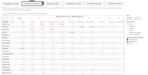
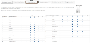
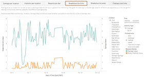
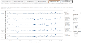
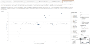
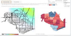
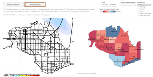
| + | The following image shows the dashboard that I have created (missing background page). In each image, it shows a paragraph of what the image/figure/table is supposed to describe and the filters available. | ||
| + | |||
| + | <font size="5"><font color="#8B4513">'''Within Earthquake Reports'''</font></font> | ||
| + | <br/> | ||
| + | [[File:CH14-2019.jpg|300px]] | ||
| + | <br/> | ||
| + | [[File:CH15-2019.jpg|300px]] | ||
| + | <br/> | ||
| + | [[File:CH16-2019.jpg|300px]] | ||
| + | <br/> | ||
| + | [[File:CH17-2019.jpg|300px]] | ||
| + | <br/> | ||
| + | [[File:CH18-2019.jpg|300px]] | ||
| + | <br/> | ||
| + | [[File:CH19-2019.jpg|300px]] | ||
| + | <br/> | ||
| + | <font size="5"><font color="#8B4513">'''Within Map Comparisons'''</font></font> | ||
| + | <br/> | ||
| + | [[File:CH20-2019.jpg|300px]] | ||
| + | <br/> | ||
| + | [[File:CH21-2019.jpg|300px]] | ||
<br/> | <br/> | ||
| − | |||
Revision as of 22:51, 14 October 2019
|
|
|
|
|
|
Interactive Visualization
Dashboard Explanation
The following image shows the dashboard that I have created (missing background page). In each image, it shows a paragraph of what the image/figure/table is supposed to describe and the filters available.
