IS428 AY2019-20T1 Assign Chew Hui Ling Insights
|
|
|
|
|
|
Question 1
Emergency responders will base their initial response on the earthquake shake map. Use visual analytics to determine how their response should change based on damage reports from citizens on the ground. How would you prioritize neighborhoods for response? Which parts of the city are hardest hit? Limit your response to 1000 words and 10 images.
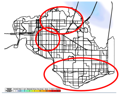
From the image below we can see that the earthquake shake map that was given (on the left) compared to the table that was generated based on location and shake intensity value. We have filtered the data to only display results on 8th April (based on given instructions) to compare with the majorquake map
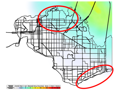
We can see that there is a little mismatch for some locations such as old town and scenic vista (marked in red). Based on the image shake map we can assume that old town shake intensity should be around 4 to 5. However, in the reports that were given, it was around most reports concentrated around 5 to 7. Same goes for scenic vista where the shake map shows that the shake intensity should be around 1 to 2. However, in the reports that were given, it shows that most of the reports concentrated around 1 to 3 instead. Despite that, we can see that most of the data corresponds correctly to the shake map itself only with a few mismatches.
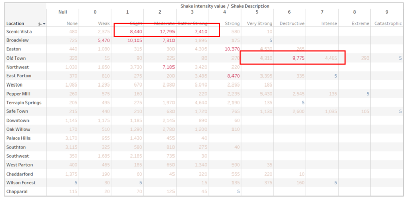
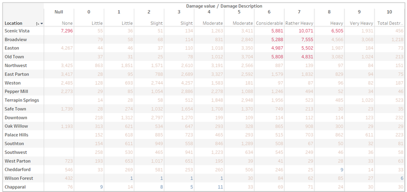
However, based on damage reports, we can see that there is a little mismatch regarding the data where the location broadview has a high number of reports on the damage value 6 and 7. This make it rather confusing because firstly broadview’s shake intensity lies around 0 to 2. However, its damage is even greater than Easton or Old Town where their shake intensity lies around 4 to 7. Hence, we will have to check both the shake intensity and damage report that was given to provide a clear answer. So, we can conclude that since the shake map has mismatches, there will need to be considerations taken to the 2 locations that specified different shake intensities so that users can be warned of it.
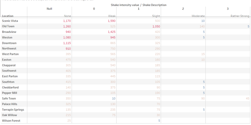
From the image below we can see that the earthquake shake map that was given (on the left) compared to the table that was generated based on location and shake intensity value. We have filtered the data to only display results on 6th April (based on given instructions) to compare with the prequake map
By referring to the table below, we can see that like in the previous parts we can see that there is a little mismatch where old town, broadview, Weston and scenic vista (marked in red) has a higher shake intensity compared to the shake map given. We will then have to take into consideration shake intensity and damage value to see if there are any mismatch which based on the reports given it looks like there is not much difference. So, we can conclude that since the shake map has mismatches, there will need to be considerations taken to the 4 locations that specified different shake intensities so that users can be warned of it. However, we also need to take into consideration of human error, where one may feel that the intensity is 5 but the actual intensity should be 2 to 3 instead.
Since the initial shake map has a few mismatches, but mainly being correct. We will take into consideration of the shake map itself as the baseline. And using the damage and shake intensity report, we will look at the outliers and determine whether if the shake intensity is supposed to be higher or lower.
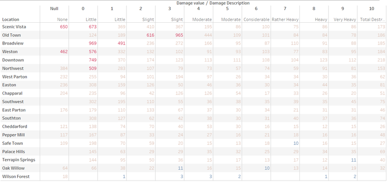
Based on overall table (the two tables below), we can see the locations with the hardest hits are Scenic Vista, Old Town, Broadview and Easton.
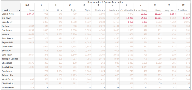
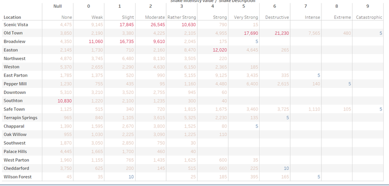
Using the breakdown by area for the 4 locations, we can see that there is not much of a difference between the damages taken by the areas.
Question 2
Use visual analytics to show uncertainty in the data. Compare the reliability of neighborhood reports. Which neighborhoods are providing reliable reports? Provide a rationale for your response. Limit your response to 1000 words and 10 images.
The uncertainty in the data refers to things such as during the same time there is 100 records saying that the shake intensity of the certain location is 6 but there are 5 records saying that it is 1. Or shake intensity is null but damage for a certain area is 10.
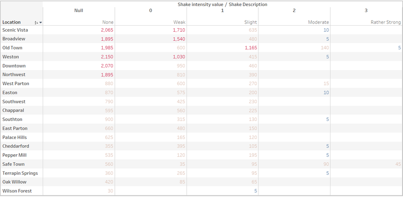
I will be using the filter to only get data from 6 and 7 April. This is because I can see that despite only having shake intensity from around 0 to 3. There is still records of huge damages. Hence, I will be focusing on those data to find out which location provides the reliable reports.

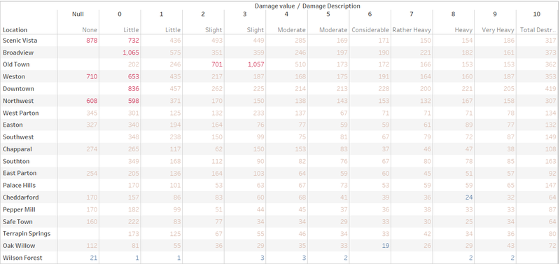
Based on the tables below, I can see that every location has a few outliers, so it means that all the locations are not completely reliable. But based on what can be seen, those that are reliable are areas with the lowest values within the damage value range of 8 to 10. For example, locations like Cheddarford, Safe Town and Wilson Forest.
The reason why I chose those locations is because as said before every location has a few outliers. This means that every location is bound to have people who put destruction as the damage description. Hence, I decided to choose those who have lowest values within the damage value range of 8 to 10. Another thing we need to take note of is also the percentage whereby how many people out of the population of the location is choosing destruction. This is because it could be that 60% of the people in the location chose destruction when the shake intensity is 2. This means that there are more people inputting the wrong number for the intensity which makes the location less reliable.
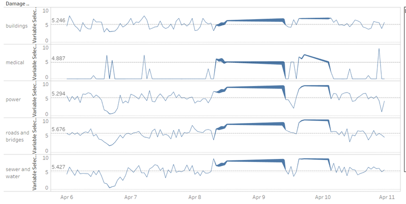
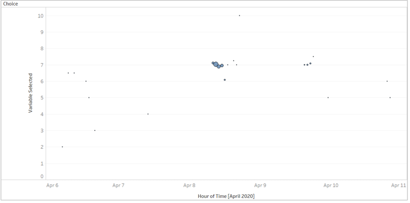
The following image is the screen shot taken from Wilson Forest based on average damage value. It can be seen that there is some outliers but most of the report congregates around the April 8 to April 10 which means that this information is reliable in a sense that the number of outliers is not too prominent and could be taken away easily.
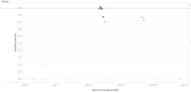
It also corresponds to the shake intensity as shown below. Where there is no huge difference where suddenly April 7 has a huge circle with the shake intensity of 4 and damage of 0.
Question 3
How do conditions change over time? How does uncertainty in change over time? Describe the key changes you see. Limit your response to 500 words and 8 images.
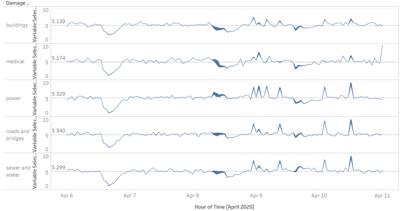
Based on the image below, we can see that the condition will remain stagnant at first and start peaking during the earthquake duration and slowly stagnate again for the different areas. However, there are still some areas that suddenly peaks such as medical where the peaks during the earth duration are not as terrible as others such as power or roads and bridges. But afterwards it starts to peak. This could be because of residue problems such as the medical center is already affected by the earthquake but still remained intact but after prolonged period, it started to break down, hence causing the huge spike.
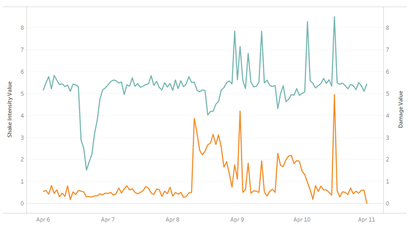
As you can see from this image where the green represents the damage and orange represents the shake intensity, where first there is a huge drop in the damage then it remains stagnant until earthquake duration comes where its starts to slowly peak and final remain stagnant once again.
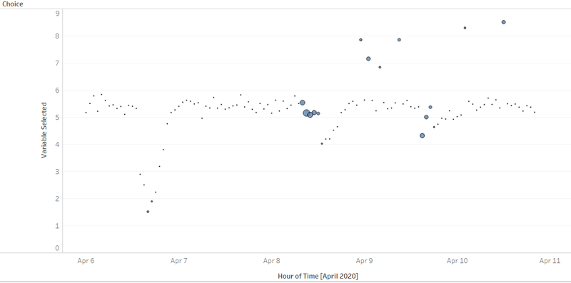
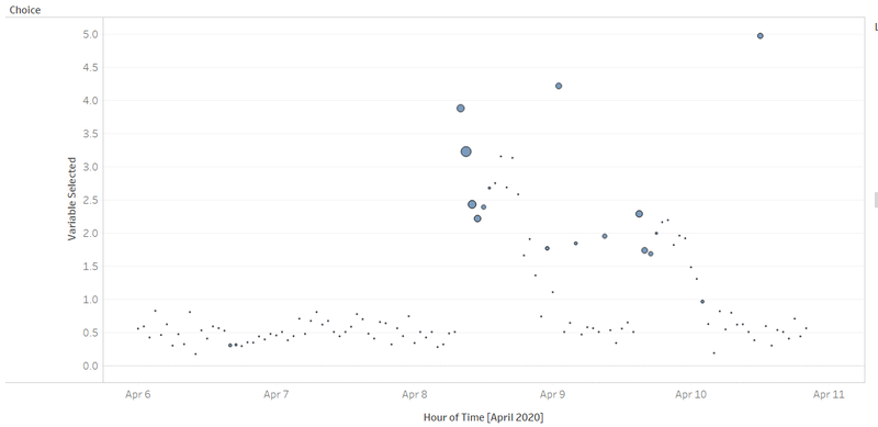
Based on the 2 images below we can see that for uncertainty, it increases during the non-earthquake duration and drops during the earthquake period. This is because during earthquake periods, the certainty will be higher as the damage and intensity are there where in a sense. There would confirm be damages and intensity, compared to when there is no intensity and damage. Because usually uncertainty occurs where there is no shake intensity but there are damages in the graph above.
Question 4
he data for this challenge can be analyzed either as a static collection or as a dynamic stream of data, as it would occur in a real emergency. Describe how you analyzed the data - as a static collection or a stream. How do you think this choice affected your analysis? Limit your response to 200 words and 3 images.
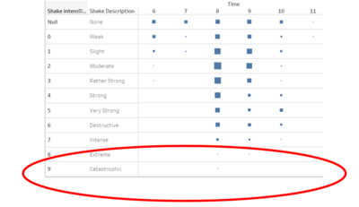
Based on what I have done, I have analysed the data in a static collection whereby when you continue this application in real time there would be some problems occurring. This is because I will have to change some features to incorporate the future data. One reason is that I have created a static value for shake intensity where based on the excel files because there was no intensity on 10. I decided to remove 10 because of convenience. This will lead to having to redesign some areas regarding my application.
Another thing would be that for example if the user wants additional information besides shake intensity and damage or average and count. I will have to add additional features into the dashboard because of the static code that I have done.
