Difference between revisions of "IS428 AY2019-20T1 Assign Harvey Kristanto Lauw: Visualisation Task 2"
| Line 1: | Line 1: | ||
| + | <div style=background:#800000 border:#000000> | ||
| + | [[File:Title.jpg|200px]] | ||
| + | <font size = 6; color="#FFFFFF"> VAST Challenge 2019: Mini-Challenge 1</font> | ||
| + | </div> | ||
| + | |||
| + | <!--MAIN HEADER --> | ||
| + | {|style="background-color:#800000;" width="100%" cellspacing="0" cellpadding="0" valign="top" border="0" | | ||
| + | | style="font-family:Century Gothic; font-size:100%; solid #000000; background:#008000; text-align:center;" width="25%" | | ||
| + | ; | ||
| + | [[IS428_AY2019-20T1_Assign_Harvey_Kristanto_Lauw| <font color="#FFFFFF">Background</font>]] | ||
| + | |||
| + | | style="font-family:Century Gothic; font-size:100%; solid #000000; background:#808000; text-align:center;" width="25%" | | ||
| + | ; | ||
| + | [[IS428_AY2019-20T1_Assign_Harvey_Kristanto_Lauw:_Dataset| <font color="#FFFFFF">Dataset Analysis & Transformation</font>]] | ||
| + | |||
| + | | style="font-family:Century Gothic; font-size:100%; solid #000000; background:#A52A2A; text-align:center;" width="25%" | | ||
| + | ; | ||
| + | [[IS428_AY2019-20T1_Assign_Harvey_Kristanto_Lauw:_Visualisation_Task_1| <font color="#FFFFFF">Interactive Visualization</font>]] | ||
| + | |||
| + | | style="font-family:Century Gothic; font-size:100%; solid #000000; background:#800000; text-align:center;" width="25%" | | ||
| + | ; | ||
| + | [[IS428_AY2019-20T1_Assign_Harvey_Kristanto_Lauw:_Others| <font color="#FFFFFF">Others</font>]] | ||
| + | |||
| + | | | ||
| + | |} | ||
| + | |||
[[IS428_AY2019-20T1_Assign_Harvey_Kristanto_Lauw:_Others| <font color="#FFFFFF">Others</font>]] | [[IS428_AY2019-20T1_Assign_Harvey_Kristanto_Lauw:_Others| <font color="#FFFFFF">Others</font>]] | ||
{|style="background-color:#BBB193;" width="100%" cellspacing="0" cellpadding="0" valign="top" border="0" | | {|style="background-color:#BBB193;" width="100%" cellspacing="0" cellpadding="0" valign="top" border="0" | | ||
Revision as of 17:46, 13 October 2019
|
|
|
|
|
|
|
|
|
Task 2: Uncertainty Analysis
Use visual analytics to show uncertainty in the data. Compare the reliability of neighbourhood reports. Which neighbourhoods are providing reliable reports? Provide a rationale for your response.
Approach
| Description | Reference |
|---|---|
|
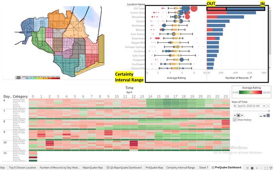
Step 1: Identifying the Top 5 locations To first understand how uncertain values are derived, a box plot of all Average Rating per Hour of the Day is plotted out to get a high-level understanding. We can tell that not all locations have outlier datapoints in the respective locations during the time period of the whole data collection from 6th to 11th April (Refer to Figure 2.1). The plot has 2 axes containing the same variable, the box plot on the left is to derive the outliers demographics, being able to know are the outliers more on the higher ratings whereby the population tends to overstate the values which may affect the real impact assessment of the Major Quake. The plot also shows the outliers beneath the box plot, which could suggest that the population can be understating the rating values for any reason like the user might be too accustomed to the earthquake as compared to others. The bar graph on the right shows the comparison in Average rating of all values inside (In Blue) and outside(In Red) the Certainty Interval Range. As sorted by the overall Number of Records. Condition in considering the ranking in locations with reliable reports are as listed:
I would rank these locations to be the top 5 locations:
|
|
|
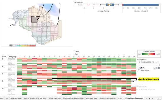
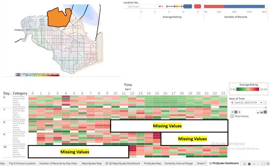
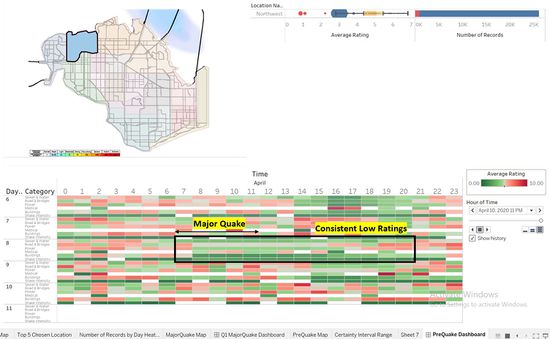
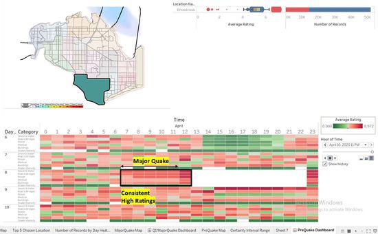
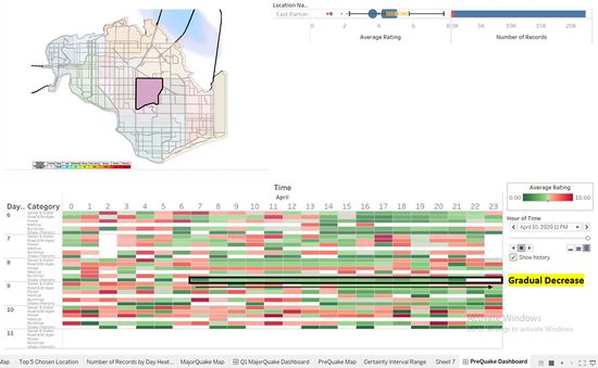
Step 2: Uncertainty Qualitative Analysis After getting the locations with a more significant number of records, we can make an analysis of factors that might cause uncertainty in the data points. Firstly, I studied the data points for Easton (Refer to Figure 2.2). Easton is one of the location that was identified to be the top few locations which was hit the hardest by the Major Quake from 7 to 11 am on the 8th April. However, as we can see after the Major quake the Shake Intensity Rating is decreasing over time as marked out in Figure 2.2. Similarly, when you look at the Calendar Heat Map for the other variables in the reports that came in over 24 hours after the Major quake, it has gradually dropped in Rating value and the number of reports coming in is decreasing as well. Thus, showing signs that the major quake is over, and the conditions are improving. Secondly, for Old Town (Refer to Figure 2.3). Old town was also one of the locations identified to be the top few locations which were hit the hardest by the Major Quake. However, there were too many missing data points to make any conclusion to whether the data points over the time period from 6th to 11th April are reliable. Thirdly, for Northwest (Refer to Figure 2.4). Northwest was within the impacted area of effect from the Major Quake shake map provided for reference. However, during the occurrence of the Major Quake, the users have provided low ratings in both shake intensity and the other variables. Hence, even though the number of reports that are not within the Certain Interval Range(Box plot range) is low, I would not classify the data points for this location in its entirety to be reliable to follow. Next, for Broadview (Refer to Figure 2.5). Broadview was not within the impacted area of effect from the Major Quake shake map. However, looking at its data points during the Major Quake and 24 hours after that, even with the missing data, we could assume that Broadview was hit at the very least harder than Northwest which got up to the top 5 chosen location that has been hit the hardest in the previous question. This could only suggest the Major quake shake map provided or the datapoints input by the population is unreliable. Lastly, for East Parton (Refer to Figure 2.6). North Parton follows the same analysis as Easton where the rating value for shake intensity gradually decreases, which aligns the recovering from the major quake and its data points are also gradually dropping in the Number of Records. Hence, this report is realistic and reliable to be used. |
|
|
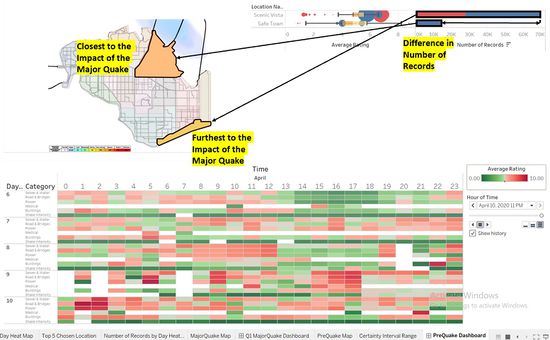
Step 3: Further Considerations required While just looking at the number of reports to quantify the reliability of the reports, I believe that we need to seek further information or data columns (E.g. User demographics, profession, etc.) to support the reliability further and validating with the context of the challenge that can be found in VAST 2019 - St. Himark - About Our City.docx. Damage reports like these are largely subjective because it is done by public users and everyone gauges the damage differently, for example - some people might be comparing the current damage on a building they see and compare it with a building that is still intact in the same area, whereas some might compare it by looking at the news and then decide if the number they’re going to input is the right value. Sparsely populated locations also have very little reports which in my analysis might seem like the reports generated for that location is not as reliable as the location with a higher number of population (Refer to Figure 2.7). From the visualisations plotted, we can see uncertainty here even though Scenic Vista was the furthest from the epicentre of the Major quake but it has a higher number of records to prove its reliability in the previous steps. For this, I would suggest creating different bins or thresholds to better mitigate this possibility of error created by the difference in Population or Number of records. |
|

