IS428 AY2019-20T1 Assign Harvey Kristanto Lauw: Visualisation Task 1
|
|
|
|
|
|
|
|
|
Task 1: Damage Analysis
Emergency responders will base their initial response on the earthquake shake map. Use visual analytics to determine how their response should change based on damage reports from citizens on the ground. How would you prioritize neighborhoods for response? Which parts of the city are hardest hit?
Approach
| Description | Reference |
|---|---|
|
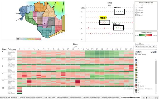
Step 1: Identifying the Major Quake Part 1 Looking at changes in the Number of Records over time, there are multiple occasions in which there is a huge spike increase of records and it will gradually decrease. These points suggest that there are multiple quakes during the 6th,8th and 9th April (Refer to Figure 1.1) from the 6th to 11th of April because the vast number of the population has a heightened need to contribute towards raising awareness for rescue efforts. As time passed, fewer reports will come in as majority of the population would have been aware of the event and it will revert to the normalised quantity. I would then choose the most major quake among the marked-out time period by comparing the number of records and changes. Conditions for choosing a major quake listed below:
Hence, identifying that 8th of April, from time period 7 to 9pm will be classified as the Major Quake within this time period. |
|
|
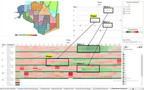
Step 2: Identifying the Major Quake Part 2 For further confirmation on the Major Quake, I went to analyse the Rating by Categories by plotting a Calendar Heat Map by hours. The ratings are in the range from 0 to 10, 0 being the least damage and 10 being the highest damage to the categories. For the purpose of rescue efforts, we will be interested in looking at Ratings that are given as high as possible throughout the marked-out time period previously (Refer to Figure 1.2). Conditions for choosing a major quake in this step is as listed:
By comparing these 3 time periods, 8th of April, from time period 7 to 9pm has the highest and consistent high rating (In shades of Red) as compared to the other 2. |
|
|
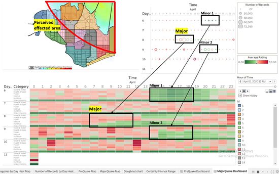
Step 3: Choosing the Top 5 Locations Part 1 After identifying the time period of the major quake and scoping down the time ranges, I moved on to using the mc1-majorquake-shakemap.png file to identify which locations I should be focusing on as marked-ed out on the Geographical Visualization (Refer to Figure 1.3). The shake map contains the reading of an area of effect of a major quake (The time period which have been identified previously). The perceived shaking has been interpolated for us ranging from weak to strong. I also ranked the location that are in the area of effect based on the perceived shaking as listed below:
|
|
|
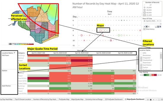
Step 4: Choosing the Top 5 Locations Part 2 With the slightly shortlisted list of Location Name, I moved on to further analyse by plotting the more focused Calendar Heat Map by Hours and Location and ranking the top 5. While keeping the previous requirement of a Major Quake intact, which means the chosen locations for ranking needs to have a “Quake” trend (Huge spike and gradual decrease), the Highest Number of Records and be within the area of effect from the Major quake shake map reference (Refer to Figure 1.4). I have sorted out these top 5 locations:
|
|
|
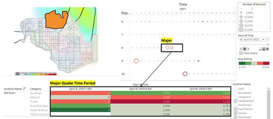
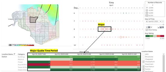
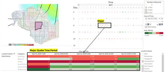
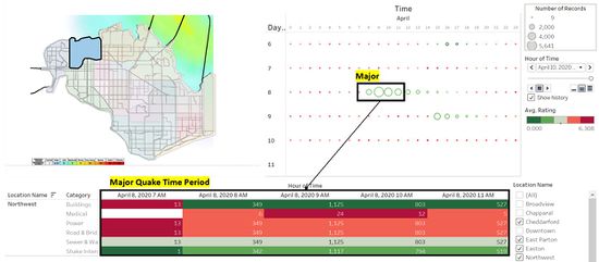
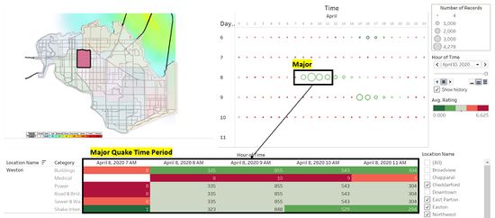
Step 5: Damage Analysis on Top 5 locations Next, I start to analyse the desired data points for these 5 locations as shown in Figure 1.5 to 1.9. Firstly, I studied the data points for the location, Old Town (Refer to Figure 1.5). It was one of the few locations to receive a hit first when the Major Quake occurs from 7 to 11 pm as references from the epicentre of the quake by the Major quake shake map given to us. Old town has high ratings for each of the variable and a high number of records which could roughly tell us the number of the population that is affected. However, its data points get cut off or the population stopped reporting for rescue efforts from 10 am till the end of the day which does not give us enough data to make any conclusion for the location that has been hit the hardest. Secondly, for Easton (Refer to Figure 1.6). It contains data points for the entire time period as compared to Old Town. In order to best assign rescue efforts to the location that has been hit the hardest, the Ratings together with the Number of Records needs to be high enough. However, in Easton’s case, more than 50% of its data points would suggest a low rating beneath 5 which makes it an unlikely candidate for the rescue party to head over first. Thirdly, for East Parton (Refer to Figure 1.7). Just like Easton, it covers the full range of time period with data points. In terms of the data points demographic on high and low ratings, it would seem to be as similar Easton. However, East Parton would be more severe in damage as the low ratings aren’t as red as they’re in the lighter green shade (E.g. Road Bridges & Shake Intensity) and transitioning into the red risk levels. In this position, I would rank East Parton higher than Easton in terms of damage done to its Facilities. Next, for Northwest (Refer to Figure 1.8). The data points have a much more similar demographics as Easton. However, in terms of the population’s awareness and the number of reports for rescue efforts, it falls short from Easton. Hence, I would rank Northwest beneath Easton in terms of damage done. Lastly, for Weston (Refer to Figure 1.9). Majority of the data points contain low ratings (Shades of Green). Hence placing it beneath Northwest. In conclusion, in terms of the amount of damage done, the ranking would be:
In conclusion, East Parton is the town that rescue efforts should be first directed to.
|
|

