Difference between revisions of "IS428 AY2019-20T1 Assign Foo Yong Long: Visualization"
Jump to navigation
Jump to search

Ylfoo.2017 (talk | contribs) |
Ylfoo.2017 (talk | contribs) |
||
| Line 37: | Line 37: | ||
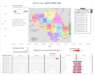
== Dashboard 3: Data Uncertainty == | == Dashboard 3: Data Uncertainty == | ||
| − | [[File: | + | [[File:Analysisconta.png|frameless|center]] |
== Visualization Techniques == | == Visualization Techniques == | ||
Revision as of 23:34, 13 October 2019

Contents
Dashboard Link
The link of the visualization can be found here: https://public.tableau.com/profile/foo.yong.long#!/vizhome/MC2Final/MC2Storyboard?publish=yes
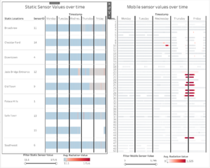
Dashboard 1: Home Page

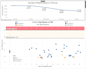
Dashboard 2: Response Priority

Dashboard 3: Data Uncertainty

Visualization Techniques
| Technique | Rationale & Implementation |
|---|---|
Interactive Technique 1: Filter for the use of time range slider
 |
Adding a filter option allows the person using the dashboard to instantly narrow down the dates that he/she wishes to focus on. Employing the use of a slider also allows the user to specify a range of dates that he/she might wish to analyse. This works best with the date option as analysing a range of dates might allow the user to discover new insights.
From a usability standpoint, having a slider allows the user to easily select the range of the time period wanted. This step is easier than using a checkbox/list, which requires multiple unnecessary clicks to achieve the same effect. Implementation: To achieve this slider filter function, simply do the following steps:
|
Interactive Technique 2: Hover
 |
Having the hover function allows the user to get key information about a specific data point at a glance. This helps to enhance the usability aspect by ensuring that important information is made available to the user once he chooses a specific data point
Implementation: To achieve the hover function, simply do the following steps:
|
Interactive Technique 3: Additional Information on Hover
 |
Adding additional information when you hover allows the user to view additional information about that particular datapoint from another worksheet without having to physically access the second worksheet. This further enhances the prowess of the hover function
Implementation: To add more information to the hover function, simply do the following steps:
|
Interactive Technique 4: Filter by Neighbourhood
 |
Filtering by Neighbourhood allows the user to specifically focus on a particular neighbourhood to conduct analysis. The rationale behind only allowing a single value is predicated on the assumption that the user only wishes to analyse one particular neighbourhood. Hence, a single value list form of filter is used.
Implementation: To achieve the Filtering by Neighbourhood filter, simply do the following steps:
|