Difference between revisions of "IS428 AY2019-20T1 Assign Ngoh Yi Long Tasks"
(Created page with "<div style=background:#3D5480 border:#A3BFB1> <font size = 5; color="#FFFFFF">MC2: St. HiMark Radiation Monitor System</font> </div> {|style="background-color:#3D5480;" width...") |
|||
| Line 22: | Line 22: | ||
|} | |} | ||
| − | 1. Visualize radiation measurements over time from both static and mobile sensors to identify areas where radiation over background is detected. Characterize changes over time. | + | ''' 1. Visualize radiation measurements over time from both static and mobile sensors to identify areas where radiation over background is detected. Characterize changes over time. ''' |
{| class="wikitable" | {| class="wikitable" | ||
|- | |- | ||
| − | | | + | |[[File:Task 1.1 (YL).png|thumb]] || |
| − | [[File:Task 1.1 (YL).png|thumb]] || | ||
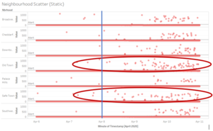
For the 9 static sensors, its readings are only found in 7 neighbourhoods. A scatterplot is created for all its reading from the 5 days of dataset given split into its respective neighbourhoods. As we can see, as the timeframe passes, the static readings are showing increasing higher points of recorded radiation level. In addition, we can see that particularly 2 neighbourhoods – Old Town and Safe Town are showing more results that are having higher radiation levels. This could be because these 2 towns are the closest in proximity from the nuclear power plant. | For the 9 static sensors, its readings are only found in 7 neighbourhoods. A scatterplot is created for all its reading from the 5 days of dataset given split into its respective neighbourhoods. As we can see, as the timeframe passes, the static readings are showing increasing higher points of recorded radiation level. In addition, we can see that particularly 2 neighbourhoods – Old Town and Safe Town are showing more results that are having higher radiation levels. This could be because these 2 towns are the closest in proximity from the nuclear power plant. | ||
|- | |- | ||
Revision as of 23:01, 13 October 2019
MC2: St. HiMark Radiation Monitor System
|
|
|
|
|
|
1. Visualize radiation measurements over time from both static and mobile sensors to identify areas where radiation over background is detected. Characterize changes over time.
|
For the 9 static sensors, its readings are only found in 7 neighbourhoods. A scatterplot is created for all its reading from the 5 days of dataset given split into its respective neighbourhoods. As we can see, as the timeframe passes, the static readings are showing increasing higher points of recorded radiation level. In addition, we can see that particularly 2 neighbourhoods – Old Town and Safe Town are showing more results that are having higher radiation levels. This could be because these 2 towns are the closest in proximity from the nuclear power plant. | |
|
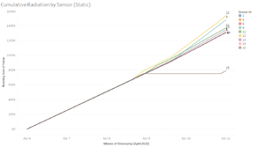
Using this cumulative radiation readings by each sensor would show the increased in the difference of recording levels over time. As we can see from the line graph, sensor-id 12 and 9 are having one of the highest cumulative radiation readings over time. Both the sensors are in Old Town which is the neighbourhood beside Safe Town where the nuclear power plant is located. Therefore, based on the static readings that we have, we can show that Safe Town and Old Town might be the more prominent areas of radiation. | |
|
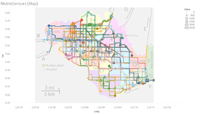
This are all the plotting of the mobile sensors over the 5 days of data provided. With this information, it is still relatively difficult to identify the areas where there might be radiation over the background. The neighbourhoods with more larger circles would mean that there are higher values being recorded over the time frame. | |
|
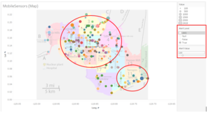
I introduced a new variable Alert Value to set unsafe cpm level and using a calculated field of Alert Level to only show those points which are above the Alert Value. From the improved visualization we can see that most of the radiation level which are above 100 are in the central, north and south-east of the town. This diagram can help to recognise area of radiation found above a certain threshold and allow the relevant authority to check on the actual radiation level on the ground. |


