Difference between revisions of "IS428 AY2019-20T1 Assign Foo Yong Long:R&R"
Ylfoo.2017 (talk | contribs) (Created page with "900px|center <!-- Header Start --> {|style="background-color:#E5E4E2; color:#dfdddc; padding: 10 0 10 0;" width="100%" cellspacing="0" cellpadding="0" val...") |
Ylfoo.2017 (talk | contribs) |
||
| Line 25: | Line 25: | ||
<!-- Header End --> | <!-- Header End --> | ||
<br> | <br> | ||
| + | |||
| + | == Question 4 == | ||
| + | ===Summarize the state of radiation measurements at the end of the available period. Use your novel visualizations and analysis approaches to suggest a course of action for the city.=== | ||
| + | ---- | ||
| + | <br> | ||
| + | <p> | ||
| + | <div style="background: #364558; padding: 15px; font-weight: bold; line-height: 0.3em; text-indent: 0px;font-size:20px"><font face="Arial" color=#fbfcfd><center>'''Contamination Control'''</center></font></div> | ||
| + | |||
| + | [[File:LPXASG15.jpg| 900px |center]] | ||
| + | {| class="wikitable" style="background-color:#FFFFFF;" width="100%" | ||
| + | |- | ||
| + | ! style="font-weight: bold;background: #536a87;color:#fbfcfd;width: 10%;" | No. | ||
| + | ! style="font-weight: bold;background: #536a87;color:#fbfcfd;width: 90%;" | Description | ||
| + | |- | ||
| + | | | ||
| + | 1 | ||
| + | || | ||
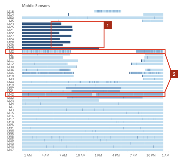
| + | The 8 contaminated cars left St.Himark and have not returned since. To prevent further contamination, the city should attempt to locate the cars as soon as possible. | ||
| + | |- | ||
| + | | | ||
| + | 2 | ||
| + | || | ||
| + | Sensors M2 and M42 are still transmitting high radiation readings, and have been doing so for some time. This could be indicative of a contaminated area/car and should be looked into as well. | ||
| + | |} | ||
| + | |||
| + | <br> | ||
| + | <p> | ||
| + | <div style="background: #364558; padding: 15px; font-weight: bold; line-height: 0.3em; text-indent: 0px;font-size:20px"><font face="Arial" color=#fbfcfd><center>'''Neighbourhoods of Concern'''</center></font></div> | ||
| + | |||
| + | [[File:LPXASG16.jpg| 900px |center]] | ||
| + | {| class="wikitable" style="background-color:#FFFFFF;" width="100%" | ||
| + | |- | ||
| + | ! style="font-weight: bold;background: #536a87;color:#fbfcfd;width: 10%;" | No. | ||
| + | ! style="font-weight: bold;background: #536a87;color:#fbfcfd;width: 90%;" | Description | ||
| + | |- | ||
| + | | | ||
| + | 3 | ||
| + | || | ||
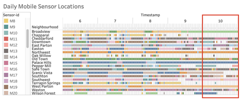
| + | The number of cars going through Chapparal and Terrapin Springs suddenly decreased towards the end of the simulation. There could be infrastructural damage or other reasons leading to this decrease. | ||
| + | |} | ||
| + | |||
| + | |||
| + | ===Use visual analytics to compare the static sensor network to the mobile sensor network. What are the strengths and weaknesses of each approach? How do they support each other?=== | ||
| + | ---- | ||
| + | <br> | ||
| + | <p> | ||
| + | <div style="background: #364558; padding: 15px; font-weight: bold; line-height: 0.3em; text-indent: 0px;font-size:20px"><font face="Arial" color=#fbfcfd><center>'''Areas Lacking Coverage'''</center></font></div> | ||
| + | |||
| + | [[File:LPXASG13.jpg| 900px |center]] | ||
| + | {| class="wikitable" style="background-color:#FFFFFF;" width="100%" | ||
| + | |- | ||
| + | ! style="font-weight: bold;background: #536a87;color:#fbfcfd;width: 10%;" | No. | ||
| + | ! style="font-weight: bold;background: #536a87;color:#fbfcfd;width: 90%;" | Description | ||
| + | |- | ||
| + | | | ||
| + | 4 | ||
| + | || | ||
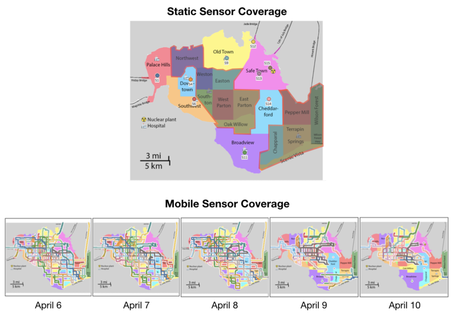
| + | The 9 static sensors are only cover 7 out of the 19 neighbourhoods, leaving many neighbourhoods in Central and Southeast St.Himark uncovered. The range of the static sensors also do not seem to be sufficient to detect radiation over an entire neighbourhood given their relatively low readings, with the occasional spike. | ||
| + | |- | ||
| + | | | ||
| + | 5 | ||
| + | || | ||
| + | The mobile sensors provided much better coverage of the city, with the 50 sensors covering pretty much the entire island on a day to day basis. However, in the aftermath of an earthquake or major event (April 9 – 10) the mobility of cars can become restricted due to infrastructure damage. Citizens may also avoid travelling in the aftermath, resulting in lesser ground covered. | ||
| + | |} | ||
| + | |||
| + | == Question 5 == | ||
| + | ===The data for this challenge can be analyzed either as a static collection or as a dynamic stream of data, as it would occur in a real emergency. Describe how you analyzed the data - as a static collection or a stream.=== | ||
| + | ---- | ||
| + | <br> | ||
| + | <p> | ||
| + | <div style="background: #364558; padding: 15px; font-weight: bold; line-height: 0.3em; text-indent: 0px;font-size:20px"><font face="Arial" color=#fbfcfd><center>'''Visualizing Time Series'''</center></font></div> | ||
| + | |||
| + | [[File:LPXASG17.jpg| 900px |center]] | ||
| + | {| class="wikitable" style="background-color:#FFFFFF;" width="100%" | ||
| + | |- | ||
| + | ! style="font-weight: bold;background: #536a87;color:#fbfcfd;width: 10%;" | No. | ||
| + | ! style="font-weight: bold;background: #536a87;color:#fbfcfd;width: 90%;" | Description | ||
| + | |- | ||
| + | | | ||
| + | 1 | ||
| + | || | ||
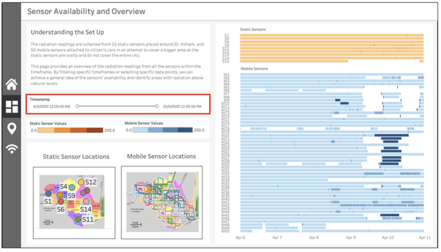
| + | In the process of designing the dashboard, I ensured that all the visualizations could be filtered by date. This is so that static analysis can be done on the entire dataset, as well as dynamic analysis by working on a sliding window of data. | ||
| + | |} | ||
| + | |||
| + | |||
| + | ===How do you think this choice affected your analysis?=== | ||
| + | ---- | ||
| + | <br> | ||
| + | <p> | ||
| + | <div style="background: #364558; padding: 15px; font-weight: bold; line-height: 0.3em; text-indent: 0px;font-size:20px"><font face="Arial" color=#fbfcfd><center>'''Dynamic versus Static Analysis'''</center></font></div> | ||
| + | |||
| + | [[File:LPXASG18.jpg| 900px |center]] | ||
| + | {| class="wikitable" style="background-color:#FFFFFF;" width="100%" | ||
| + | |- | ||
| + | ! style="font-weight: bold;background: #536a87;color:#fbfcfd;width: 10%;" | No. | ||
| + | ! style="font-weight: bold;background: #536a87;color:#fbfcfd;width: 90%;" | Description | ||
| + | |- | ||
| + | | | ||
| + | 2 | ||
| + | || | ||
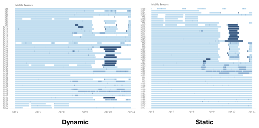
| + | While most of the analysis could be done dynamically, static analysis is especially helpful when trying to identify clusters or patterns in the data. When viewing a stream of dynamic sensor data, it is very difficult to immediately identify patterns or gaps at a glance. However, when viewed statically, it is possible to sort them in a manner where visible clusters and patterns can be found to make meaningful analysis. | ||
| + | |} | ||
Revision as of 20:28, 13 October 2019
Contents
- 1 Question 4
- 1.1 Summarize the state of radiation measurements at the end of the available period. Use your novel visualizations and analysis approaches to suggest a course of action for the city.
- 1.2 Use visual analytics to compare the static sensor network to the mobile sensor network. What are the strengths and weaknesses of each approach? How do they support each other?
- 2 Question 5
Question 4
Summarize the state of radiation measurements at the end of the available period. Use your novel visualizations and analysis approaches to suggest a course of action for the city.
| No. | Description |
|---|---|
|
1 |
The 8 contaminated cars left St.Himark and have not returned since. To prevent further contamination, the city should attempt to locate the cars as soon as possible. |
|
2 |
Sensors M2 and M42 are still transmitting high radiation readings, and have been doing so for some time. This could be indicative of a contaminated area/car and should be looked into as well. |
| No. | Description |
|---|---|
|
3 |
The number of cars going through Chapparal and Terrapin Springs suddenly decreased towards the end of the simulation. There could be infrastructural damage or other reasons leading to this decrease. |
Use visual analytics to compare the static sensor network to the mobile sensor network. What are the strengths and weaknesses of each approach? How do they support each other?
| No. | Description |
|---|---|
|
4 |
The 9 static sensors are only cover 7 out of the 19 neighbourhoods, leaving many neighbourhoods in Central and Southeast St.Himark uncovered. The range of the static sensors also do not seem to be sufficient to detect radiation over an entire neighbourhood given their relatively low readings, with the occasional spike. |
|
5 |
The mobile sensors provided much better coverage of the city, with the 50 sensors covering pretty much the entire island on a day to day basis. However, in the aftermath of an earthquake or major event (April 9 – 10) the mobility of cars can become restricted due to infrastructure damage. Citizens may also avoid travelling in the aftermath, resulting in lesser ground covered. |
Question 5
The data for this challenge can be analyzed either as a static collection or as a dynamic stream of data, as it would occur in a real emergency. Describe how you analyzed the data - as a static collection or a stream.
| No. | Description |
|---|---|
|
1 |
In the process of designing the dashboard, I ensured that all the visualizations could be filtered by date. This is so that static analysis can be done on the entire dataset, as well as dynamic analysis by working on a sliding window of data. |
How do you think this choice affected your analysis?
| No. | Description |
|---|---|
|
2 |
While most of the analysis could be done dynamically, static analysis is especially helpful when trying to identify clusters or patterns in the data. When viewing a stream of dynamic sensor data, it is very difficult to immediately identify patterns or gaps at a glance. However, when viewed statically, it is possible to sort them in a manner where visible clusters and patterns can be found to make meaningful analysis. |
