Difference between revisions of "IS428 AY2019-20T1 Assign Chew Hui Ling Visualization"
Jump to navigation
Jump to search
Hlchew.2017 (talk | contribs) (Created page with "<div style=background:#D3D3D3 border:#696969> 165px <b><font size = 6; color="#8B4513"> VAST Challenge 2019 MC 1: Crowdsourcing for Situational Aw...") |
Hlchew.2017 (talk | contribs) |
||
| (6 intermediate revisions by the same user not shown) | |||
| Line 11: | Line 11: | ||
| style="font-family:Century Gothic; font-size:100%; solid #1B338F; background:#D3D3D3; text-align:center;" width="20%" | | | style="font-family:Century Gothic; font-size:100%; solid #1B338F; background:#D3D3D3; text-align:center;" width="20%" | | ||
; | ; | ||
| − | [[IS428_AY2019-20T1_Assign_Chew_Hui_Ling_Data_Preparation|<b><font size=" | + | [[IS428_AY2019-20T1_Assign_Chew_Hui_Ling_Data_Preparation|<b><font size="2"><font color="#BC8F8F">Data Analysis and Preparation</font></font></b>]] |
| style="font-family:Century Gothic; font-size:100%; solid #1B338F; background:#D3D3D3; text-align:center;" width="20%" | | | style="font-family:Century Gothic; font-size:100%; solid #1B338F; background:#D3D3D3; text-align:center;" width="20%" | | ||
; | ; | ||
| − | [[IS428_AY2019-20T1_Assign_Chew_Hui_Ling_Visualization|<b><font size=" | + | [[IS428_AY2019-20T1_Assign_Chew_Hui_Ling_Visualization|<b><font size="4"><font color="#8B4513">Visualization</font></font></b>]] |
| style="font-family:Century Gothic; font-size:100%; solid #1B338F; background:#D3D3D3; text-align:center;" width="20%" | | | style="font-family:Century Gothic; font-size:100%; solid #1B338F; background:#D3D3D3; text-align:center;" width="20%" | | ||
| Line 29: | Line 29: | ||
<br/> | <br/> | ||
| − | <font size="5"><font color="#8B4513">''' | + | <font size="5"><font color="#8B4513">'''Interactive Visualization'''</font></font> |
| − | + | {| class="wikitable" | |
| − | + | |- | |
| + | ! Features !! Reasons | ||
| + | |- | ||
| + | | [[File:CH10-2019.jpg|300px]]|| I used a range picker in most of my dashboard so that the user can zoom in on a certain range of date. The user can also still click on the date itself and select a day which makes it multi functional. | ||
| + | |- | ||
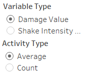
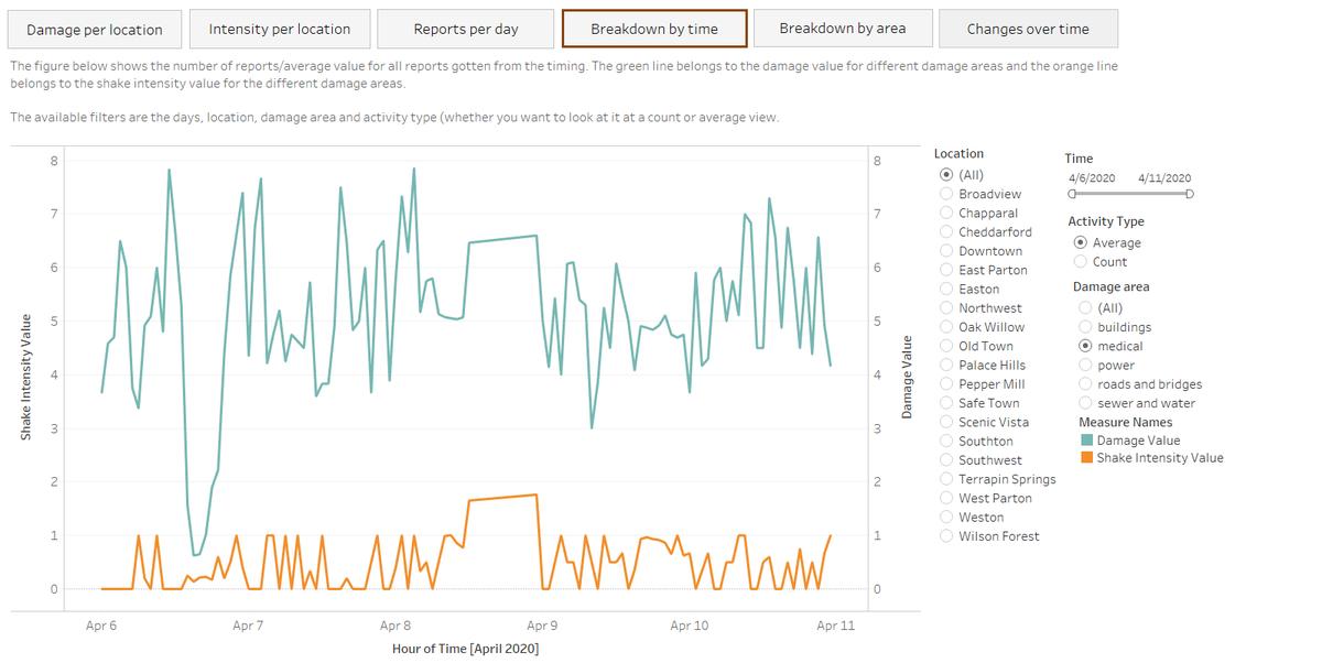
| + | | [[File:CH11-2019.jpg|300px]]|| In order to be more user-friendly, instead of having multiple charts that visualise the same variables such as time and value. I decided to create parameters such as variable type and activity type. This is to allow the user to choose what they want in just one chart. | ||
| + | <br/> | ||
| + | For example, if the user wants to look at count instead of average. The user simply must click on count within the activity type. | ||
| + | <br/> | ||
| + | <br/> | ||
| + | Code is as follows: | ||
| + | <br/> | ||
| + | CASE [Activity Type] | ||
| + | <br/> | ||
| + | WHEN "Average" THEN Avg([Damage value]) | ||
| + | <br/> | ||
| + | WHEN "Count" THEN COUNT([Damage value]) | ||
| + | <br/> | ||
| + | END | ||
| + | <br/> | ||
| + | |- | ||
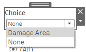
| + | | [[File:CH12-2019.jpg|300px]]|| Just like before I decided to give more choices for the users where there would be a standard chart that is available, and the user can choose to put in the extra variable or not. | ||
| + | <br/> | ||
| + | For example, if the user wants to add damage area for a more in-depth visualisation, the user can just click on damage area within choice and it will automatically be placed into the “row” field | ||
| + | <br/> | ||
| + | <br/> | ||
| + | Code is as follows: | ||
| + | <br/> | ||
| + | CASE [Damage Area] | ||
| + | <br/> | ||
| + | WHEN 'Damage Area' | ||
| + | <br/> | ||
| + | THEN [Damage area] | ||
| + | <br/> | ||
| + | ELSE '' | ||
| + | <br/> | ||
| + | END | ||
| + | |- | ||
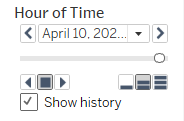
| + | | [[File:CH13-2019.jpg|300px]]|| If the user is more into visualisation, we have this feature that will plot the different variables chosen such as average damage value or count for shake intensity. It will then slowly plot to allow the user to view how is the reporting like during the 4 days. | ||
| + | |- | ||
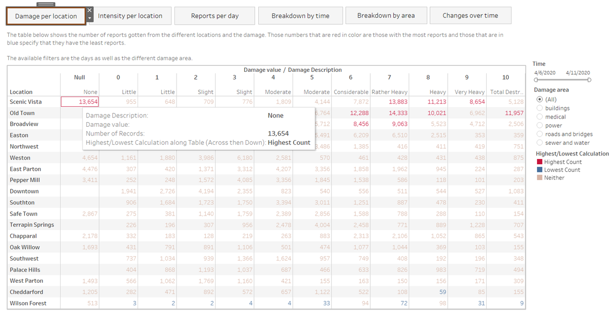
| + | | [[File:CH345-2019.jpg|100px]]|| I have also created something for the tables so that it will allow the user to view the top 10 and bottom 10 counts immediately. This is to make it more user friendly because without it, they have to slowly find which are the highest and lowest values which makes it also very time consuming. Hence, with this it will change the color for the numbers that are top 10 and bottom 10. Special thing to note is that it is calculated based on table across then down so that it will calculate for the whole table instead of one column or row. | ||
| + | <br/> | ||
| + | Code is as follows: | ||
| + | <br/> | ||
| + | IF RANK_UNIQUE(sum([Number of Records]), 'desc') <= 10 | ||
| + | <br/> | ||
| + | THEN "Highest Count" | ||
| + | <br/> | ||
| + | ELSEIF RANK_UNIQUE(sum([Number of Records]),'asc') <= 10 | ||
| + | <br/> | ||
| + | THEN "Lowest Count" | ||
| + | <br/> | ||
| + | ELSE"Neither" | ||
| + | <br/> | ||
| + | END | ||
| + | <br/> | ||
| + | |} | ||
<br/> | <br/> | ||
| − | <font size=" | + | <font size="5"><font color="#8B4513">'''Dashboard Explanation'''</font></font> |
| − | |||
| − | |||
<br/> | <br/> | ||
| + | The dashboard link is as follows: https://public.tableau.com/profile/chew.hui.ling#!/vizhome/Assignment_15710532491460/BackgroundPage | ||
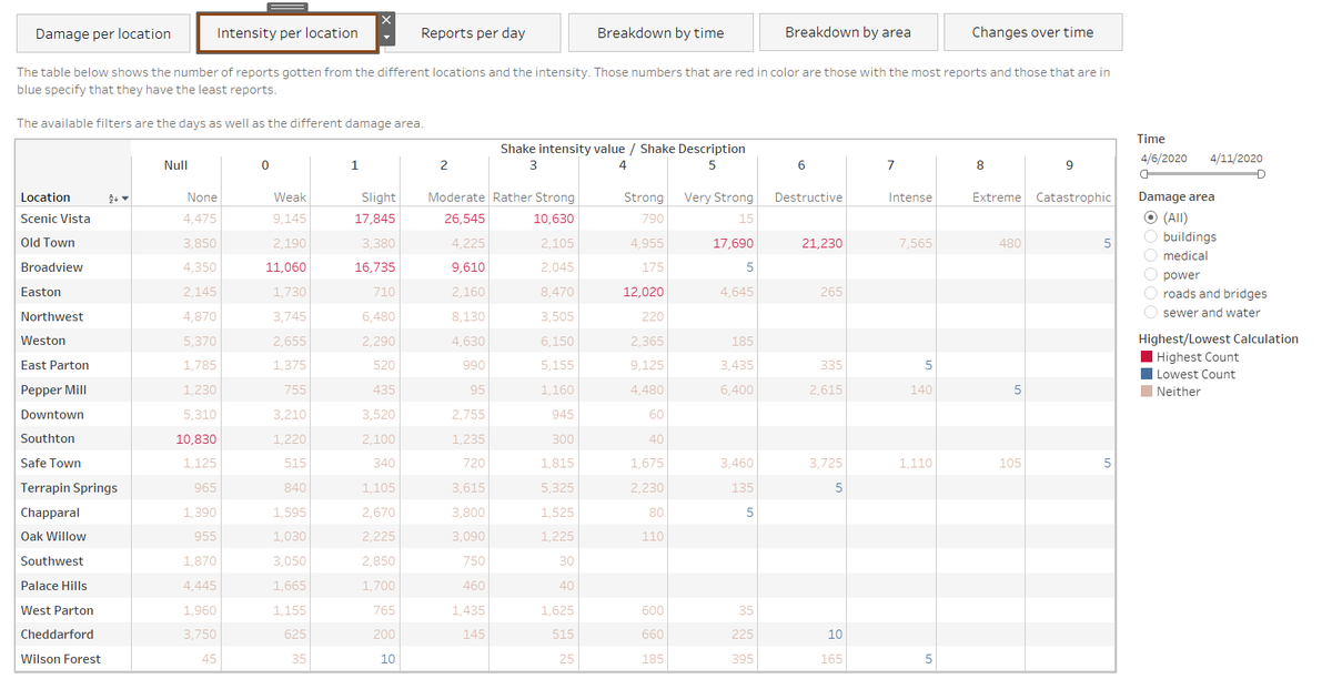
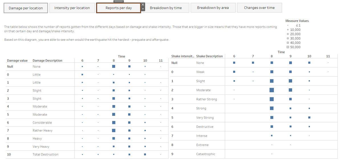
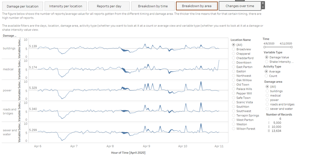
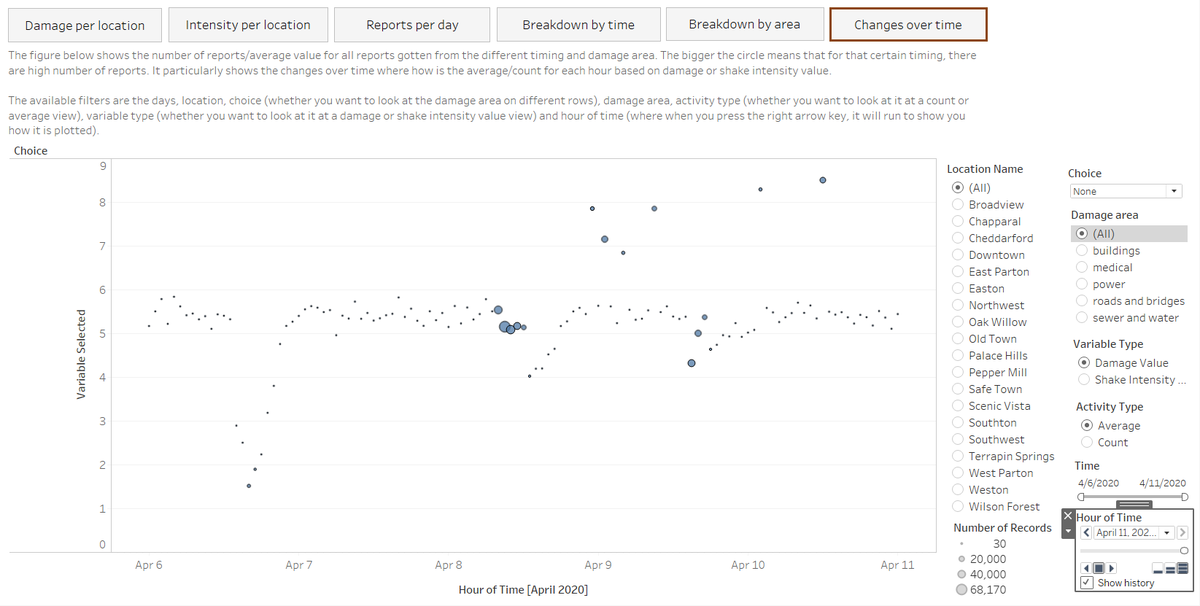
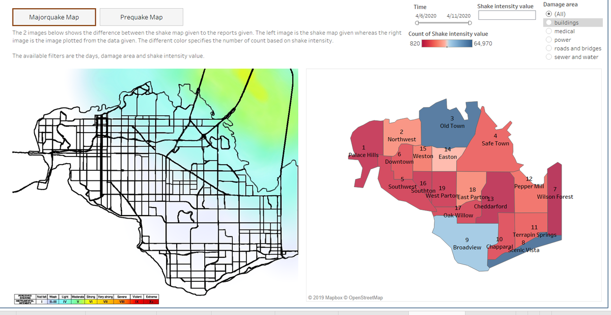
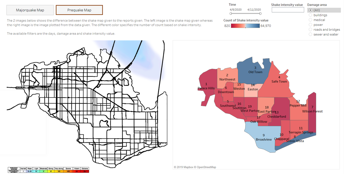
| − | + | The following image shows the dashboard that I have created (missing background page). In each image, it shows a paragraph of what the image/figure/table is supposed to describe and the filters available. | |
| − | |||
| − | |||
| − | |||
| + | <font size="3"><font color="#8B4513">'''Within Earthquake Reports'''</font></font> | ||
| + | <br/> | ||
| + | [[File:CH14-2019.jpg|1200px]] | ||
| + | <br/> | ||
| + | [[File:CH15-2019.jpg|1200px]] | ||
| + | <br/> | ||
| + | [[File:CH16-2019.jpg|1200px]] | ||
| + | <br/> | ||
| + | [[File:CH17-2019.jpg|1200px]] | ||
| + | <br/> | ||
| + | [[File:CH18-2019.jpg|1200px]] | ||
<br/> | <br/> | ||
| − | + | [[File:CH19-2019.jpg|1200px]] | |
<br/> | <br/> | ||
| − | |||
| − | |||
| − | |||
| − | |||
| − | |||
<br/> | <br/> | ||
| − | + | <font size="3"><font color="#8B4513">'''Within Map Comparisons'''</font></font> | |
| − | |||
| − | |||
| − | |||
| − | <font size="3"><font color="#8B4513">''' | ||
<br/> | <br/> | ||
| − | + | [[File:CH20-2019.jpg|1200px]] | |
| − | |||
| − | |||
| − | |||
| − | |||
| − | |||
| − | |||
| − | |||
| − | |||
| − | |||
| − | [[File: | ||
| − | |||
| − | |||
<br/> | <br/> | ||
| − | + | [[File:CH21-2019.jpg|1200px]] | |
<br/> | <br/> | ||
| − | |||
Latest revision as of 23:46, 14 October 2019
|
|
|
|
|
|
Interactive Visualization
Dashboard Explanation
The dashboard link is as follows: https://public.tableau.com/profile/chew.hui.ling#!/vizhome/Assignment_15710532491460/BackgroundPage
The following image shows the dashboard that I have created (missing background page). In each image, it shows a paragraph of what the image/figure/table is supposed to describe and the filters available.
