Difference between revisions of "IS428 AY2019-20T1 Assign Foo Yong Long: Visualization"
Jump to navigation
Jump to search

Ylfoo.2017 (talk | contribs) |
Ylfoo.2017 (talk | contribs) |
||
| (5 intermediate revisions by the same user not shown) | |||
| Line 26: | Line 26: | ||
<br> | <br> | ||
| + | == Dashboard Link == | ||
| + | The link of the visualization can be found here: https://public.tableau.com/profile/foo.yong.long#!/vizhome/MC2Final/MC2Storyboard?publish=yes | ||
| + | <br> | ||
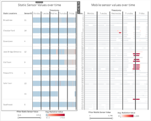
| + | == Dashboard 1: Home Page == | ||
| + | [[File:1stdash.png|frameless|center]] | ||
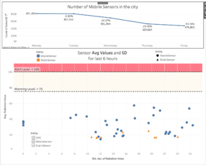
| + | == Dashboard 2: Response Priority == | ||
| + | [[File:3rddash.png|frameless|center]] | ||
| + | |||
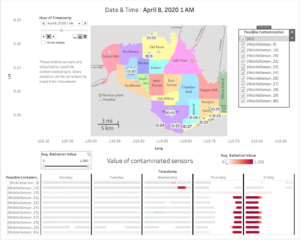
| + | == Dashboard 3: Data Uncertainty == | ||
| + | [[File:Analysisconta.png|frameless|center]] | ||
| + | |||
| + | == Visualization Techniques == | ||
{| class="wikitable" | {| class="wikitable" | ||
|- | |- | ||
| Line 33: | Line 45: | ||
|- | |- | ||
| Interactive Technique 1: Filter for the use of time range slider | | Interactive Technique 1: Filter for the use of time range slider | ||
| − | [[File: | + | [[File:filter1.png|frameless|center]] |
| − | || Adding a filter | + | || Adding a filter allows the user to narrow down values that he/she wants to focus on. A slider allows the user to easily select the range of values that he or she wants to focus on and is easier than using a checkbox when analyzing continuous values. Examples of continuous variables used include dates and CPM values. |
| − | |||
'''Implementation:''' | '''Implementation:''' | ||
To achieve this slider filter function, simply do the following steps: | To achieve this slider filter function, simply do the following steps: | ||
| − | # Add the | + | # Add the ‘AVG(Value)’ measure to the filter |
| − | # Select | + | # Select "Range of Values" |
# Show the filter | # Show the filter | ||
|- | |- | ||
| Interactive Technique 2: Hover | | Interactive Technique 2: Hover | ||
| − | [[File: | + | [[File:hover12.png|frameless|center]] |
| − | || Having the hover function allows the user to get | + | || Having the hover function allows the user to get important information about a data point at one glance. |
'''Implementation:''' | '''Implementation:''' | ||
| Line 53: | Line 64: | ||
To achieve the hover function, simply do the following steps: | To achieve the hover function, simply do the following steps: | ||
# Drag relevant details to ‘Tooltip’ | # Drag relevant details to ‘Tooltip’ | ||
| − | # | + | # Edit Tooltip. Make sure the variables are utilized. |
|- | |- | ||
| − | | Interactive Technique 3: | + | | Interactive Technique 3: Group |
| − | [[File: | + | [[File:MobileSensorsHighgroup.png|frameless|center]] |
| − | || | + | || |
| + | To better segmented and analyze data points that have similar characteristics. | ||
'''Implementation:''' | '''Implementation:''' | ||
To add more information to the hover function, simply do the following steps: | To add more information to the hover function, simply do the following steps: | ||
| − | # | + | # Highlight data points. |
| − | # | + | # Right-click on them and add to group |
|- | |- | ||
| − | | Interactive Technique 4: | + | | Interactive Technique 4: Pages/Animation |
| − | [[File: | + | [[File:pages.png|frameless|center]] |
| − | || | + | || Incorporating timing into pages allows us to better analyze the movement of certain data points. It provides a new context for analysis and helps user to spot trends. |
'''Implementation:''' | '''Implementation:''' | ||
To achieve the Filtering by Neighbourhood filter, simply do the following steps: | To achieve the Filtering by Neighbourhood filter, simply do the following steps: | ||
| − | # Drag | + | # Drag ‘timestamp’ to ‘Filter’ |
| − | # | + | # Drag 'timestamp' to pages |
| − | + | ||
|- | |- | ||
Latest revision as of 23:48, 13 October 2019

Contents
Dashboard Link
The link of the visualization can be found here: https://public.tableau.com/profile/foo.yong.long#!/vizhome/MC2Final/MC2Storyboard?publish=yes
Dashboard 1: Home Page

Dashboard 2: Response Priority

Dashboard 3: Data Uncertainty

Visualization Techniques
| Technique | Rationale & Implementation |
|---|---|
Interactive Technique 1: Filter for the use of time range slider
 |
Adding a filter allows the user to narrow down values that he/she wants to focus on. A slider allows the user to easily select the range of values that he or she wants to focus on and is easier than using a checkbox when analyzing continuous values. Examples of continuous variables used include dates and CPM values.
To achieve this slider filter function, simply do the following steps:
|
Interactive Technique 2: Hover
 |
Having the hover function allows the user to get important information about a data point at one glance.
Implementation: To achieve the hover function, simply do the following steps:
|
Interactive Technique 3: Group
 |
To better segmented and analyze data points that have similar characteristics. Implementation: To add more information to the hover function, simply do the following steps:
|
Interactive Technique 4: Pages/Animation
 |
Incorporating timing into pages allows us to better analyze the movement of certain data points. It provides a new context for analysis and helps user to spot trends.
Implementation: To achieve the Filtering by Neighbourhood filter, simply do the following steps:
|