|
|
| Line 42: |
Line 42: |
| | From both the static and mobile sensor readings, we can also definitely see an increase in radiation level after April 8 (shown by the blue line on the graphs) which could be the cause of the earthquake which may have affected the nuclear power plant to suffer damage and causing an increase in radiation level throughout the city. | | From both the static and mobile sensor readings, we can also definitely see an increase in radiation level after April 8 (shown by the blue line on the graphs) which could be the cause of the earthquake which may have affected the nuclear power plant to suffer damage and causing an increase in radiation level throughout the city. |
| | |- | | |- |
| | + | |} |
| | | | |
| | | | |
| Line 57: |
Line 58: |
| | We have outliers like this for mobile sensor-id 12 with such a high value of 57,345. It is difficult for us not to dismiss the sensor when it returns such an abnormal large value. | | We have outliers like this for mobile sensor-id 12 with such a high value of 57,345. It is difficult for us not to dismiss the sensor when it returns such an abnormal large value. |
| | |- | | |- |
| − | | | + | |[[File:Task 2.2 (YL).png|400px|frameless]] || |
| − | [[File:Task 2.2 (YL).png|400px|frameless]] || | + | This diagram shows the number of recorded readings for some of the mobile sensors which I have picked out. These 28 mobile sensors have pockets of missing readings along the 5-day period, which creates uncertainty on these sensors to whether are they working in good condition. <br> |
| − | This diagram shows the number of recorded readings for some of the mobile sensors which I have picked out. These 28 mobile sensors have pockets of missing readings along the 5-day period, which creates uncertainty on these sensors to whether are they working in good condition. | |
| | Static sensors are having 1 out of 9 with missing recorded values whereas mobile sensors have 28 out of 50 mobile sensors with missing recorded values. Mobile sensors have more than half of its total sensors with missing values which shows more uncertainties over the mobile than the static sensors. It might be due to the data connectivity of the user who are uploading the data. However, this would just cause pour more uncertainty over data being uploaded by users themselves. | | Static sensors are having 1 out of 9 with missing recorded values whereas mobile sensors have 28 out of 50 mobile sensors with missing recorded values. Mobile sensors have more than half of its total sensors with missing values which shows more uncertainties over the mobile than the static sensors. It might be due to the data connectivity of the user who are uploading the data. However, this would just cause pour more uncertainty over data being uploaded by users themselves. |
| | |- | | |- |
| | + | |[[File:Task 2.3 (YL).png|400px|frameless]] || |
| | + | From the above mobile sensors, I have filtered out the respective sensors where its radiation level has been recorded over these time frame. As we can see, a lot of the sensors are moving across the city. Many of the high radiation level recorded are by these sensors in the north and south-east of the city. <br> |
| | + | Although the static sensors only have one sensor which is uncertain, mobile sensors itself can be seen above might be proving uncertainty over the north and south-east area where majority of the large radiation level readings were being recorded. |
| | + | |- |
| | + | |[[File:Task 2.4 (YL).png|400px|frameless]] <br> |
| | + | [[File:Task 2.5 (YL).png|400px|frameless]] || |
| | + | Comparing the 2 graphs, the highlight table depicts the maximum value recorded for each minute over the time frame for all mobile sensors. As we can see there is 2 regions of high readings which could show the earthquake and other major events. The event happening right before April 9 has caused many mobile sensors to not be able to properly have their readings recorded at the later part of the day on April 9. Similar for the event happening around April 10, which caused the mobile sensors to not have their readings recorded at the later part in the day. This might show a relationship over major events occurring and the uncertainty on the sensors, where some of the sensors would not be working or unable to retrieve data after the event has happened. |
| | + | |- |
| | + | |} |
MC2: St. HiMark Radiation Monitor System
1. Visualize radiation measurements over time from both static and mobile sensors to identify areas where radiation over background is detected. Characterize changes over time.
 |
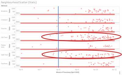
For the 9 static sensors, its readings are only found in 7 neighbourhoods. A scatterplot is created for all its reading from the 5 days of dataset given split into its respective neighbourhoods. As we can see, as the timeframe passes, the static readings are showing increasing higher points of recorded radiation level. In addition, we can see that particularly 2 neighbourhoods – Old Town and Safe Town are showing more results that are having higher radiation levels. This could be because these 2 towns are the closest in proximity from the nuclear power plant.
|
 |
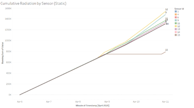
Using this cumulative radiation readings by each sensor would show the increased in the difference of recording levels over time. As we can see from the line graph, sensor-id 12 and 9 are having one of the highest cumulative radiation readings over time. Both the sensors are in Old Town which is the neighbourhood beside Safe Town where the nuclear power plant is located.
Therefore, based on the static readings that we have, we can show that Safe Town and Old Town might be the more prominent areas of radiation.
|
 |
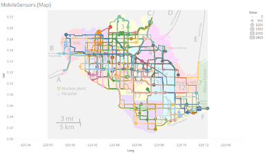
This are all the plotting of the mobile sensors over the 5 days of data provided. With this information, it is still relatively difficult to identify the areas where there might be radiation over the background. The neighbourhoods with more larger circles would mean that there are higher values being recorded over the time frame.
|
 |
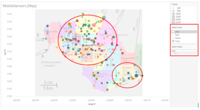
I introduced a new variable Alert Value to set unsafe cpm level and using a calculated field of Alert Level to only show those points which are above the Alert Value. From the improved visualization we can see that most of the radiation level which are above 100 are in the central, north and south-east of the town. This diagram can help to recognise area of radiation found above a certain threshold and allow the relevant authority to check on the actual radiation level on the ground.
|
 |
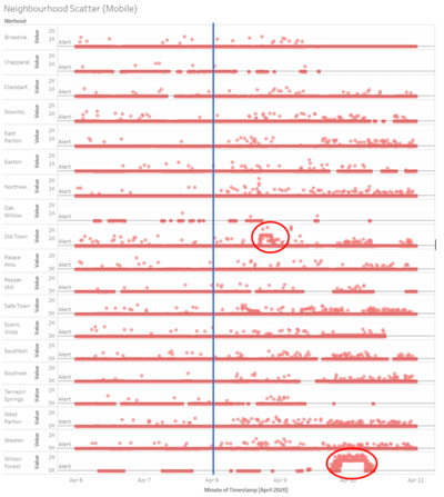
With the addition of the scatter plot of the mobile sensor readings mapped by its respective neighbourhood along the time frame, we can see certain areas and time which has an increase in radiation level. We can identify some of the pocket of high recorded readings such as Old Town around the start of April 9 and Wilson Forest around the start of April 10 (which is the central and south-east of the city).
From both the static and mobile sensor readings, we can also definitely see an increase in radiation level after April 8 (shown by the blue line on the graphs) which could be the cause of the earthquake which may have affected the nuclear power plant to suffer damage and causing an increase in radiation level throughout the city.
|
2. Use visual analytics to represent and analyze uncertainty in the measurement of radiation across the city.
a. Compare uncertainty of the static sensors to the mobile sensors. What anomalies can you see? Are there sensors that are too uncertain to trust?
b. Which regions of the city have greater uncertainty of radiation measurement? Use visual analytics to explain your rationale.
c. What effects do you see in the sensor readings after the earthquake and other major events? What effect do these events have on uncertainty?

Static Sensors |
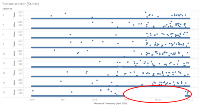
The scatter plot shows the points of each recording over the 5-day time frame. As we can see from the plot above, for sensor-id 15 which is found at the nuclear power plant, there was a time from around April 9 to April 11 there was no radiation level recorded. This could show some uncertainty on the sensor where it was not able to detect any readings for a 2-day period.
|

Mobile Sensors |
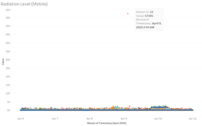
We have outliers like this for mobile sensor-id 12 with such a high value of 57,345. It is difficult for us not to dismiss the sensor when it returns such an abnormal large value.
|
 |
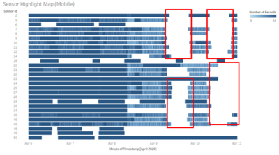
This diagram shows the number of recorded readings for some of the mobile sensors which I have picked out. These 28 mobile sensors have pockets of missing readings along the 5-day period, which creates uncertainty on these sensors to whether are they working in good condition.
Static sensors are having 1 out of 9 with missing recorded values whereas mobile sensors have 28 out of 50 mobile sensors with missing recorded values. Mobile sensors have more than half of its total sensors with missing values which shows more uncertainties over the mobile than the static sensors. It might be due to the data connectivity of the user who are uploading the data. However, this would just cause pour more uncertainty over data being uploaded by users themselves.
|
 |
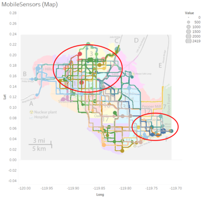
From the above mobile sensors, I have filtered out the respective sensors where its radiation level has been recorded over these time frame. As we can see, a lot of the sensors are moving across the city. Many of the high radiation level recorded are by these sensors in the north and south-east of the city.
Although the static sensors only have one sensor which is uncertain, mobile sensors itself can be seen above might be proving uncertainty over the north and south-east area where majority of the large radiation level readings were being recorded.
|

 ||
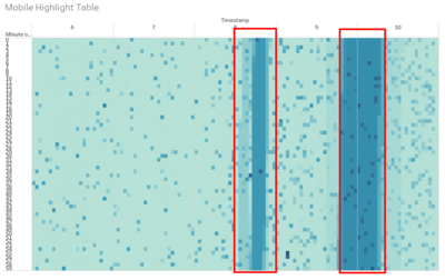
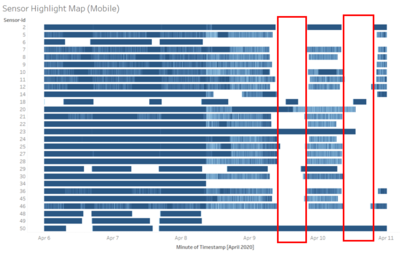
Comparing the 2 graphs, the highlight table depicts the maximum value recorded for each minute over the time frame for all mobile sensors. As we can see there is 2 regions of high readings which could show the earthquake and other major events. The event happening right before April 9 has caused many mobile sensors to not be able to properly have their readings recorded at the later part of the day on April 9. Similar for the event happening around April 10, which caused the mobile sensors to not have their readings recorded at the later part in the day. This might show a relationship over major events occurring and the uncertainty on the sensors, where some of the sensors would not be working or unable to retrieve data after the event has happened. ||
Comparing the 2 graphs, the highlight table depicts the maximum value recorded for each minute over the time frame for all mobile sensors. As we can see there is 2 regions of high readings which could show the earthquake and other major events. The event happening right before April 9 has caused many mobile sensors to not be able to properly have their readings recorded at the later part of the day on April 9. Similar for the event happening around April 10, which caused the mobile sensors to not have their readings recorded at the later part in the day. This might show a relationship over major events occurring and the uncertainty on the sensors, where some of the sensors would not be working or unable to retrieve data after the event has happened.
|
