Difference between revisions of "IS428 AY2019-20T1 Assign Foo Yong Long:R&R"
Ylfoo.2017 (talk | contribs) |
Ylfoo.2017 (talk | contribs) |
||
| (4 intermediate revisions by the same user not shown) | |||
| Line 33: | Line 33: | ||
<div style="background: #364558; padding: 15px; font-weight: bold; line-height: 0.3em; text-indent: 0px;font-size:20px"><font face="Arial" color=#fbfcfd><center>'''Contamination Control'''</center></font></div> | <div style="background: #364558; padding: 15px; font-weight: bold; line-height: 0.3em; text-indent: 0px;font-size:20px"><font face="Arial" color=#fbfcfd><center>'''Contamination Control'''</center></font></div> | ||
| − | |||
{| class="wikitable" style="background-color:#FFFFFF;" width="100%" | {| class="wikitable" style="background-color:#FFFFFF;" width="100%" | ||
|- | |- | ||
| Line 42: | Line 41: | ||
1 | 1 | ||
|| | || | ||
| − | + | ||
| + | [[File:EndState.jpg| 900px |center]] | ||
| + | Highly likely contaminated cars with sensor IDs 20,21,22,24,25,27,28,29 and 45 has left the country. The government should issue a warning to search for these 9 vehicles. | ||
| + | |||
| + | | | ||
| + | |||
|- | |- | ||
| − | | | + | | |
2 | 2 | ||
|| | || | ||
| − | + | [[File:EndState6Hrs.jpg| 900px |center]] | |
| + | |||
| + | The graph above shows the standard deviation and average value of sensor readings for the last 6 hours that are still in the city. Sensor 1,26,35 and 47 has to be checked and replaced as they may be faulty with 0 standard deviations in readings for the last 6 hours. The government will have to Monitor mobile sensor 32 carefully as it has a high variability of sensor readings and its average value is reaching the warning level. | ||
| + | |||
|} | |} | ||
| + | ===Use visual analytics to compare the static sensor network to the mobile sensor network. What are the strengths and weaknesses of each approach? How do they support each other?=== | ||
| + | ---- | ||
<br> | <br> | ||
<p> | <p> | ||
| − | <div style="background: #364558; padding: 15px; font-weight: bold; line-height: 0.3em; text-indent: 0px;font-size:20px"><font face="Arial" color=#fbfcfd><center>''' | + | <div style="background: #364558; padding: 15px; font-weight: bold; line-height: 0.3em; text-indent: 0px;font-size:20px"><font face="Arial" color=#fbfcfd><center>'''Areas with Coverage'''</center></font></div> |
| + | |||
| + | [[File:Mobilesensorcoverage.png| 900px |center]] | ||
| − | |||
{| class="wikitable" style="background-color:#FFFFFF;" width="100%" | {| class="wikitable" style="background-color:#FFFFFF;" width="100%" | ||
|- | |- | ||
| Line 63: | Line 73: | ||
3 | 3 | ||
|| | || | ||
| − | The | + | [[File:DropMobileSensor.png| 900px |center]] |
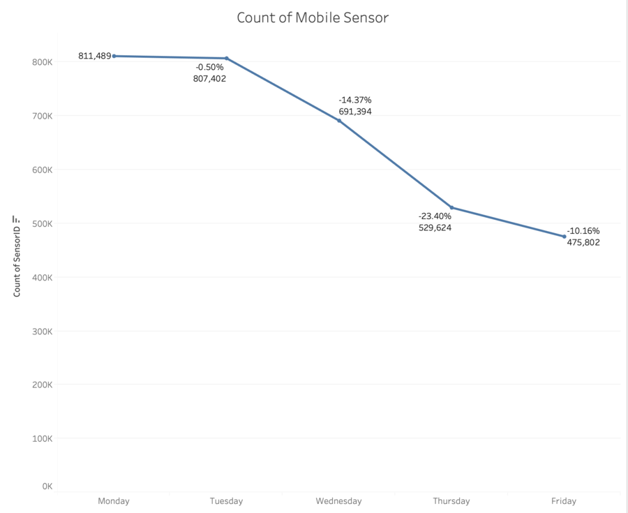
| − | + | The mobile sensors are able to cover a wider area. The graph above shows a decrease in overall mobile sensors from Monday to Friday. This can be due to wear and tear and vehicles traveling out of the city. | |
| + | |||
| + | [[File:Wednesday.png| 900px |center]] | ||
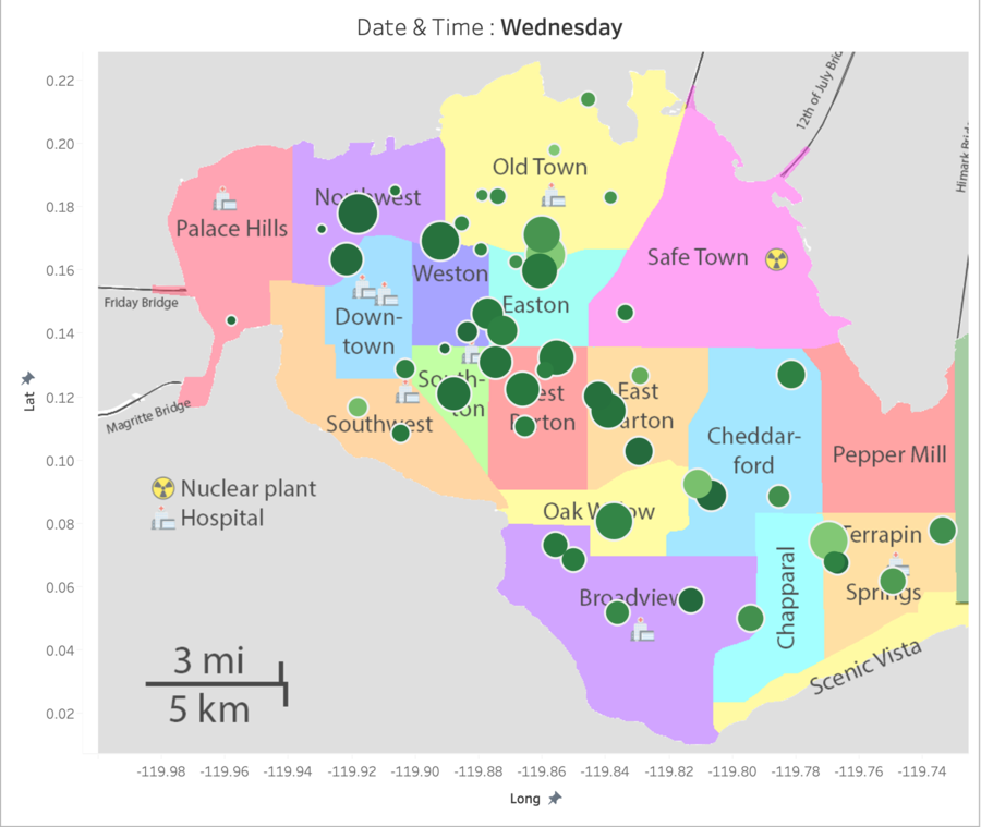
| + | Furthermore, the area of coverage are dependent on the travel routes of the vehicles, which are unpredictable. For example, based on the graph above, there are no mobile sensors around the Safe Town, and thus we have limited coverage of the area around the Nuclear Plant. | ||
| − | + | Nonetheless, they still provide much better coverage of the city compared to the static sensors. | |
| − | |||
| − | |||
| − | |||
| − | |||
| − | |||
| − | |||
| − | |||
| − | |||
| − | |||
|- | |- | ||
| | | | ||
4 | 4 | ||
|| | || | ||
| − | The | + | [[File:StaticSensorCoverage.png| 900px |center]] |
| + | |||
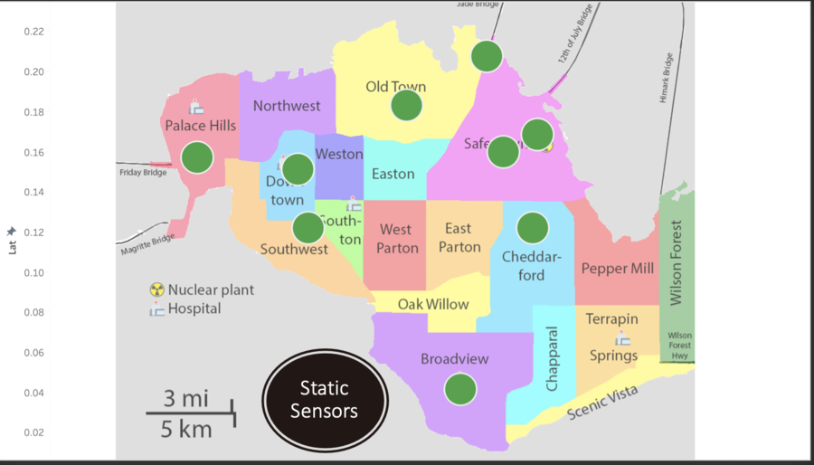
| + | The static sensor coverage is weaker compared to Mobile Sensors, covering only 9 out of 19 locations. Furthermore, it might be unreliable at close range distances. However, it is still easier to manage and implement compared to mobile sensors. | ||
| + | |||
|- | |- | ||
| | | | ||
5 | 5 | ||
|| | || | ||
| − | The mobile sensors | + | All in all, there is a need to have two types of sensors on the ground. The mobile sensors help to achieve coverage which static sensors can't while static sensors help to make up for the inconsistency that is present in mobile sensors. |
|} | |} | ||
| Line 95: | Line 102: | ||
<br> | <br> | ||
<p> | <p> | ||
| − | <div style="background: #364558; padding: 15px; font-weight: bold; line-height: 0.3em; text-indent: 0px;font-size:20px"><font face="Arial" color=#fbfcfd><center>''' | + | <div style="background: #364558; padding: 15px; font-weight: bold; line-height: 0.3em; text-indent: 0px;font-size:20px"><font face="Arial" color=#fbfcfd><center>'''Analyzing the data as a stream'''</center></font></div> |
| − | |||
{| class="wikitable" style="background-color:#FFFFFF;" width="100%" | {| class="wikitable" style="background-color:#FFFFFF;" width="100%" | ||
|- | |- | ||
| Line 106: | Line 112: | ||
1 | 1 | ||
|| | || | ||
| − | In the process of designing the dashboard, I | + | The dataset given consist of real-time data. It is where analytics is performed on a moving / scrolling data to unconver patterns or insights. As the timeframe given is continuous, the environment will be constantly be changing every second. |
| + | |||
| + | In the process of analyzing and designing the dashboard, I ensure that Timestamp is set to continuous and incorporated into my filters to undergo a more thorough analysis of the data. | ||
| + | |||
|} | |} | ||
| − | |||
===How do you think this choice affected your analysis?=== | ===How do you think this choice affected your analysis?=== | ||
| Line 116: | Line 124: | ||
<div style="background: #364558; padding: 15px; font-weight: bold; line-height: 0.3em; text-indent: 0px;font-size:20px"><font face="Arial" color=#fbfcfd><center>'''Dynamic versus Static Analysis'''</center></font></div> | <div style="background: #364558; padding: 15px; font-weight: bold; line-height: 0.3em; text-indent: 0px;font-size:20px"><font face="Arial" color=#fbfcfd><center>'''Dynamic versus Static Analysis'''</center></font></div> | ||
| − | + | ||
{| class="wikitable" style="background-color:#FFFFFF;" width="100%" | {| class="wikitable" style="background-color:#FFFFFF;" width="100%" | ||
|- | |- | ||
| Line 125: | Line 133: | ||
2 | 2 | ||
|| | || | ||
| − | + | ||
| + | [[File:StaticVsDynamic2.png| 900px |center]] | ||
| + | |||
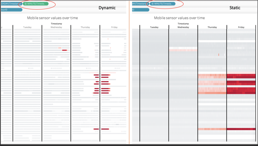
| + | For example in the graph above, instead of utilizing time-stamp as a dimension, it should be converted to continuous data to uncover missing gaps and find patterns within the time frame. | ||
| + | |} | ||
| + | |||
| + | {| class="wikitable" style="background-color:#FFFFFF;" width="100%" | ||
| + | |- | ||
| + | ! style="font-weight: bold;background: #536a87;color:#fbfcfd;width: 10%;" | No. | ||
| + | ! style="font-weight: bold;background: #536a87;color:#fbfcfd;width: 90%;" | Description | ||
| + | |- | ||
| + | | | ||
| + | 3 | ||
| + | || | ||
| + | |||
| + | [[File:StaticVsDynamic1.png| 900px |center]] | ||
| + | |||
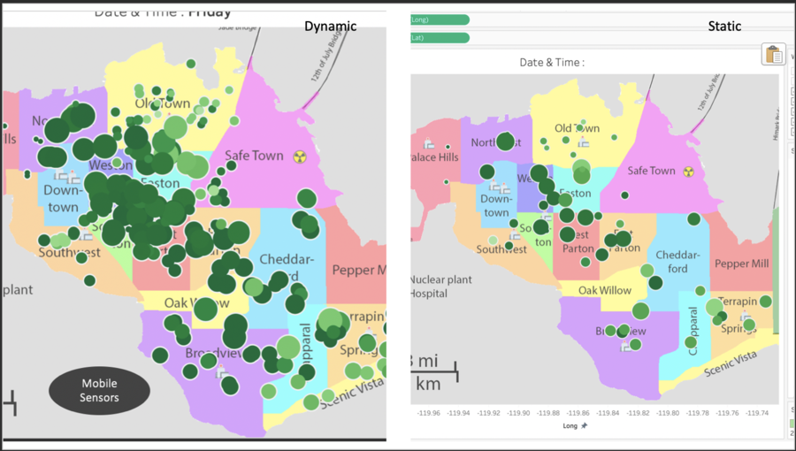
| + | Similarly to the previous example, by analyzing data as a stream of data, I can see the areas being covered at each particular instance instead of having an average count of sensors within a given time frame. | ||
| + | |||
| + | Throughout my analysis, all data points have been analyzed as a continuous stream of data. | ||
|} | |} | ||
Latest revision as of 22:44, 13 October 2019
Contents
- 1 Question 4
- 1.1 Summarize the state of radiation measurements at the end of the available period. Use your novel visualizations and analysis approaches to suggest a course of action for the city.
- 1.2 Use visual analytics to compare the static sensor network to the mobile sensor network. What are the strengths and weaknesses of each approach? How do they support each other?
- 2 Question 5
Question 4
Summarize the state of radiation measurements at the end of the available period. Use your novel visualizations and analysis approaches to suggest a course of action for the city.
| No. | Description | |
|---|---|---|
|
1 |
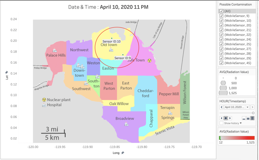
Highly likely contaminated cars with sensor IDs 20,21,22,24,25,27,28,29 and 45 has left the country. The government should issue a warning to search for these 9 vehicles. |
|
|
2 |
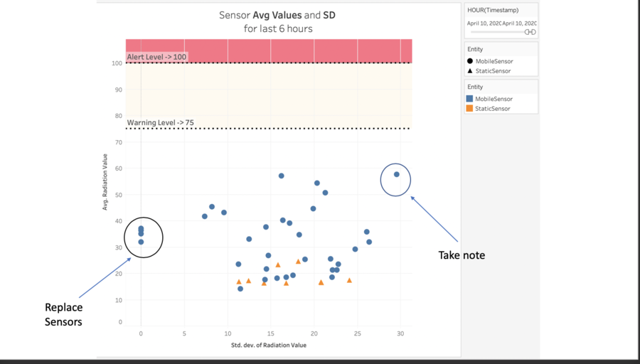
The graph above shows the standard deviation and average value of sensor readings for the last 6 hours that are still in the city. Sensor 1,26,35 and 47 has to be checked and replaced as they may be faulty with 0 standard deviations in readings for the last 6 hours. The government will have to Monitor mobile sensor 32 carefully as it has a high variability of sensor readings and its average value is reaching the warning level. |
Use visual analytics to compare the static sensor network to the mobile sensor network. What are the strengths and weaknesses of each approach? How do they support each other?
| No. | Description |
|---|---|
|
3 |
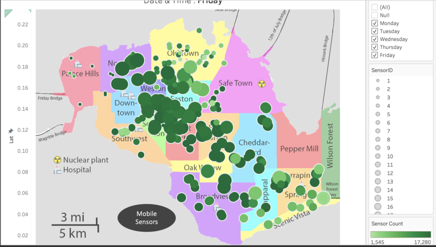
The mobile sensors are able to cover a wider area. The graph above shows a decrease in overall mobile sensors from Monday to Friday. This can be due to wear and tear and vehicles traveling out of the city.
Furthermore, the area of coverage are dependent on the travel routes of the vehicles, which are unpredictable. For example, based on the graph above, there are no mobile sensors around the Safe Town, and thus we have limited coverage of the area around the Nuclear Plant. Nonetheless, they still provide much better coverage of the city compared to the static sensors. |
|
4 |
The static sensor coverage is weaker compared to Mobile Sensors, covering only 9 out of 19 locations. Furthermore, it might be unreliable at close range distances. However, it is still easier to manage and implement compared to mobile sensors. |
|
5 |
All in all, there is a need to have two types of sensors on the ground. The mobile sensors help to achieve coverage which static sensors can't while static sensors help to make up for the inconsistency that is present in mobile sensors. |
Question 5
The data for this challenge can be analyzed either as a static collection or as a dynamic stream of data, as it would occur in a real emergency. Describe how you analyzed the data - as a static collection or a stream.
| No. | Description |
|---|---|
|
1 |
The dataset given consist of real-time data. It is where analytics is performed on a moving / scrolling data to unconver patterns or insights. As the timeframe given is continuous, the environment will be constantly be changing every second. In the process of analyzing and designing the dashboard, I ensure that Timestamp is set to continuous and incorporated into my filters to undergo a more thorough analysis of the data. |
How do you think this choice affected your analysis?
| No. | Description |
|---|---|
|
2 |
For example in the graph above, instead of utilizing time-stamp as a dimension, it should be converted to continuous data to uncover missing gaps and find patterns within the time frame. |
| No. | Description |
|---|---|
|
3 |
Similarly to the previous example, by analyzing data as a stream of data, I can see the areas being covered at each particular instance instead of having an average count of sensors within a given time frame. Throughout my analysis, all data points have been analyzed as a continuous stream of data. |
