Difference between revisions of "IS428 AY2019-20T1 Assign Christine Interactive Visualization"
| (6 intermediate revisions by the same user not shown) | |||
| Line 32: | Line 32: | ||
==<div><font color=#100c08 face="Century Gothic"><b>COMMON INTERACTIVE FEATURES ACROSS ALL PAGES/DASHBOARDS</b></font></div>== | ==<div><font color=#100c08 face="Century Gothic"><b>COMMON INTERACTIVE FEATURES ACROSS ALL PAGES/DASHBOARDS</b></font></div>== | ||
| − | These interactive features will be available across all pages / dashboards except '''Homepage'''. Other two common interactive features will be explained in detail in [[#Homepage|Homepage Dashboard]]. | + | These interactive features will be available across all pages / dashboards except '''[[#Homepage|Homepage Dashboard]]'''. Other two common interactive features will be explained in detail in [[#Homepage|Homepage Dashboard]]. |
</br> | </br> | ||
<center> | <center> | ||
| Line 81: | Line 81: | ||
==<div id="Homepage"><font color=#100c08 face="Century Gothic"><b>HOMEPAGE DASHBOARD</b></font></div>== | ==<div id="Homepage"><font color=#100c08 face="Century Gothic"><b>HOMEPAGE DASHBOARD</b></font></div>== | ||
In this page, there will be brief write-up for the problem statement as well as motivation behind this analysis conducted along with the navigation buttons.<br/> | In this page, there will be brief write-up for the problem statement as well as motivation behind this analysis conducted along with the navigation buttons.<br/> | ||
| − | '''Interactive Features in Homepage will be available as well in | + | '''Interactive Features in Homepage will be available as well in [[#Density|Density Map Dashboard]], [[#Map|Map Dashboard]], [[#Radiation|Radiation Level Readings]], and [[#Cumsum|Cumulative Sum Dashboard]].''' |
<div id="Fc.7">[[File:christine.2016_figure_c.7_Homepage.png|1000px|frameless|center]] | <div id="Fc.7">[[File:christine.2016_figure_c.7_Homepage.png|1000px|frameless|center]] | ||
<center>''Figure c.7 - Homepage Dashboard''</center></div></br> | <center>''Figure c.7 - Homepage Dashboard''</center></div></br> | ||
| Line 173: | Line 173: | ||
<br/> | <br/> | ||
| − | ==<div><font color=#100c08 face="Century Gothic"><b>MAP DASHBOARD</b></font></div>== | + | ==<div id="Map"><font color=#100c08 face="Century Gothic"><b>MAP DASHBOARD</b></font></div>== |
In this dashboard, the size of the dots on map will represent the different level of readings. Additionally, in mobile sensor readings, we will able to monitor the movement of cars on map along with the level of readings. | In this dashboard, the size of the dots on map will represent the different level of readings. Additionally, in mobile sensor readings, we will able to monitor the movement of cars on map along with the level of readings. | ||
<div id="Fc.19">[[File:christine.2016_figure_c.19_MapDashboard.png|1000px|frameless|center]] | <div id="Fc.19">[[File:christine.2016_figure_c.19_MapDashboard.png|1000px|frameless|center]] | ||
| Line 220: | Line 220: | ||
<br/> | <br/> | ||
| − | ==<div><font color=#100c08 face="Century Gothic"><b>RADIATION LEVEL READINGS</b></font></div>== | + | ==<div id="Radiation"><font color=#100c08 face="Century Gothic"><b>RADIATION LEVEL READINGS</b></font></div>== |
In this section, it will visualize the sensors’ reading over time for both Static and Mobile sensor. Through this graph, the small spikes or even small fluctuation of each reading can be observed so that it will allow users to detect any anomalies within that period of time. When raw data can reveal the spikes and changes over time, but it is not significant enough due to the consistent shift in CPM values (e.g. 8 and 13 showed the elevation in CPM values but when have more subtle changes will become not that obvious). Hence, to show the smaller changes, the log scale of radiation will be used. | In this section, it will visualize the sensors’ reading over time for both Static and Mobile sensor. Through this graph, the small spikes or even small fluctuation of each reading can be observed so that it will allow users to detect any anomalies within that period of time. When raw data can reveal the spikes and changes over time, but it is not significant enough due to the consistent shift in CPM values (e.g. 8 and 13 showed the elevation in CPM values but when have more subtle changes will become not that obvious). Hence, to show the smaller changes, the log scale of radiation will be used. | ||
<div id="Fc.26">[[File:christine.2016_figure_c.26_RadiationLevel.png|1000px|frameless|center]] | <div id="Fc.26">[[File:christine.2016_figure_c.26_RadiationLevel.png|1000px|frameless|center]] | ||
| Line 271: | Line 271: | ||
<br/> | <br/> | ||
| − | ==<div><font color=#100c08 face="Century Gothic"><b>CUMULATIVE SUM DASHBOARD</b></font></div>== | + | ==<div id="Cumsum"><font color=#100c08 face="Century Gothic"><b>CUMULATIVE SUM DASHBOARD</b></font></div>== |
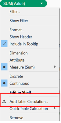
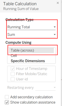
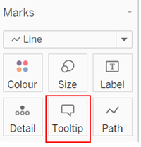
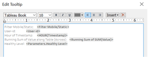
In this cumulative sum graph, it let users to be able to observe the first spikes of radiation level observed which will help in emergency responses if needed. | In this cumulative sum graph, it let users to be able to observe the first spikes of radiation level observed which will help in emergency responses if needed. | ||
<div id="Fc.35">[[File:christine.2016_figure_c.35_CumSumDashboard.png|1000px|frameless|center]] | <div id="Fc.35">[[File:christine.2016_figure_c.35_CumSumDashboard.png|1000px|frameless|center]] | ||
Latest revision as of 21:09, 13 October 2019
Visualization of Always Safe Nuclear Power Plant can be accessed here:
https://public.tableau.com/profile/christine2582#!/vizhome/Assignment2_Christine_V2/Homepage
In this case, a large dataset is provided to the investigator to conduct a deep analysis of the problem in St. Himark. Due to large dataset, numerous analysis is needed in order to provide better insight in detecting the cause of the problem or even propose a solution to the detected problem. As such, it will be impossible to display all analyses in a single dashboard. While these analyses are interrelated to each other hence, there is no sequential order that should be followed. To resolve these issues, flexibility has become the main solution where it should provide users the flexibility to navigate the dashboard from one to another. To do so, the interactive button was created with 5 different categories – Homepage, Density Map, Map Dashboard, Radiation Level Readings, and Cumulative Sum of Sensors Readings. Each of these categories will be a further breakdown and provide the freedom of users to choose the analysis that they interested in.
Contents
COMMON INTERACTIVE FEATURES ACROSS ALL PAGES/DASHBOARDS
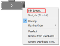
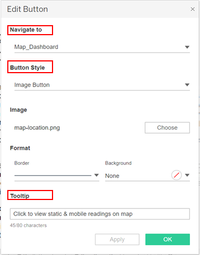
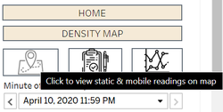
These interactive features will be available across all pages / dashboards except Homepage Dashboard. Other two common interactive features will be explained in detail in Homepage Dashboard.
| Interactive Technique | Rationale | Implementation Step |
|---|---|---|
* Except Density Map |
|
|
|
|
|
HOMEPAGE DASHBOARD
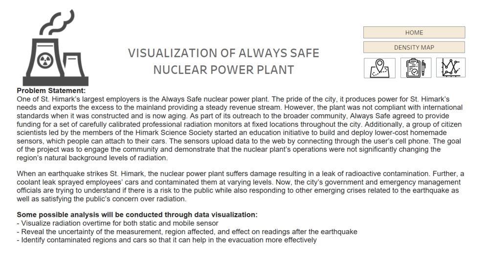
In this page, there will be brief write-up for the problem statement as well as motivation behind this analysis conducted along with the navigation buttons.
Interactive Features in Homepage will be available as well in Density Map Dashboard, Map Dashboard, Radiation Level Readings, and Cumulative Sum Dashboard.
| Interactive Technique | Rationale | Implementation Step |
|---|---|---|
*Navigation button will be available for every pages/dashboards |
|
|
|
|
|
DENSITY MAP DASHBOARD
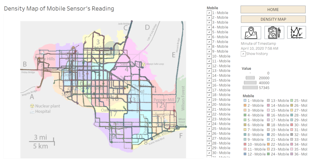
In this section, density map especially for Mobile sensor will be provided so that user could identify the region that have high possibility of getting contaminated.
| Interactive Technique | Rationale | Implementation Step |
|---|---|---|
|
|
| |
|
|
|
MAP DASHBOARD
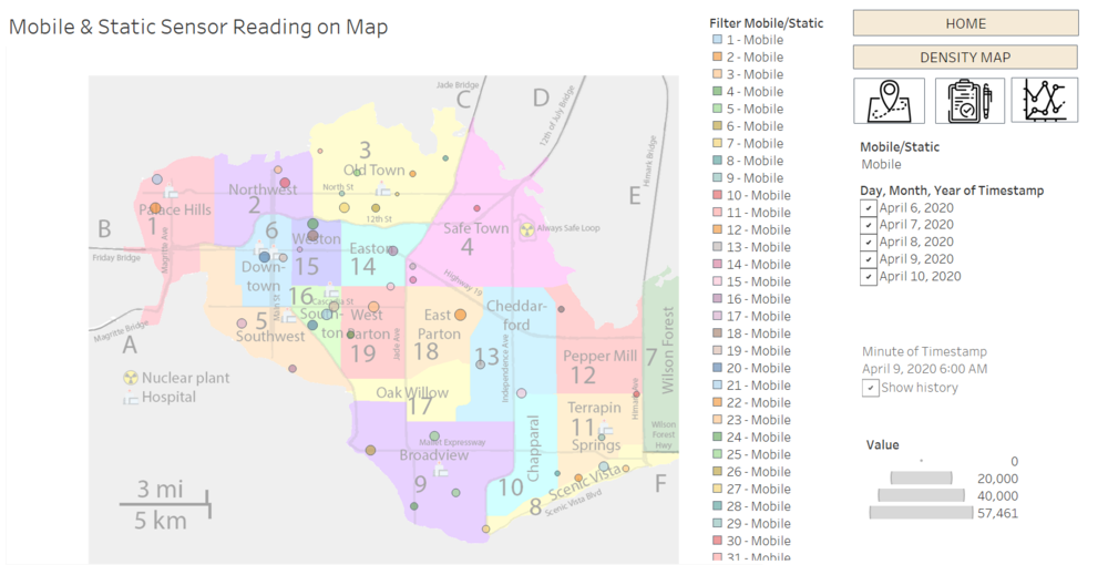
In this dashboard, the size of the dots on map will represent the different level of readings. Additionally, in mobile sensor readings, we will able to monitor the movement of cars on map along with the level of readings.
| Interactive Technique | Rationale | Implementation Step |
|---|---|---|
|
|
| |
|
|
|
RADIATION LEVEL READINGS
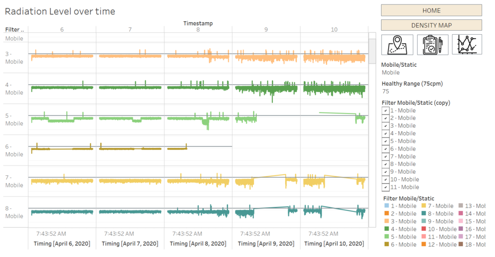
In this section, it will visualize the sensors’ reading over time for both Static and Mobile sensor. Through this graph, the small spikes or even small fluctuation of each reading can be observed so that it will allow users to detect any anomalies within that period of time. When raw data can reveal the spikes and changes over time, but it is not significant enough due to the consistent shift in CPM values (e.g. 8 and 13 showed the elevation in CPM values but when have more subtle changes will become not that obvious). Hence, to show the smaller changes, the log scale of radiation will be used.
| Interactive Technique | Rationale | Implementation Step |
|---|---|---|
|
|
| |
|
|
|
CUMULATIVE SUM DASHBOARD
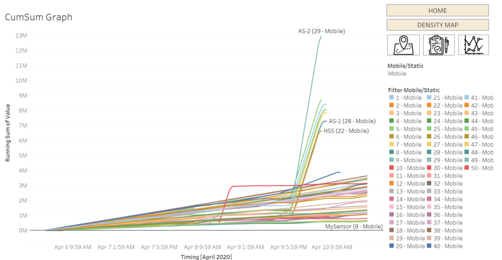
In this cumulative sum graph, it let users to be able to observe the first spikes of radiation level observed which will help in emergency responses if needed.
| Major Features | Rationale | Implementation Step |
|---|---|---|
|
|
| |
|
|
|

