Difference between revisions of "IS428 AY2019-20T1 Assign Benedict Then Question 3"
Jxthen.2017 (talk | contribs) |
Jxthen.2017 (talk | contribs) |
||
| Line 45: | Line 45: | ||
<br> | <br> | ||
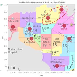
| + | [[File:Map 9 april.jpg|thumb||Static Sensor: Total Measurements on 9 April]] | ||
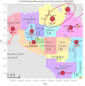
| + | [[File:Map 10 april.jpg|thumb|Static Sensor: Total Measurments on 10 April]] | ||
| + | |||
| + | |||
| + | |||
| + | <br> | ||
[[File:Mobile Anmoly (no filter).png|550px|thumb|left|Mobile Sensor Radiation measurement over time]] | [[File:Mobile Anmoly (no filter).png|550px|thumb|left|Mobile Sensor Radiation measurement over time]] | ||
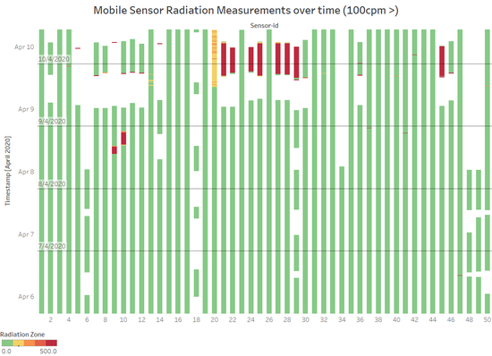
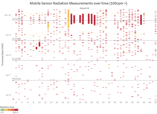
[[File:Static Anmoly (above 100z).png|550px|thumb|center|Mobile Sensor Radiation readings over time (100cpm >)]] | [[File:Static Anmoly (above 100z).png|550px|thumb|center|Mobile Sensor Radiation readings over time (100cpm >)]] | ||
Revision as of 20:01, 12 October 2019
|
|
|
|
|
|
3.Given the uncertainty you observed in question 2, are the radiation measurements reliable enough to locate areas of concern?
Visualization Information:
These visualisations show the radiation measurements of all Mobile Sensors individually from 06/04/2020 to 10/04/2020. Each dot represents one radiation reading of a sensor at a timestamp (e.g. 06/04/2020 12:00:05 PM, mobile sensor 1, 20 cpm). Both Visualisations above are the same. Just that the one of right has been filtered to show only radiation readings above 100cpm. The reason for the visualisation on the right is because there are so many radiation readings that are at a normal/green level that it made the high readings not visible. Hence, once I filtered it, we can see more high readings as shown in the second visualisation.
Identifying potentially contaminated vehicles
From the visualization above, we can that there are certain sensors that have a prolonged period of high radiation measurements of 100 cpm and above (Yellow Zone >). This can be seen in mobile sensors 9, 10, 13, 20, 21, 22, 24, 25, 27, 28, 29, 45. These prolonged high radiation measurements started from the latter half of 9/4/2020 to 10/4/2020, where it is around the same time as the earthquake resulting in radiation contamination. Hence, it is likely that these vehicles having these sensors are contaminated.
