IS428 AY2019-20T1 Assign Tan Sok Yi Insights
|
|
|
|
|
Contents
Insights
Task 1
Emergency responders will base their initial response on the earthquake shake map. Use visual analytics to determine how their response should change based on damage reports from citizens on the ground. How would you prioritize neighbourhoods for response? Which parts of the city are the hardest hit?
Priortizing neighbourhoods
Emergency responders should prioritise their response based on the background information of the different locations. For instance, location 4, where the Always Safe nuclear power plant that supplies power to StHimark is located, should be identified as a high priority location. Trauma Hospital, which is the only Level 1 Trauma Center in the area, located in location 5 should also be identified as a high priority location as it serves as an important facility to aid in helping the injured in the case of a natural disaster. Such information could be found in the dashboard and emergency responders could make use of such available information to prioritise the neighbourhoods.
Hardest Hit
Locations identified by the shake map
When emergency responders based their initial responses based on the earthquake shake maps, they are most likely to focus their responses on the north-east part of the city.
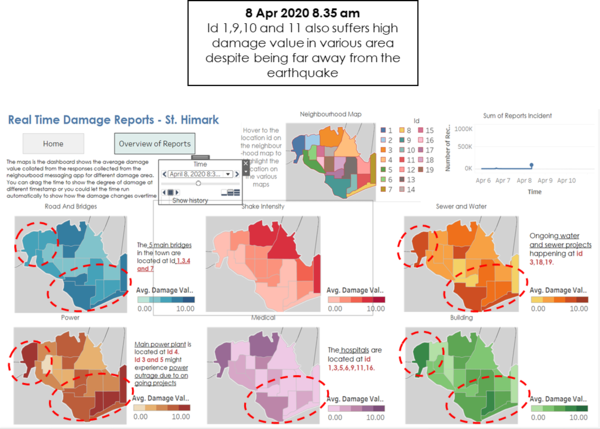
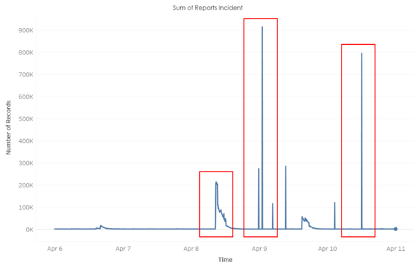
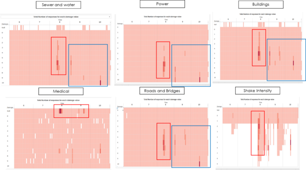
As seen from the above, there was an increase in the number of reports on 8 Apr 2020 at 8.35 am. This suggests that the earthquake could possibly happen at around 8.35 am. Looking at the shake intensity map, the responses collected correspond with the major quake map that was given to us as part of the datasets, showing us that the effects of the earthquake were mostly experienced at the northeast part of the city (id 2,3,4,7,12). Location id 3, located at the north of the town does suffer the hardest hit, having a high damage value is all the different damage areas.
However, the other locations in the north-east part of the town did not suffer as much damage as location id 3. The damages were relatively mild for location 4 and 12 and location 7 only suffer more damage in buildings and power. This continues until 9 am. As such, instead of focusing the rescue effort only at the northeast part of the town, emergency responses could divert their attention to other locations which suffer more damage.
Locations outside of shake map
At the same timing, when the earthquake first struck, id 1,9,10 and 11 were among the locations which were hardest hit, despite it being far away from the locations identified by the earthquake shake map. These 3 locations suffer from high damage value in multiple areas (buildings, medical, power, roads and bridges, water and sewage).
Conclusion
Hence, instead of basing their response based on the locations identified by the earthquake shake map, the emergency responders can focus on location id 1,3,9,10 and 11, locations which were hardest hit by the earthquake, based on the responses collected from the citizens.
Task 2
Use visual analytics to show uncertainty in the data. Compare the reliability of neighbourhood reports. Which neighbourhoods are providing reliable reports? Provide a rationale for your response.
When the earthquake happen (8 April)
Reliable
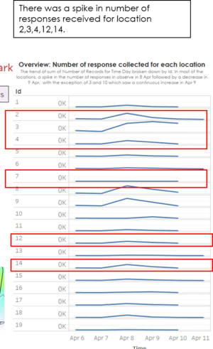
With reference to the shake map, the locations most affected by the earthquake that happens on the 8 Apr would be location 2,3,4,7,12,14.
With the exception of location 7, this coincides with the line chart which shows that these locations experienced an increase in the number of responses collected on 8 Apr, This was followed by a downward trend in 9 Apr and 10 Apr where there the city was not hit by the earthquake.
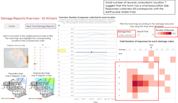
For location 7, this could be due to the small population size in the town, as suggested by the analysis on the heat map. The small population makes the changes appears insignificant in the line chart. Further analysis on these locations using the heat map shows no anomalies and hence, the responses collected from these locations could be deemed as reliable.
Unreliable
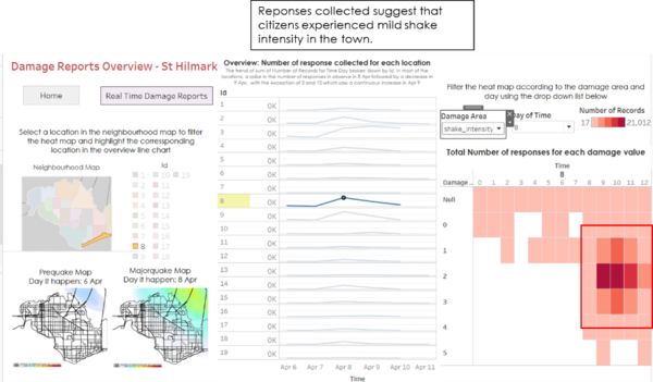
As seen from the line graph, although not affected by the earthquake, there was also a spike observed in location 8 and 9. For location 8, despite if being far away from the earthquake, the chart shows that there were citizens were experience mild shake intensity in the town. In conjunction with the shake map, these reports could be deemed as unreliable.
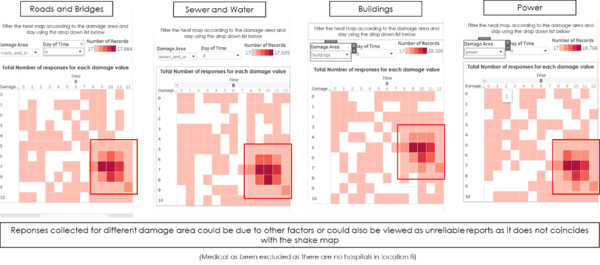
As for the other damage areas, the damage could be due to other circumstances or that these could be view as an unreliable report.
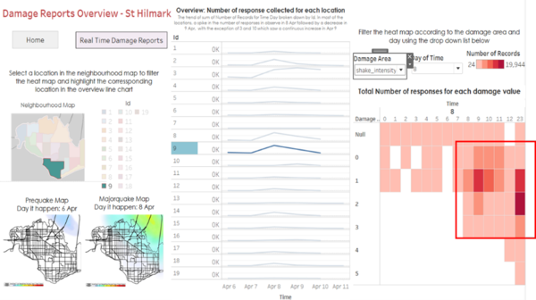
Likewise, for location 9, the shake intensity heat map does not match the shake maps and hence reports could be view as unreliable. Reports collected for the other damage area could be due to other factors or that these could be view as an unreliable report.
After the earthquake (9 and 10 April)
Unreliable
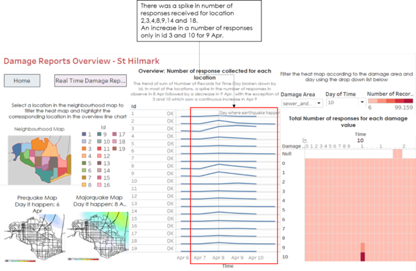
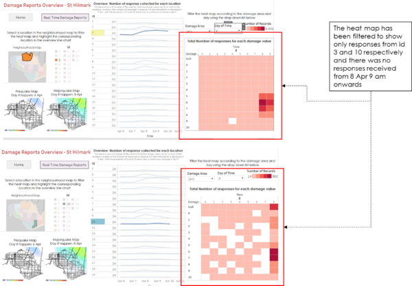
An overview of the line chart that shows that for the majority of the location, there was a spike in the total number of responses collected on 8 Apr followed by a downward trend on 9 Apr and 10 Apr, except id 3 and 10 where the number of responses continues to increase on 9 Apr.
Further analysis done on these 2 locations shows that there were no responses collected after 8 Apr 9 am. This corresponds with the earlier analysis in task 1 where the real-time damage reports show no responses for id 3 and 10 after 8 Apr 9 am. As the earlier analysis suggests that there might be a power outrage in these 2 locations, these might have caused the responses to not be received by the server at the time that it was sent. These responses could only get send after the power returns, hence resulting in the surge of responses on 9 Apr, when in turns causes the reports from id 3 and 10 to be unreliable at Apr 9.
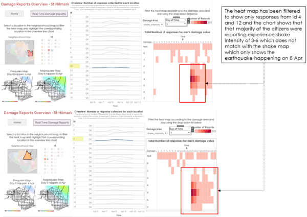
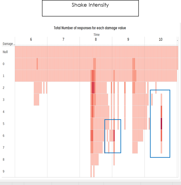
At 9 Apr where the earthquake had stopped, many reports reporting to have experienced a mid-level of shake intensity were received from id 4 and 12. In conjunction with the shake map, these could be view as unreliable reports.
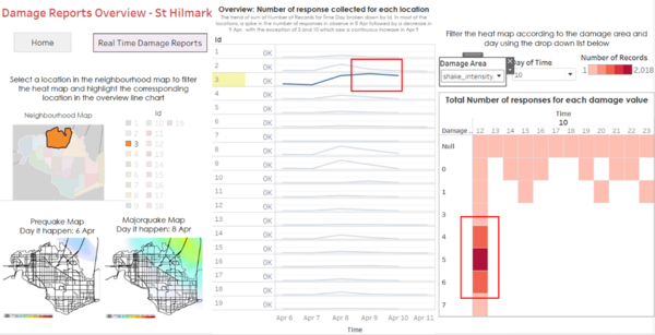
On 10 Apr, many reports were received from location 3. Further analysis of the responses suggests that there were mid-level of shake intensity experience at the town. This is not in conjunction with the shake map and hence would be considered the unreliable report.
As for the other damage areas, the damage could be due to other circumstances or that these could be view as an unreliable report.
Conclusion
Reports provided by location 4, 8, 9, and 12 were not as reliable as the reports received from the other locations at the time of the earthquake. For location 3 and 10, due to power outrage, reports sent by the citizens were only received on 9 Apr. This makes the reports provided by these 2 locations unreliable on 9 April. Apart from these locations, there were no anomalies observed for the other locations in the city.
Task 3
How do conditions change over time? How does uncertainty in change over time? Describe the key changes you see
Conditions
The earthquake happens on 8 April and as seen from the line chart, the number of reports increases after the earthquake, mainly on 8, 9 April and mid of 10 April.
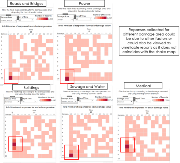
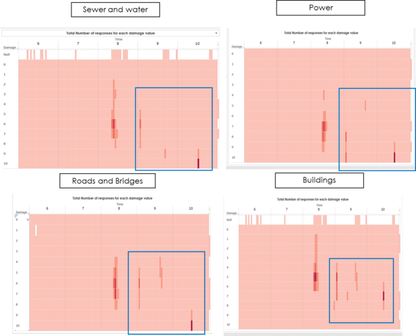
Further analysis on the heatmap also shows more responses were collected after the earthquake and the responses are mainly concentrated on the mid-level in the different damage area, except for medical, which suggest that little damage was done to the different hospitals in the town. Over time, on 9 and 10 Apr, similar patterns on the responses collected were spotted on sewage and water, power, buildings and road and bridges.
Overall, we can see that the number of citizen’s reports and the degree of damage increases after the earthquake happens.
Uncertainty
Likewise, for uncertainty, the reports become relatively unreliable after the earthquake happens on 8 Apr.
There was no earthquake on the 9 April and 10 April but there were reports claiming to have experience earthquakes on those days.
Similarly, for the other damage areas (sewage and water, power, road and bridges and buildings), there were reports reporting mid to high damage in these different areas when the earthquake has stopped, creating uncertainty in the citizen’s report.
Conclusion
After the earthquake, the degree of damage in the different damage area and uncertainty in the reports increases
References
The following references have been useful in the completion of the assignment:
