IS428 AY2019-20T1 Assign Sean Chai Shong Hee Interactive Visualisation
Jump to navigation
Jump to search
Click the link below to access the visualisation: [[1]]
Homepage
Clicking begin brings users to the menu selection page, where users can select between viewing visualisations for static sensor or mobile sensor.
Menu Page
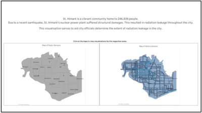
The menu page shows a brief background of what the visualisation is about. Users can view visualisations for static and mobile sensors by click on the image of the maps respectively.
Static Sensor Page
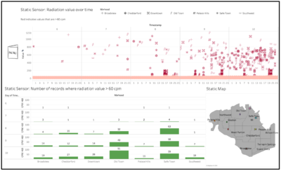
Static Sensor: Number of records where radiation value > 60 cpm This chart shows the number of records, based on each neighbourhood, where values recorded were more than 60 cpm. 60 cpm is the base background radiation value. Hovering over each bar will highlight all the values that make up the number of records, and also highlights the neighbourhood
Static Map: Shows the location of static sensors in each neighbourhood
Clicking the menu icon will bring users back to menu selection page
Static Sensor Page
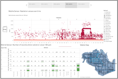
Mobile Sensor: Radiation value over time Users will be able to see 3 charts. The top chart shows users how radiation values change over time. Time is disaggregated into day by hour format. Different shapes represent different neighbourhoods, as indicated by the legend. Hovering over the any data point will highlight the neighbourhood the value belongs to and its corresponding record where values are > 60cpm
Mobile Sensor: Number of records where radiation value > 60 cpm This chart shows the number of records, based on each neighbourhood, where values recorded were more than 60 cpm. 60 cpm is the base background radiation value. Hovering over each bar will highlight all the values that make up the number of records, and also highlights the neighbourhood
Mobile Map: Shows the location of data recorded by mobile sensors within St. Himark
Clicking the menu icon will bring users back to menu selection page
Dynamic Visualisation of Mobile Sensor Data
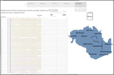
Mobile sensor ID with values more than the average radiation values recorded by mobile sensors for each neighbourhood: This chart plots the scatterplot of values recorded by each mobile sensor. Values in orange are values that are less than the average value in the neighbourhood that the mobile sensor is in. Values in red indicate values recorded that are higher than the average value in the neighbourhood.
The map shows the distribution of values over time. Adjusting the slider will change the distribution of data points
Slider: Adjusting slider will result in both charts values changing according to the time
Clicking the menu icon will bring users back to menu selection page
Mini Case Challenge 2: Visualising Radiation Measurements in St. Himark
User Guide
The interactive visualisation has the following pages:
- Homepage
- Menu Selection
- Static Sensors Visualisation
- Mobile Sensors Visualisation
- Dynamic Visualisation of Mobile Sensor Data
Static Sensor: Radiation value over time Users will be able to see 3 charts. The top chart shows users how radiation values change over time. Time is disaggregated into day by hour format. Different shapes represent different neighbourhoods, as indicated by the legend. Hovering over the any data point will highlight the neighbourhood the value belongs to and its corresponding record where values are > 60cpm


