IS428 AY2019-20T1 Assign Sean Chai Shong Hee Data Preparation
Data Preprocessing with Pandas
Data was provided in the form of 3 csv files:
- MobileSensorReadings.csv: Consists of measures of radiation values in count per minute. Also contained the longitude and latitude of where the values were collected, and the respective time they were recorded
- StaticSensorReadings.csv: Consists of measure of radiation values in count per minute. Also contained the respective time at which the values were recorded.
- StaticSensorLocations.csv: Consists of the longitude and latitude of each static sensor
A polygon Shapefile was also provided, which provides the spatial representation of St. Himark
Before any meaningful observations can be made with Tableau, the csv files have to preprocessed to allow Tableau to carry out a spatial join between point and polygon geometric data. As such, the longitude and latitude values needs to be converted to Point geometry values using GeoPandas. The GeoDataframe is later exported into a Shapefile.
Importing python libraries
I first start off by importing libraries that are necessary in the creation of the new Shapefiles. These libraries include Pandas, Shapely and GeoPandas.
Reading csv files to Pandas Dataframe
Next, I read the csv files into a Pandas Dataframe.
Merging StaticSensorReadings and StaticSensorLocations
I proceed by merging the static_reading dataframe with the static_loc dataframe. Here, a full outer join on "Sensor-id" is done to ensure all values are accounted for, even if they are null.
Creating the GeoDataframe
Longitude and Latitude values are first converted into geometry point values. Here, I append the geometry point values into a new column called "geometry" and create my new GeoDataframe
We can see that I now have a new column called "geometry", which contains geometry point values for each of the rows
Exporting our Dataframe to a Shapefile
Finally, I export my GeoDataframe to a Shapefile. This Shapefile can be later used for spatial join with the provided "StHimark.shp"
Creating Shapefile for MobileSensorReadings
Following the steps above, I did the same for "MobileSensorReadings.csv" and generated my mobile sensors Shapefile.
Tableau
With my new Shapefile created, I will now begin to work on visualisations in Tableau.
Spatial Join
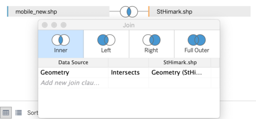
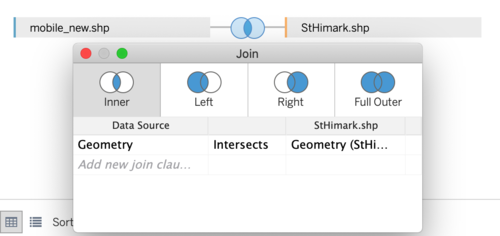
Tableau supports the matching of locations of geographic points from one data table to polygons of another data table. This is done by using the predicate "intersect". To leverage on Tableau's "intersect" function, I opened my static sensor Shapefile as my primary data file, followed by the provided "StHimark.shp" Shapefile.
I established an inner join for both files as I only want data that is collected within the boundaries of St. Himark. The two data tables will be connected by their geometries, where point geometry from my static sensor Shapefile intersects the polygon of the "StHimark" Shapefile.
The same was done for my mobile sensor Shapefile. A new data source is created, with my mobile sensor Shapefile being my primary data file, followed by the "StHimark.shp" Shapefile.
The above picture shows a sample of how my data files look like after intersecting point geometry values with polygon.
Calculated Fields
Before embarking on my visualisation journey, I carried out some background research on natural background radiation levels. According to the National Radiation Network,background radiation levels, on average, ranges from 5-60 counts per minute (cpm). As such, I will be using the upper limit of 60 cpm as the base background radiation level. To start off, I first create 3 calculated fields for both of my data sources that will help me in my visualisations.
| Calculated Field Name | Formula | Function |
|---|---|---|
Calculated fields are used to highlight values that fall over the stated thresholds. This makes it easier to read the visualisations obtained.


