IS428 AY2019-20T1 Assign Nurul Khairina Binte Abdul Kadir InteractiveVisualization

From Visual Analytics for Business Intelligence
Jump to navigation Jump to search


VAST 2019 MC1: Crowdsourcing for Situational Awareness

Introduction

Data Analysis and Transformation

Interactive Visualization

Task Findings

References


Dashboard Overview

The interactive visualization can be accessed here: https://public.tableau.com/views/AssignmentVA_15709028039740/Overview?:embed=y&:display_count=yes&:origin=viz_share_link

For the best experience, adjust your screen resolution to 1366x768 and enable full screen on the browser. Adjust the dashboard so that all elements can be clearly visible without the need to scroll up/down.

A summary of the breakdown of the visualizations created for Question 1 is as shown below.

No. Dashboard Name Purpose
1 Overview Provide more information on the Mini-Challenge and the questions that will be addressed
2 Shake Map Analysis Gain a better idea of the situation and see if the reports reveal the same key observations
3 Time Of Earthquake Identify when the earthquake started and use the identified timeframe for further analysis
4 Hardest Identify which neighbourhoods are hardest hit from the earthquake
5 Emergency Response Planning Determine how the emergency response should change based on the reports made
6 Prioritization: Building, Medical, and Power Damages Some cities are more affected than others and prioritizing the right cities based on the damage types is a very crucial step
7 Prioritization: Roads and Bridges, Sewer and Water Damages Some cities are more affected than others and prioritizing the right cities based on the damage types is a very crucial step

A summary of the breakdown of the visualizations created for Question 2 is as shown below.

No. Dashboard Name Purpose
1 Reliability Of Reports #1: Damage Reports Over Time Analyse reports made before the earthquake and delay in reports
2 Reliability Of Reports #2: Comparison Of Maximum Impact Scores Over Time Observe the change in impact scores before, during and after the earthquake
3 Reliability Of Reports #3: Variation In Impact Scores Explore the differences in the reported impact scores by citizens who live in the same region / within the neighbourhood
4 Damage Uncertainty Observe the relationship between shake intensity and other damage types

A summary of the breakdown of the visualizations created for Question 3 is as shown below.

No. Dashboard Name Purpose
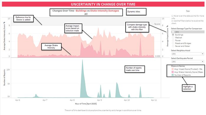
1 Uncertainty in Change Over Time Use research on earthquakes to explore the uncertainty in the data throughout the entire period. Insights for key changes will be derived from other charts listed above.

Throughout all the different dashboards, useful guides/tips are provided to help users navigate through the different filters and actions so that their analysis can be performed smoothly. The following interactivity elements are also used throughout all the dashboards to maintain consistency:

Common Interactive Features Across All Dashboards

The following interactive techniques have been employed in this dashboard:

Interactive Technique Rationale Brief Implementation Steps
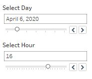
Filter by day and hour with the use of a slider

Filter By Day and Hour.jpg
  • To provide flexibility for users to choose the time period that they are interested to analyze. The day and hour are split to provide the user with more flexibility.
  • The use of checkboxes or dropdown list requires the user to check/uncheck each date manually which is time-consuming. As such, a time range slider is preferred.
  1. Check that the data type for Time is set to Date & Time
  2. Drag the Time field to the Filters panel
  3. Select "Hour" or "Day". Select All Value in the checkbox.
  4. Right-click on the Time field in the Filters panel and select Show Filter
  5. Change the filter type to Singe Value Slider
Filter data source by neighbourhood using a drop-down list

Filter By Neighbourhood.jpg
  • To allow the analyst to focus on a specific neighbourhood(s).
  • A drop-down list will give the users some control over the visualization. The user can select the values without the risk of misspelling and all available options can be seen
  1. Drag the Neighbourhood field to the Filters panel. Select All Value in the checkbox.
  2. Right-click on the Neighbourhood field in the Filters panel and select Show Filter
  3. Change the filter type to Single Value list or Multiple Value list
Filter data source by damage type using a drop-down list

Filter By Damage Type.jpg
  • To allow the analyst to focus on a specific damage type(s) and make comparisons
  1. Follow the steps as mentioned above. Set the filter type to Single Value list or Multiple Value list
Filter data source by Amenities using a drop-down list

Filter By Amenities.jpg
  • To allow the analyst to filter the neighbourhood based on the amenities available in each neighbourhood
  1. Follow the steps as mentioned above. Set the filter type to Single Value list or Multiple Value list
Filter data source by damage type using a drop-down list

Filter By Damage Type.jpg
  • To allow the analyst to focus on a specific damage type(s) and make comparisons
  1. Follow the steps as mentioned above. Set the filter type to Single Value list or Multiple Value list
Dynamic title in dashboard based on filters and parameters
Dynamic Titles.jpg


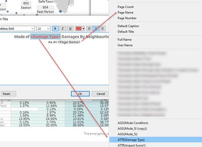
  • User do not have to check the filters manually to see if the right selection was made
  • The time in the title also helps the reader to focus on the changes on the map since it will update dynamically depending on what the user chooses
  • Useful when multiple variables are selected
  1. Drag the field you want to change dynamically to Detail.
  2. Drag the relevant dimensions into the Filter shelf
  3. Select the chart title and edit the title. Click on the Insert button
  4. Select the fields that you want to change dynamically
    Common Dashboard Title.jpg


The following sections elaborate on the dashboard design and other interactivity techniques that are integrated into each of the individual dashboards.

Overview

Purpose / Description

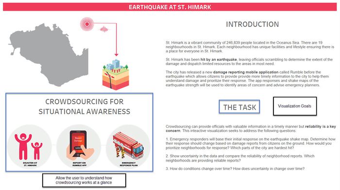
The Overview is the landing page you will see when you open the workbook/link. This is considered the home page for this visualization. Icons are used to explain how crowdsourcing works and how it will used by the emergency response team. The visualization goals are also started here to give the user an idea of what to expect from the dashboards.

0 OverviewMarks.jpg

Shake Map Analysis

Dashboard Design

Purpose / Description

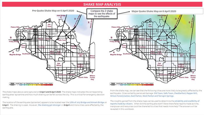
Before we begin analyzing the reports, we will first analyze the shake maps that were captured on 6 April and 8 April 2020. This is a crucial step since the shake maps will be used to check the reliability of the reports made by citizens through the Rumble app - Do the reports reveal the same key observations? The shake maps indicate the corresponding earthquakes' epicenters and how much shaking can be felt across the city. This is critical for emergency decision making. Insights gained from the shakemap are also displayed here.

1 Shakemap design.jpg

Time Of Earthquake

Dashboard Design
Purpose / Description

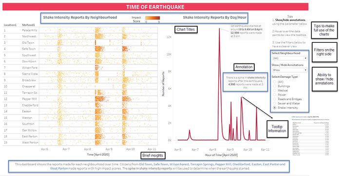
The aim of the dashboard is to analyze the number of reports made by each neighbourhood throughout the entire period and identify the time of the earthquake. The charts are placed side by side to allow for easier analysis. The filters are consistently placed at the right side of the dashboard and the tips will help the user to explore the chart on their own. The line chart is used since the objective is to show the trend in reports made over time.

Time earthquake design.jpg

Interactive Technique

The following interactive techniques have been employed in this dashboard:

Interactive Technique Rationale Brief Implementation Steps
Show / Hide Annotations

Show or Hide Annotations.jpg

  • The annotations was added in to highlight the spike in reports.
  • If it is not needed in the view, the user will be able to hide it and focus more on the chart.
  1. On an individual worksheet, right-click an empty area of the Data pane on the left and select Create Parameter.
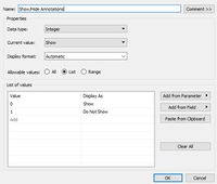
  2. In the Create Parameter dialog box, do the following: Enter the name that will appear above the menu like 'Show/Hide Annotations'. For Data type, select String. For Allowable Values, select List. Click ok.
    Show or hide parameter settings.jpg

  3. Create a calculated field to trick Tableau into seeing the Mark as a new one when the parameter changes. Here is the calculation.
    Show or Hide Annotations Calculated Field.jpg

  4. Add it to the view
  5. Add annotations for the current parameter
  6. Change Parameter and repeat the previous step
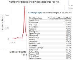
Hover over the data points in the line chart to find out more about the proportion of reports made by each neighbourhood

Proportion of Reports Made By Neighbourhood.jpg

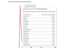
  • When a user hovers over a mark, the tooltip displays relevant data and details from a separate and related visualization (The proportion of reports chart) filtered to that mark.
  • This will help the user to engage with the data at a different or deeper level while keeping them in the current context and maximizing the space available for the current view.
  • This will provide the user with a more granular level of detail.
  1. Create a new worksheet. Drag the Neighbourhood field to the Rows tab and Number of Records to Text in the Marks card.
  2. To add a field label to the Number of Records, type "Proportion of Reports Made" in the Columns tab at the tab
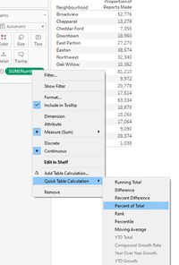
  3. To convert the number of records to percentage, right-click on the Number of Records and add a Quick Table Calculation (Percent of Total)
    Table Calculation for Proportion of Reports.jpg

  4. Sort Neighbourhood in descending order by the % of Total Number of Record. Apply the necessary filters to this sheet.
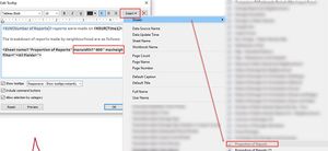
  5. To display this sheet in the tooltip of another worksheet, go to the main worksheet and click on the tooltip. Click on Insert Sheet and select this Proportion of Reports Made sheet.
  6. Adjust the max-width and height and do basic formatting
Sheet in Tooltip.jpg

Hardest Hit Areas

Dashboard Design

Purpose / Description

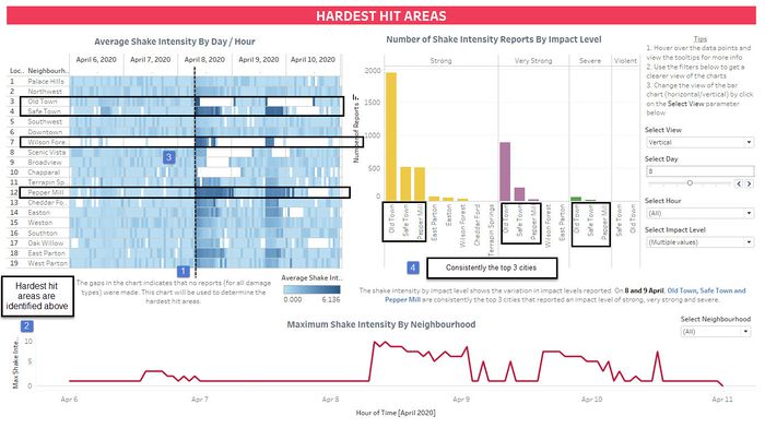
The aim of the dashboard is to analyze the average shake intensity and the number of shake intensity reports made for each neighbourhood throughout the entire period. A heatmap is used to show the average shake intensity as it allows the user to quickly identify areas that are more affected by the earthquake. The gaps in the chart indicate that no reports (for all damage types) were made. Null impact scores are not filtered out in this chart. Therefore, if the user hover over the data points and the average shake intensity is empty, it means that the impact score is Null.

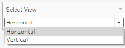
For the Shake Intensity By Impact Level chart, the purpose is to show the variation in impact levels reported and to identify cities that are hardest hit. There are 2 options to view this chart – Horizontal or Vertical. A grouped bar chart is used since it allows for easy comparison and identification of patterns and anomalies.

The Maximum Shake Intensity By Neighbourhood chart can be used to observe the number of records made over time as well as the intensity of the shaking. A line chart is used to show the trend over time. However, it shouldn't be relied upon completely since there could be outlier/false reports with high impact scores and this will not reflect the true extent of the damage.

Hard confirmed.jpg

Interactive Technique

The following interactive techniques have been employed in this dashboard:

Interactive Technique Rationale Brief Implementation Steps
Change View

Select View Parameter.jpg
  • To provide analysts with the flexibility to toggle or switch between 2 views on the same dashboard for the same data.
  • The vertical view is useful to compare all impact levels whereas the Horizontal view can be used to focus on each impact level. It depends on the preferences of the user.

Note: There are 2 separate sheets used for this visualization - Horizontal and Vertical

  1. On an individual worksheet, right-click an empty area of the Data pane at left and select Create Parameter.
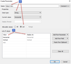
  2. In the Create Parameter dialog box, do the following: Enter the name that will appear above the menu like 'Select View'. For Data type, select String. For Allowable Values, select List.
  3. Under the List of values, type Horizontal and Vertical in the Value and Display As column respectively. Click Ok. The parameter is created.
    Parameter Settings.png
  4. Show the Parameter in the worksheet/dashboard.
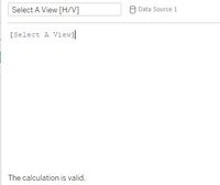
  5. Create a Calculated field. Give the calculation a descriptive name like Select A View [H/V]. In the formula text box, enter the name of the parameter you created above which is 'Select View'. Click OK.
    Select View Calculated Field.jpg
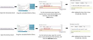
  6. One by one, open each sheet you plan to add to your dashboard and drag the new calculation to the Filters shelf. Then do the following in the Filter dialog box, and click OK.
    Adding Filter Process.jpg
  7. Create a Dashboard. Drag a Vertical or Horizontal layout container to the dashboard. Now drag each sheet to the layout container, identified by the dark blue outline.
    Drag Sheets.jpg
  8. Right-click the title area of each view in the dashboard, and select Hide Title. If the titles are visible, they prevent selected views from filling the dashboard.
  9. Show the parameter on the dashboard and it is done!
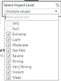
Select Impact Level

Select Impact Level.jpg
  • To allow the analyst to focus on a specific impact level(s).
  • The user can choose to focus on impact levels that are Strong and Above with this multi-select dropdown list.
  1. Set the filter type to Multiple Value list
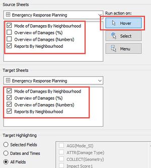
Dashboard Action: Hightlight

Dashboard Hover Hard Hit.jpg
  • When the user is interested in a specific data point, he/she can simply place the cursor over the data point.
  • It will highlight the row corresponding to the neighbourhood in the other chart for easier analysis.
  1. From a dashboard, select Dashboard and then click on Actions.
  2. In the Actions dialog box click the Add Action button and then select Highlight.
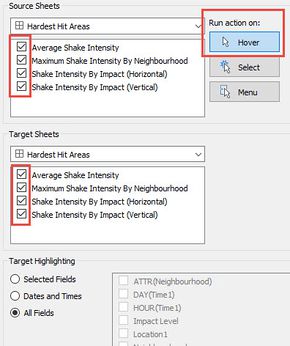
  3. Tick the Source Sheets and Target Sheets. Select Hover as the trigger of the action.
  4. click OK twice to close the dialog boxes and return to the view.
    Action Settings.jpg

Emergency Response Planning

Dashboard Design

Purpose / Description

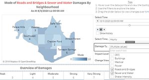
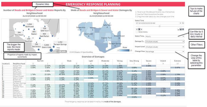
The emergency response can be determined by the mode of the damages. The blank map makes it easy for users to see the change in the size of the circle marks which denotes the number of reports over time. The bigger the size, the greater the number of reports made by a specific neighbourhood. The mode chart is represented by the maximum number of reports made by the impact score for each damage type and neighbourhood. It is better to use mode instead of average and maximum since they are prone to be affected by outliers. An area that is the hardest hit may not always have a very high number of reports since there are other factors that could influence the number of reports like the size of the population in a neighbourhood.

Therefore, using the mode of the impact score seems to be a better option in assessing the extent of the damage. The overview table will also provide the emergency responders with a breakdown of the reports by impact scores if they prefer to look at the details. The maps would allow them to get the information they are looking for at a glance.

Emergency design.jpg

Interactive Techniques

The following interactive techniques have been employed in this dashboard:

Interactive Technique Rationale Brief Implementation Steps
Traverse through a daily/hourly/5 min time series by clicking on the arrows
Time Choices.jpg

  • To analyze changes in mode and number of reports over a period of time
  • The user has more options on which timeframe to use when viewing the animation without having to change the filters manually. However, analysis is usually done on the hourly/daily time frame.
  • It is helpful in analyzing time-series data
  1. On an individual worksheet, right-click an empty area of the Data pane on the left and select Create Parameter.
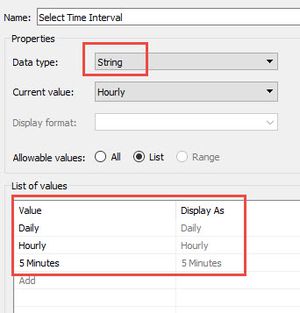
  2. In the Create Parameter dialog box, do the following: Enter the name that will appear above the menu like 'Select Time Interval'. For Data type, select String. For Allowable Values, select List.
  3. Under the List of values, type Daily, Hourly and 5 Minutes in the Value and Display As column respectively. Click Ok. The parameter is created.
    Time - Parameter Settings.jpg

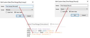
  4. Create a Calculated field called Select Time Range [Calculation] and use the formula as shown below. Custom dates were created for Minutes and Hours.
    Time Range Calculation.jpg

  5. Drag the Select Time Range [Calculation] field into the Pages shelf. Right-click and select Exact Date. Show the Select Time Interval parameter.
Change View

Change View (Numbers and Percentage).jpg
  • To provide analysts with the flexibility to toggle or switch between 2 views on the same dashboard for the same data
  1. Follow the same steps as mentioned in the Hardest Hit Areas dashboard (Change View)
  2. For more information, refer to this site.
Dashboard Action: Highlight

Hover action - emergency.jpg
  • Easier to se the relevant data points on other charts in the dashboard like the Number of Reports By Neighbourhood
  • Allows you to call attention to marks of interest by dimming all other points
  1. The action settings can be seen below
Dashboard Action for Emergency Response Planning.jpg

Prioritization - Building, Medical, Power

Dashboard Design

Purpose / Description

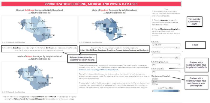
The aim of the dashboard is to identify neighborhoods to prioritize based on the damage reports and shake maps. Having maps for each damage type will allow users to see an overview of the damages across types and the heatmap makes it easy to identify areas that require more immediate attention than others. The relevant information like maintenance work and building information is strategically placed below the chart so that the team can refer to it and take that into consideration when making critical decisions.

An assumption made is that the emergency response team comprise of different divisions and responders are specialized or trained to deal with a specific damage type. The Amenities filter can also come in handy when it comes to transporting the injured to the hospitals and the school can be turned into a temporary shelter if needed.

Priority 1.jpg

Interactive Techniques

The following interactive techniques have been employed in this dashboard:

Interactive Technique Rationale Brief Implementation Steps
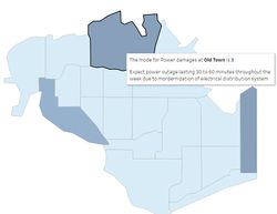
Hover over the data points of each map to find out more information about the neighbourhood

Power Tooltip Info.jpg
  • When the user is interested in a specific data point, he/she can simply place the cursor over the data point.
  • A tooltip will instantly appear with the relevant details (eg. Building information, Neighbourhood with Hospitals, Power Maintainance Work, etc) which is critical for analysis.
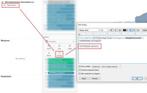
  1. Drag the relevant fields into the Tooltip in the Marks card
  2. The tooltip can be formatted depending on your preferences
Tooltip Guide.jpg
Filter By Maintainance Or Hospitals Using A Multiple Value List

250
  • Allow users to identify neighbourhoods with maintenance work or with hospital facilities located within the neighbourhood
  • User don't have to manually hover over each data point in the map
  1. Set the filter type to Multiple Value list


Prioritization - Roads and Bridges, Sewer and Water

Dashboard Design

Purpose / Description

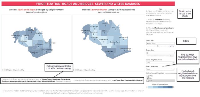
The aim of the dashboard is to identify neighborhoods to prioritize based on the damage reports and shake maps. Having maps for each damage type will allow users to see an overview of the damages across types and the heatmap makes it easy to identify areas that require more immediate attention than others. The relevant information like maintenance information is strategically placed below the chart so that the team can refer to it and take that into consideration when making critical decisions.

Possible implications of maintenance work: Repair work on some roads will result in delays in traffic. This can also mean that rescue efforts may be affected.

Prioritization 2.jpg

Interactive Techniques

The following interactive techniques have been employed in this dashboard:

Interactive Technique Rationale Brief Implementation Steps
Hover over the data points of each map to find out more information about the neighbourhood

Power Tooltip Info.jpg
  • When the user is interested in a specific data point, he/she can simply place the cursor over the data point.
  • A tooltip will instantly appear with the relevant details (eg. Building information, Neighbourhood with Hospitals, Power Maintainance Work, etc) which is critical for analysis.
  1. Drag the relevant fields into the Tooltip in the Marks card
  2. The tooltip can be formatted depending on your preferences
Tooltip Guide.jpg
Filter By Maintainance Or Hospitals Using A Multiple Value List

250
  • Allow users to identify neighbourhoods with maintenance work or with hospital facilities located within the neighbourhood
  • User don't have to manually hover over each data point in the map
  1. Set the filter type to Multiple Value list


Reliability of Reports #1: Damage Reports Over Time

Dashboard Design

Purpose / Description

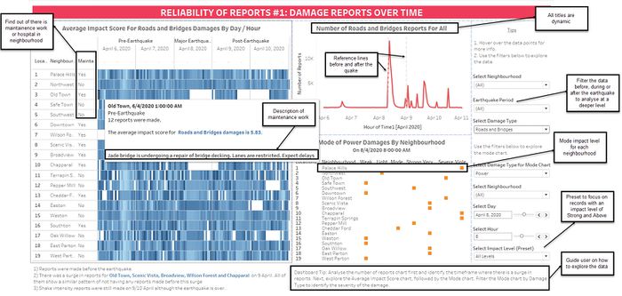
The aim of the dashboard is to analyze reports made before the earthquake and understand more about the delay in reports in some of the neighbourhoods. The charts used in this dashboard is similar to the Time of Earthquake dashboard described above.

One of the differences is that was a mode chart was added in and it has its own filter for Damage Type. This will allow the user to make comparisons between the average impact score for a specific damage type and time with the mode for Power damages etc. The mode chart will also allow users to identify anomalies in the data easily. This chart instead of a map since the user can make comparisons across the different neighbourhoods and see the mode clearly without having to hover over the data point or look at how dark the color is in the heat map.

Furthermore, if there is 1 mode for each neighborhood, we can check if there is a big variation in impact levels reported. For example, if a neighbourhood has a mode of Weak and a mode of Severe at a specific timing for a specific damage type, it shows the uncertainty and inaccuracy in the data. When using a map, if there are 2 modes, the mode that is displayed on the map is the maximum value and this suggests that we will not be able to detect the difference in impact levels.

A maintenance/hospital column is also added to this dashboard and it will indicate if there is maintenance work or hospitals within the neighborhood based on the selected damage type. The description will be displayed when the user hovers over the data point.

Dashboard Tip: Analyse the number of reports chart first and identify the timeframe where there is a surge in reports. Next, explore the Average Impact Score chart, followed by the Mode chart. Filter the Mode chart by Damage Type to analyze the severity of the damage and detect outliers in the data.

Reliability design latest.jpg

Interactive Techniques

The following interactive techniques have been employed in this dashboard:

Interactive Technique Rationale Brief Implementation Steps
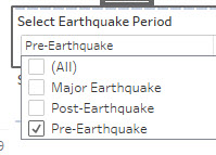
Filter based on the earthquake period (Pre, During and Post Earthquake) using a Drop-Down List
Earthquake period filtering.jpg
 

  • Users can focus on a specific time frame to identify patterns/anomalies
  • Easy to make comparisons between the different earthquake periods to check the reliability of the data.
  • A multi-select drop-down list will be useful since we can see the data for the entire length and narrow down if needed.
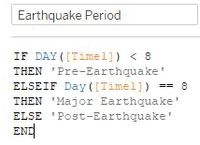
  1. Create a calculated field for Earthquake Period. Use IF-ELSEIF-ELSE statements. Pre-Earthquake data will comprise of data before the earthquake which is 8 April 2020. Major Earthquake will be the actual day of the earthquake. Post-Earthquake will be data after 8 April which is 9 April to 11 April 2020. The calculated field is as follows:
    Earthquake Period Calculated Field.jpg
  2. Drag the Earthquake Period field to the Filters panel
  3. Right-click on the Earthquake Period field in the Filters panel and Show Filter
  4. Change the filter type to Multiple Values (List) since we need to look at data during the entire period and narrow it down when needed
Impact Level Preset For Faster Filtering

Impact Level Preset.jpg
  • Instead of having to manually tick the impact levels using the drop-down box, this preset will allow users to focus on impact levels that are more crucial.
  • This preset gives user the option to filter the records with an impact level of Strong and above. If there is no need to narrow down the scope to these levels, the user can click on All Levels to reset the filters

The parameter is used for filtering the records and the steps are slightly different as compared to the one on Hardest Hit Areas dashboard (Change View) which is for sheet swapping.

  1. Create a parameter
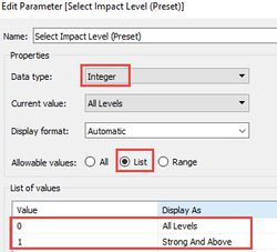
  2. In the Create Parameter dialog box, do the following: Enter the name that will appear above the menu like 'Select Impact Level (Preset)'. For Data type, select Integer. For Allowable Values, select List.
    Impact Level Preset Settings.jpg
  3. Show the Parameter in the worksheet/dashboard.
  4. Create a Calculated field. Give the calculation a descriptive name like Select Impact Level [Filter]. In the formula text box, enter the following conditions.
  5. Drag the new calculation to the Filters shelf. We are done with this simple but useful preset!
Hover over the data points in the line chart to find out more about the proportion of reports made by each neighbourhood
Tooltip Proportion .jpg

  • When a user hovers over a mark, the tooltip displays relevant data and details from a separate and related visualization (The proportion of reports chart) filtered to that mark.
  • This will provide the user with a more granular level of detail.
  1. Follow the same steps as mentioned in the Time Of Earthquake dashboard (Change View) since a duplicate of the chart was made for this dashboard
  2. In short, the tooltip will display a chart outside of the dashboard if the sheet is inserted into the tooltip.
Hover over the data points of each map to find out more information about the neighbourhood
Maintainence or hospital info.jpg

  • When the user is interested in a specific data point, he/she can simply place the cursor over the data point.
  • A tooltip will instantly appear with the relevant details (eg. Building information, Neighbourhood with Hospitals, Power Maintainance Work, etc) which is critical for analysis.
  1. Drag the relevant fields into the Tooltip in the Marks card. The tooltip can be formatted depending on your preferences

Reliability of Reports #2: Comparison of Maximum Impact Scores Over Time

Dashboard Design

Purpose / Description

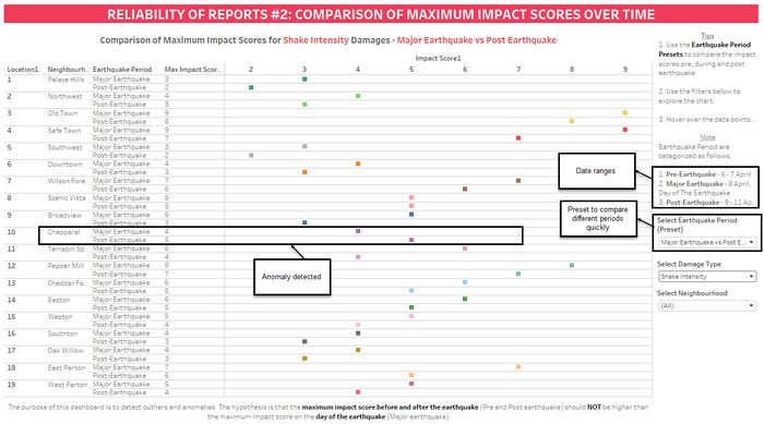
The aim of the dashboard is to compare the maximum impact scores before, during and after the earthquake and it can be used to detect anomalies in the data. The Earthquake Period preset also helps the user to speed up the time taken to analyze between 2 periods. We are assuming that there is no earthquake after the one on 8 April for this analysis.

Comparison 2.jpg

Interactive Techniques

The following interactive techniques have been employed in this dashboard:

Interactive Technique Rationale Brief Implementation Steps
Earthquake Period Preset for Faster Filtering
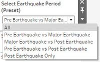
Earthquake Period Preset (Pre, During, After) for Comparison.jpg


  • Instead of having to manually tick the earthquake periods using a drop-down box, this preset will allow users to quickly compare the maximum impact scores between the different earthquake periods. There are 5 options in this preset.
  • If there is no need to narrow down the scope to these levels, the user can click on All to reset the filters. However, the dashboard will be more cluttered if All was selected
  1. Follow the steps in the Reliability of Reports #1: Damage Reports Over Time dashboard (Impact Level Preset For Faster Filtering).
  2. Create a parameter. Show the Parameter. Create a calculated field. Drag the calculated field to the Filter shelf.

Reliability of Reports #3: Variation In Impact Scores

Dashboard Design

Purpose / Description

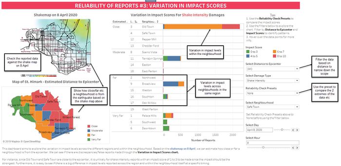
The aim of the dashboard is to explore the differences in the reported impact scores by citizens who live in the same region / within the neighborhood. Based on the shakemap on 8 April, we can estimate how close or far a neighbourhood is from the epicenter. A map of St. Himark is added to the dashboard so that users can see that neighborhoods like Palace Hills are very far away from the earthquake. We can see if there are discrepancies/false reports made through the Variation in the Impact Scores chart. A stacked bar chart is used since we want to see the proportion of reports made for each impact level group and compare it with other neighborhoods in the same region.

For instance, since Old Town and Safe Town are close to the epicenter, it is unlikely for shake intensity reports with an impact score of 1 to 3 to be made since the impact should be the strongest. Furthermore, it is easy to see if there is a big difference in impact levels reported across the region and within the neighbourhood itself at a specific timing.

Variation 3.jpg

Interactive Techniques

The following interactive techniques have been employed in this dashboard:

Interactive Technique Rationale Brief Implementation Steps
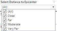
Filter by Estimated Distance to Epicenter Using A Drop-Down List
Distance filter.jpg


  • Users will able to focus on a specific region (eg. cities that are close to the epicenter) to identify patterns/anomalies or make comparisons between the region to check the reliability of the data.
  • A multi-select drop-down list will be useful since we can see the data across neighbourhoods and narrow down if needed
  1. Create a calculated field called Estimated Distance to Epicenter. Group the neighborhoods based on the estimated distance to the epicenter. Note that this is just an estimation
  2. Drag the Estimated Distance to Epicenter to the Filters shelf and show the filter
  3. Change the filter type to Multiple Value list
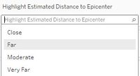
Highlight Neighbourhoods Based On Estimated Distance to Epicenter
Highlight distance to epicenter.jpg


  • To highlight neighbourhoods that are of interest to the analyst based on its proximity to the earthquake

This is one of the ways to highlight a dimension.

  1. Drag the Neighbourhood file to the Filters shelf.
  2. Right-click on Neighbourhood and select Show Highlighter
Highlight neighbourhood step.jpg
Reliability Check Presets For Faster Filtering
Reliability Check (Extremes).jpg


  • This preset allows users to quickly explore the extreme ends of the impact scores by region and identify anomalies
  • It eliminates the need of having to manually select the impact score to make comparisons

This is one of the ways to highlight a dimension.

  1. Follow the same steps as mentioned in the Reliability of Reports #1: Damage Reports Over Time dashboard (Impact Level Preset)


Reliability of Reports #4: Damage Uncertainty

Dashboard Design

Purpose / Description

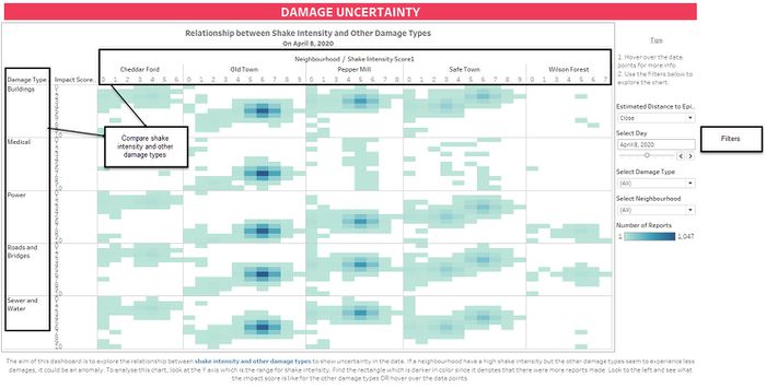
The aim of this dashboard is to explore the relationship between shake intensity and other damage types to show uncertainty in the data. If a neighbourhood have a high shake intensity but the other damage types seem to experience less damages, it could possibly be an anomaly. To analyse this chart, look at the Y axis which is the range for shake intensity. Find the rectangle which is darker in color since it denotes that there were more reports made. Look to the left and see what the impact score is like for the other damage types OR hover over the data points.

Uncertainty.jpg

Uncertainty in Change Over Time

Dashboard Design

Purpose / Description Find out if there is a relationship between shake intensity and the number of reports over time and assume that there were 3 earthquakes. A dual-axis chart is useful in comparing the shake intensity and other damage types in a specific time frame.

Meh.jpg

Interactive Techniques

Interactive Technique Rationale Brief Implementation Steps
Highlight selected item

Highlighter.jpg


  • Highlight actions allow us to call attention to marks of interest by dimming all others. It works well with a small amount of data.
  • Right-click on the legend and click on Highlight Selected Item
  1. Follow the steps in the Reliability of Reports #1: Damage Reports Over Time dashboard (Impact Level Preset For Faster Filtering).
  2. Create a parameter. Show the Parameter. Create a calculated field. Drag the calculated field to the Filter shelf.