IS428 AY2019-20T1 Assign Lee Hui Xin Anne
Contents
- 1 Problem & Motivation
- 2 Information Gathering
- 3 Data Analysis & Transformation Process
- 4 Data set Import Structure & Process
- 5 Interactive Visualization
- 6 Interesting & Anomalous Observations
- 6.1 Q1: Emergency Responders’ prioritzed neighbouroods response based on Visualized damaged reports and parts of that City that are hardest hit.
- 6.2 Q2: Use visual analytics to show uncertainty in the data. Compare the reliability of neighborhood reports and identify which neighborhoods are providing reliable reports.
- 6.3 Q3: Identify how conditions change and uncertainty change over time.
- 7 References
Problem & Motivation
St. Himark has been hit by an earthquake, leaving officials scrambling to determine the extent of the damage and dispatch limited resources to the areas in most need. They quickly receive seismic readings and use those for an initial deployment but realize they need more information to make sure they have a realistic understanding of the true conditions throughout the city.
In a prescient move of community engagement, the city had released a new damage reporting mobile application shortly before the earthquake. This app allows citizens to provide more timely information to the city to help them understand damage and prioritize their response. In this mini-challenge, use app responses in conjunction with shake maps of the earthquake strength to identify areas of concern and advise emergency planners. Note: the shake maps are from April 6 and April 8 respectively.
With emergency services stretched thin, officials are relying on citizens to provide them with much needed information about the effects of the quake to help focus recovery efforts.
By combining seismic readings of the quake, responses from the app, and background knowledge of the city, help the city triage their efforts for rescue and recovery.
Task Questions:
- Emergency responders will base their initial response on the earthquake shake map. Use visual analytics to determine how their response should change based on damage reports from citizens on the ground. How would you prioritize neighborhoods for response? Which parts of the city are hardest hit?
- Use visual analytics to show uncertainty in the data. Compare the reliability of neighborhood reports. Which neighborhoods are providing reliable reports? Provide a rationale for your response. Limit your response to 1000 words and 10 images.
- How do conditions change over time? How does uncertainty in change over time? Describe the key changes you see. Limit your response to 500 words and 8 images.
Information Gathering
Before the start of analysis, it is essential to have a better understanding about the different areas in St. Himark. Looking through the layout and description of St. Himark several key information was identified to be helpful and critical to the investigation.
Danger Facilities
Using St. Himark City description, some facilities were identified to be threat to the people living in the vicinity. Location 3, SAFE TOWN, a neighborhood where a Nuclear Power Plant resides. Nuclear Power Plants are vulnerable to earthquake and may potentially impact people over a large area causing damage by fires, explosion and release of radioactive materials. In addition to the potential harm it may cause, Residents in Location 3, SAFE TOWN, consists of mostly older-single family who lives close to the Nuclear Power Plant. In case of Earthquake, the residents might not be able to evacuate quickly and might require addition assistance. If no efficient evacuation is provided, SAFE TOWN might face the highest casualty.
Hospital Facilities
Subsequently emergency first aid facilities such as hospitals was identified:
- Medical Surgical Care located at PALACE HILL
- OLD TOWN Hospital known for its expertise in diabetes and endocrinology, digestive health, oncology, and orthopedics.
- DOWNTOWN Himark has Children hospital and has the only Trauma Hospital in the area.
- BROADVIEW has a Community Hospital which offers a full spectrum of medical care.
- TERRAPIN SPRINGS has a full-service, non-profit community hospital, offering comprehensive medical, surgical and therapeutic services.
- SOUTHON able to provide critical care, neurology, gastrointestinal, and orthopedic care.
Using the hospital locations, DOWNTOWN is identified as the area where most causality should be allocated in times of emergency.
Potential Obstructions
Lastly, construction areas was identified to have a significant impact on the efficiency of the evacuation. With Location 6, DOWNTOWN, being the priority place to allocate casualty, the ongoing Road construction in Location 6, DOWNTOWN might cause a delay in the evacuation and unable to provide citizens in need of medical aid. It is essential to identify an alternative road to ensure medical aid is provided in time. Also, with Friday Bridge and Magritte and Jade Bridges being repaired, in anticipation of delays of manpower and medical aid, emergency planner should be advised to request for an air-transportation.
Data Analysis & Transformation Process
The data-sets usually requires cleaning and transformation before it can be sensibly analyzed. It is important to have a proper understanding of the Data, knowing whether the numbers are Categorical or Continuous data and to ensure that it is in the right format. This section elaborates on the data-set analysis and transformation process before it was imported for Interactive Visualization Analysis.
The Data was collected using the Rumble App which crowd sources damage reporting, by collecting information about reporting time, location and different area’s shake intensity with 0 being the lowest and 10 being the highest.
The following section illustrates the issues faced in the data analysis phase leading to a need to transform the data into specified format.
| Issue Faced 1 |
|---|
|
Issue: The report data provided the shake intensity of various facilities in their specific rows, making analysis by various facilities difficult. |
|
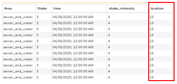
Solution: Data cleaning was performed to pivot the various facilities into a single column called Area using Tableau Prep. By doing so, it reduce the need to perform binning on Tableau during the analysis and it allows Shake Intensity and Damage to be filtered and visualized according to the various areas. To solve this issue:
|
| Issue Faced 2 |
|---|
|
Issue: To find out which areas has the highest intensity ratings. Filtered by Area, I was only able to view the data by in each instances. Even with St Himark’s map image and location, without the zone coordinated of each areas, the layout could not be plotted. It may posed as a Visualization problem as it is essential for emergency advisers to have an overview of St. Himark rather than having to look through the data instances. |
| Solution 1 To resolve this issue, the geometrical data of St Himark Neighborhood was made available in a Shape file which can be easily uploaded to tableau through the following steps:
|
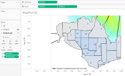
| Solution 2 An alternative solution would be to identify the coordinates for each zones. This is done using an online tool that allow analysts to get coordinates for custom polygons on a map image. By plotting the neighborhoods on a custom polygon map, it would generate the coordinates of the zone. This will allow us to plot the location of each neighborhood on the image map. The following details the process of generating the individual zone coordinates:
|
| Issue Faced 3 |
|---|
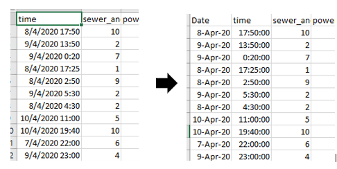
| Issue: During the process of filtering the shake intensity by day, the time field provided by timestamp have been wrongly identified. Tableau has taken then date 04/08/2020 and 04/09/2020 as 4th august and 4th September instead of 8 and 9 of April. If the issue is not identified, the analysis of the earthquake will be identified as separate events rather than one event resulting in a misrepresentation and inaccurate Visual Analysis |
| Solution: To resolve this issue, time is being split into Date and time using excel’s Data, text to column function to separate the timestamp and changing the Date format into type: d-mmm-yy. |
Data set Import Structure & Process
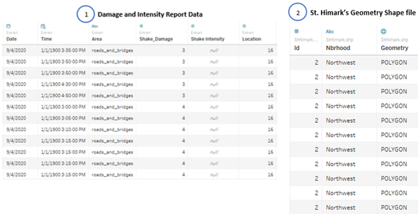
With the data-set analysis and transformation phase completed, the following files will have to be imported into Tableau for analysis:
Each of the data file is added as a data source in Tableau. The relationship defined between each data source is the id or locations in the city. This will allow analysis to be conducted across all the data sources.
Additional processing was perform on both data sources:
- Import the Damage and Intensity Report Data
- Add new data connections to the Damage and Intensity Report Data. The new data connection file will be St. Himark’s Geometry Shape file
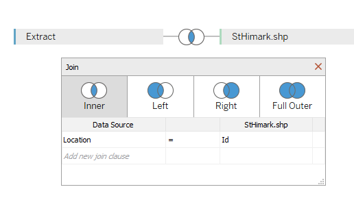
- Perform inner join between both data sources using Damage and Intensity Report Data’s Location and St. Himark shape file’s ID. This will create a relationship between the Geometry provided with the locations. The following shows the configuration of the join:
Interactive Visualization
The interactive visualization can be accessed here: https://public.tableau.com/profile/anne1684#!/vizhome/Assignment1_15703574756750/Home?publish=yes
For the best experience, adjust your screen resolution to full screen by enabling full screen on the browser. Throughout all the different dashboards, useful guides and tips are provided to help users navigate through the different filters and actions to increase the efficiency of their analysis. The following elements are used through out all the dashboards to maintain consistency:
| Interactive Technique | Rationale | Brief Implementation Steps |
|---|---|---|
|
Filter dates with the use of time range slider |
To provide flexibility for analysts to choose the time period which they are interest in analyzing. The use of checkbox or radio boxes is time-consuming as it requires analysts to check or unchecked the box. |
|
|
Filter data source by Area types using a single selection drop down list |
To allow analysts to concentrate on the data collected from each Areas with the use of a single selection. The use of a drop down-list also allows analysts to easily view all the selection choices and select the area type that they are interested to analyse. |
|
|
Filter Locations with the use of range slider |
To provide flexibility for analysts to select a few locations that they are interest to analyse. |
|
Home Dashboard
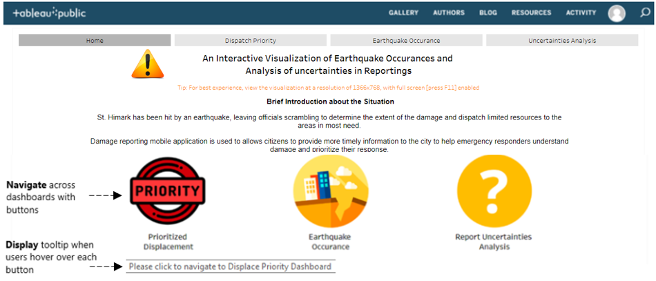
To have an in-depth analysis on all the data attributes provided, it will not be possible to display all the attributes in a single dashboard. Hence, 3 separate dashboards (excluding home page) were created to provide a detailed visualization
To allow flexibility and easy to understand in navigation, the following interactive techniques and instructions have been employed:
| Interactive Technique | Rationale | Brief Implementation Steps |
|---|---|---|
Navigate across dashboards with buttons |
To provide users with the flexibility of moving across dashboards using a simple and easy to understand user interface. |
|
Display tool-tips when user hovers over each button |
To provide users with contextual information about the dashboard and the expected information and chart they will look at after selection. |
|
Dispatch Priority Dashboard
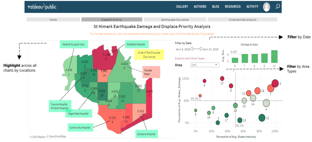
The purpose of the Dashboard is to allow analysts to identify Locations that has reported high Shake Intensity and Damage. Additional Facilities Annotations was added to display crucial information that are useful for analysis and visualization. The following shows the Damage and and Shake Intensity Dashboard of St. Himark.
To allow flexibility and easy to understand in navigation, the following interactive techniques and instructions have been employed:
| Interactive Technique | Rationale | Brief Implementation Steps |
|---|---|---|
|
Filter dates with the use of time range slider |
To provide flexibility for analysts to choose the time period which they are interest in analyzing. The use of checkbox or radio boxes is time-consuming as it requires analysts to check or unchecked the box. |
|
|
Filter data source by Area types using a single selection drop down list |
To allow analysts to concentrate on the data collected from each Areas with the use of a single selection. The use of a drop down-list also allows analysts to easily view all the selection choices and select the area type that they are interested to analyse. |
|
|
Highlight Locations upon hover |
When analysts hovers over the specific location on the map, the tool-tip displays the differences in Shake Intensity and Damage reported. This provides visual aid to the analysts. |
|
|
Additional information displayed on Geometric map |
To provide users with additional visual and contextual information to aid with their analysis. |
|
|
Hover over Geographical Map to specific data points to display the differences in Shake Intensity and Damage reported |
To provide users with additional visual and contextual information to aid with their analysis. |
|
Earthquake Occurrence Dashboard
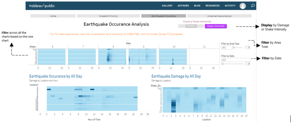
The purpose of the Dashboard is to provide an overview of the Shake Intensity and Damage across all 6 days. Additional charts below are displayed to show an in-depth analysis of Earthquake's Shake Intensity and Damage by Day, Hours and Location. Filters are consistently placed at the right side to increase usability. The following shows the date, time and location in which Earthquake had occurred.
To allow flexibility and easy to understand in navigation, the following interactive techniques and instructions have been employed:
| Interactive Technique | Rationale | Brief Implementation Steps |
|---|---|---|
Filter data source by Area types using a single selection drop down list |
To allow analysts to concentrate on the data collected from each Areas with the use of a single selection. The use of a drop downlist also allows analysts to easily view all the selection choices and select the area type that they are interested to analyse. |
|
Filter data source by Date using a single selection slider |
To enable analysts to view the damage or Shake intensity by specific day and to identify hidden insights. |
|
Image Buttons by Damage or Shake Intensity |
To allow analysts to concentrate on the data collected a single information between Damage and Shake Intensity |
|
Filter across all the charts based on the one chart |
To allow analysts to view the information in detail and to see how one data point is correlated to another data point in another chart given the same time. |
|
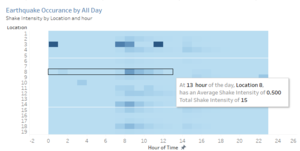
Hover over data points of each boxs to display more information about the hour of the day and Shake Intensity or Damage |
When analysts is interested in a specific data point, they can simply hover over it and Tool-tip displays relevant details which might be crucial for analysis |
|
Uncertainties Analysis Dashboard
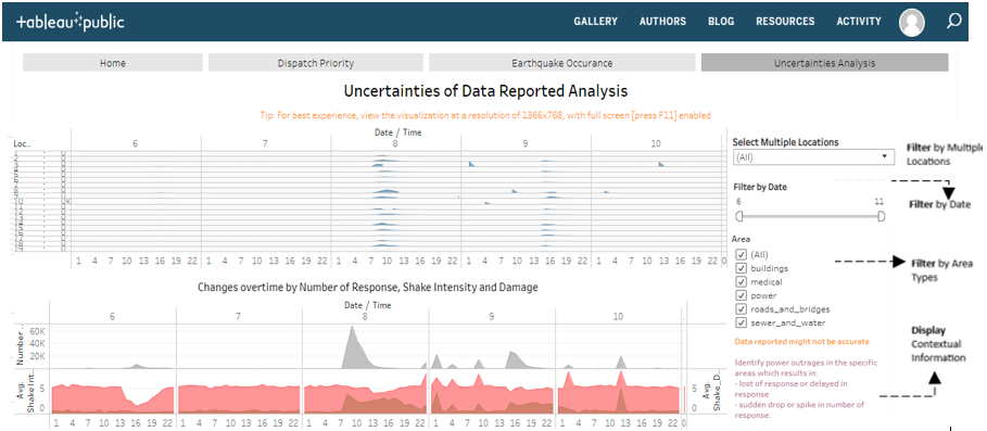
The purpose of the Dashboard is to allow analysts to detect the sudden changes in the number of responses sent over the period of time. Using the charts to identify uncertainties in data reported and relationship and changes in reporting over time. The following shows a detailed records of Number of response received throughout the 6 days of Earthquake.
To allow flexibility and easy to understand in navigation, the following interactive techniques and instructions have been employed:
| Interactive Technique | Rationale | Brief Implementation Steps |
|---|---|---|
Filter Locations with the use of multi-selection drop-down checkbox |
To provide flexibilty for analysts to select a few locations that they are interest to analyse. |
|
Filter data source by Date using a single selection slider |
To enable analysts to view the damage or Shake intensity by specific day and to identify hidden insights. |
|
Additional information display on dashboard to explain purpose of dashboard |
To provide users with additional visual and contextual information to aid with their analysis. |
|
Filter data source by Area types using a multi-selection check-boxes |
To allow analysts to concentrate on the data collected from each Areas with the use of a single selection. The use of a drop down-list also allows analysts to easily view all the selection choices and select the area type that they are interested to analyse. |
|
Interesting & Anomalous Observations
Using the dashboard as a platform for investigation and analysis, the following aims to provide answers to the question posed.
Q1: Emergency Responders’ prioritzed neighbouroods response based on Visualized damaged reports and parts of that City that are hardest hit.
| Patterns | Visualization |
|---|---|
| 1.1 Locations with high reported Damage and Shake Intensity
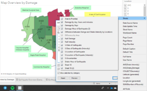
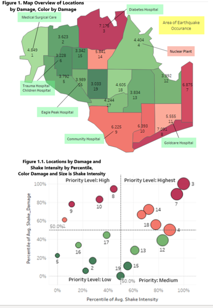
Based on the Geographical Image provided, it depicts the North-East side of the City to be located closes to the Earthquake Zone. But in contrast to the image, Locations in South East Side were shown to reflect a higher damage as compared to Locations in the North East side. Figure 1. shows the damage reported by each of the locations. Figure 1.1. shows the scatter plot of the level of priority according to the percentile of damage and shake intensity reported. According to both Figures, it shows that locations 3, 7, 8, 9 and 10 has one of the highest damage reported. Further analysis was done to identify the reason for difference in Location affected as shown in the Geographic image and the reported Locations. |
|
|
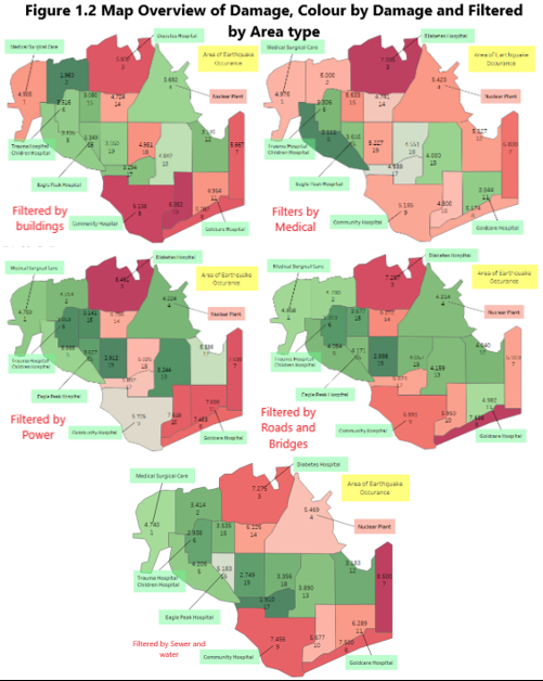
1.2 Area with high reported Damage and Shake Intensity Note: Area type includes Building,Medical, Power, Roads and Bridges Filtering the Map Overview by Area type, it can be identified that the reason for high damage reported in locations 7, 8, 9, 10 and 11 might be due to a high number of buildings, power plants and Road and Bridges which are prone to damage due to Earthquakes. Based on the data, we can infer that Emergency Responders should prioritize areas with a higher number of Buildings, Power plants and Road and Bridges. Based on the City description provided, it is essential that emergency responders monitor location 4 closely, as Nuclear Power Plants are vulnerable to earthquake and may potentially impact people over a large area causing damage by fires, explosion and release of radioactive materials. In addition to the potential harm, Residents in location 3 consists of mostly older-single family who lives close to the Nuclear Power Plant. In case of Earthquake, the residents might not be able to evacuate quickly and might require addition assistance. If no efficient evacuation is provided, Location 3, SAFE TOWN, might face the highest casualty. |
Q2: Use visual analytics to show uncertainty in the data. Compare the reliability of neighborhood reports and identify which neighborhoods are providing reliable reports.
| Patterns | Visualization |
|---|---|
| 2.1 Date and Time of Earthquake and Pre-Shake Occurrence
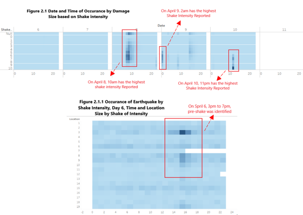
Figure 2.1 provides the information on Date and Time in which the Earthquake occurred. Inferring from figure 2.1, dates 8, 9 and 10 has showed signs of Earthquake occurrence as it has a higher shake intensity being reported. Note: Hour of Time ranges from 0 to 23 On April 8, Earthquake was detected to have happened at 10am in the day. On April 9, Earthquake was detected to have happened at 2am in the night. Lastly, on April 10, an Earthquake was detected to have happened at 11pm in the afternoon. After doing a more in-depth drill down using Damage and Shake Intensity by day, a pre-shake was identified to have occurred on April 6 from 3pm to 7pm. |
|
| 2.2 Location of Earthquake Occurrence
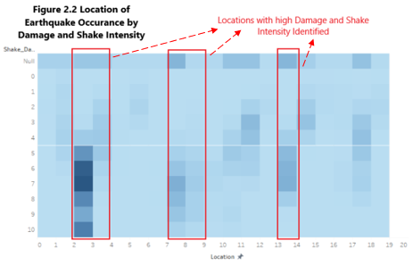
According to the pre-shake image provided, it was shown that the Earthquake happened on the North-East side of the city. Using the Geographic map, the areas that likely to be affected by the Earthquake are 2, 3, 4, 12, 14 and 7. In contrast to the image, based on the Location of Earthquake Occurrence by Damage and Shake Intensity as shown in Figure 2.2, locations 3, 8, 9 and 14 were seen to have a high shake Intensity and Damage.
|
|
| 2.3 Uncertainties in data reported
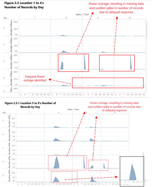
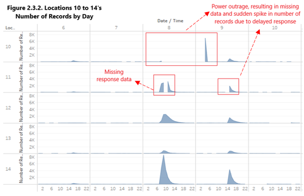
It is seen that some data reported might not be accurate as there might be power outrages in the specific areas resulting in a lost of response or delayed in response which will result in sudden drop or spike in number of response. Based on Figure 2.3, Location 3 is identified to have unreliable data. There are frequent power outrages which resulted in a delayed response time and a sudden spike in the number of records at the later time of the day. According to City description, location 3 is identified to be doing a modernization to their electrical distribution system which might have contributed to the outrages. Based on Figure 2.3, Location 4 is identified to have frequent power outrages which results in the lost of data which might be why the Shake Intensity report was low despite located near the Earthquake Zone. Based on Figures 2.3.1 and 2.3.2, Locations 8, 9, 10, 11 and 17 are identified to have unreliable data as there are lost of response data or delayed response time due to the Earthquake, resulting in the spike in number of response at a later time. Overall, Locations 3,4,8,9,10,11 and 17 were found to be unreliable. |
Q3: Identify how conditions change and uncertainty change over time.
| Patterns | Visualization |
|---|---|
| 3.1 Changes in Conditions
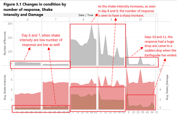
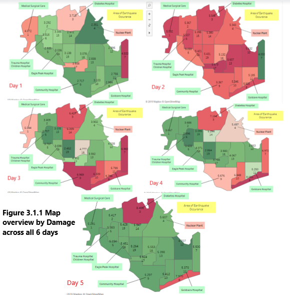
Based on Figure 3.1, It can be inferred that the number of response is closely related to the shake intensity. Seen in day 6 and 7, despite having a high damage, when the shake intensity are low, the number of response are low as well. As the shake intensity increases, as seen in day 8 and 9, the number of response is seen to have a sharp increase. On days 10 and 11, the response had a huge drop and came to a sudden stop when the Earthquake has ended. Viewing by damage as shown in Figure 3.1.1, it can be seen that there was a sudden increase in reports of high damage at the second day. Using the happenings of Earthquake shown in Figure 2, the report is identified to be inaccurate as Earthquake occurrence had identified to be on the 3 day. From both information, it can be inferred that on day 2, after Earthquake was announce, citizen started to panic and gave a report higher than actual, resulting in inaccurate reports.. Subsequent days, 3,4 and 5, it started to provide a more accurate representation. |
|
| 3.2 Uncertainties changes over time
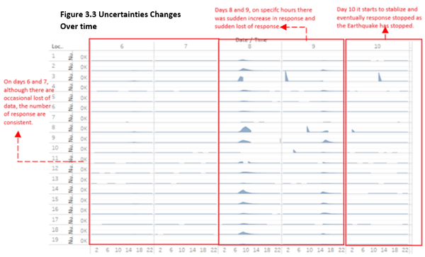
Based on figure 3.3, it can be inferred that during the occurrence of Earthquake, there was an increase in number of power outrages which resulted in lost of data and delayed response, making the information collected less reliable. On days 6 and 7, although there are occasional lost of data, the number of response are consistent. Whereas days 8 and 9, on specific hours there was sudden increase in response and sudden lost of response. From which, we could infer that on days 8 and 9 the reports are less reliable. As response are sent and received at the different timings from the actual situation. While day 10 it starts to stabilize and eventually people stopped providing response as the Earthquake has stopped. |
References
https://wiki.smu.edu.sg/1617t3isss608g1/ISSS608_2016-17_T3_Assign_GUAN_YIFEI_Visualization
https://wiki.smu.edu.sg/1617t1IS428g1/IS428_2016-17_Term1_Assign3_Gwendoline_Tan_Wan_Xin
https://wiki.smu.edu.sg/1617t1IS428g1/IS428_2016-17_Term1_Assign3_Lim_Kim_Yong
https://wiki.smu.edu.sg/1617t1IS428g1/IS428_2016-17_Term1_Assign3_Tan_Kee_Hock
https://vast-challenge.github.io/2019/MC1.html
https://public.tableau.com/profile/gwennisme#!/vizhome/Assignment3_145/Home
https://en.wikipedia.org/wiki/Help:Table#Color;_scope_of_parameters

