IS428 AY2019-20T1 Assign Hsu En Yang
Contents
- 1 MC1: PROBLEM & TASK
- 2 DATA TRANSFORMATION
- 3 IMPORTING DATASET PROCESS
- 4 INTERACTIVE VISUALISATION
- 5 LOOKING INTO THE DASHBOARDS
- 6 QUESTION 1
- 7 QUESTION 2
- 8 QUESTION 3
- 9 References
- 10 Comments
MC1: PROBLEM & TASK
St. Himark has been hit by an earthquake, leaving officials scrambling to determine the extent of the damage and dispatch limited resources to the areas in most need. They quickly receive seismic readings and use those for an initial deployment but realize they need more information to make sure they have a realistic understanding of the true conditions throughout the city. In a prescient move of community engagement, the city had released a new damage reporting mobile application shortly before the earthquake. This app allows citizens to provide more timely information to the city to help them understand damage and prioritize their response. In this mini-challenge, use app responses in conjunction with shake maps of the earthquake strength to identify areas of concern and advise emergency planners.
With emergency services stretched thin, officials are relying on citizens to provide them with much needed information about the effects of the quake to help focus recovery efforts.
By combining seismic readings of the quake, responses from the app, and background knowledge of the city, help the city triage their efforts for rescue and recovery.
Tasks and Questions:
- Emergency responders will base their initial response on the earthquake shake map. Use visual analytics to determine how their response should change based on damage reports from citizens on the ground. How would you prioritize neighborhoods for response? Which parts of the city are hardest hit? Limit your response to 1000 words and 10 images.
- Use visual analytics to show uncertainty in the data. Compare the reliability of neighborhood reports. Which neighborhoods are providing reliable reports? Provide a rationale for your response. Limit your response to 1000 words and 10 images.
- How do conditions change over time? How does uncertainty in data change over time? Describe the key changes you see. Limit your response to 500 words and 8 images.
DATA TRANSFORMATION
Data transformation is necessary for deep-dive analysis and accurate presentation.
Tableau Prep Builder: Data Manipulation for dataset: mc1-reports-data.csv
Pivoting for damage categories
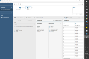
With the use of the pivot function, the different categories: medical, power, road_and_bridges, sewer_and_water and buildings can be aggregated. These categories are named as Areas and its corresponding column would be Damage Area.
Binning of Shake Intensity:
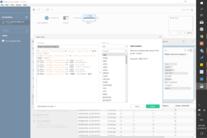
To align with the given shake intensity categories, we have to bin the raw data of shake intensity. To do so, we create a calculation to bin each numerals into the corresponding categories.
Binning of Event Dates:
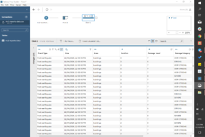
To easily identify the day of event, we can bin the dates into pre-earthquake, earthquake and post-earthquake. This allow for easier analysis.
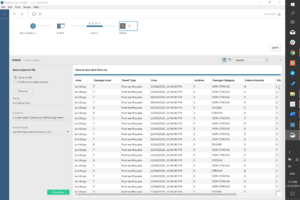
Final Output of Data Transformation:
Below is the generated CSV from Tableau Prep Builder after data manipulation:
External Help: Data Manipulation for given dataset: StHimarkNeighborhoodShapefile/StHimark.shp
The original SHP file given in MC2 could not be used as it defaults to an irregular size and therefore unreadable. In order to grow the map and get the polygon coordinates,
- Refer to VA Discussion Forum for guide/steps to implement. (shoutout to Kelvin Chia for sharing this tedious process!)
- After the transformation into polygon coordinates, StHimark_Features.csv and StHimark_Points.csv and will be used during the analysis later.
IMPORTING DATASET PROCESS
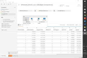
1. Import STHimark_Points and StHiMark_Features from polygon transformation -> dataset joined by intersect StHimark ID
2. Import prepped dataset from Tableau Prep Builder -> merged by intersect Location
INTERACTIVE VISUALISATION
Access dashboard here: https://public.tableau.com/profile/alexia5264#!/vizhome/FINAL_15709704471540/HOME?publish=yes
Dashboard
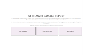
A minimalist dashboard allows for easy-understanding and quick access by any users new to this field.
| Navigation | Description |
|---|---|
| Real-time update | This dashboard is highly recommended for users who are looking for analysis of an urgent situation. In this case, responders can use this page to quickly understand the overview of the damage and intensity and break it down to severity by the number of reports. |
| Historical Overview | This dashboard is suitable for users who are looking to analyse the progression over time. For St Himark, this tool is dedicated to illustrate the type of responses that the citizens have provided since the implementation of the mobile application. |
| Data integrity | This dashboard is useful to understand the limitations of the used data. |
Filter options
| Technique | Reason |
|---|---|
| Neighbourhood selection: |
To allow viewers to deep dive into respective neighbourhoods to further understand the situation. |
| Date selection: |
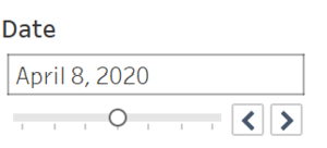
To allow viewers to select the dates to compare the situation across various events. |
| Area selection: |
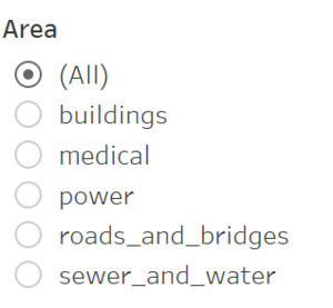
To allow responders to allocate resources corresponding to the areas that require support. |
| Iterative animation: |
To visualise the damage by area over time. |
LOOKING INTO THE DASHBOARDS
Real-time update
- Damage scale by time: X-axis - damage level, Y-axis - hours of the day, colour gradient - number of reports
- Intensity scale by time: X-axis - shake intensity, Y-axis - hours of the day, colour gradient - number of reports
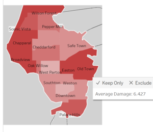
- Map: Provides overview of the neighbourhoods with average damage level
- Filter options: scales can be narrowed down by date, area and neighbourhood.
Historical overview
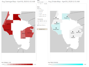
- To view the average damage (left) and average intensity (right) over time
- Filter options: can be narrowed down to area (e.g. buildings)
Data integrity
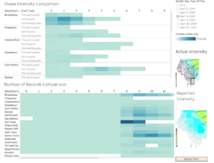
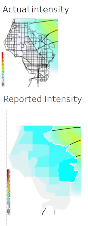
- Actual intensity vs Reported intensity: To compare the difference in intensity
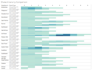
- Shake intensity comparison: To see existence of reports by event types
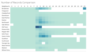
- Number of records comparison: To see consistency of reports tagged to event impact
- Filter options: can be narrowed down by date
QUESTION 1
How would you prioritize neighborhoods for response?
Given that Old Town is amidst the neighbourhoods closest to earthquake epicenter, without checking data integrity, the average damage level should reflect the urgency of the situation in that area. Following which, the average damage level should be the mode of priority.
In a similar vein, in Real-time update dashboard, filtering by areas allows for differentiation in resource allocation. Based on the damage average, response resources can be segregated based on the area (e.g. buildings) within the neighbourhood.
Which parts of the city are hardest hit?
Based on the colour gradient, Pepper Mill, Safe Town and Old Town were the closest to the epicentre of the earthquake that occurred on 8APRIL. During the time when the earthquake struck, between 8AM-11AM (highest reporting number on 8APR), these three neighbourhoods generally reported higher number of responses which indicated a substantial damage average.
QUESTION 2
Which neighborhoods are providing reliable reports?
1. Comparison by shake intensity map
During earthquake, all neighbourhoods appear to have provided reliable reports.
2. Comparison by shake intensity and event type
By default, pre-earthquake should generally report lower intensity levels, or, given the same intensity level, report lower number of responses. Old town seems to have unreliable reports as it reported higher in number, given the same intensity level of 5 & 6, in post-earthquake than during the earthquake. Scenic Vista also appears to be questionable as highest intensity level in post-earthquake is the same as during the earthquake itself. Otherwise, other neighbourhoods are seemingly consistent with the event.
3. Comparison by number of reports
On 7APR, there were substantial number of reports entering the system over the 24HOUR clock. However, on 8APR after the supposed strike time of the earthquake (approx. 8AM-11AM), there was a significant loss in data as seen in the empty spaces. Neighbourhoods there were unreliable: Broadview, Chapparal, Old Town, Scenic Vista and Wilson Forest.
The losses in data were more randomised and inconsistent over the post-earthquake days.
In short, the unreliability can be attributed to the missing reports that may have been due to power losses. Also, the inaccuracy/inconsistency in reporting levels may be due to varying perceptions of magnitude of impact.
QUESTION 3
How do conditions change over time?
The trend over time showed progression in the changes. Pre-earthquake reports were lower in numbers up until 8APRIL, when the event took place. There was a visible spike in the numbers reported and the intensity scale covered a wider range (thus higher shake intensity) than pre-earthquake event. While it was not officially reported, there were still higher numbers of reports and scale range in post-earthquake than in pre-earthquake. By general knowledge, we can deduce that there were aftershocks during the post-earthquake event days. Moreover, this was reported consistently across neighbourhoods, thus it is unlikely that the report is unreliable.
How does uncertainty in data change over time?
Generally, the data appeared consistent during pre-earthquake event with results resonating with regular circumstances. However, once the earthquake struck, the integrity of data became uncertain as the results were inconsistent. For example, given the same location, the shake intensities and damage levels were vastly different. This could be attributed to human error in perception as different citizens may view the magnitude of impact differently. In addition, there was an unfortunate loss of data which may be the result of power loss and other reasons unidentified. With the lack of the full picture, it is difficult to cross-reference the accuracy of the situation reported. Fortunately, post-earthquake period showed a more consistent data with similar levels of shake intensity and damage within each neighbourhood.
References
SMU VA Discussion Forum https://wiki.smu.edu.sg/1617t1IS428g1/IS428_2016-17_Term1_Assign3_Gwendoline_Tan_Wan_Xin#Interactive_Visualization
Comments
Please input your comments here!
