IS428 AY2019-20T1 Assign Damian Er Zhong Ying Visualisation
|
|
|
|
|
|
Interactive Visualisation
The visualisation can be accessed at this link: https://public.tableau.com/profile/damian.er#!/vizhome/AssignmentDamianErZhongYing/Assignment
The size of the interactive visualisation is set to automatic, which means that it will resize automatically to any screen it is displayed on. For optimal viewing, it is best to view the visualisation in full screen mode.
Due to the different visualisation methods utilised to solve the issues presented, multiple dashboards have been developed to address different key areas. As such, to make it interactive and easy for users such as emergency responders to navigate, I have used the story function of Tableau to combine different dashboards together.
The visualisation is composed of 6 dashboards which are connected using a story.
- Overview
- Reports Overview
- Reports Over Time
- Hardest Hits
- Detailed Reports
- Reliability
- Reliability Over Time
In the interactive visualization, navigation buttons are provided through the story to allow users to easily navigate across the different dashboards. Filters are also provided to allow users to effectively analyse and obtain insights based on their choosen criteria and delve deeper into a certain criteria. The following interactivity elements are used throughout the dashboards:
| Interactive Technique | Rationale and Implementation |
|---|---|
| Use of a time range slider |
As this visualisation deals with time series data, it is useful to add a time range slider as it will allow users to decide on the period they would like to analyse. This is a quick and efficient way of performing this instead of having to choose the specific period manually.
To achieve this, simply do the following steps:
|
| Filter by Day, Hour, Location and Damage Type |
Filters have been added for Day of Time, Hour of Time, Location and Damage Type. Single Value dropdown has been used for Day, Hour and Location. Single Value list was used for Damage Type as it is more likely to be accessed more often by users.
To achieve this, simply do the following steps:
|
| Using motion for storytelling |
This will allow users to view how the damage change over time. This is an extremely useful feature as it will allow the user to see how the situation change on the ground by the hour.
To achieve this, simply do the following step:
|
| Using visualisation as filter in dashboard |
Clicking on any specific point in visualisation will highlight the relevant points in other visualisation in the same dashboard. This makes it easy to see specific areas that the user would like to go in-depth.
To achieve this, simply do the following step:
|
Overview Dashboard
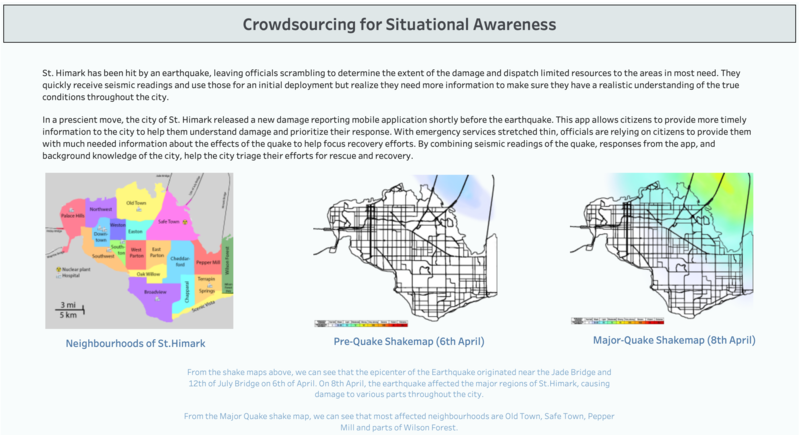
The Overview dashboard provides a quick overview of the St.Himark community and the problem and motivation for St.Himark's situation. It also shows the map of St.Himark and the two shake maps which shows how much earthquake can be felt across the city. Initial insights on which neighbourhoods are highly affected by the earthquake are shown in this dashboard.
Reports Overview Dashboard
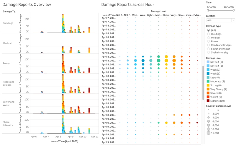
This dashboard allows the user to get a glance of the overall situation on the ground and also be able to view the breakdown in reports across different damage types.
Reports Over Time Dashboard
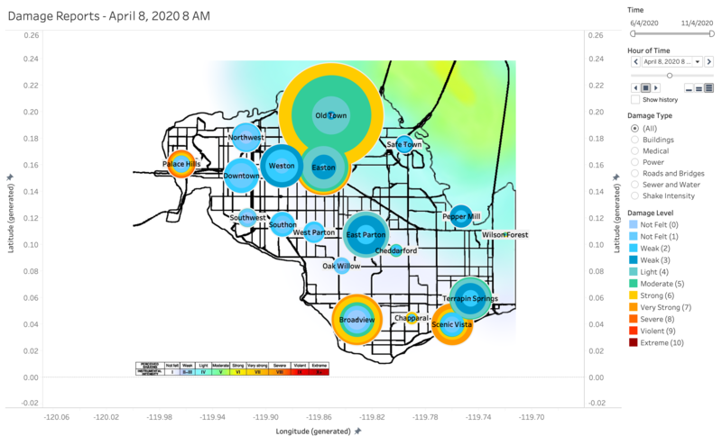
This visualisation allows emergency responders to have a hour-by-hour look at how the situation is moving on the ground. The background image of the visualisation is layered with the major quake shake map. This will allow the emergency responders to easily determine if the reported damage reports in the specific neighbourhood is reliable in their claims.
Hardest Hits Dashboard
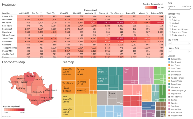
This dashboard allows emergency responders to easily see the hardest hit neighbourhoods and other relevant information. This will allow emergency responders to prioritise the location that has been hit the hardest by the earthquake. The dashboard consists of a heatmap, choropleth map and tree map. The heatmap shows the breakdown of damage reports by the damage level across different locations. It easily shows the most reports from different locations and damage level. The choropleth map shows the region with the average damage suffered. The higher the average damage, the heavier the region has been hit. As this visualisation has been used as a filter, clicking on a specific region will cause the heatmap and treemap to show the specific location that has been clicked. Lastly, the treemap shows the most reports by damage level from different locations. It is a quick and visually attractive method to show prioritisation based on number of reports received.
Reliability Dashboard
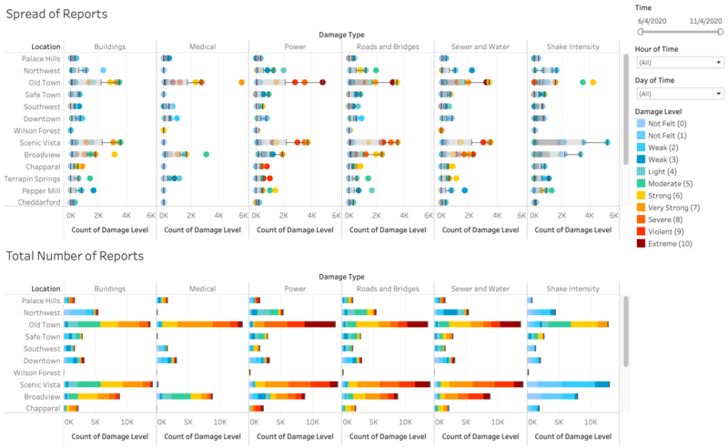
This reports shows the spread of reports received and the total number of reports received. The total number of reports visualisation allows you to easily compare the number of reports received across different damage types by locations. This will allow the emergency responders to determine the reliability of reports received by comparing across damage types. The spread of reports received uses a boxplot to show the difference in number of reports received for different damage level by location. The wider the boxplot, the more discrepancy in the reports for the location and damage type. It will allow the emergency responders to determine the reliability of the reports that have been received. By using the boxplot, the higher count of damage levels (damage levels at the maximum whisker) should be more representative of the situation on the ground.
Reliability Over Time Dashboard
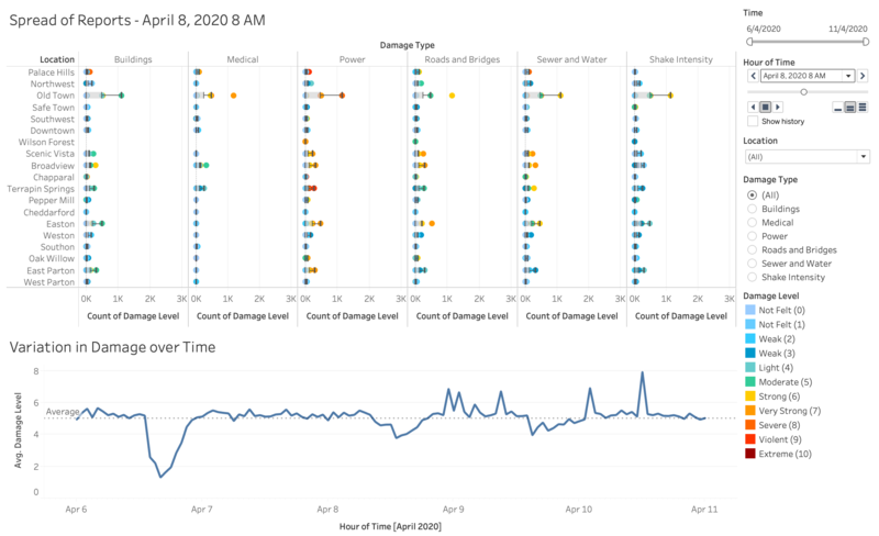
This dashboard shows the reliability of reports over time. The spread of reports is used with a page time to visuliase how the spread in reports change over the period of time. We can see how theres a greater discrepancy when there are more reports. The variation in damage visualisation shows the difference in average reported damage across the whole period. The more unstable the time series chart, the more unreliable the data shown.
