IS428 AY2019-20T1 Assign Damian Er Zhong Ying Observations
|
|
|
|
|
|
Observations and Insights
Question 1: Emergency responders will base their initial response on the earthquake shake map. Use visual analytics to determine how their response should change based on damage reports from citizens on the ground. How would you prioritize neighborhoods for response? Which parts of the city are hardest hit? Limit your response to 1000 words and 10 images.
By using the Overview dashboard, we will be able to determine from the shake maps that the Pre-Quake occured on 6th April while the Major-Quake occured on 8th April. We can also see that during the Pre-Quake (6th April), majority of the neighbourhoods were not affected by the earthquake. For the Major-Quake (8th April), the main areas that have been affected are Old Town, Safe Town, Pepper Mill and parts of Wilson Forest.
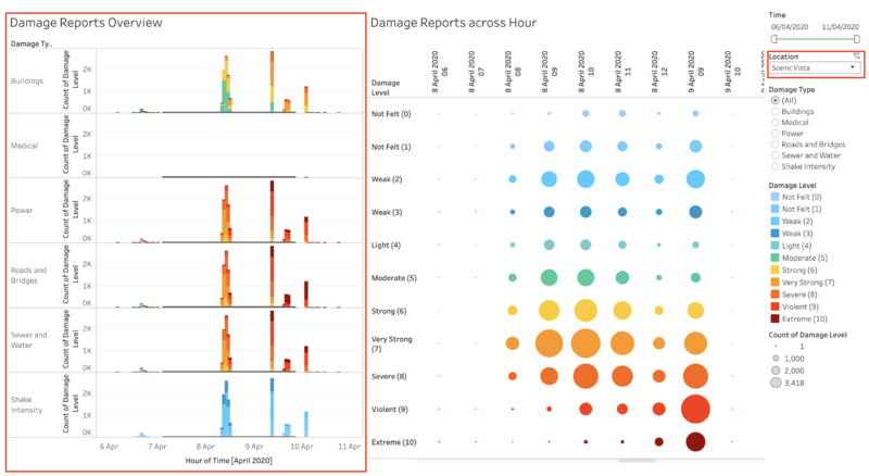
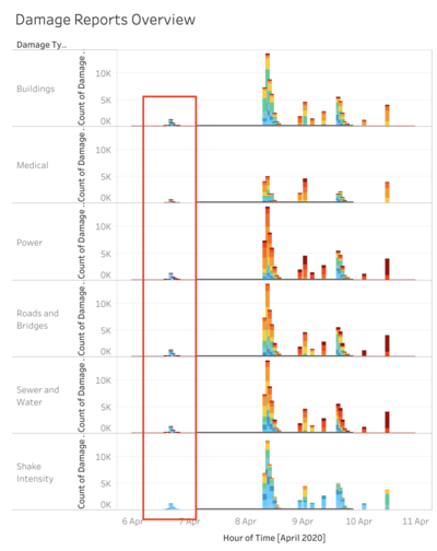
However, it is not known when the earthquake actually struck on the 8th of April. To determine this, we can look at the Reports Overview Dashboard. This dashboard gives us a quick glance on when reports were reported throughout the whole period from 6th April to 11th April. By looking at the dashboard, we can look at the number of reports coming from citizens on the ground as a whole and determine when the earthquake actually hits. From the visualisation, we can see that there was a surge in damage reports on April 8, 8am. This suggests that the major earthquake struck at that timing.
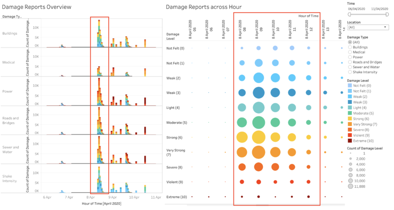
From the dashboard, by filtering to only shake intensity, we are able to obtain interesting insights such as the multiple aftershocks on 9th April and 10th April, which was not documented in the mini-challenge. The intensity of the aftershocks should be in greater intensity compared to the pre-quake, which struck at 6th April 4PM.
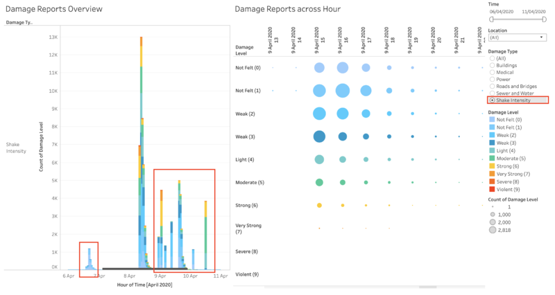
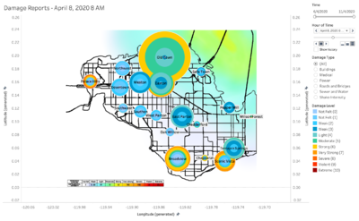
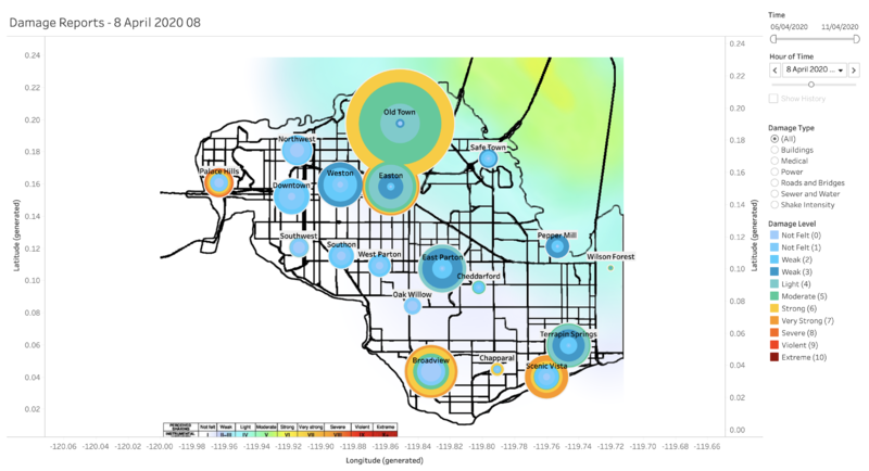
The reports over time dashboard provide a live feed showing the users regarding which neighbourhoods have had the greatest impact and the volume of reports. Neighborhoods with a greater impact will be prioritized based on the severity of damage and the number of reports. The image below shows the reports during the time of the major quake. This visualisation easily shows which locations have had the biggest hit. We can see from the visualisation that medical damage is generally not really affected by the earthquake, with the lowest amount of reports coming from medical damage.
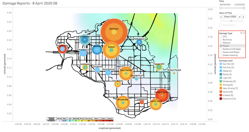
Emergency responders will be able to filter to the specific damage type they would like to focus on. For example, if emergency responders would like to focus on the power damage during the time of the major quake, he can just filter to only power damage and easily see which neighbourhood he should prioritise.
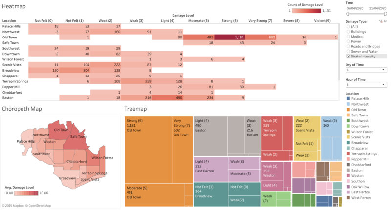
If the emergency responder would like to have a more in-depth look into the damage, he can use the Hardest Hits dashboard. By using a heatmap in the hardest hits dashboard, we will be able to determine which neighbourhoods have been hit the hardest. The heatmap provides the total number of reports for each damage level from each neighbourhood based on filters such as day, hour and damage type. The choropleth map provides a visual representation of the average damage that the location has suffered. The treemap aids by showing the overall volume of reports coming from each neighbourhood. Higher volume of reports with higher severity should therefore be prioritised.
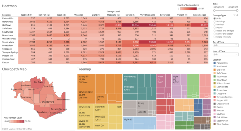
Looking at the choropleth map, we can view the average damage that has been reported by citizens on the ground. At April 8, 8am, we can see that the Old town, Safe Town, Pepper Mill and Wilson Forest have been hit the hardest through the reported shake intensity.
Using the Total Number of Reports visualisation in the reliability dashboard, we can see the detailed total number of reports reported by the different neighbourhoods. We can see that the Old Town was hit the hardest across all categories of damage type.

Based on the above dashboards, emergency responders will be able to know when the earthquake has struck, and easily determine which location has been hit the hardest, as well as which location they should prioritise based on the damage from each damage type. Priority should be made based on the reported damage level followed by then number of reports from the neighbourhood.
Question 2: Use visual analytics to show uncertainty in the data. Compare the reliability of neighborhood reports. Which neighborhoods are providing reliable reports? Provide a rationale for your response. Limit your response to 1000 words and 10 images.
To show uncertainty in the data, we will be focusing on the time of the major quake which is on 8th April, 8AM. By viewing the Reports Over Time dashboard and setting the time to 8th April, 8AM and the filter to Shake Intensity, we can see that the reported intensity is quite reliable with regards to the shake map that was provided. As shown in the shake map on Overview dashboard, we can see that Old Town, Safe Town, Pepper Mill and parts of Wilson Forest are impacted the most by the earthquake. This coincides with our visualisation which shows that those four towns have been impacted the hardest by the earthquake. Nearby towns such as Easton and East Parton are the next most impacted by the earthquake. An interesting observation that we can pick up is that the towns of Safe Town and Wilson Forest are providing very little reports in contrast to the rest of the neighbourhood eventhough they should be reporting more as they are the most impacted. This could mean that the most of the citizens in the town do not have access to the reporting application due to damage to their facilities.
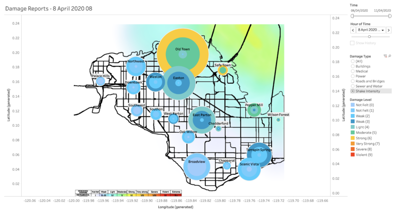
However, if we were to look at the reported damage from the Reports Over Time dashboard, we can see that neighbourhoods that are far from the epicentre of the earthquake such as Palace Hills, Broadview, Scenic Vista and Chapparal are claiming high levels of damage. This shows a discrepancy between their reported shaking intensity and damage levels across the different damage types.

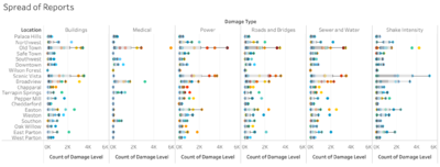
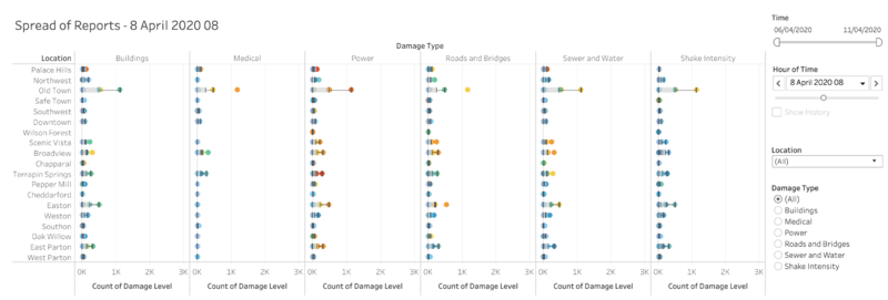
Looking at the Spread of Reports visualisation in the Reliability dashboard, we can see that there is discrepancy in the reports by citizens in the same neighbourhood. The greater the number of reports, the greater the discrepancy in the reports. We can see that the most reports are by Old Town, Scenic Vista, Broadview and Easton. In general, the greater the reported amount of data, the more unreliable the reports given by the citizen. It is more accurate to take the damage level with the highest number of reports in that neighbourhood if the number of reports are huge.
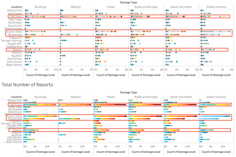
Thus, based on visual analytics, we can determine that towns nearer to the epicenter of the earthquakes such as East Parton and Safe Town are providing the most reliable reports while towns such as Scenic Vista, Broadview, Palace Hills and Easton are not providing very reliable reports.
Question 3: How do conditions change over time? How does uncertainty in change over time? Describe the key changes you see. Limit your response to 500 words and 8 images.
By using the Reliability over Time dashboard, we can visualise the change in uncertainty over time. The greater the spread in the number of reports, the greater the uncertainty. We can see this in the Spread of Reports visualisation in the Reliability Over Time dashboard. During the period of major quake on 8th April, we can see how the spread in reported damage level increases. However, in periods where there is no earthquake, the uncertainty remains quite stable, with no spread across reports.

We can also see the variation in damage over time visualisation in the Reliability over Time dashboard. This visualisation shows the change in reported damage over time. We can see that there was a sharp drop on 6th April 4pm even though there was a Pre-Quake that day. However, this does not make sense, and if we dig deeper by looking at the number of reports from the reports overview dashboard, we can see that the drop in damage coincided with a rise in total number reports due to the Pre-Quake.



Thus we can conclude that, the greater the number of reports, the more uncertainty in the reported data due to the spread, but if the number of reports are too small, it leads to uncertainty as well. The highest reported damage level during peak period of reports should be the most accurate representation of the damage on the ground. It is important to use the variation in damage over time with the spread of reports to determine the change in uncertainty over time.
Question 4: The data for this challenge can be analyzed either as a static collection or as a dynamic stream of data, as it would occur in a real emergency. Describe how you analyzed the data - as a static collection or a stream. How do you think this choice affected your analysis? Limit your response to 200 words and 3 images.
The data was analysed as a mixture of both static collection and a stream. A static collection will allow the emergency response team to have a graspe of the overall situation on the ground, while the dynamic stream of data will allow the emergency response team to better plan their priority areas based on the timing and location. This will allow the emergency response team to determine which areas are providing reliable reports.
The Reports Over Time dashboard was setup to be analysed as a dynamic stream of data. This allows the emergency responders to easily see how the situation is changing on the ground as the stream of data is incoming every hour. The Reliability dashboard was setup to be analysed as a static collection. This will allow the emergency response team to analyse and determine which locations have reliable reports.
Together, by using a combination of both static collection and dynamic stream of data, the emergency responders will be better equipped to tackle the challenges of prioritisation and seek the best course of action from analysing past data and getting an effective feed of live visual data.
