ISSS608 2018-19 T1 Assign Qiao Xueyu Insights
|
|
|
|
|
|
Contents
Official Air Quality Measurements
A Typical Day
Past
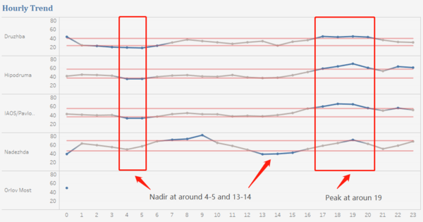
The graph on the right shows the hourly trend from 2013 to 2017. Sicne we dont have enough hourly data during this period, the hourly trend reflects mainly the concentration of the last month of 2017. From the graph we can notice that the PM10 concentration reaches to a nadir at around 4-5 and 13-14 and to a peak at around 19 on average. A possible guess is that the peak occurs at the time when people come back home from home and the amount of traffic increases so the traffic emission increases as well. And the nadir occurs at the time when people are less busy and therefore the amount of traffic emission is less. And among the four stations that have daily data, readings from the station of Druzhba are lowest on average, whose lowest readings are about half of other stations' lowest concentration and highest readings is a bit higher than other stations' lowest readings. |
Recent
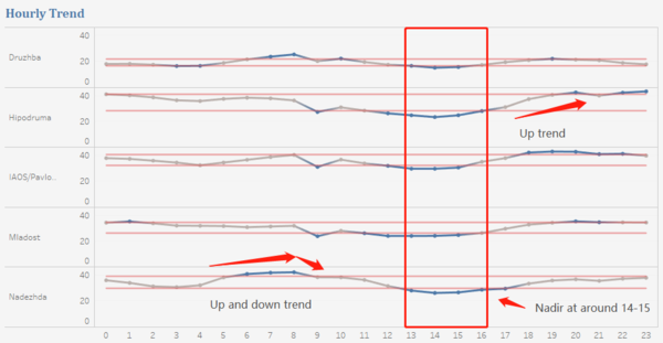
The graph on the right shows the hourly trend in 2018. From the graph we can notice that the PM10 concentration reaches to nadir at around 14-15 and to a peak at around 9 and 19-20 on average. In this graph, the station of Druzhba also reads the lowest concentration on average while Nadezha and Hipodruma read the highest concentration. The hourly PM10 concentration readings of 2017 and 2018 follow a similar overall trend,and the peak and nadir occur at around the same time. This might be becuase the time periods of these two graph are quite close given the missing data in the previous graph. And we can better compare the past and current hourly trend if the stations have hourly records from 2013 to 2016. |
Continuous Trend
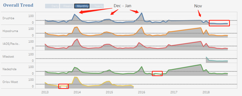
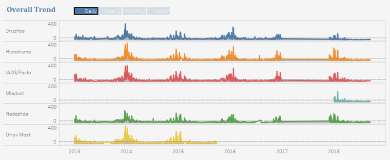
The graph on the right shows the continuous weekly trend from 2013 to 2018.
In the previous hourly trend we noticed that the station of Druzhba always reads a lower concentration, but from this graph with the data from 2013 to 2016, we can find the difference between each station is quite small, and Druzhba only reads a lower concentration from December 2017. And from December 2017 onwards, Druzhba has the lowest readings on average compared with other stations.
We can also notice there're some time periods without data.
From the graph we can notice that the PM10 concentration peak occurs in December and January from 2014 to 2016, November in 2017 and January in 2018, which are mainly during winter. The peak occurs in winter when people who live in areas like Sofia may burn fossils or other stuff than emit particular matters. We will explore the relationship between them in task 3. The slope from 2017 to 2018 is due to the missing data, but it's weird the end of the slope dropped down suddenly, the concentration of December 2017 is also abnormally low. And the concentration in the winter of 2015 is much lower than other peaks.
If we dig deeper to view the daily trend, we can notice that the concentration starts to grow from the first several days of November each year. And although there're some days with high concentration, most days' daily concentration is within the range of EU standard daily PM10 concentration plus/minus one standard deviation. And concentration in winter is not keeping high, some days' readings are acceptable. And the overall concentration decreases across time, especially during the end time period shown above.
Operation of Stations
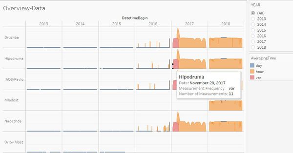
| First, as mentioned in the Data Exploration part, we only have daily data from 2013 to 2015, hourly data from the end of November in 2017 onwards. Missing data affects our exploration on the hourly trend before the end of November in 2017. And we found some interesting trends from the analysis above, we would be able to better validate the findings if we have more historical data. And we can also notice that before November 28 there is no data in the year 2017, and in certain years there are several hourly measures which also affects our analysis. |
Citizen Science Air Quality Measurements
Sensors' Coverage & Performance
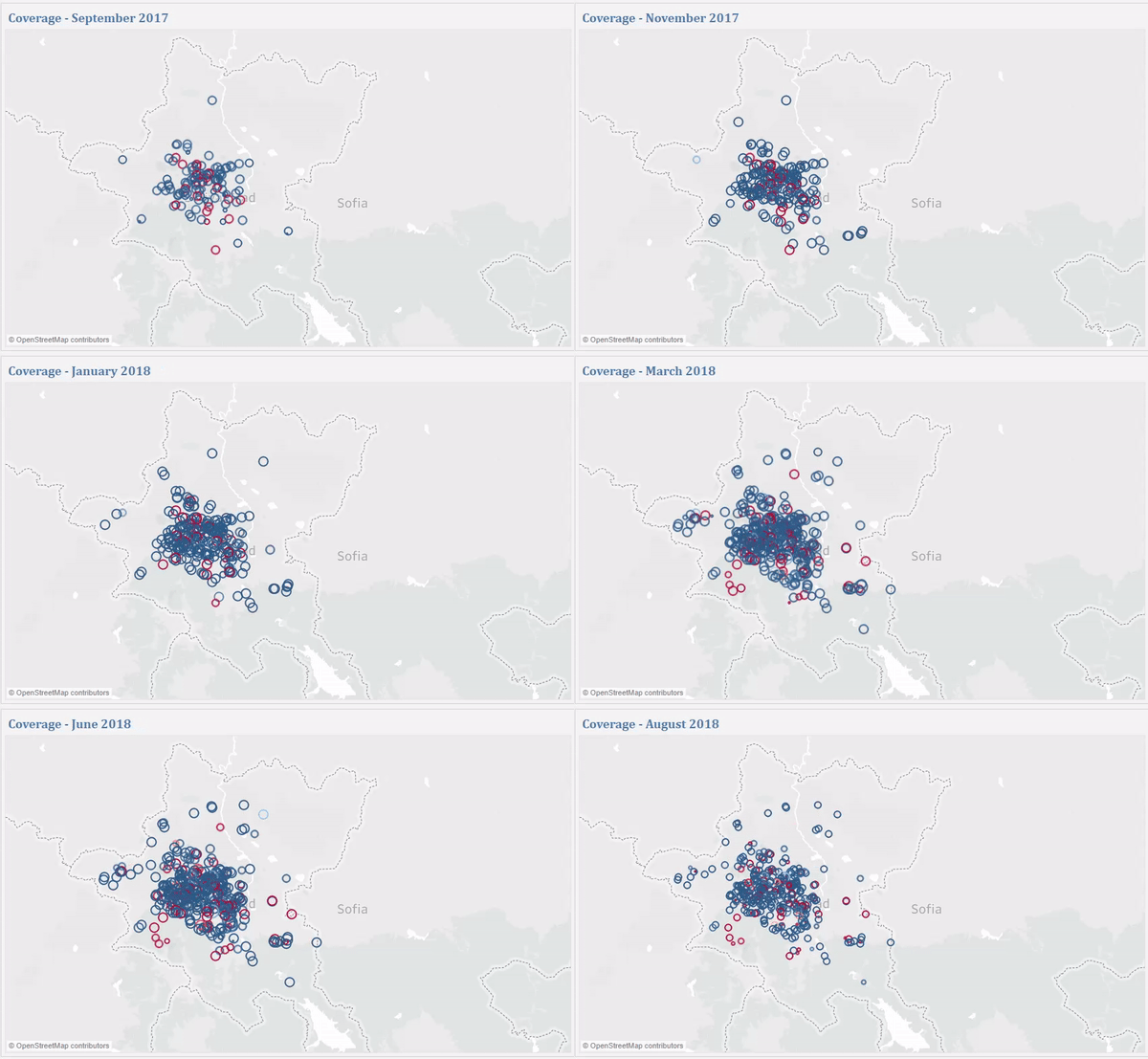
In the phase of data exploration and preparation, we found the sensors cover not only Sofia City so excluded the sensors outside the city.
The graph above shows the coverage of citizen sensors in the Sofia City. The color of circles represents the percentage of anomalies where red indicates high percentage and the size of circles represent the number of records/measurements.
First, it's obvious the citizen sensors mainly cover the center-east region of Sofia City. And if we click the play button to view the change over time, we can notice: firstly, the number of sensors increased over the time period and not all the sensors operate all the time; secondly, there're some sensors keep present to be red which means they keep giving anomalies. Given that the anomalies include not only PM10 and PM2.5 but temperature, humidity and pressure, some sensors cannot give normal PM2.5 and PM10, and some sensors cannot give normal temperature, humidity or pressure.
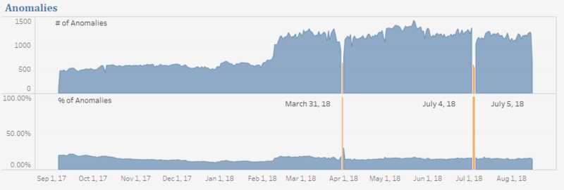
The graph above shows the number and percentage of anomalies. From this graph we can notice that the percentage of anomalies is highest at the beginning of this time period, and decreased gradually. At around the end of February 2018, the percentage increased and keeps stable except the three highest lines which are 100% anomalies on March 31, July 4 and July 5 2018. If we select these three days and view the coverage map, we can find that the number of sensors on these three days is the lowest and no one of them operated noramlly. Either the reading of temperature, humidity or pressure is abnormal or the reading of PM10 or PM2.5 is abnormal, and the pressure of all of them is 0.
Air Quality Measurements
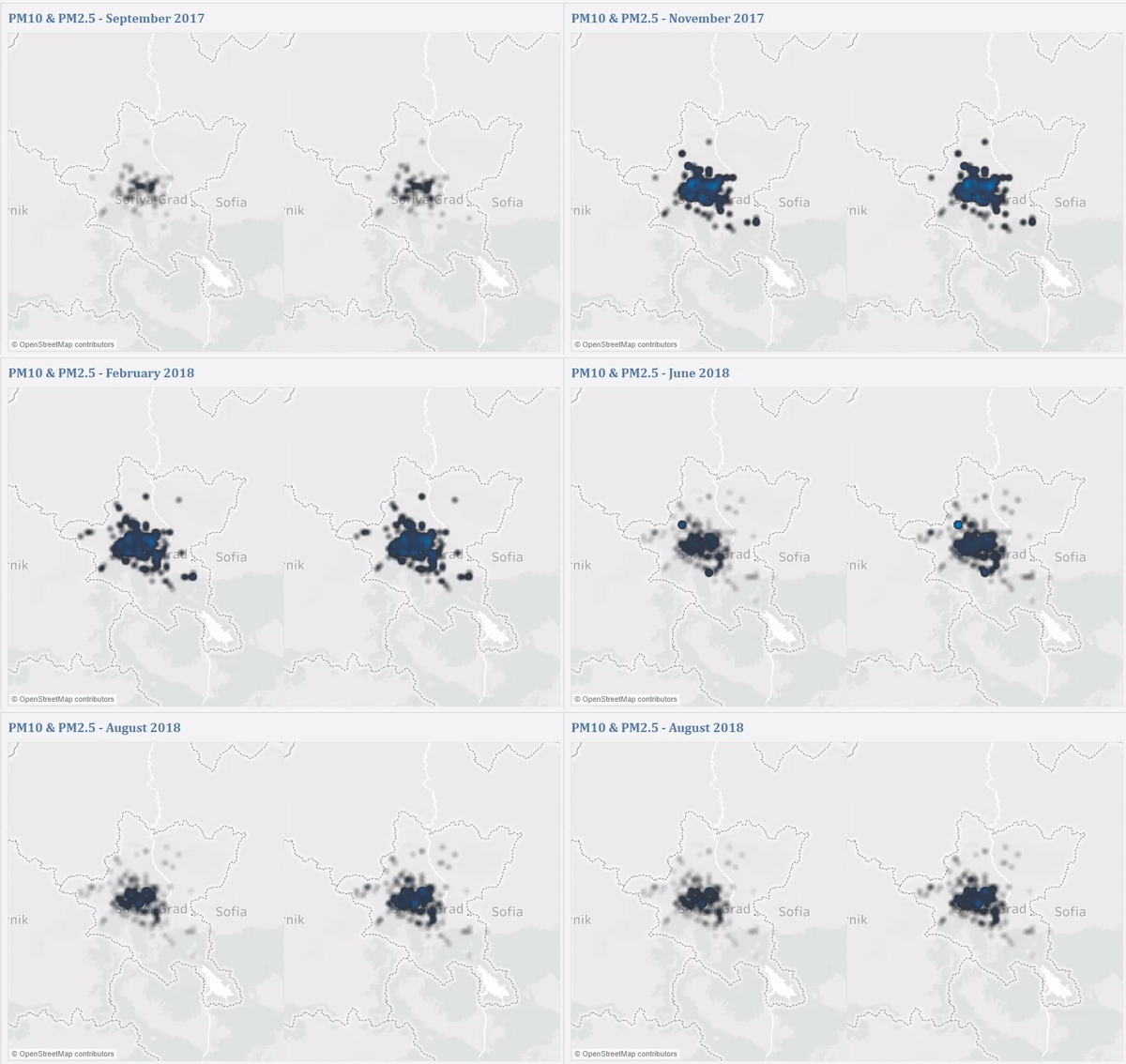
The graph above shows the change of reading of PM10 and PM2.5 over the time. The bright dots are those whose readings are high. From this graph we can notice that PM10 and PM2.5 are highly correlated, the change of PM2.5 always follows the change of PM10. And the center-west zone is the most polluted area. Although the fact that the amount of pollution is higher in this area is not because the number of sensors in this area is high, the coverage of sensors does impact the interpretation of contamination density since we have no idea about the density in areas without sensors.
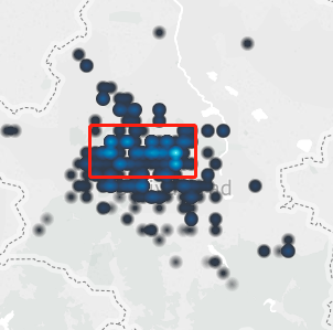
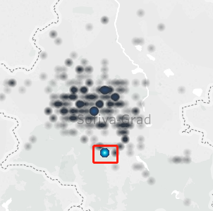
The graphs above show two areas with high concentration of PM10 and PM2.5.The left area is polluted in most of the months while the right area is highly polluted in July 2018.
Combining these two graphs, we can find that the pollution got heavier from September 2017 to March 2018 and got lighter from March 2018 onwards.
Air Quality & Other Factors
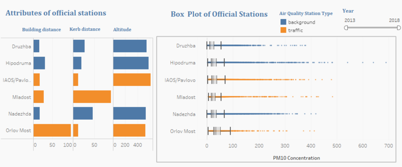
The graph above shows the relationship between the average PM10 concentration of official stations with their attributes. First, it's obvious that the readings of traffic stations are higher than background stations. Vehicle emissions impact the concentration of both PM10 and PM2.5, so the concentration of traffic stations tends to be higher than normal stations.
Usually in urban areas, because the main source of PM10 and PM2.5 is traffic emissions, the concentration decreases with height, here the station of Orlov Most has the lowest altitude and highest median and minimum value, but the other stations' concentration doesn't have an obvious relationship with their altitudes, so we can't conclude the relationship between concentration and altitude from this dataset.
Except for the relationship between concentration and altitude, it's also worth noticing that the station of Orlov Most which has the highest median and minimum concentration values is located at a place that is furthest to building and nearest to curb. Orlor Most is also called Eagles' Bridge which is a famous attraction, so it's possible this station is located in the middle of road and therefore affected by traffic emissions.
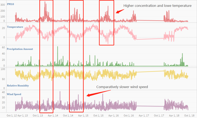
The above graph reveals the relationship between PM10 concentration and some weather factors. The most obvious one is temperature. From the analysis of previous tasks, we found that pollution often reaches to a peak during winter time when areas like Sofia have a large amount of household burning of fossil fuels or biomass, which will increase the gas emission. Relative Humidity also impacts the concentration of pollutants. Concentration tends to increase when relative humidity increases. And although not very obvious, we can also notice that wind speed is lower when the concentration is higher which might be because high speed of wind can help blow away the pollutants. The relationship between concentration and preception amount is not obvious but it seems concentration is higher when perception amount is lower. Another factor not shown here is dew point which is affected by temperature and relative humidity and therefore has a similar relationship with concentration as the temperature does.
Among all the factors, some factors like wind speed can impact the pollutants concentration directly, some other factors like temperature impact the pollutants concentration due to their relationship with other factors like burning of fossils.
