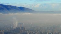
 Sofia City's Air Pollution Problem Analysis
Viz & Insights
Spatio-temporal Analysis of Official Air Quality [Task 1]
The Daily / Hourly Trends. View the interactive Tableau design here: [1]
Spatio-temporal Analysis of Citizen Science Air Quality Measurements [Task 2]
Note: The outliers observed in part 3 were removed for the analysis of long period patterns to avoid misunderstandings.
| Patterns |
Visualization |
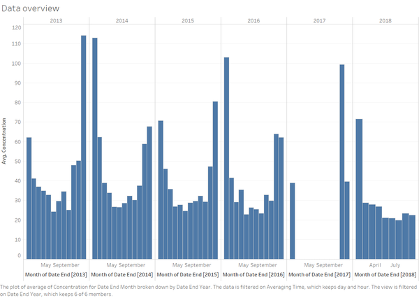
| 1. Setting the scene – General Overview of the data readings
The pollution recordings were broken down into monthly series and it was observed that the data between Feb 17 to Oct 17 is missing. To prevent the missing data from skewing the rest of the analysis, we exclude all readings taken in 2017.
It is also essential to note that the data has been transformed into two data sets based on time frame, namely daily and hourly.
The hourly data has been recomputed into daily, by averaging out the hourly readings, and added to the daily data set. This allows for clearer investigation by first looking at the daily observations, before delving and zooming into the hourly data set.
.
|
|
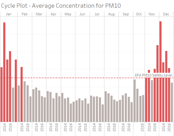
| 2.Seasonality
When aggregating the average data taken across the official stations, it is clear that the average readings for months in Dec and January are above the stipulated safety level by EFA for PM10. As this is an overall outlook, we look zoom into respective years across the respective stations to see if there are any interesting pointers worth investigating.
The trend appears to be relatively consistent across the years. Thus when looking at the meteorological parameters we will see if there are similar patterns, proportionally or inversely proportionally, that may explain then pollution trend.
|
|
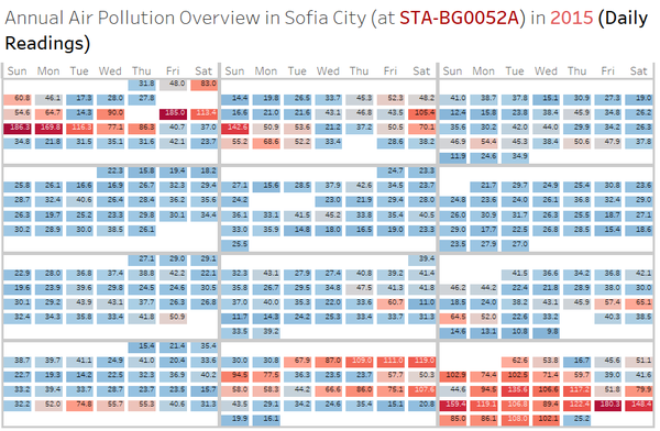
| 3. In-depth Analysis (Daily Reading)
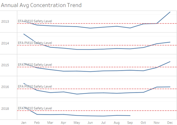
Station - BG0040A: PM10 readings start to pike in Nov and drop in Jan. Minimal breach of safely level between Feb to Oct. This trend is consistent across the years.
Station - BG0050A: PM10 readings start to pike in Nov and drop in Jan. Minimal breach of safely level between Feb to Oct. This trend is consistent across the years.
Station - BG0052A: PM10 readings start to pike in Nov and drop in Jan. But readings Dec and Jan are exceptionally high. in Minimal breach of safely level between Feb to Oct. This trend is consistent across the years.
Station - BG0054A: The station has ceased to take pollution readings since Oct 2015. Station has not been taking records for the past 3 years.
Station - BG0073A: PM10 readings start to pike in Oct and drop in Feb. While the severity of pollution seems to dip since 2016, the pollution in months of Dec and Jan remains dreadful.
Station - BG0079A: Station began its operations in 2018.
|
|
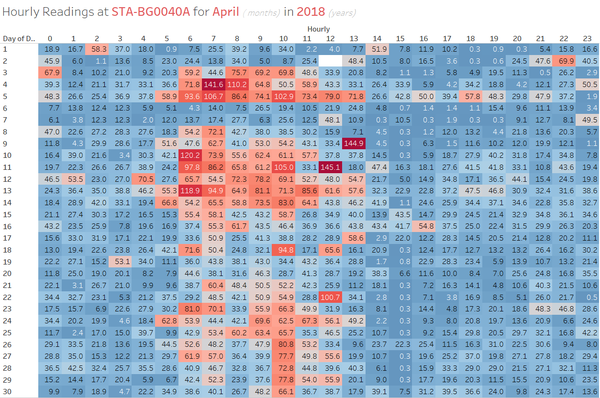
| 4. In-depth Analysis (Hourly Readings)
The Hourly Readings were taken from 2016. However the not all the readings were taken consistently across the stations. As we have also excluded data set from 2017 due ti missing readings, we will be investigating on the hourly readings across stations from the Jan 2018 onwards.
Jan Readings was high as expected.
Anamoly Servere pollution readings observed on :
1) wee hours of 17 & 18 Feb (stations BG0050A, BG0073A, BG0079A)
2) wee hours of 18 Mar (stations BG0050A, BG0052A, BG0073A, BG0079A. Data Missing for BG0040A.)
3) morning for the month of Apr at station BG0040A.
4) no significant findings for the rest of 2018.
|
|
| 5. Problems
The presence of these pockets of missing data in both daily and hourly readings, as well as absence of 9 months worth readings in 2017 prohibits the thorough analysis of the pollution situation at Sofia City. The absence of a comprehensive data will diminish the effectiveness of environmentalists and authorities from crafting effective policies to tackle the problem as they may not be able to sieve out the root cause. Moreover, the data that was available was only on PM10 and there were no data made available on PM2.5. It is important to analyse the presence of PM2.5 as it brings about worsen and detrimental situation to the people of Sofia City.
However in the case of Sofia, the emergence of AirBG, a citizens' initiative to address the awful air pollution, has vastly boosted efforts to garner air pollution readings as well as meteorological data. We will now investigate the Citizen's reading on the next part. |
| Patterns |
Visualization |
|---|
1.Campers
Fig 7 provides the yearly visitor traffic calendar for the campers. The campers visited the reserve more often from May to Aug, possibly because this is the warm period of the year. The highest traffic of campers was observed in July 2015. There is a drastic drop in the campers, especially extended campers, from Q4 2015 onwards, which could be attributed to the colder weather. |
|
| 2. Rangers Trend
Fig 8 below reveals weekly activity pattern for rangers. In 8.1, the heatmap was configured to show the average stay duration for the rangers at various gates. We noticed the rangers would stay for extended durations at camping 8 (Mondays, 10am to 14pm) as well as gate 2 & rangerstop 1 (Mondays 6am – 11am, Wednesdays 13 – 16pm). The rangers could be doing inspection or maintenance works at this these locations. Looking at the reserve map, we can observe that ranger stop 1 and camping 8 are both located at the “dead ends” of the reserve, with no paths extending beyond them – it is likely that these two locations are surrounded with floras whereby periodic maintenance is required.
In Fig 8.2 we could see the rangers gathered at the rangerbase and gate 8 (which is in close proximity to the ranger base) on Thursdays 14pm. It could be an indication that the weekly ranger meetings were held on Thursdays 14pm at the rangerbase. |
|
3.Service Trucks
Fig 9 below shows the weekly movement pattern for service trucks at various gates. We noticed that there were a higher number of service trucks moved pass the “connecting path” on Thursdays, at two prominent timings: 1am and 16pm. This might be the scheduled delivery/pick up hours for the service trucks. |
|
| 4. Sightseeing coaches
Lastly, Fig 10 shows the weekly movement pattern for sightseeing coaches. The sightseeing coaches seemed to be bringing the visitors to the reserve on fixed days and hours, as the darker blocks on the heatmap tend to appear in regular intervals. For example, the coaches tend to visit the reserve at below timings:
-Fridays & Sundays 3am
-Thursdays & Sundays 11am
-Sundays 16pm
-Mondays 22 pm |
|
Integratio of Data Set [Task 3]
The Movement Anomaly
We first used the “Movement Anomaly” dashboard to discover the anomalies in the visitors’ movements. Each individual movement was represented by a Gantt bar. The Y axis contains all the days in the observation period and X axis shows the hours of the day. Filters allows the users to filter to see the activities at restricted gates, or only the activities by certain type of cars or visitors. Three movement anomalies were observed.
| Anomalies & Car ID |
Visualization |
| In 12.1, we filtered away the 2P cars and filtered in only the restricted gates and noticed two types of trespassing behaviours:
a.A group of 6 cars (type 1) entered from entrance 1 trespassing restricted area ranger stop 1 from 10am to 16pm, on 10 July 2015. The sensors at gate2 did not capture any of their activities, most likely they moved to rangerstop1 from the entrance1 directly through the jungles. As discussed earlier on, rangerstop 1 is one of the areas that are frequently maintained by the rangers and floras could be found there. This could be one area where the birds are nesting.
|
The gif below shows the paths adopted by the suspicious vehicles,the restricted gates are colored in red. |
| 2.b.4 vehicle entered from entrance 3 trespassing restricted areas (gate5,gate6,rangerstop6,gate3 & ranger stop 3) 23 times from 2am to 5 am, only observed on Tuesdays and Thursdays. The trespassing cars followed almost exactly the same paths. This looks like some planned acts which were only performed under the masks of the dark night. Type 4 vehicles are the heavy trucks; they could be transporting some illegal materials in or out of the preserve repeatedly.
|
The gif below shows the paths adopted by the suspicious vehicles,the restricted gates are colored in red. |
| In 12.2, we kept only the “extended campers” and included all the gates in the analysis. We noticed some suspicious movements of the extended campers at 0 hours which the rest of the extended campers would not be active at this hour. Interestingly, we noticed all the activity records belong to the car ID 20154519024544-322, which stayed in the preserve for 5 months. |
Stay Duration Anomaly
In the “Stay Duration Anomaly” dashboard we introduced two scatter plots for anomaly discovery.
| Anomalies & Car ID |
Visualization |
| 4.Abnormally high number of stops visited with low average duration
• Car-ID 20154519024544-322 visited total 281 stops in the park and stayed in the park from 19th Jun to 5th Oct (Extended camper). The same car ID appeared under observation 4.
• Car-ID 20154112014114-381 visited 98 stops and stayed from 14th Jun to 26th Jul (Extended camper)
5.Abnormally high average duration in the reserve with low number of stops visited
• 20150105060134-242, 20150420100416-232 visited 4 checkpoints but stayed for over one month in the reserve (Extended camper) |
|
| 6.Hiking or sightseeing visitors with abnormally long stay in the park (they are the same group of visitors observed in 1)
7.Hiking or sightseeing visitors with abnormally long stay in the park, car type4
|
|
 Sofia City's Air Pollution Problem Analysis

.png)


