ISSS608 2018-19 T1 Assign Cao Xinjie Task1
|
|
|
|
|
|
|
|
DATA OVERVIEW
After joining all the data together, we can find out the date of data is from 2013-01-01 to 2018-09-13. The air quantity has three data types (day, hour, var), but the hour data start from 2015. The Sofia has six Air quantity stations (40, 50, 52, 54, 73, 79), each station has different its own location, altitude and other information. The station 40A, 50A and 52A are background air pollution, the other three stations are traffic pollution.
DATE AVERAGE DATA
The following image shows the date average air quality in five years, x-axis means all the date in one year, y-axis means the air quality index. we can find out the during Dec and Jan the air pollution increases a lot than the other month, which is obviously.
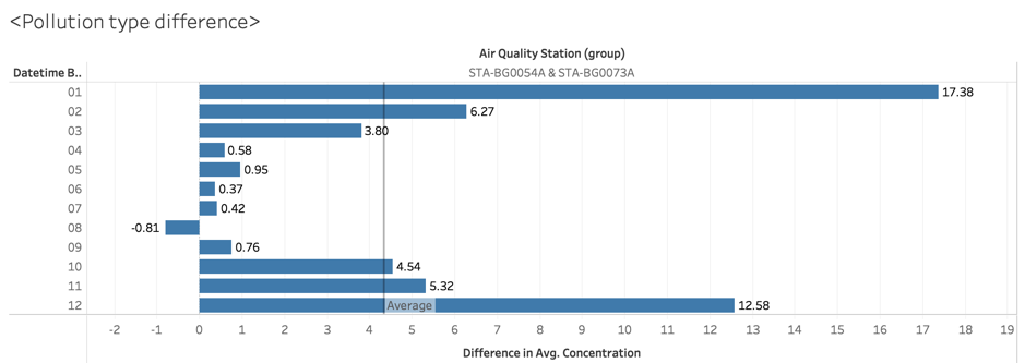
Two reasons can explain the shaped rise of the air pollution in the winter. First, Sofia needs to burn fuel for heating, the fossil fuel contains carbon which is bad for air. Second, in the winter, the car will emit more harmful particles because of inadequate fuel burning. To verify whether the second guess is correct, I make the first three station (40A, 50A, 52A) in a group and (54A, 73A) in a group. Because the first group’s pollution type is background which means general pollution, the second group is the traffic pollution. The reason why not use the 79A station is that 79A only have the data in 2018, this chart uses the date from 2013-2017.
The figure above is using group2’s data minus group1’s. The y-axis is the month, the x-axis is the difference of average air quality (group2-group1). In the chart, we can confirm our guess, the traffic air pollution increases a lot in the winter. The air quality near the traffic is much larger than the general one in Nov to Feb.


