ISSS608 2018-19 T1 Assign Cao Xinjie Task2
|
|
|
|
|
|
|
|
Contents
The Sensors’ Coverage, Performance, and Operation
Data Overview
After using R to join two data and using the geohash package to get the latitude and longitude.
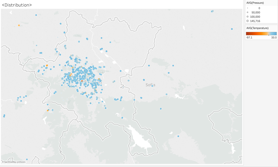
The figure is about the geographical distribution of all the sensors. The sensors can detect the Humidity, PH10, PH2.5, Pressure, and Temperature. In the figure1 we can know that sensors are spread across the country and Sofia. The center part of Sofia has the highest density, but around the center the sensors’ density is low. Some part of the Sofia cannot be detected like the northeast part and south part. The sensors are not working properly all the time, in the figure1 we use color to measure the Temperature and size to measure the Pressure. The temperature ranges from -97.1 to 33, the temperature is impossible to below -40 degree. The pressure also has a problem, because the normal pressure is about 100000, but some sensors’ average pressure is below 60000 which is unreasonable for the air pollution sensor.
Time Heatmap
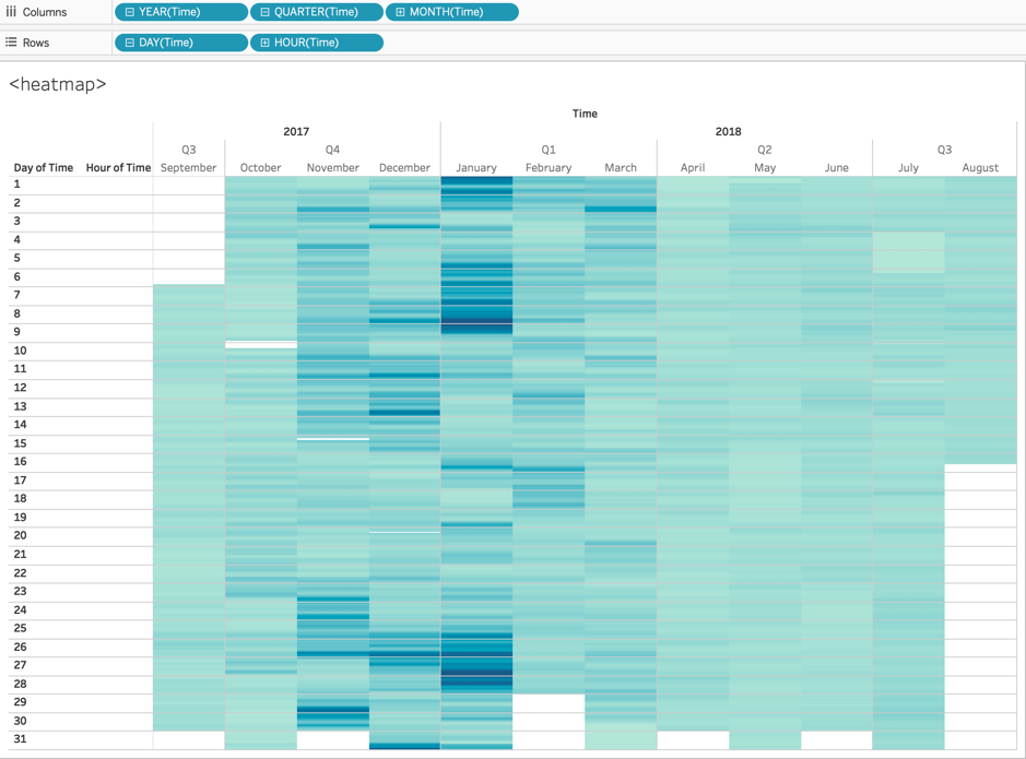
The figure below is a heat map of the date and time in this year and we put the P1 in the color measurement. The darker the color the heavier air pollution. In the figure2 we can know that there are some hours the sensors are not working like 10 Oct in 2017.
Special Day
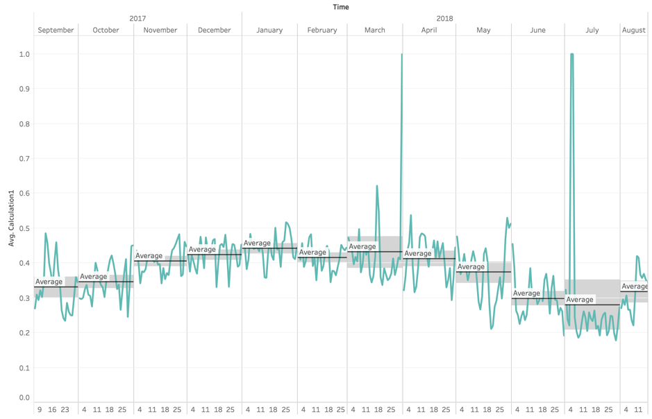
We decided to create a new calculation in Tableau: (P1-P2)/P1. We put the new calculation in y-axis and time is x-axis. After adding the confidential interval, we can know that in the March and July, there is some unexpected value of P1.
Wrong Numbers
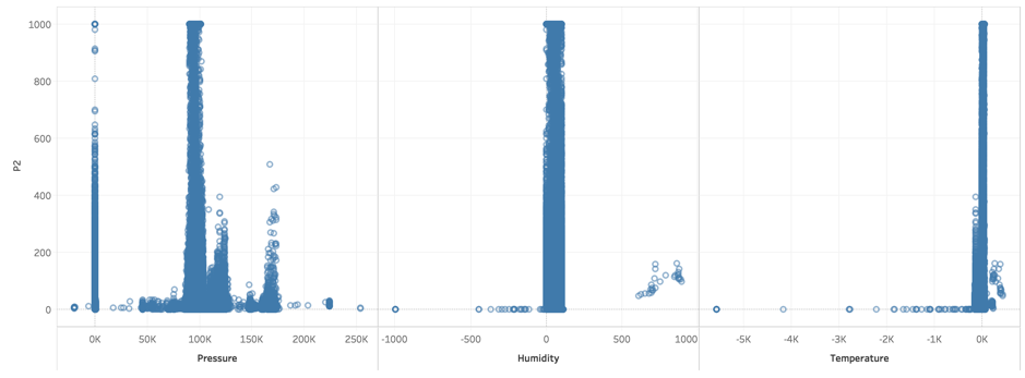
This figure is to see the distribution of Pressure, Humidity, and Temperature. You can clearly see the particular data that is incorrect. There is much missing value in Pressure. And the negative Humility is wrong. The high negative temperature which is not normal is also the wrong data.
Air Pollution Analysis
Heatmap of P1&P2
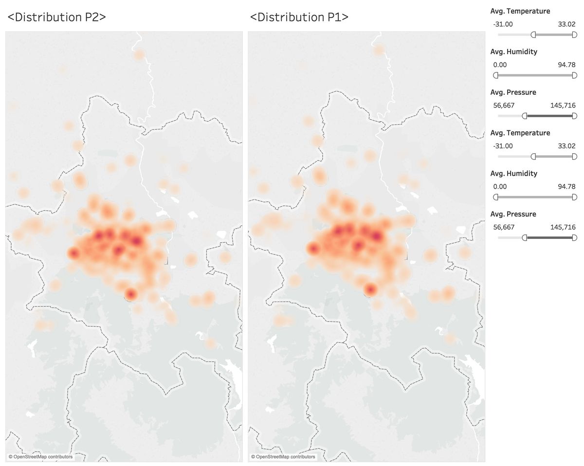
The figure is two heat maps of the distribution of air pollution. We use the filter to delete the wrong data. Through these two maps, we can know that the center part of Sofia has the highest air pollution. Meanwhile, the south part of Sofia also has a heavy air pollution. The air pollution around Sofia is not heavy.
Air Pollution Distribution
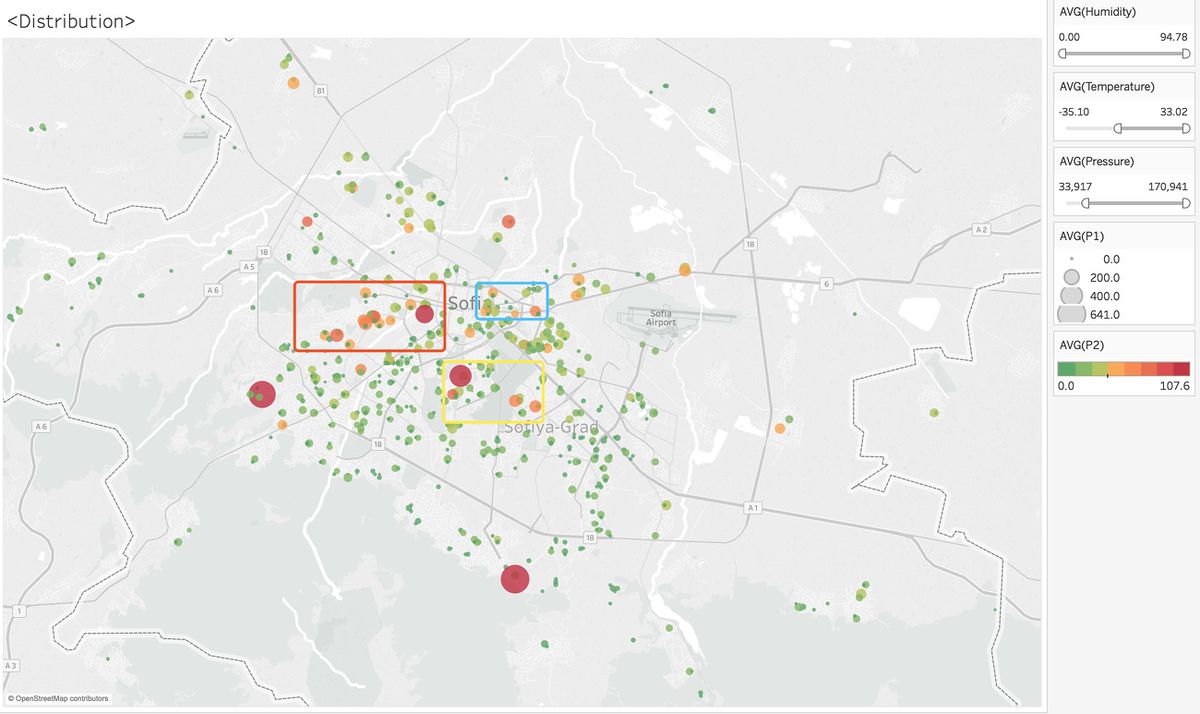
To find out a more accurate location for air pollution, we did the figure below. We use the color to measure P2 and use size to measure P1. We can find out there are three part have heavier pollution than other places. The areas circled in red have the densest air pollution, and the yellow circles are the surrounding pollution caused by major sources of pollution. The blue circle is like traffic pollution.
Clustering
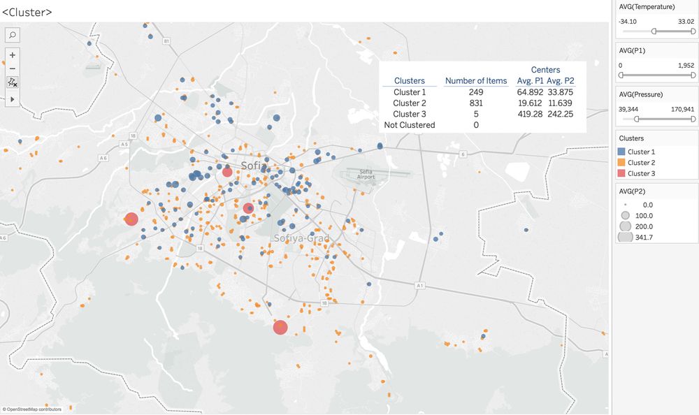
To classify the air pollution stations, we used clustering in the Tableau. The result has three clusters, the first cluster is the heavy pollution part, in the map with blue color, we can easily find out the blue color's point is bigger than the yellow color point in the map. The first cluster is like the place with high traffic pollution, they are in the center part of Sofia. The second cluster is relative good air place, in the map is yellow color. The third cluster is the heaviest part of the city, they may be the industry part of the city, their pollution is much higher than the first and second cluster.
Pollution by Month
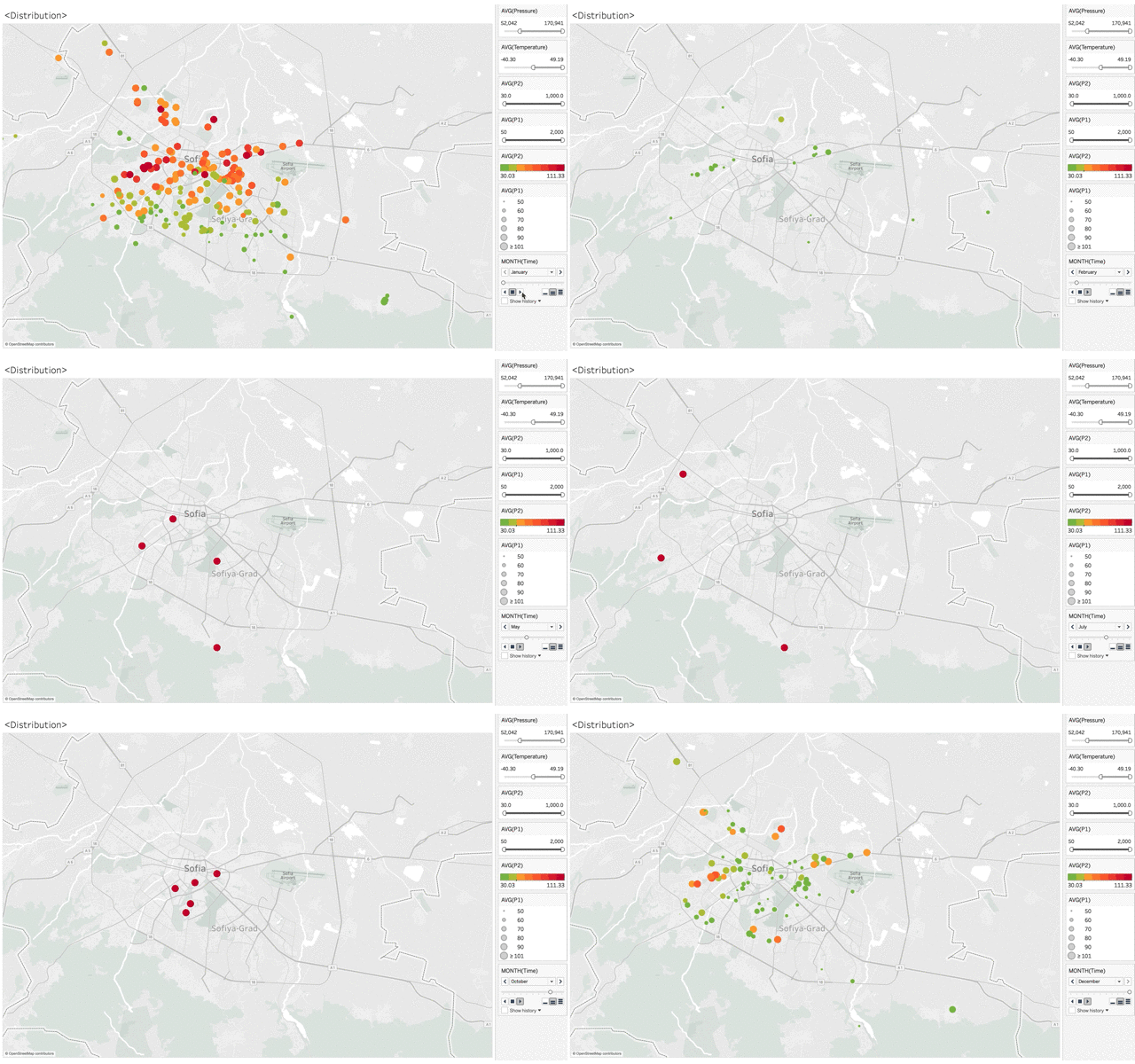
We filtered out the detection stations with good average air quality, and only keep the value of PM2.5 over 30 and PM10 over 50. Through the figure, we can know that during the month of light air pollution (Feb-Oct), the distribution is changing month by month. Like Aug, the heavy pollution is in the downtown. In June the heavy pollution place is around Sofia. But during the heavy air pollution month (Nov-Jan), the heavy pollution parts are in the center part of Sofia, especially in the red circle and blue circle of the last figure,
Pollution by Hour
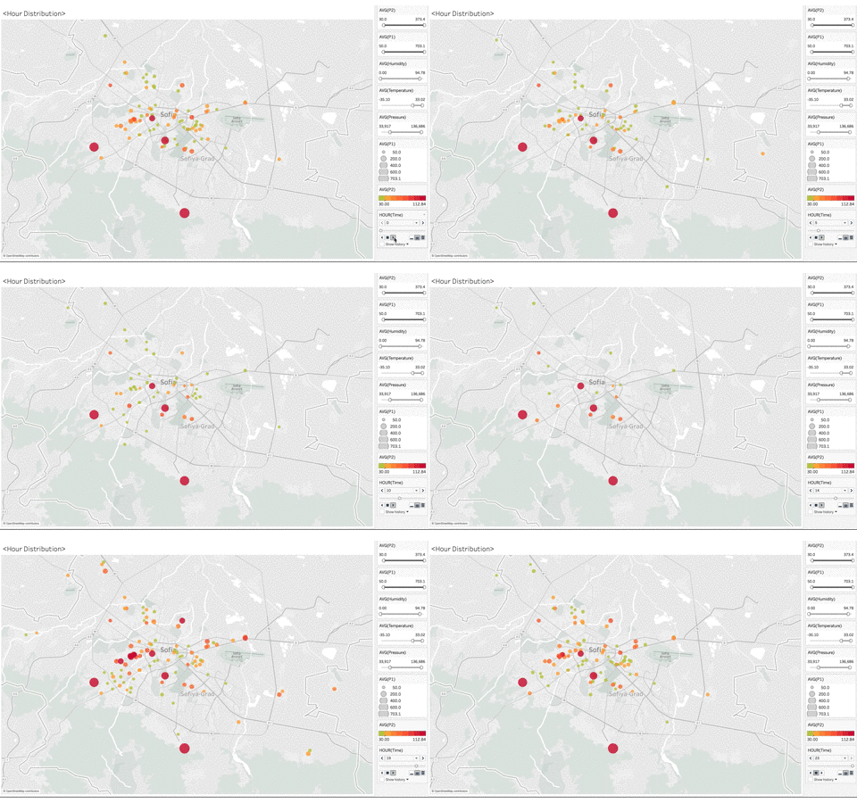
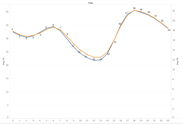
We filtered out the detection stations with good average air quality, and only keep the value of PM2.5 over 30 and PM10 over 50. Color measure the PM2.5 and size measure the PM10. The lift figure is the change by the hour. It's obvious that the different hour has different air pollution distribution. 0-4am. the pollution is nearly the same, from 5 am the distribution start to increase, the reason may be the traffic and the industry. From 9 am. the air pollution start to decrease, except some main points. And at 15 pm, the pollution increases quickly. Around 18 pm is the peak of the pollution in one day. During 18-24pm the air pollution decrease again.
