From Visual Analytics and Applications
Jump to navigation
Jump to search
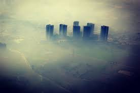 Air Polution in Sofia, Bulgaria
Official Air Quality Measurements
|
|
The Map shows the distribution of official stations.
- Hover the mouse over each flag to get detailed information
- Click the flag on the dashboard to highlight the Hourly Trend of this selected station
|
|
|
The Hourly Trend graph shows the average hourly PM10 concentration of each station.
- Hover the mouse over each dot to see the average concentration during a certain time period
- Slide the sidebar to select the year to view
- Select the standard deviation from the drop-down list
- Click the station names to highlight the station location on the Map
Parameter created:
- Standard Deviation: to control the number of standard deviation
Calculation Fields created:
- Upper Bound: to draw the upper bound
- Lower Bound: to draW the lower bound
- Outlier: to judge whether a value exceeds the bounds
|
|
|
The Overall Trend graph shows the trend of each station according to the date granularity selected.
- Clcik the blue boxes to adjust the date granularity
|
 Air Polution in Sofia, Bulgaria


