ISSS608 Assign Pu Yiran-Task 1
|
|
|
Task 1 |
|
|
Contents
Get to know about 6 air quality stations
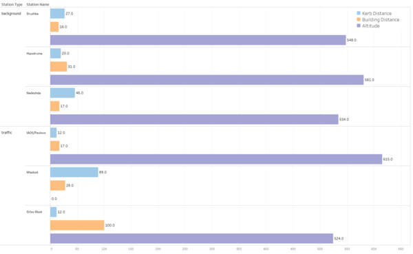
Three stations—Druzhba, Hipodruma and Nadezhda are categorised as ‘Background’, which means the stations are located where the pollution levels represent the average exposure of the general population within the area under assessment. The pollution levels near these three stations are not dominated by a single source type (e.g. traffic), but more related to residences’ daily life.
On the contrary, the other three station—IAOS, Maldost and Orlov are categorized as ‘Traffic’, which indicates that in these areas, the pollution level of PM10 is determined predominantly by the emissions from road traffic. (http://dd.eionet.europa.eu/vocabulary/aq/stationclassification/view)
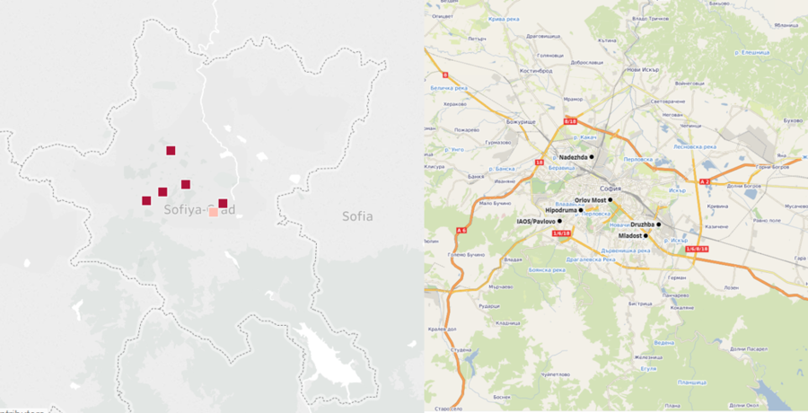
Six stations are located at central region of Sofia city, with different building distance, kerb distance and altitude, which is displayed in the right picture and below.
By creating some visualization, it is observed that:
1) Station Nadezhda (BG0040A) has missing data of the entire July 2016.
2) Only data of November and December are given for 2017.
3) Station Orlov Most (BG0054A) only provides data of 2013, 2014 and 2015.
4) Station Maldost (BG0079A) only provides data of 2018.
Insight 1 - Look into Calendar
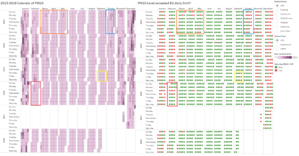
Although Bulgaria is said to be one of the most polluted country in Europe, throughout a whole year, the concentration of PM10 is not always high. Typically, among 12 months, January, Febuary, November and December are the heaviest polluted, especially January and December. However, the rest months have much lower daily average concentration of PM10. This fact can be identified from the calendar view below, where the depth of colour represents the daily average concentration of PM10.
Calendar gives a general view of air pollutant across months, and by filtering, we can look into each station or station type, but horizontal comparisons need other visualizations.
Insight 2 - Time series patterns of monthly average
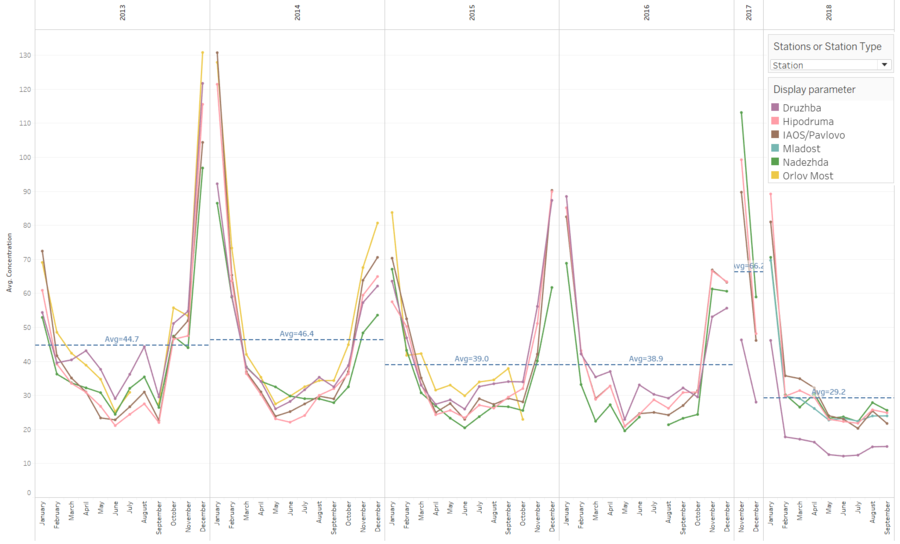
From below visualization of monthly average, PM10 can be found not evenly distributed across months or across 6 locations—some periods of time and some locations tend to have higher concentration of PM10.
Knowing EU limit of yearly average PM10 is 40 µg/m3 and daily average PM10 is 50 µg/m3, Sofia is found to have excessive yearly average PM10 in 2013 and 2014, which was 44.7 µg/m3 and 44.6 µg/m3 respectively. Although 2015, 2016 and 2018 have much lower yearly average, we can’t ignore the impact of missing data and incomplete records.
Identical with above calendar, PM10 was measured highest in January and December, but lowest in May, June and July, which are known as the most pleasant months in Bulgaria with moderate temperature and weather.
Concentration of PM10 across months makes a shape of ‘V’ – from January onwards, it continuously decreases until bottom in May, June and July, after which, from August, it starts increasing significantly and reaches its pick in December.
Insight 3 - Discover changes from bubble charts
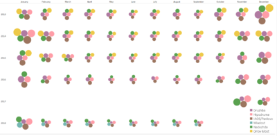
Although the ‘V’ pattern can be seen from all 5 air quality stations (except for Mladost BG0079A) regardless of the source of PM10 or the difference between monitoring machines/methods, PM10 was not always staying in high concentration at same places or same period of time.
In this case, bubble charts allow both horizontal and vertical comparisons. For example, PM10 measured by station Druzhba, was much higher than that of other stations in 2013, 2014 and 2015, however, in 2017 and 2018, PM10 measured by BG0052A has the lowest monthly average among all the stations.
By contrast, station Nadezhda, concentration of PM10 at which increased largely in November across 6 years while decreased largely in December across 6 years.


