Difference between revisions of "ISSS608 2018-19 T1 Assign Qiao Xueyu Visualization"
Jump to navigation
Jump to search
Xyqiao.2017 (talk | contribs) |
Xyqiao.2017 (talk | contribs) |
||
| Line 29: | Line 29: | ||
|} | |} | ||
<br/> | <br/> | ||
| + | [https://www.nytimes.com/2013/10/15/business/international/bulgarias-air-is-dirtiest-in-europe-study-finds-followed-by-poland.html View the interactive dashboard here] | ||
== Official Air Quality Measurements == | == Official Air Quality Measurements == | ||
{| | {| | ||
Revision as of 10:43, 18 November 2018
|
|
|
|
|
|
View the interactive dashboard here
Official Air Quality Measurements
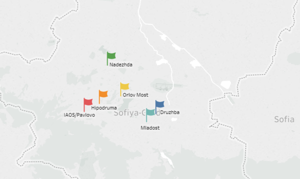
The Map shows the distribution of official stations.
| |
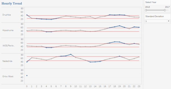
The Hourly Trend graph shows the average hourly PM10 concentration of each station.
Parameter created:
Calculation Fields created:
| |
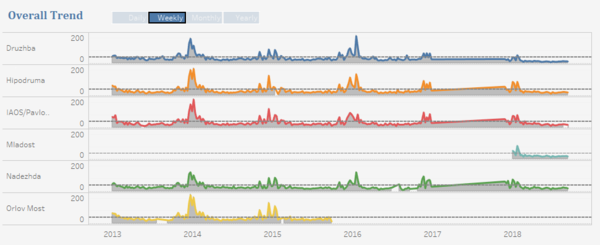
The Overall Trend graph shows the trend of each station according to the date granularity selected.
|
Citizen Science Air Quality Measurements
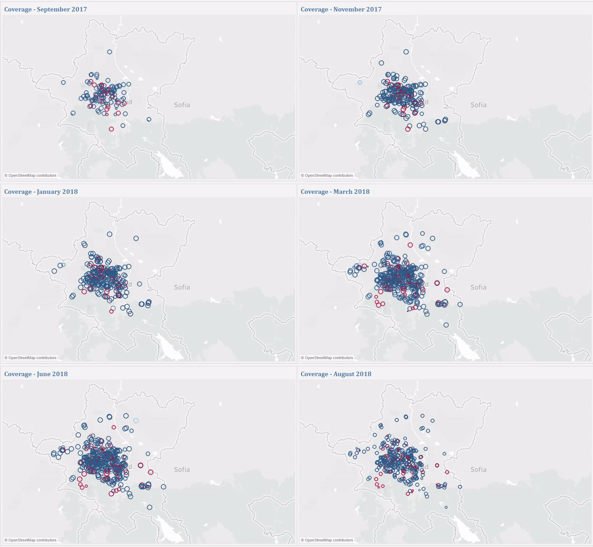
The Coverage Map shows the citizen sensors' coverage.
| |
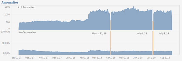
The Anomalies graph shows the number of anomalies and the percentage of anomalies over the time period.
| |
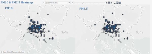
The PM10 & PM2.5 Heatmap shows the concentration change over the time period.
|
Air Quality & Other Factors
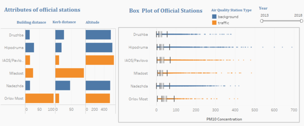
The graph on the left helps us to explore the relationship between PM10 concentration and attributes of them like distance to curb, distance to building and altitude.
| |
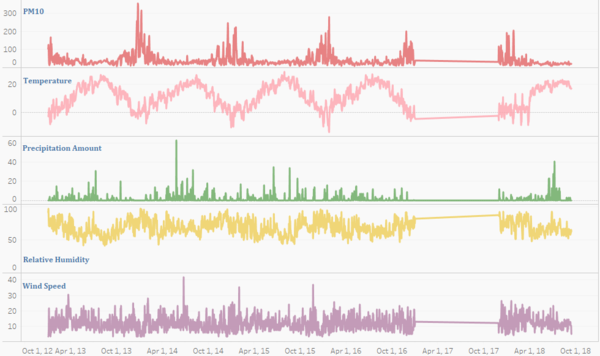
| The line charts of meteorological variables help us explore the relationship between meteorological factors and pollutant concentration. |
