From Visual Analytics and Applications
Jump to navigation
Jump to search
 Air quality in Sofia city
Insights
Task1 Insights
| Patterns |
Visualization |
|
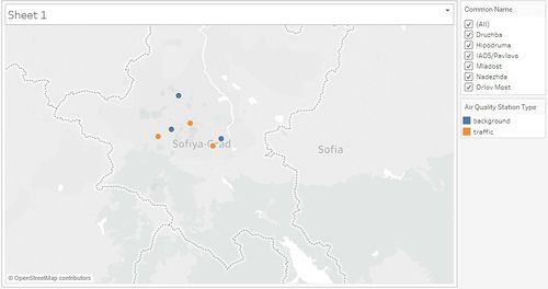
from the map, we can see that these six stations locate at the centre of the country, and it means more convenience for stations to monitor air quality.
|
|
|
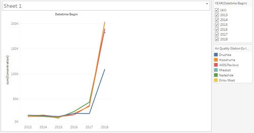
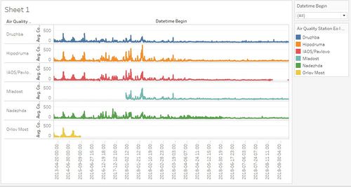
1. from year 2013 to year 2017, sum quantity of air concentration of 5 stations stay stable.
2. for all stations, there has been a sharp increasing of air concentration form year 2017 to year 2018 except Mladost and Orlov Most.
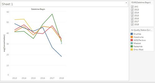
3. in general, the annual average PM 10 concentration in Bulgaria is around 45.
4.basically, for stations, Averaging Time has been changed to hour from year 2017, it is normal that air concentration declines from 2016 to 2017, but for Nadezhda and IAOS/Pavlovo, air concentration has reached peak in 2017, which means air quality at that time is a big concern.
5.all stations show downtrend in recent two years, which means that Bulgaria is improving its air quality in recent two years.
|
|
|
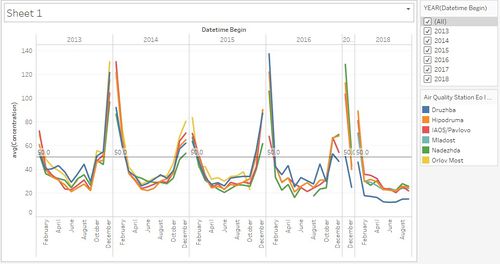
From the visualization above, monthly tendency shows a shape of U, PM 10 firstly has high concentration in January and February, then it starts to decrease onwards and fluctuate slightly from April to October, after that, it begins to increase rapidly from October to December, and shows its uptrend. Better air quality from April to October in Bulgaria may due to its appropriate temperature, humidity and pressure, as well as some other factors.
For PM10, knowing that EU limit value is 50 μg/m3 per day and set it as a reference line, we can see that in January and February, and November and December, average PM 10 concentration is above EU limit value, and some months far exceed 50 μg/m3 per day.
|
|
|
From the upper picture, there are some peaks from year 2013 to year 2018. And these peaks approximately is around midnight, at this time, people are sleeping and the amount of carbon dioxide in the air is the highest because of respiration. Then, after photosynthesis, the amount of carbon dioxide begins to decline in the air and air quality become better.
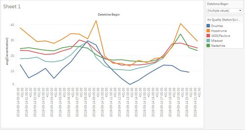
I select a typical day- 2018.9.14,you can see that lower picture.
In the beginning, the average concentration of PM 10 in the air is quite high, and then it shows down trend overall in all five stations from midnight to 5 am though it fluctuates slightly during this period. After 5 am, the concentration rises continuously and arrives its peak at around 9 am. Next, declining trend displays again, and the PM 10 average concentration arrives the lowest point at around 15 µg/m3 and this time is approximately 1 pm. After that, it rises onwards and finally arrives its second peak at around 7 pm. |
|
|
These are some observations from the data set:
1.Mladost only has year 2018 data
2.Orlov Most has data from 2013-2018.
3. year 2017 only have November and December data.
4. year 2018 is lack of October, November and December data.
5. air quality station type of some stations is background, while the other is traffic. The background type indicate that PM 10 levels represents the emission of all general population within that area, and the traffic type shows that air quality concern is more related to road traffic.
Anomalies and the affection:
As mentioned before, some observations from the data set shows that some stations have missing data in some years or months, and this could affect overall spatial-temporal analysis of official air quality. Basically, for stations, averaging time has been changed to hour from year 2017, while there are other times when averaging time vary from day, hour, and var. And this also has impact on the computation of average concentration of PM 10.
|
Task2 Insights
| Patterns |
Visualization |
|---|
1.Characterize the sensors’ coverage, performance and operation.
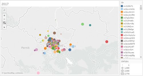
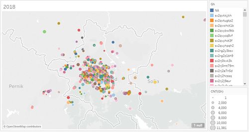
In Bulgaria, sensors are distributed across the whole country, but more sensors seem to locate on the south west part, especially in Sofia city. And, there are also a certain number of sensors distributed at the external of Sofia city. In Sofia city, most sensors are located at the centre, and a minority of sensors distribute at the urban area and some areas nominally external to the city. In all, there are 382 sensors located in Bulgaria in 2017 and 528 sensors in 2018. Compared with 2017, there are more sensors located in Sofia city in 2018. |
|
| 2.Estimate whether sensors work properly.
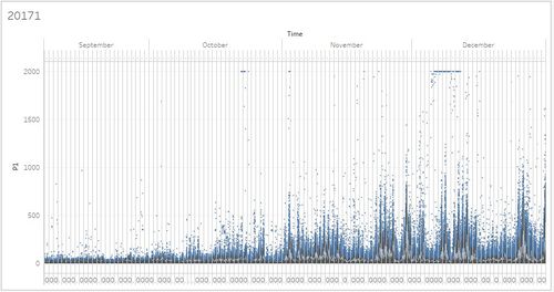
In year 2017, by looking at the amount of P1 of each sensor in every hour during September to December, many outliers display during this period, and these figures can be regarded as abnormal data which show that the corresponding sensor does not work well at that moment.
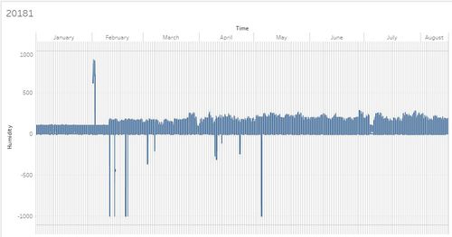
In year 2018, take humidity for example, we can find out that there are still some outliers existing in this period, not all the sensors can give the right data or always work well. |
|
| 3.Which part of the city shows relatively higher readings than others
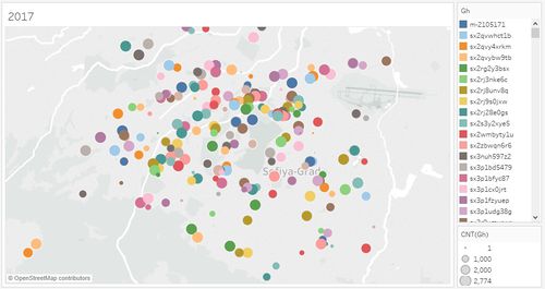
Form the upper picture, we can see that the north west part of Sofia city has relatively higher readings than other parts as there are bigger size circle gathered at that place.
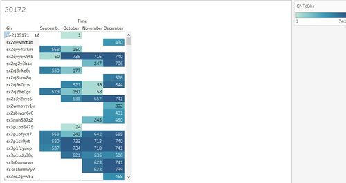
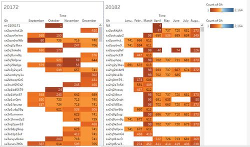
Typically, when these sensors have higher recordings than others, you may infer that this could happen due to longer monitor period of these sensors. However, it is important to note that the overall recording of sx3nuh597z2 is much more than sx3p1bd5479, and sx3nuh597z2 just begin its monitor from November while sx3p1bd5479 has started its monitor in October. Thus, monitor period may not be the important impact on the recordings differences. In addition, it is obvious that in general, the recordings have been rising from September to December in 2017.
So, based on what we see from the perspective of year 2017 data, we can infer that the number of recordings may have something to do with months. |
|
| 4. Are these differences time dependent
After I combine the two years’ recordings in a one dashboard, it is important to note that the lowest number of recordings mainly distribute in October, November and March, while the highest number of recordings display in December, January, May, June and July. So, I can roughly infer that in winter and summer, the intensity of monitoring increase because the usage of electricity and oil increase in the extreme weather like hot or cold day. While, the number of recordings in summer and autumn are not that high.
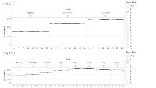
Next, we can see whether hourly change can have the impact on the number of recordings. Here, we combine the data of both 2017 and 2018. I take the second day of each month for example, and it is obvious that the number of recordings stay stable for 24 hours, same with other days. |
|
Task3 Insights
| Patterns |
Visualization |
1.the relationship between local topography with air quality measure detected in task2.
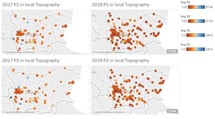
From the picture above, it is important to notice that PM 10 concentration has something to do with local topography, in Bulgaria, west parts of it are facing more challenge of the air pollution. In addition, as time went by, the number of sensors is increasing, and the PM 10 concentration seems to decline in some areas, same with PM 2.5. |
|
| 2.the relationship between local meteorology with air quality measure detected in task2.
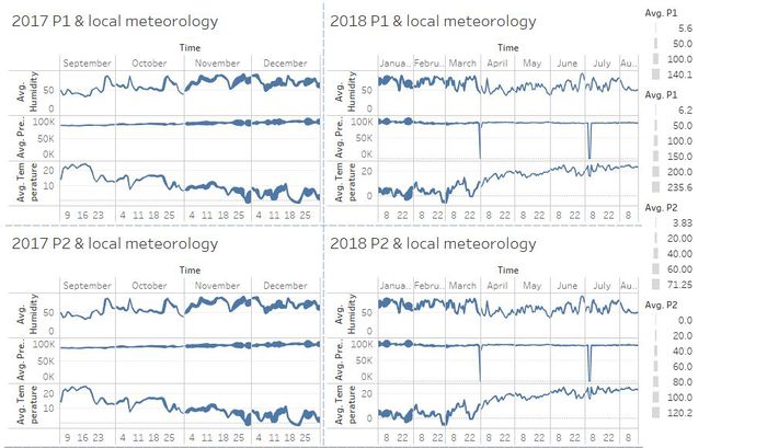
Average Pm 10 concentration in 2017 and 2018 and its relationship with humidity, pressure and temperature. From the chart, we can conclude that PM 10 arrives its highest concentration in November, December, and January. Moreover, when the average number of pressure and humidity rise, the average concentration of PM 10 rises as the bold line displays. On the contrary, when the average number of temperature rises, the average concentration of PM 10 declines as the thinner line displays.
Average Pm 2.5 concentration in 2017 and 2018 and its relationship with humidity, pressure and temperature. From the chart, we can conclude that PM 2.5 arrives its highest concentration in November, December, and January. Moreover, when the average number of pressure and humidity rise, the average concentration of PM 2.5 rises as the bold line displays. On the contrary, when the average number of temperature rises, the average concentration of PM 2.5 declines as the thinner line displays. |
|
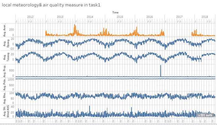
3.the relationship between local meteorology with air quality measure detected in task1.
In the chart, I highlight the average PM 10 concentration line. It is obvious that Daily average dew point temperature and Daily average temperature have negative relationship with the average concentration. When the average temperature rises, the average concentration declines, and vice versa. The other local meteorology such as pressure, rainfall, humidity, wind do not have impact on the average PM 10 concentration. |
|

