 Air quality in Sofia city
Data Preparation & Dashboard
Data Preparation
| Description |
Illustration |
| 1.Task1 data preparation
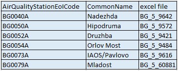
First, I open metadata in EEA Data file and find the correlation between air quality station eol code and station names.
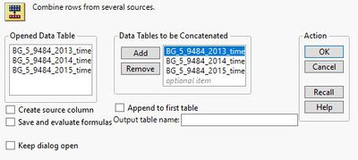
Next, I open measurement files belonging to one station in JMP Pro, and concatenate tables from year 2013 to year 2018, and save it as excel format. By combining six excel files, I can get one excel consisting of PM 10 concentration measurements of all six stations from year 2013 to year 2018.
|
|
| 2.Task2 data preparation
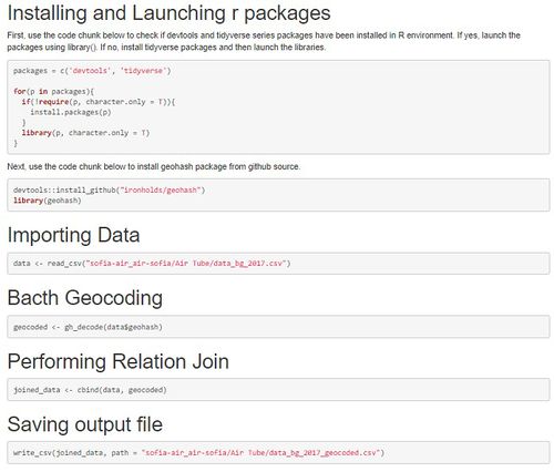
First, I do step-by-step operation to use geohash package to geocode a csv file of geohash addresses.
Step-by-step operation is shown beside.After that I get two geocoded excel files, the one is Citizen science air quality measurements data of year 2017 and the other is in year 2018.
Next, open two files in tableau and do visualization.
|
|
| 3.Task3 data preparation
We continue to use the previous excel files and open it in Tableau.
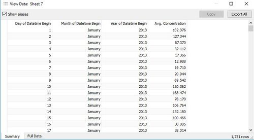
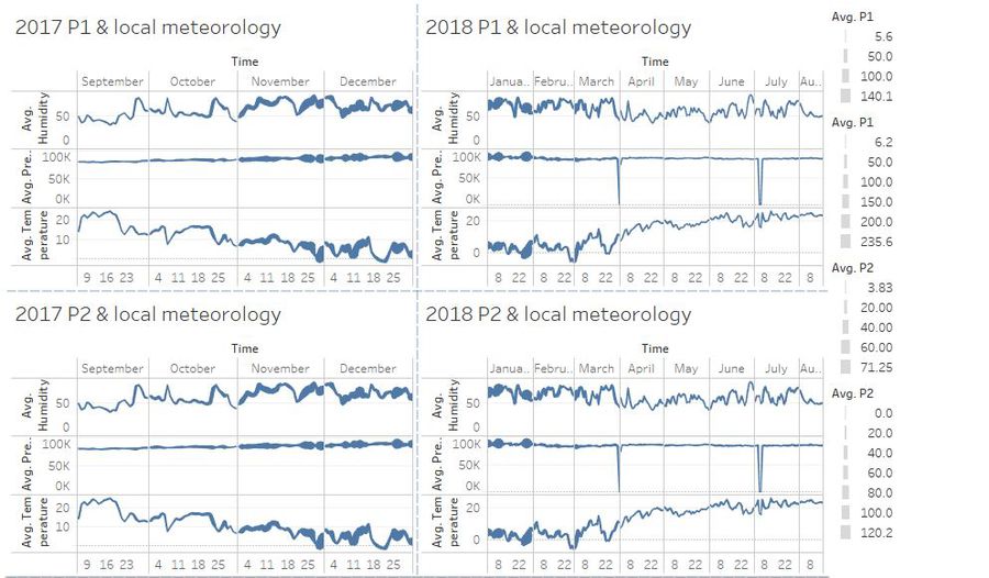
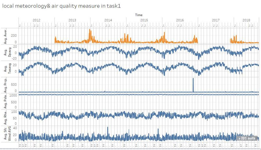
at this time, using local meteorology files including temperature, pressure, rainfall, humidity, wind etc, we Compare data with EEA data. then, I find some mistakes, 2017-09-31 data exists, and 2018-3-29,2018-3-30,2018-3-31 ,2018-06-30 data are missing in the local meteorology file. after aggregation, I get the average PM 10 concentration by using excel from task 1 and export average concentration data. finally, i add average PM10 concentration data into the local meteorology file, and open it in Tableau for visualization.
|
How to export data from tableau:
|
| 4.Useful files after aggregation
1. for task1, i use one excel file,combine all station measurement data from 2013 to 2018, also add latitude and longitude of each station to be the new two columns.
2. for task2, i use two excel files which are exported by R.
3. for task3, except using files from task1 and task2, i also use local Meteorological measurements file, but i add two columns into this local Meteorological measurements file.
The first column is time as it is more convenience for me to use in tableau, the other column is average PM10 concentration which i can export from task1 file.
|
The Task1 file:
The Task2 file:
The Task3 files:
|
| 5.Overall visualization design concepts
As this assignment has three tasks, we can design our dashboard according to inquiries of each tasks.
|
Dashboard
View the interactive Tableau design here:
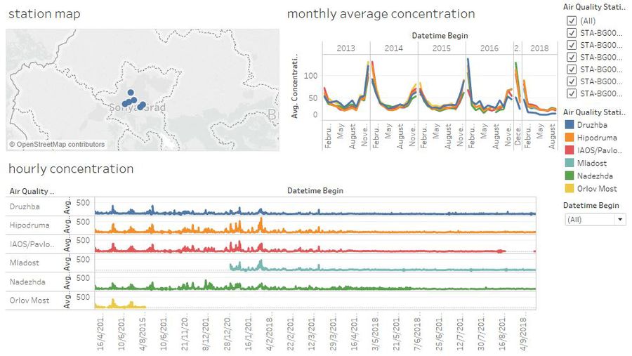
1.task1 dashboard Overview -- Characterize the past and most recent situation with respect to air quality measures in Sofia City. What does a typical day look like for Sofia city? Do you see any trends of possible interest in this investigation? What anomalies do you find in the official air quality dataset? How do these affect your analysis of potential problems to the environment?
2.task2 dashboard overview
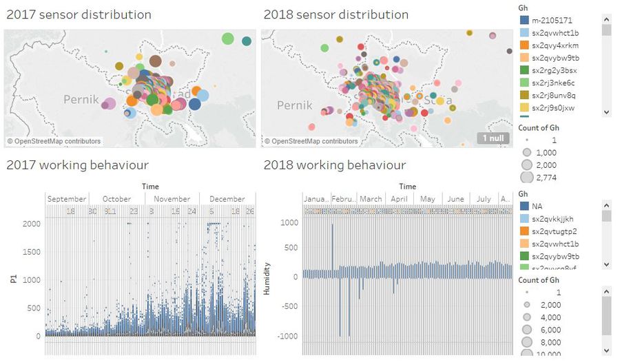
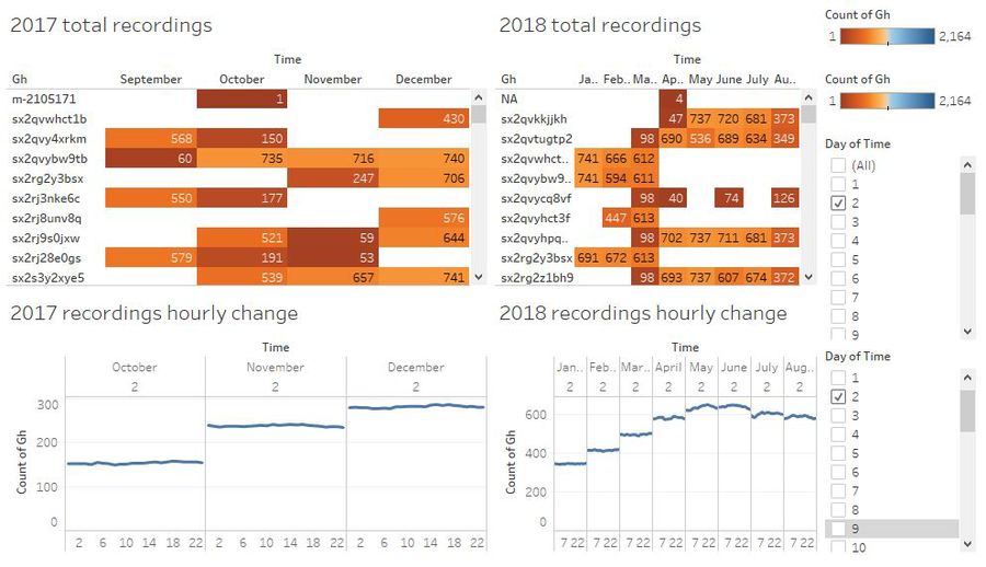
- Characterize the sensors’ coverage, performance and operation. Are they well distributed over the entire city? Are they all working properly at all times? Can you detect any unexpected behaviors of the sensors through analyzing the readings they capture?
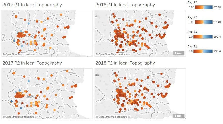
- Now turn your attention to the air pollution measurements themselves. Which part of the city shows relatively higher readings than others? Are these differences time dependent? p>
3.task3 dashboard overview -- to reveal the relationships between the factors mentioned above and the air quality measure detected in Task 1 and Task 2.
- the relationship between local topography with air quality measure detected in task2.
- the relationship between local meteorology with air quality measure detected in task2.
- the relationship between local meteorology with air quality measure detected in task1.

