ISSS608 2017 T3 Assign BI HE Question
|
|
|
|
|
|
Q1 Characterize the past and most recent situation with respect to chemical contamination in the Boonsong Lekagul waterways. Do you see any trends of possible interest in this investigation?
Method
Month-to-Month comparision
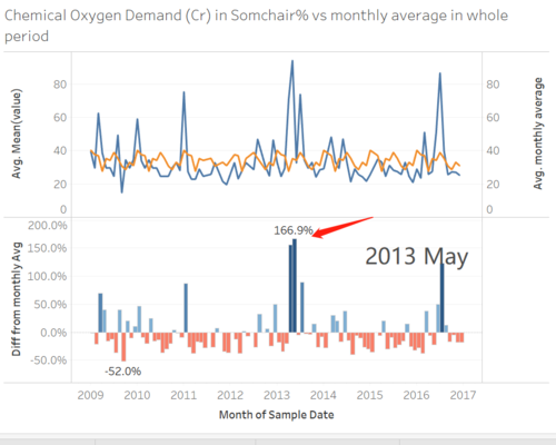
The line graph is used to display the trend of each indicator. Set up the axis as dual axis for real time waterway data and monthly average data. And synchronize the axis for two lines.
For the second part of the graph, the bar chart can be used to show the change of difference from monthly average. The setting for columns and rows is as below.
The filter for measure and location provides user to observe the trend for each indicator in each location.
Location comparison
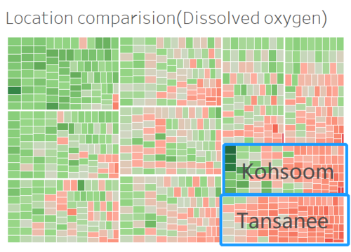
tree map is also useful in this case. Filters and marks setting are below
Insights
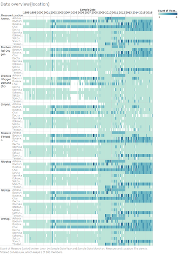
Data overview
Based on the observation of all 106 indicators, only eight of them have relative complete data for all 10 locations in the period of 2009-2016.
They are:
- Ammonium
- Biochemical Oxygen
- Chemical Oxygen (Cr)
- Chlorides
- Dissolved Oxygen
- Nitrates
- Nitrites
- Orthophosphate
So, the further research will have based on these 8 chemistry indicators.
location comparison
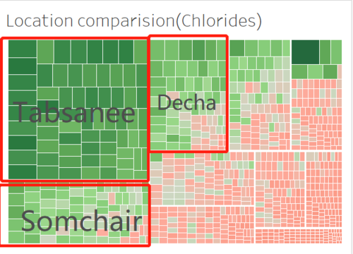
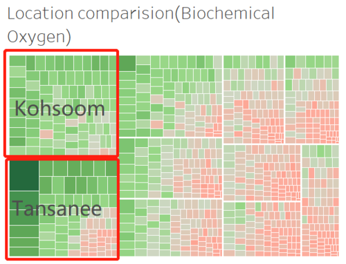
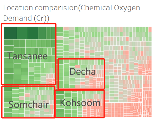
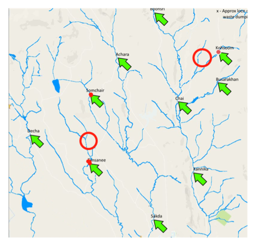
The tree map of shows the difference from the location average for all location in all period of time. From Tree maps for all 8 chemistry indicators, we can observe that Some of specific locations show up several times with the data above (or below) the average for long period, such as Tansanee, Kohsoom, Sochair and Decha.
Comparison in time series
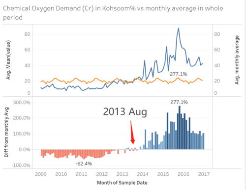
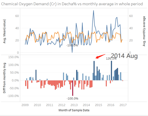
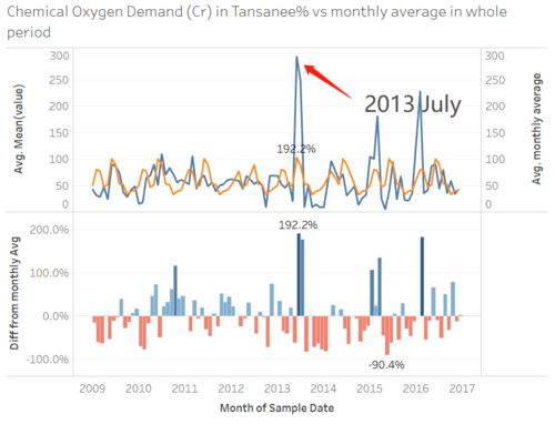
I did the further research for Chemical Oxygen Demand(Cr). The data from all 4 suspected location are shown in time series pattern. The upper part of graph shows the real time data value (blue) and the monthly average value(yellow), and the bottom part shows the difference between real-time data and monthly average data with bar chart.
