ISSS608 2017-18 T3 Assign Tan Yong Ying Application Design
Jump to navigation
Jump to search
 VAST Challenge 2018: Suspense at the Wildlife Preserve
|
|
|
|
|
|
|
Application Design
Since all the analysis are done using base R or R packages, the analysis filters and results are presented in an R-Shiny web application. Visit the R-Shiny application here. The R-Shiny web application consists of three tabs:
- Sample Bird Recordings Overview: The first tab gives an overview of the 2,010 recordings from 19 species in the Preserve provided by Mistford College (2,010 records after data cleaning) using two bar charts. The user can choose a species to look at the number of recordings available by vocalization type ("call", "song", "call,song") and recording quality ("A", "B", "C", "D", "E" and "no score") across the years.
The color mapping chosen for the count of records is the colorblind-safe palette developed by Masataka Okabe and Kei Ito. It is available as part of the ggthemes package, but I implemented it manually by explicitly defining the colors for each level of Visualization_type and Quality. This is because different species have different levels in their subset (e.g. species A has quality "A" to "E", while another species has quality "A" to "D" and "no score") and we want to ensure the color is the same for each level throughout all the species.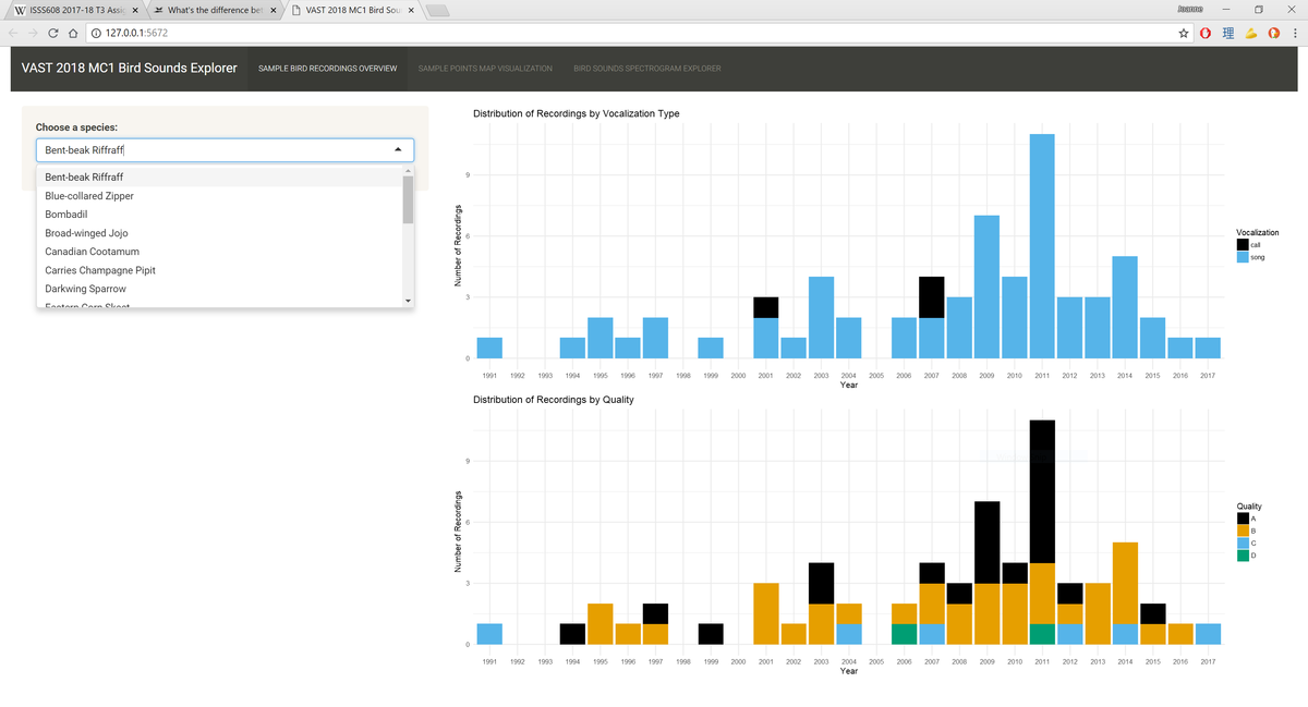
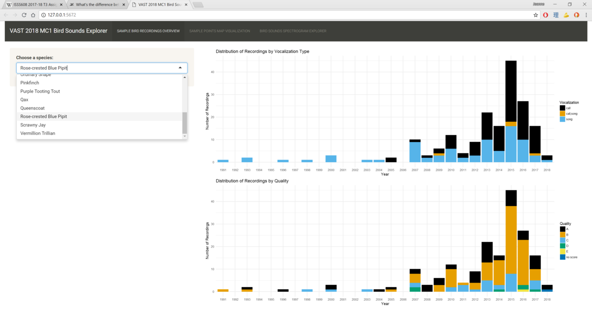
For example, we see the first screenshot only has two levels for Vocalization_type. When there is an additional level for this variable in the second screenshot which is in the middle of "call" and "song", the colors for "call" and "song" values are not affected by it.
To achieve this, I defined a list of colors mapped to their respective levels in a vector, then use scale_fill_manual() to refer to the vector of colors to fill the bars.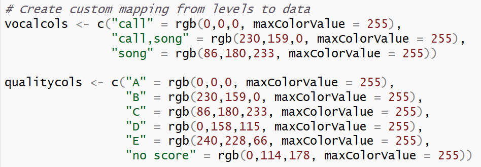 Defining the vectors of colors mapped to the levels of each variable
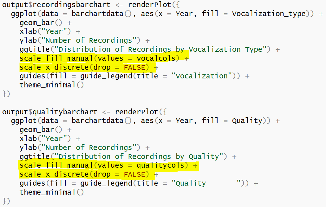 Using the defined vectors to fill the bars using scale_fill_manual
There is also a line which states "scale_x_discrete(drop = FALSE)". It means that all levels on the X-axis will be displayed regardless of whether the level has data points or not. This is important for bar charts that go by year, because we want to correctly represent years that do not contain data points instead of excluding them and giving the audience the misconception that the species has data points for all the years in the dataset. - Sample Points Map Visualization: The second tab allows users to explore what is the overall distribution of the species in the Preserve from years 2010 to 2017. In addition, it also shows users the distribution of recordings by calls versus songs. The spatial distributions of each species are calculated using kernel density estimations (KDE). In the KDE method, we want to compute the intensity of a point distribution based on a defined bandwidth and kernel function. In our context, the recordings of bird sounds in the Preserve which are denoted with their respective X and Y coordinates make up our point distribution. For example, when we say we use the KDE method to analyse the spatial distribution of recordings for the Rose-crested Blue Pipit species with a bandwidth of 20 pixels (since our map is defined in pixel units), it means we want to calculate what is the expected number of Rose-crested Blue Pipit recordings in each kernel that has a radius of 20 pixels based on the existing data. In other words, if an area has many recordings of Rose-crested Blue Pipit, it will have a higher intensity than another area which has few or no recordings of the same species, and this intensity will be denoted with an increasingly deep shade.The KDE calculation is performed and plotted using the ggplot2 package. In the user interface, one goes through four simple steps to generate the KDE plots for each species.
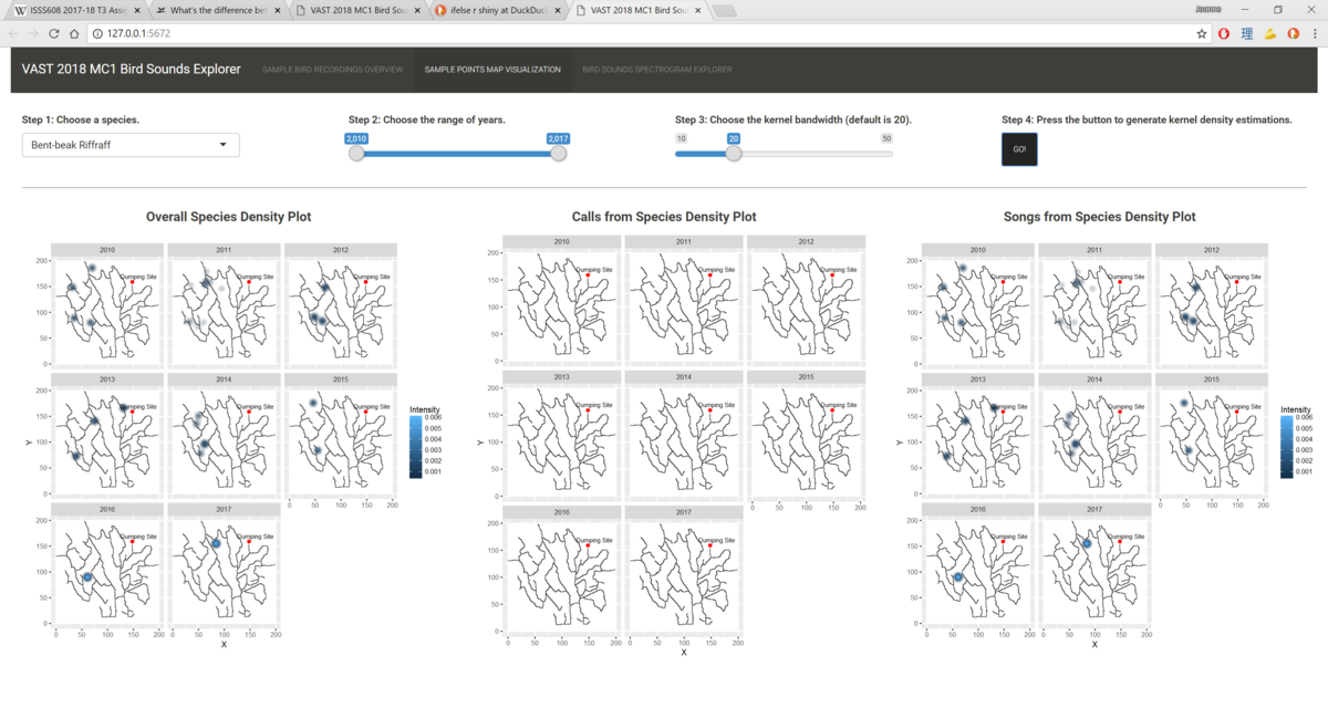
- Choose a species you are interested in.
- Choose the range of years you want to generate the KDE plots for. Due to number of data points available, the application has limited the range of years to be 2010 to 2017.
- Choose the bandwidth you want to use to calculate the KDE. The default is set to 20, as it is able to highlight differences between areas with different intensities while not losing out on showing local variations. A bigger bandwidth results in more widespread kernels and contours, while a smaller bandwidth results in highly localised kernels and contours that almost resemble a point in the diagram. Because the application should ensure a fair comparison of point intensity between different areas of the map and between the three maps, I adopted a fixed bandwidth scheme that is consistent throughout the tab.
- Press the button to generate the plots.
- Mean Spectrum Explorer: The third tab summarizes a statistical method used to compare the correlation between two audio files using heatmap as the visualization tool. Using meanspec method in the seewave package, the mean frequency spectrum (i.e. the mean relative amplitude of the frequency distribution) is calculated for each audio file. Then, using the corspec method in the same package, the similarity between the two mean frequency spectra is calculated. Two key numbers are returned from this method: the maximum correlation value between the two frequency spectra rmax (-1 < rmax < 1) and the frequency offset f between these files that corresponded to rmax expressed in kHz.
During exploration, I discovered that out of these two numbers, the frequency offset is a better indicator of similarity between the two spectra, which is contrary to the common understanding that correlation usually depicts similarity. This is because two dissimilar spectra are also able to achieve a high correlation value but at the expense of a large frequency offset.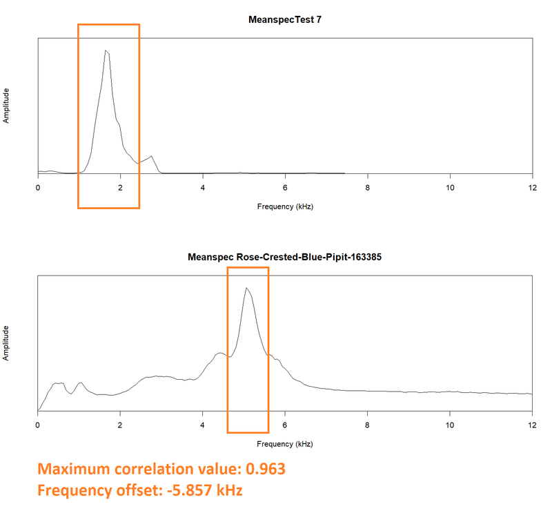
I had tried to calculate the correlation between the fifteen test files and 25 Rose-crested Blue Pipit call files that had "A" quality and were recorded between 2010 and 2017. The summary showed that while there is a small distribution for the correlation value, there is a huge distribution for the frequency offset value. The shortfall of this method is elaborated further in the Insights section.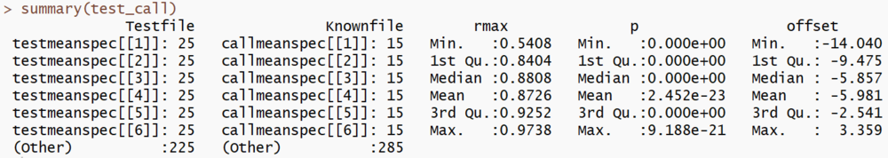
This is a sample screenshot of the third tab layout. Users just choose the species they are interested to compare against the test files, click the button and the application will show a heatmap of the frequency offset figures between the test files and the identified song files of the species. (The tables of frequency offsets between the test files and identified call files have been corrupted, and they will be included in the application before 14 July 2018.)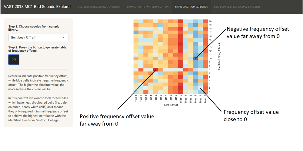
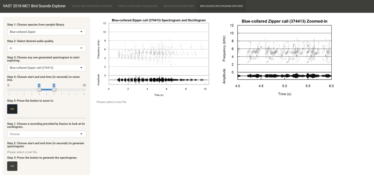
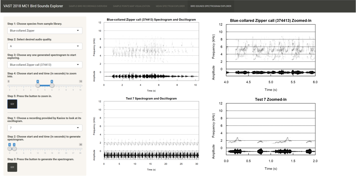
- Birds Spectrogram Explorer: The fourth tab allows users to compare recordings using spectrograms as the main visualization tool. The spectrogram plots time on the x-axis and the frequency of the track at any time point on the y-axis. It also maps the amplitude of the frequency at any time point on a continuous color palette which is typically grey. The louder the sound, the more intense the color.
In this interface, there is a sidebar panel that users navigate to select recordings to inspect their spectrograms and a main page panel that shows the user four plots. The top two plots are for the recording selected from Mistford College, and the bottom two plots are for the recording provided by Kasios. The left two plots show the spectrogram and oscillogram for the full recording, and the right two plots show the zoomed-in spectrogram and oscillogram based on the time range chosen by the user. The workflow is as follows:- Choose one of the 19 species from the files provided by Mistford College which they are interested in.
- Choose the desired quality of the files to filter down the list of recordings. It is highly recommended to choose "A" quality due to the purity of the bird sounds and/or the lack of background noise.
- Choose one of the pre-rendered spectrograms from the dropdown list to get an overview of the characteristics of the sounds made by the species, such as the time interval between each note, the shape and direction of the notes, or the frequency range of the species. Any changes made up to this step will be reflected in the first plot.
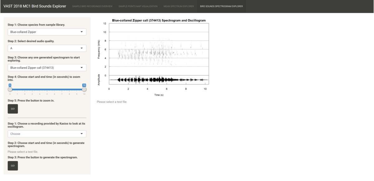
- Choose the time range of the recording you wish to zoom into to get a clearer look on the notes. A recommended time range to zoom into is 2 seconds long.
- Press the button to generate the zoomed-in spectrogram for the known file, which is shown in the second plot.
- Choose one of the 15 test files provided by Kasios that the user is interested in. The pre-rendered spectrogram is shown in the third plot.
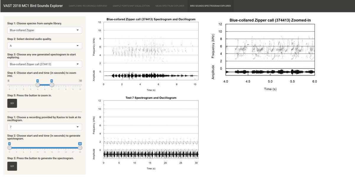
- Choose the time range of the test file you wish to drill into. The length of the time range chosen here should be equivalent to the length of the time range chosen in step 4.
- Press the second button to generate the zoomed-in spectrogram for the test file shown in the fourth plot.


Banner image credit to: Marshal Hedin