ISSS608 2017-18 T3 Assign Song Xuejing Visualization

From Visual Analytics and Applications
Jump to navigation Jump to search

VAST Challenge 2018: Suspense at the Wildlife Preserve
Mini Challenge 2 - Like a duck to water

Background

Methodology & Answer

Dashboard Design

Feedback

Back to main


Dashboard Design


Description Illustration
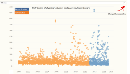
1. Scatter Plot: Distribution of Chemical Values in Past Years and Recent Years
  • Since we want to show the trend of past years and recent years, we therefore define years before 2013 as Past, years after 2013 as Recent.
  • Moreover, map out the color to better disdinguish these two situation. User can choose the chemicals by using the drop down menu.
Scatterplot1.png
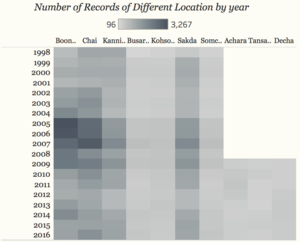
2. Heat Map: Number of Records of Different Location by Year
  • Location arranged by different streams.
  • The darker the color, the higher the value.


Heatmap3.png
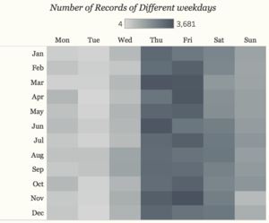
3. Heat Map: Number of Records of Different weekdays
  • All records from 1998 to 2016, arranged by month and weekdays.
  • The darker the color, the higher the value.
Heatmap4.png
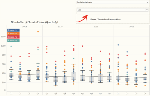
4. Boxplot: Distribution of Chemical Value (Quarterly)
  • Only years from 2013 to 2016 are used.
  • Filter for different streams and chemical measurements.
  • Grey line shows the trend line for each pane.
  • Color mapped by different streams.
Boxplot song.png
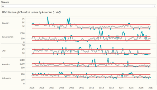
5. Control Chart: Distribution of Chemical Values by Location (1 std)
  • Formulas for upper bound, lower bound and Outliers.
Lowerbound: WINDOW_AVG(SUM([Value])) - (WINDOW_STDEV(SUM([Value])) * 1)
Upperbound: WINDOW_AVG(SUM([Value])) + (WINDOW_STDEV(SUM([Value])) * 1)
Outliers: SUM([Value]) < [Lower Bound] OR SUM([Value]) > [Upper Bound]
  • Map outliers to color, blue means this value exceeds Upperbound or Lowerbound.
  • Filter based on streams.


Controlchart song.png
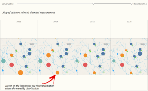
6. Map: Map of Value on Selected Chemical Measurement
  • By changing the different chemical from boxplot, the map will keep changing.
  • The color mapped out by different streams.
  • the circle represent the value of this location, the bigger the circle, the higher the value.
  • Hover on the location point, the tooltip will show the distribution of the selected chemical at this location.
Map song.png