1718t1is428T3
With the continually rising prices of car prices in Singapore and the increasing polarisation of incomes in the country, our group is curious as to discover what have been the changes in the market demand for cars. Going deeper into the market, we will also show how the tastes for car brands have waxed and waned over the years. Demand for cars like Datsun and Supra have disappeared off the roads, while Fords and Audis have taken their places. Are Singaporeans starting to prefer more American and German cars than before? From this visualisation, car manufacturers are able to clearly segment the car market in Singapore and target the right group of buyers.
We aim to deliver a highly interactive web application that allows someone to easily navigate between a large amount of time-series data and geographical data.
Our intended audience is:
- Car dealers to make better forecast for car stock
- Prospective car buyers
- Potential Car Suppliers wanting to enter the Singapore vehicle market
In this project, we will be focusing on the following:
- To discover the trend of registered cars and the COE for different brands across time
- To help consumers discover current and future COE trends for different cars categories (A & B)
- Trends in Singapore car market by brand (geography, market segmentation)
For this visualisation we need a few datasets.
- CIEC - List of car brands and the no. of registered vehicles (TBC)
(Awaiting confirmation by Prof. Kam)
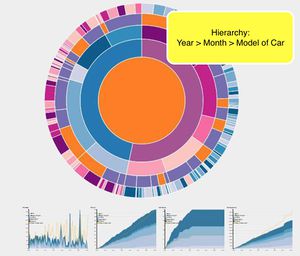
Sunburst Diagram
This type of visualisation shows hierarchy through a series of rings, that are sliced for each category node. Each ring corresponds to a level in the hierarchy, with the central circle representing the root node and the hierarchy moving outwards from it. Colour can be used to highlight hierarchal groupings or specific categories. We believe that a sunburst diagram would be effective as we would be able to visualise the number of cars breaking down from region to country to car brand. We would be using chart since it is easy to implement and interactive.
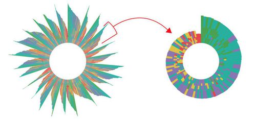
These are some variations of the sunburst that we are considering too.
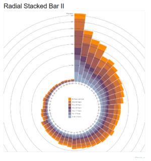
Radial Stackbar chart
We may want to effectively compare the prices. As there would be many elements, a radial stackbar chart will allow the prices to be presented in a single view and not across the screen.
We are considering adding transition from sunburst to radial stackbar chart.
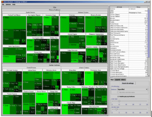
Tree Map
Treemaps are used to display hierarchical data. Treemaps are economical in that they can be used within a limited space and yet display a large number of items simultaneously. We chose to use tree map, because it would give an overview of the number of cars registered by brand.
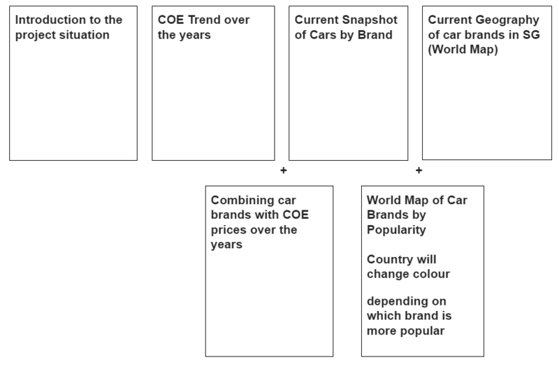
Our Group has decided on the below storyboard in order to make it clear for users to have an overview of the geographical, car brand, prices across time.
| Technical Challenges | Mitigation Plan |
|---|---|
| Obtaining datasets |
|
| Acquiring Data, Data Cleaning |
|
| Using d3.js and Highchart to display the visualisations which we want |
|
| Unfamiliarity in Implementing Interactivity and Animation Tools/Techniques in Visualization App |
|
| Tasks | Duration | Resource | Status |
|---|---|---|---|
| 1. Iteration 1 | |||
| 1.1 Brain Storm of Topics | Week 6-7 | All | Completed |
| 1.2 Decide and search for availability of data | Week 8 | All | Completed |
| 1.3 Change to a new topic & Data Gathering/Cleaning | Week 9 | All | In Progress |
| 2. Iteration 2 | |||
| 2.1 Designing of Prototype & Technical Learning | Week 10 | All | In Progress |
| 2.2 Technical Learning | Week 11 | All | In Progress |
| 2.3 Designing of Poster & Visualization Application Development | Week 12 | By brand: Cheryl, By region: Sarah, By country: Kang Li | In Progress |
| 3. Iteration 3 | |||
| 3.1 Visualization Application Development & Intergation | Week 13 | All | In Progress |
| 3.2 Research Paper + Final Amendments | Week 14 | All | In Progress |
Our team has decided to focus on these few tools and libraries in order to showcase our product.
- D3.js
- HighChart.js
- Tableau
- Notepad++
- Adobe PhotoShop
- What influences COE prices?
https://www.gov.sg/factually/content/what-influences-coe-prices
Please share with us your feedback! :)
