Difference between revisions of "1718t1is428T10"
| Line 1: | Line 1: | ||
| − | [[File:teamveglogo.jpg| | + | [[File:teamveglogo.jpg|200px|frameless|center]] |
<p></p><br/> | <p></p><br/> | ||
Revision as of 00:29, 16 October 2017
Contents
Problem and Motivation
We want to look into how much market share Singapore actually has in its Top 15 visitor arrival countries.
Based on the 2016 Marketing Report by Singapore Tourism Board (STB), STB has plans to grow Singapore’s tourism industry and one of the key questions they have while approaching their market portfolio is What is the growth potential for our current and potential markets?
We believe that despite knowing that these are the top 15 visitor countries, it is important not to miss out on whether Singapore has room to grow and maximize its market share in these countries in order to sustain its growth.
Even as Indonesia, China, and India ranks as the top three countries that are contributing to Singapore’s booming tourism sector, we seek to dig deeper to find out the actual population within these the top 15 countries that are coming to Singapore. Has Singapore really won majority of their citizens over? This project seeks to provide an interactive visualization to aid in deriving more information.
Background Survey of Related Works
| Visualizations | Explaination |
|---|---|

|
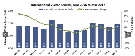
This visualisation comprises of two charts in one - a time-series line chart, and a bar chart, which compares the international visitor arrival with the year on year change. Despite the limitations with this visualisation (seemingly confusing), the team feels that it is necessary to give a broad overview of the overall trend in relation to the total number of visitors. Additionally, it would be good to subsequently break this down to enable zooming into a certain country's monthly changes. |

|
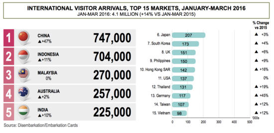
The bar chart allow user to compare data between the countries. Next to each bar, we will indicate whether the number of visitors increases or decreases from the previous year, and how much different is the percentage. This chart is to let our user get a rough gauge of the number of visitors to Singapore. |

|
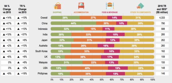
The used of stacked horizontal bar charts is an effective way of demonstrating the distribution of tourists by country. The columns allow us to show the net change in visitors to Singapore, on whether it's increased or decreased with respect to the changes in population. This chart allows users to understand the proportion of overseas visitors to Singapore in contrast to other destinations they have traveled to. |
Tools / Libraries
-Microsoft Excel
-D3.js
-Chart.js
-JQuery
-Github
-Tableau
Technical Challenges
| Key Technical Challenges | Proposed Solution |
|---|---|
| |
|
Roles & Milestones
- Project Timeline
References
- D3.js: https://d3js.org/
- Singapore Inbound Tourism Data: https://www.stb.gov.sg/statistics-and-market-insights/Pages/statistics-Visitor-Arrivals.aspx
- Singapore Tourism Board Marketing Strategy Report 2016: https://www.stb.gov.sg/news-and-publications/publications/Documents/Marketing_Strategy-Of_Stories_Fans_and_Channels.pdf
- CEIC Database: https://www.ceicdata.com/en
Search
Go
Main Page
Course information
Project Groups
Recent changes
Terms of use
Wiki Policy
Intellectual Property
Help
Tools
What links here
Related changes
Upload file
Special pages
Page information
Privacy policyAbout Visual Analytics for Business IntelligenceDisclaimersPowered by MediaWiki

