Difference between revisions of "1718t1is428T3"
m |
m |
||
| Line 176: | Line 176: | ||
|| | || | ||
<center>This dataset will be used to track the car demand of the consumers and their willingness to buy a car in Singapore</center> | <center>This dataset will be used to track the car demand of the consumers and their willingness to buy a car in Singapore</center> | ||
| + | |- | ||
| + | | | ||
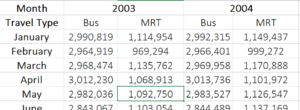
| + | <p><center>'''[https://public.tableau.com/views/2016Ridership_Public/PTRidershipDashboard?:embed=y&:display_count=yes&publish=yes&:showVizHome=no Public Transport Ridership]''' </center></p> | ||
| + | [[File:Public_transport_dataset.PNG|center|300px]] | ||
| + | || | ||
| + | * Month | ||
| + | * Year | ||
| + | * Average Monthly Bus Ridership | ||
| + | * Average Monthly Train Ridership | ||
| + | || | ||
| + | <center>This dataset will be used for the visualisation of the correlation between public transport ridership growth and COE price growth</center> | ||
|- | |- | ||
|} | |} | ||
Revision as of 23:08, 26 November 2017
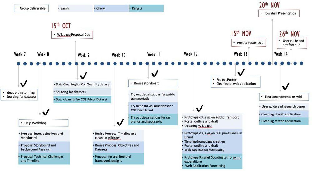
A recent news article highlights Singapore's struggle between owning cars and taking public transportation. "The Big Read: Despite push for public transport, a love for cars endures" The government has been making a conscientious effort to promote the utilization of the public transport and dissuade the public from driving. Apart from improving the transport system, there are deterrent measures such as a Certificate of Entitlement (COE) bidding system, high carpark rates, high taxes and the dreaded ERPs.
Out of these factors, the COE not only takes up the largest proportion of income spent on cars, its significant fluctuations are discussed the most frequently with a bid occurring every twice a month. Data Autolytics serves to explore the relationship between the existing COE prices and public transport. With our current infrastructure, are people really be dissuaded by even higher COE prices? Or does the government need to have more pull factors to woo people to using the public transport?
The push for more quantifiable analysis in Singapore have made current resources data-rich but information poor. Presently, there are many sources of fragmented datasets on the vehicle population. There is a need for policy makers, industry professionals and the everyday Singaporean to be able to easily access understand the transport landscape before they make informed decisions on policies or drive for change. To be able to do so, they need to be able to access the data from a central location and have the numbers tell a story in a way which they can easily understand and analyse. By piecing the parts together, we hope to give a more complete picture and help our audiences make more informed decisions.
We aim to deliver an interactive web application that allows someone to easily access and navigate a large amount of time-series data.
Our intended audiences are:
- Car suppliers dealers to make better forecasts
- Prospective car buyers
- Government and policy makers regarding vehicle overpopulation
In this project, we will be focusing on the following:
- Different price sensitivities of car buyers
- The market share of car brands
- The proportion of transport expenditure to the transport tax revenue collected
- The effectiveness of COE prices in encouraging public transport ridership
| Related Works | Relevant and Useful Features |
|---|---|
|
|
|
|
|
|
|
|
|
|
|
|
|
|
|
| Proposed Visualization | Explanation |
|---|---|
|
|
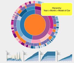
This type of visualisation shows hierarchy through a series of rings, that are sliced for each category node. Each ring corresponds to a level in the hierarchy, with the central circle representing the root node and the hierarchy moving outwards from it. Colour can be used to highlight hierarchal groupings or specific categories. We believe that a sunburst diagram would be effective as we would be able to visualise the number of cars breaking down from region to country to car brand. We would be using chart since it is easy to implement and interactive. These are some variations of the sunburst that we are considering too. |
|
|
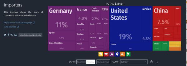
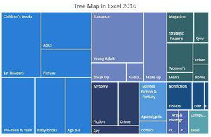
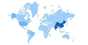
Treemaps are used to display hierarchical data. Treemaps are economical in that they can be used within a limited space and yet display a large number of items simultaneously. We chose to use a tree map, because it would give an overview of the amount spent on different car brands, car brands of similar regions would be grouped with same colour. The cars would be grouped by continent. When the cursor hovers over the continent, the geographic heatmap will be displayed to show the country distribution for that continent. |
|
|
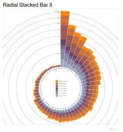
We may want to effectively compare the COE prices. As there would be many years and months of COE, a radial stackbar chart will allow the prices to be presented in a single view and not across the screen. This is a non traditional take of the bar chart. |
| Dataset/Source | Data Attribute | Rationale of Usage |
|---|---|---|
|
|
|
|
|
|
|
|
|
|
|
|
|
|
|
|
| Technical Challenges | Mitigation Plan |
|---|---|
| Obtaining datasets |
|
| Acquiring Data, Data Cleaning |
|
| Using d3.js and Highchart to display the visualisations which we want |
|
| Unfamiliarity in Implementing Interactivity and Animation Tools/Techniques in Visualization App |
|
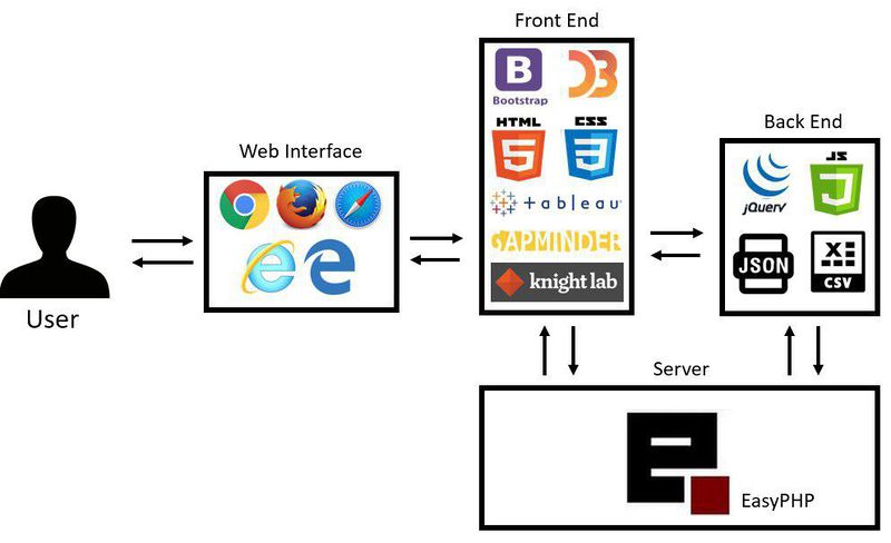
Our team has decided to focus on the following tools and libraries to create the visualisations and analysis
- D3.js
- HighChart.js
- Tableau
- Notepad++
- Adobe PhotoShop
- What influences COE prices?: https://www.gov.sg/factually/content/what-influences-coe-prices
- D3.js: https://d3js.org/
- CEIC Database: https://www.ceicdata.com/en
Please share with us your feedback! :)
Prof In class review: Project intro and motivation need review, get a full appreciation of data, data rich - information poor, need effort to consolidate. Technically this data is someone who collected through various sources to put it through LTA, consolidated info in LTA repo, one of this web data service provider, they actually subscribe to LTA, they distribute through their paid portal, unless you know a query search for vertical form. Need effort to organize it to do a proper analysis. Understand how the structure of data looks like, to create data visualization. The current data structure of what you download from CEIC, dont have hierarchical structure, so need to reorganize the data in hierarchy ways to have hierarchical structure. Organize data to be in line with visualization else cant realise it. Be more specific in the motivation. Data sets are generic cant see the real data, need provide screenshot to see how it looks like. Reviewing diff is good. Timeline need to be updated. Tech and tools need review.
