Difference between revisions of "1718t1is428T3"
m |
m |
||
| Line 191: | Line 191: | ||
<div style="background: #006768; padding: 15px; font-weight: bold; line-height: 0.3em; text-indent: 15px; font-size: 20px;margin-top:25px"><font color=#FFFFFF>Project Timeline</font></div> | <div style="background: #006768; padding: 15px; font-weight: bold; line-height: 0.3em; text-indent: 15px; font-size: 20px;margin-top:25px"><font color=#FFFFFF>Project Timeline</font></div> | ||
| − | [[File:TimelineVA.jng|center| 850px]] | + | |
| + | [[File:TimelineVA.jng|center|850px]] | ||
| + | |||
| + | |||
<div style="border-left: #008080 solid 12px; padding: 0px 30px 0px 18px; font-family: Arial, Helvetica;"><hr /> | <div style="border-left: #008080 solid 12px; padding: 0px 30px 0px 18px; font-family: Arial, Helvetica;"><hr /> | ||
{| class="wikitable" | {| class="wikitable" | ||
Revision as of 18:16, 1 November 2017
With the continually rising prices of car prices in Singapore and the increasing polarisation of incomes in the country, our group intends to discover what have been the changes in the market demand for cars. Going deeper into the market, we will also show how the tastes for car brands have waxed and waned over the years. Demand for cars like Datsun and Supra have disappeared off the roads, while Fords and Audis have taken their places. Are Singaporeans starting to prefer more American and German cars than before? From the visualisations, we hope our users will be able to clearly segment the car market in Singapore and target the right group of buyers for their businesses.
We aim to deliver a highly interactive web application that allows someone to easily navigate between a large amount of time-series data and geographical data.
Our intended audience are:
- Car dealers to make better forecast for car stock
- Prospective car buyers
- Potential Car Suppliers wanting to enter the Singapore vehicle market
In this project, we will be focusing on the following:
- To discover the trend of registered cars and the COE for different brands across time
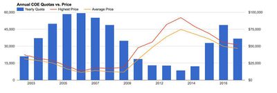
- To help consumers discover current and future COE trends for different cars categories (A & B)
- Trends in Singapore car market by brand (geography, market segmentation)
| Dataset/Source | Data Attribute | Rationale of Usage |
|---|---|---|
|
|
|
|
|
|
|
|
|
|
|
|
| Related Works | What We Can Learn |
|---|---|
|
|
|
|
|
|
|
|
|
| Proposed Visualization | Explanation |
|---|---|
|
|
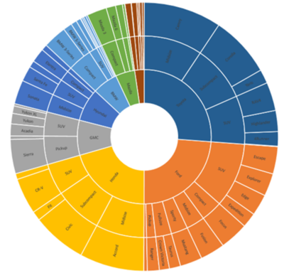
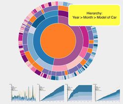
This type of visualisation shows hierarchy through a series of rings, that are sliced for each category node. Each ring corresponds to a level in the hierarchy, with the central circle representing the root node and the hierarchy moving outwards from it. Colour can be used to highlight hierarchal groupings or specific categories. We believe that a sunburst diagram would be effective as we would be able to visualise the number of cars breaking down from region to country to car brand. We would be using chart since it is easy to implement and interactive. These are some variations of the sunburst that we are considering too. |
|
|
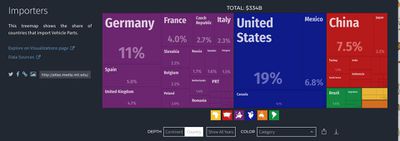
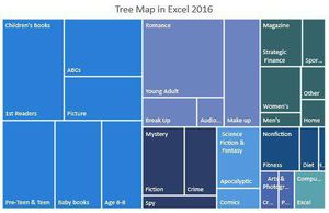
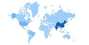
Treemaps are used to display hierarchical data. Treemaps are economical in that they can be used within a limited space and yet display a large number of items simultaneously. We chose to use a tree map, because it would give an overview of the amount spent on different car brands, car brands of similar regions would be grouped with same colour. The cars would be grouped by continent. When the cursor hovers over the continent, the geographic heatmap will be displayed to show the country distribution for that continent. |
|
|
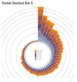
We may want to effectively compare the COE prices. As there would be many years and months of COE, a radial stackbar chart will allow the prices to be presented in a single view and not across the screen. This is a non traditional take of the bar chart. |
| Technical Challenges | Mitigation Plan |
|---|---|
| Obtaining datasets |
|
| Acquiring Data, Data Cleaning |
|
| Using d3.js and Highchart to display the visualisations which we want |
|
| Unfamiliarity in Implementing Interactivity and Animation Tools/Techniques in Visualization App |
|
| Tasks | Duration | Resource | Status |
|---|---|---|---|
| 1. Iteration 1 | |||
| 1.1 Brain Storm of Topics | Week 6-7 | All | Completed |
| 1.2 Decide and search for availability of data | Week 8 | All | In Progress |
| 1.3 Data Gathering/Cleaning and Dashboard Skeleton | Week 9 | All | Not yet started |
| 2. Iteration 2 | |||
| 2.1 Dashboard & Technical Learning (First Draft) | Week 10 | Sunburst: Kang Li, TreeMap: Sarah, Radial Bar Chart: Cheryl | Not yet started |
| 2.2 Dashboard Integrated (Second Draft) | Week 11 | All review one another's portion | Not yet started |
| 2.3 Finalize Dashboard, obtain feedback from users | Week 12 | All | Not yet started |
| 3. Iteration 3 | |||
| 3.1 Designing of Poster, Update Wiki Pages, User Guide & Research Paper | Week 13 | Poster/Wiki: Cheryl, User Guide: Sarah, Research Paper: Kang Li | Not yet started |
| 3.2 Completion of Research Paper, Final Amendments and Update Wiki | Week 14 | All | Not yet started |
Our team has decided to focus on these few tools and libraries in order to showcase our product.
- D3.js
- HighChart.js
- Tableau
- Notepad++
- Adobe PhotoShop
- What influences COE prices?: https://www.gov.sg/factually/content/what-influences-coe-prices
- D3.js: https://d3js.org/
- CEIC Database: https://www.ceicdata.com/en
Please share with us your feedback! :)
Prof In class review: Project intro and motivation need review, get a full appreciation of data, data rich - information poor, need effort to consolidate. Technically this data is someone who collected through various sources to put it through LTA, consolidated info in LTA repo, one of this web data service provider, they actually subscribe to LTA, they distribute through their paid portal, unless you know a query search for vertical form. Need effort to organize it to do a proper analysis. Understand how the structure of data looks like, to create data visualization. The current data structure of what you download from CEIC, dont have hierarchical structure, so need to reorganize the data in hierarchy ways to have hierarchical structure. Organize data to be in line with visualization else cant realise it. Be more specific in the motivation. Data sets are generic cant see the real data, need provide screenshot to see how it looks like. Reviewing diff is good. Timeline need to be updated. Tech and tools need review.

