IS428 2017 18T1 Group01 Proposal-version2
StackOverflow is the largest, most trusted online community for developers to learn, share their programming knowledge, and build their careers. This is achieved through questions and answers posted on the site that concerns a wide range of topics related to computer programming. The success of such a platform depends on high quality questions and answers contributed by an engaged community. Thus, some measures to screen for quality includes using ‘badges’ to signify reputation for users, votes on post (upvote or downvote) and using community administrators to close questions that have been answered before or are irrelevant.
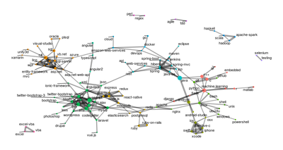
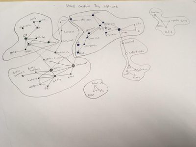
To sustain its popularity and success, the site needs to continually draw new knowledge from its users in the fast-paced software field. In addition, these said users must constantly be engaged to contribute to the site. As such, StackOverflow can better understand the relationships of its users and the topics that they engage in through data visualisation tools such as network graphs. By understanding social interactions better, it can guide StackOverflow to make necessary changes to keep its user base continually engaged. For instance, if StackOverflow notices a significant group of users with high upvotes for posts but do not post frequently, it can think of how can they encourage such users to use the platform regularly.
Objectives Some of the general problems (questions) that we wish to address are namely:
- What questions are more likely to be answered and which questions are answered promptly?
- What are the popular subcommunities and who are the biggest contributors?
- What is the distribution of experience levels within each community
- Measured by badges
- Measured by posts
- Measured by upvoted posts (or comments)
- Measured by years of experience on StackOverflow
- Who are the influential members within each StackOverflow subcommunity?
And because we are aspiring data analytics practitioners, here are some specific problems (questions) that we wish to address.
- What are the little known technologies that are used for data analytics?
- What do influential members in Stackoverflow know? Are we able to create a competency list of these members?
| Dataset/Source | Data Attributes |
|---|---|
| Badges
https://archive.org/download/stackexchange/stackoverflow.com-Badges.7z |
|
| Comments
https://archive.org/download/stackexchange/stackoverflow.com-Comments.7z |
|
| Posts
https://archive.org/download/stackexchange/stackoverflow.com-Posts.7z |
|
| Postlinks
https://archive.org/download/stackexchange/stackoverflow.com-PostLinks.7z |
|
| Users
https://archive.org/download/stackexchange/stackoverflow.com-Users.7z |
|
| Votes
https://archive.org/download/stackexchange/stackoverflow.com-Votes.7z |
|
| Related Works | What We Can Learn |
|---|---|
| Stack Overflow Trends |
|
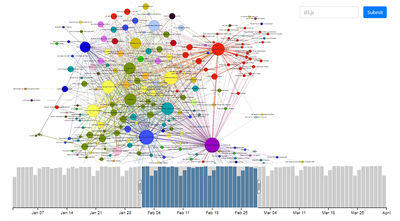
| Stack Overflow Tag Network
Source: https://www.kaggle.com/juliasilge/network-graph/code |
|
| Sketches | How Analyst Can Conduct Analysis |
|---|---|
| Stack Overflow Trends (Sketches)
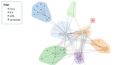
Stack Overflow Trends (Proposed Layout) Source: http://bl.ocks.org/larskotthoff/4e5dbf8be2c83631a05b |
|
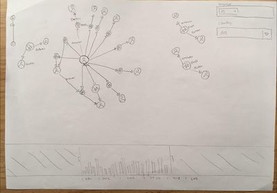
| Network Analysis (Sketches)
Network Analysis (Proposed Layout) |
|
- Storing a extremely large network of StackOverflow posts, comments and users in a graph database and creating indexes for fast retrieval.
- Using StackOverflow API to retrieve information on-demand and transform the data into insight on the visualization.
- Learning how to use the relevant tools for graph analysis such as neo4j, vis.js, sigma.js and D3.js
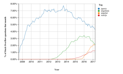
http://sotagtrends.com This web application plots the number of questions asked over time by tags on Stackoverflow. Examples of tags include “node.js”, “d3.js” and “python”. Multiple tags can be added by the user and the user can also toggle a relative comparison across the tags. Other interesting features this visualization has includes a moving reference line that slides along the X-axis, showing the exact number of questions asked for each tag.
https://insights.stackoverflow.com/survey/2017 This report created by SO describe insights about SO users using data collected through their annual developer survey. Visualizations used here are simple but effective charts – bar charts, scatter plots and line charts – that describe intriguing phenomena such as preferred programming languages among ethnicities, representation of women in technology roles and correlated technologies used by developers.

