IS428 2017-18 T1 Assign Zhang Qian
Visual Analytics Assignment
Contents
Overview
"Mistford is a mid-size city is located to the southwest of a large nature preserve. The city has a small industrial area with four light-manufacturing endeavors. Mitch Vogel is a post-doc student studying ornithology at Mistford College and has been discovering signs that the number of nesting pairs of the Rose-Crested Blue Pipit, a popular local bird due to its attractive plumage and pleasant songs, is decreasing! The decrease is sufficiently significant that the Pangera Ornithology Conservation Society is sponsoring Mitch to undertake additional studies to identify the possible reasons. Mitch is gaining access to several datasets that may help him in his work, and he has asked you (and your colleagues) as experts in visual analytics to help him analyze these datasets.
Mitch Vogel was immediately suspicious of the noxious gases just pouring out of the smokestacks from the four manufacturing factories south of the nature preserve. He was almost certain that all of these companies are contributing to the downfall of the poor Rose-crested Blue Pipit bird. But when he talked to company representatives and workers, they all seem to be nice people and actually pretty respectful of the environment.
In fact, Mitch was surprised to learn that the factories had recently taken steps to make their processes more environmentally friendly, even though it raised their cost of production. Mitch discovered that the state government has been monitoring the gaseous effluents from the factories through a set of sensors, distributed around the factories, and set between the smokestacks, the city of Mistford and the nature preserve. The state has given Mitch access to their air sampler data, meteorological data, and locations map. Mitch is very good in Excel, but he knows that there are better tools for data discovery, and he knows that you are very clever at visual analytics and would be able to help perform an analysis."
Assumptions
• Since the “Date time” in “Sensor Data” only have whole hours (E.g. “4/1/16 4:00”, “4/1/16 6:00”), it is assumed that the sensor detect chemicals on an hourly basis and each timestamp should have one record.
• Due to limited information given, it is assumed that missing record for a particular timestamp is considered abnormal behavior.
Questions
Tableau Public Link
Q1
1) Characterize the sensors’ performance and operation.
As for sensors’ performance and operation, we characterize different sensors based on their noise.
For monitor 1,2,8, there are less noise. For monitor 1 and 2, the noise occurs along three months. However, for monitor 8, the noise only appears on April and December.
For monitor 5,6,9, there are more noise and the noise appear along three months.
For monitor 3, 7 there are mild level of noise.
For monitor 4, there is an obvious shift up of the baseline readings among April, August and December.
2) Are they all working properly at all times? Can you detect any unexpected behaviors of the sensors through analyzing the readings they capture?
• Missing data points on Midnight
There are a lot of common missing data points founded at 0 o’clock for all sensors and for every chemical detection. The graph below shows for the total number of records reported from each monitor for a specific chemical at each hour on every day of that month. For example, the red circle indicates that for monitor 1, there are missing records for “Appluimonia” at 0 o’clock on April 2nd and April 7th.
• Duplicate data points for “AGO-3A”
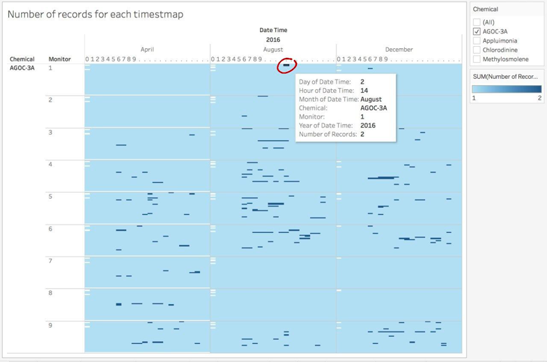
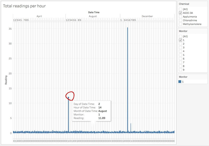
For “AGO-3A” chemical, there are a lot of duplicate records and there are a larger than usual value and a smaller value. As I deep dive into these greater value, I found that these data points result in a dramatic increase in the sum of readings for that hour. For example, as indicated by the following graphs, when monitor 1 detecting “AGOC-3A”, there are two records at 14:00 August 2nd. When we turn to “Total readings per hour”, It is obvious the total readings at 14:00 August 2nd is much higher than the rest records. Thus, I assume the higher value of these duplicates data points is considered as outliers and should be removed.
• Missing data points for detecting “Methylosmolene”
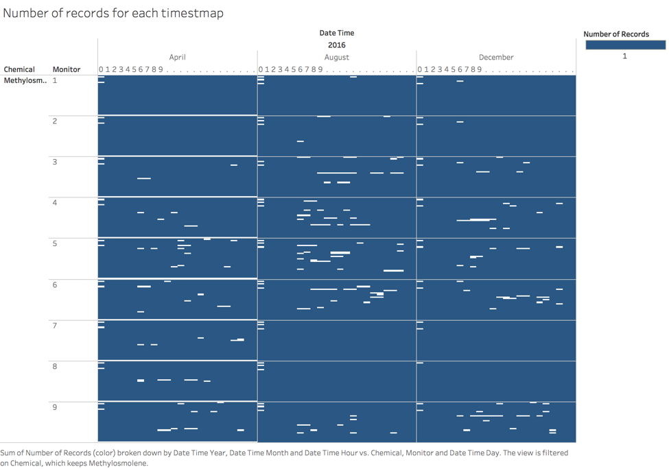
I found that there are a lot of missing data points for chemical “Methylosmolene”. Although there are some common missing data in the midnight, but the record missing is more severe for “Methylosmolene” detection than it in other chemical detection.
• Exceptions
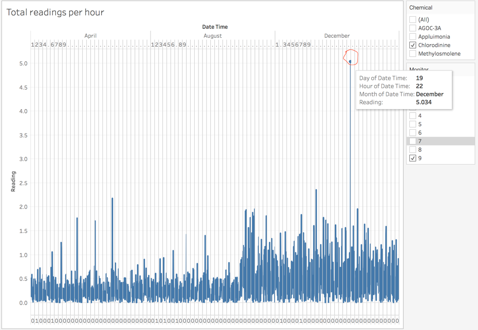
There are some data points in this dataset which is abnormally high. For example, in the figure below, the reading of “Chlorodinine” for monitor 9 at 22:00 on December 19th is 5.034 and much higher than usual while the rest data points for are all below 2.5.
Q2
Data Preparation
Since some unexpected behaviors of sensors have been identified in question 1, the first thing to do is to remove the outliers and clean the data. As mentioned in the question 1, duplicate data points only found in “AGOC-3A” detection and one of the reading number is often higher than usual. Thus, I assume that those duplicate records with higher reading results from abnormal sensor detection and should be removed. I use the following VBA program to remove these outliers. The total number of records are reduced from 79243 (excluding header line) to 79029.
1) Which chemicals are being detected by the sensor group?
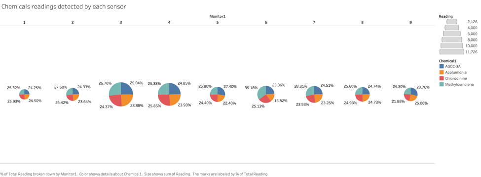
I use pie charts to find out which chemicals are detected by which sensor group. As shown in the figure above, each individual pie chart represents a monitor and the size of the pie chart represents the total number of readings it has. So we can see that monitor 3 and monitor 4 has largest readings while monitor 1 has the least readings. For each monitor, it is divided into four parts, representing the percentage of the readings for “AGOC-3A”, “Appluimonia”, “Chlorodinine”, “Methylosmolene”. According to this graph, all sensors are detecting four chemicals. The percentage of each chemicals detected by each monitor (except monitor 6) are roughly the same (around 22% to 29%).
2) What patterns of chemical releases do you see, as being reported in the data?
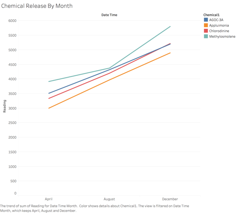
Pattern 1: For each chemical, the release amount is increasing month over month. As shown in the figure below, the sum of reading for each chemical is increasing over the month. Also the release amount of “Methylosmolene” is always the largest, followed by “AGOC-3A”, “Chlorodinine” and “Appluimonia”.
Pattern 2:
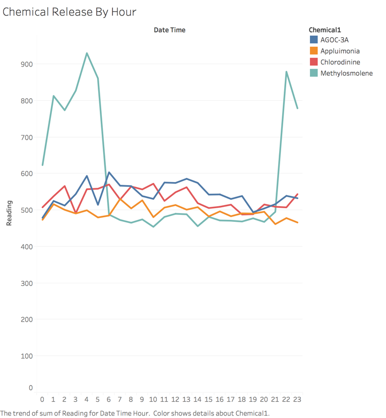
As shown in the figure below, the release of “Methylosmolene” follows a daily pattern. The detected amount of this chemical is greater during 10pm to 5am next morning. It has a dramatic decrease between 5 am and 6 am and a remarkable increase between 9pm and 10pm. While the release of the rest chemicals are not highly influence by different hours in a day.
Q3
Data Preparation
-Add the company location data into “Sensor Location.xlsx”
-Connect the "Sensor Data" to the "Sensor Location" data and fuller join them.
-Create index variable with the following script in "Meteorological Data"
"If [Wind Direction] > 0 AND [Wind Direction] <= 22.5 THEN 11.25 ELSEIF [Wind Direction] > 22.5 AND [Wind Direction] <= 45 THEN 33.75 ELSEIF [Wind Direction] > 45 AND [Wind Direction] <= 67.5 THEN 56.25 ELSEIF [Wind Direction] > 67.5 AND [Wind Direction] <= 90 THEN 78.75 ELSEIF [Wind Direction] > 90 AND [Wind Direction] <= 112.5 THEN 101.25 ELSEIF [Wind Direction] > 112.5 AND [Wind Direction] <= 135 THEN 123.75 ELSEIF [Wind Direction] > 135 AND [Wind Direction] <= 157.5 THEN 146.25 ELSEIF [Wind Direction] > 157.5 AND [Wind Direction] <= 180 THEN 168.75 ELSEIF [Wind Direction] > 180 AND [Wind Direction] <= 202.5 THEN 191.25 ELSEIF [Wind Direction] > 202.5 AND [Wind Direction] <= 225 THEN 213.75 ELSEIF [Wind Direction] > 225 AND [Wind Direction] <= 247.5 THEN 236.25 ELSEIF [Wind Direction] > 247.5 AND [Wind Direction] <= 270 THEN 258.75 ELSEIF [Wind Direction] > 270 AND [Wind Direction] <= 292.5 THEN 281.25 ELSEIF [Wind Direction] > 292.5 AND [Wind Direction] <= 315 THEN 303.75 ELSEIF [Wind Direction] > 315 AND [Wind Direction] <= 337.5 THEN 326.25 ELSEIF [Wind Direction] > 337.5 AND [Wind Direction] <= 360 THEN 348.75 END"
-create a variable X with the following script in "Meteorological Data"
"IIF([index]=1 OR [index]=WINDOW_MAX([index]),0, WINDOW_MAX([Radius])
- SIN(RADIANS(avg([Wind Direction]))))"
-create a variable Y with the following script in "Meteorological Data"
"IIF([index]=1 OR [index]=WINDOW_MAX([index]),0, WINDOW_MAX([Radius])
- COS(RADIANS(AVG([Wind Direction]))))"
-create a variable Radius with the following script in "Meteorological Data"
"WINDOW_SUM(COUNT([Wind Speed (m/s)]))"
Which factories are responsible for which chemical releases?
Radiance-->Methylosmolene
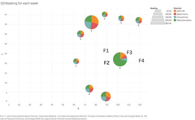
As shown in the graph below, the diagrams “Q3 wind rose for each week” shows the wind direction and speed in week 14 (first week of April). At this point, I will focus on the readings of monitor 6, which has detected “Methylosmolene” in week 14. It is very obvious the wind direction is from north east side and the Factory 3 (Radiance) is at the northeastern corner of the monitor 6. In that case, I can conclude that Radiance is responsible for “Methylosmolene” emission.
Indigo-->Chlorodinine
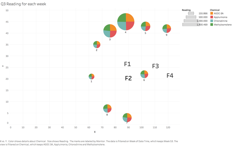
As shown in the graph below, the diagrams “Q3 wind rose for each week” shows the wind direction and speed in week 53 (last week of December). At this point, I will focus on the readings of monitor 6, which has majorly detected “Chlorodinine” in week 53. It is very obvious the wind direction is from east side and the Factory 4 (Indigo) is at the eastern corner of the monitor 6. In that case, I can conclude that Indigo is responsible for “Chlorodinine” emission.
Radiance-->AGOC-3A
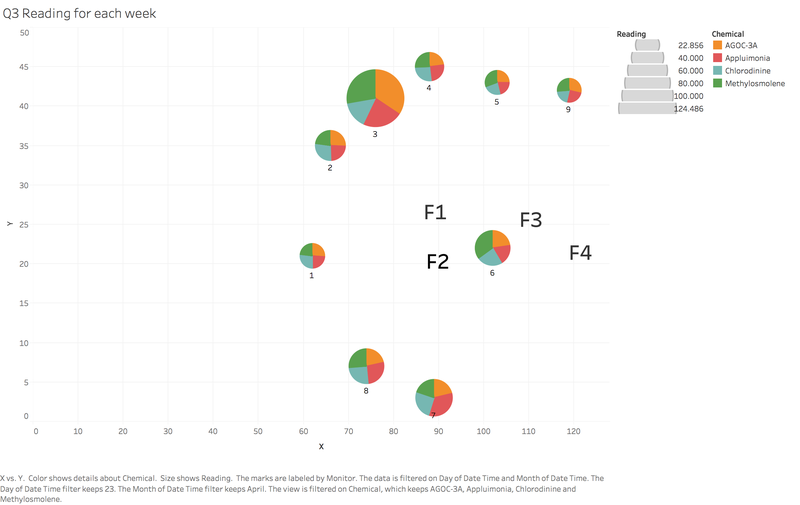
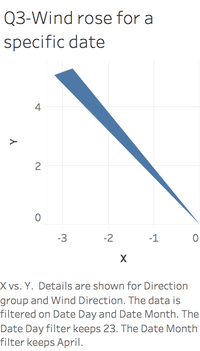
As shown in the graph below, the diagrams “Q3 wind rose for each week” shows the wind direction and speed in on April 23rd. At this point, I will focus on the readings of monitor 3, which has detected “AGOC-3A” on April 23rd. It is very obvious the wind direction is from south east and the Factory 1 (Roadrunner) is at the southeastern corner of the monitor 3. Also Factory 1 is the nearest to monitor 3 in the wind direction. In that case, I can conclude that Radiance is responsible for “AGOC-3A” emission.
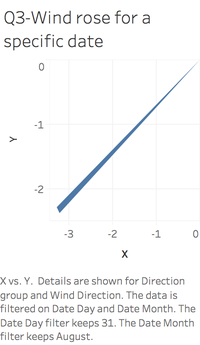
Kasios-->Appluimonia
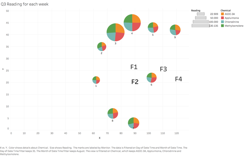
As shown in the graph above, the diagrams “Q3 wind rose for each week” shows the wind direction and speed in on August 31st. At this point, I will focus on the readings of monitor 8, which has detected “Appluimonia” on August 31st. It is very obvious the wind direction is from north east side and the Factory 1 (Kasios) is at the northeastern corner of the monitor 8. In that case, I can conclude that Kasios is responsible for “Appluimonia” emission.


