IS428 2017-18 T1 Assign Yorisan Khosugi
Contents
Overview
Mistford is a mid-size city is located to the southwest of a large nature preserve. The city has a small industrial area with four light-manufacturing endeavors. Mitch Vogel is a post-doc student studying ornithology at Mistford College and has been discovering signs that the number of nesting pairs of the Rose-Crested Blue Pipit, a popular local bird due to its attractive plumage and pleasant songs, is decreasing! The decrease is sufficiently significant that the Pangera Ornithology Conservation Society is sponsoring Mitch to undertake additional studies to identify the possible reasons. Mitch is gaining access to several datasets that may help him in his work, and he has asked you (and your colleagues) as experts in visual analytics to help him analyze these datasets.
Mitch Vogel was immediately suspicious of the noxious gases just pouring out of the smokestacks from the four manufacturing factories south of the nature preserve. He was almost certain that all of these companies are contributing to the downfall of the poor Rose-crested Blue Pipit bird. But when he talked to company representatives and workers, they all seem to be nice people and actually pretty respectful of the environment.
In fact, Mitch was surprised to learn that the factories had recently taken steps to make their processes more environmentally friendly, even though it raised their cost of production. Mitch discovered that the state government has been monitoring the gaseous effluents from the factories through a set of sensors, distributed around the factories, and set between the smokestacks, the city of Mistford and the nature preserve. The state has given Mitch access to their air sampler data, meteorological data, and locations map. Mitch is very good in Excel, but he knows that there are better tools for data discovery, and he knows that you are very clever at visual analytics and would be able to help perform an analysis.
The Task
General task
The four factories in the industrial area are subjected to higher-than-usual environmental assessment, due to their proximity to both the city and the preserve. Gaseous effluent data from several sampling stations has been collected over several months, along with meteorological data (wind speed and direction), that could help Mitch understand what impact these factories may be having on the Rose-Crested Blue Pipit. These factories are supposed to be quite compliant with recent years’ environmental regulations, but Mitch has his doubts that the actual data has been closely reviewed. Could visual analytics help him understand the real situation?
The primary job for Mitch is to determine which (if any) of the factories may be contributing to the problems of the Rose-crested Blue Pipit. Often, air sampling analysis deals with a single chemical being emitted by a single factory. In this case, though, there are four factories, potentially each emitting four chemicals, being monitored by nine different sensors. Further, some chemicals being emitted are more hazardous than others. Your task, as supported by visual analytics that you apply, is to detangle the data to help Mitch determine where problems may be. Use visual analytics to analyze the available data and develop responses to the questions below.
The specific tasks
1. Characterize the sensors’ performance and operation.
a. Are they all working properly at all times?
b. Can you detect any unexpected behaviors of the sensors through analyzing the readings they capture?
Limit your response to no more than 9 images and 1000 words.
2. Now turn your attention to the chemicals themselves.
a. Which chemicals are being detected by the sensor group?
b. What patterns of chemical releases do you see, as being reported in the data?
Limit your response to no more than 6 images and 500 words.
3. Which factories are responsible for which chemical releases?
a. Carefully describe how you determined this using all the data you have available.
b. For the factories you identified, describe any observed patterns of operation revealed in the data.
Limit your response to no more than 8 images and 1000 words.
Answers
Qn 1. Sensors' performance and operation
Qn 1.a. Are the sensors working properly at all times?
Tableau Public link for Q1a: https://public.tableau.com/profile/yorisan.khosugi#!/vizhome/VAAssignmentYorisanKhosugi1/SensorData1
A brief look at the sensor data shows that readings are recorded every hour every day over the course of three months, namely April, August and December.
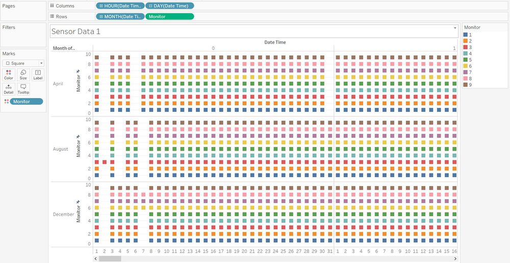
To answer this question, we have to find out if there are readings captured for every 1-hour interval for every one of the 9 sensors, as it should be, throughout the entire 3-month recording period. To confirm this, a Gantt view chart can be made in Tableau from the Sensor Data excel file in the Assignment Data provided.
This can be done by adding the Dimensions/Measures to parts of the representation as specified below and creating the chart.
| Add to | Dimension/Measure |
|---|---|
| Columns | Hour, Day |
| Rows | Month, Monitor |
| Marks (Colour) | Monitor |
As can be seen in the chart above, there is some missing data as indicated by the missing squares (not including those on 31st April as April only has 30 days). Specifically, there is no reading recorded at 12 a.m.(Hour 0) on the following dates:
a. 2nd and 6th April by all monitors
b. 2nd August by all monitors except Monitor 3, and 4th and 7th August by all monitors
c. 2nd December by all monitors, and 7th December by all monitors except Monitors 6, 7 and 8
All other hours of each recorded day, not shown in the image above, have no missing readings. The missing readings indicate the times that the sensors were not working properly. It can therefore be concluded that it is untrue that the sensors were working fully at all times.
The missing readings are all at 12 a.m., and within the first week of each month. Therefore, one likely reason is that the staff in charge of the monitors may be setting up or testing the monitors at that time. It is also possible that they are performing checks after the first few days of readings or making adjustments due to errors found, and are doing so as early as possible to affect as few readings as possible.
Qn 1.b. Can you detect any unexpected behaviors of the sensors through analyzing the readings they capture?
Tableau Public link for Q1b: https://public.tableau.com/profile/yorisan.khosugi#!/vizhome/VAAssignmentYorisanKhosugi1/SensorData2
To assess the readings from a broader overall perspective, a line graph can be plotted using Tableau. For good readability and reduced clutter, the hours have been excluded to produce visualizations which go no more specific than daily summed readings.
This can be done by adding the Dimensions/Measures to parts of the representation as specified below and creating the graph.
| Add to | Dimension/Measure |
|---|---|
| Columns | Month, Day |
| Rows | Reading |
| Filters | Month |
| Marks (Colour) | Monitor |
In addition, trend lines are added to provide an idea of the overall trend of the readings of each monitor.
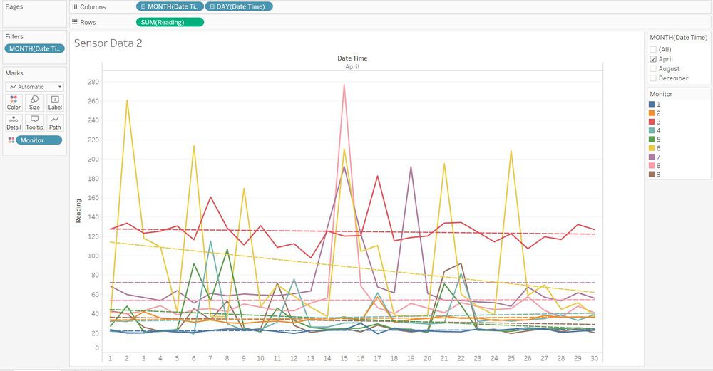
The above is the graph for the month of April. From this visualization, the following observations can be made:
1. Each monitor has differing trends. All monitors have a rather consistent unchanging trend, except for Monitor 6, which has a decreasing trend.
2. By looking at the trend lines, it can also be seen that the monitors have differing average levels. It is clear that Monitor 3 (red line) has the highest values of readings in general compared to the rest. This may be because monitor 3 is located in an area which picks up a higher amount of chemicals on average, even with differing speeds and directions of wind. Or, monitor 3 could be situated very near one or more factories, which may also have high rates of production and hence release more chemical waste.
3. The readings captured can be rather consistent on some monitors, and be very erratic on others. For example, Monitor 3 (red) recorded fairly consistent readings, with only 2 minor spikes in value on 7 and 17 April. On the other hand, Monitor 6 (yellow) recorded extremely erratic readings, with huge spikes on 2, 6, 9, 15, 21 and 25 April. This might be because monitors such as monitor 3 are less reliant on wind to pick up chemicals due to location or other factors (hence the stable readings), while monitors such as monitor 6 require wind that is strong or in a specific direction to record significant readings (hence the erratic readings).
4. The most noticeable spike is on 15 April, where readings on three monitors recorded extremely high readings, namely monitors 6, 7 and 8 (highest reading of the month, at 277.0). This may indicate that one or more factories was releasing an extremely large amount of chemicals into the environment on 15 April.
Next, a look at a visualization similar to the above, but of all three months in one comprehensive view, is observed below.
From this obervation, the following observations can be made:
1. In the month of August, monitor 3 (red) once again recorded the highest average readings for the month, but it was superceded in December by Monitor 4 (turquoise) which recorded much higher readings than monitor 3 in that month. This may be because the production levels of a factory situated near Monitor 4 happened to be much higher that month, resulting in a subsequent surge in chemical output picked up by monitor 4. This is also supported by the fact that from the gradient of the trend lines, Monitor 4 shows an increasing trend in readings in both August and December, and from the vertical position of the trend lines, has readings steadily increasing across the three months (one of the lowest in April but second highest in August, and highest among all monitors in December). These pieces of evidence may mean that the factory (or factories) near Monitor 4 may be embarking on a year-long expansion project.
2. The highest reading among all three months was 600.7, recorded on 13 August on monitor 3, much higher than the second highest, at 421.7 recorded on monitor 4 on 18 December. This could be because on 13 August, a factory (or factories) situated near monitor 3 released, in one go, the highest amount of chemicals ever in the span of the 3 recorded months.
Qn 2. Chemicals
Qn 2.a. Which chemicals are being detected by the sensor group?
Tableau Public link for Q2a/2b: https://public.tableau.com/profile/yorisan.khosugi#!/vizhome/VAAssignmentYorisanKhosugi1/SensorData3
As provided in the Assignment Data, there are 4 chemicals relevant to this case. In the interest of analyzing the declining populations of the Blue Pipit bird, these chemicals' toxicity towards animals is most important in our assessments. With regard to that, their characteristics in brief are as stated below.
1. Appluimonia – Generally does not harm or endanger humans or animals
2. Chlorodinine – Corrosives which are hazardous and harmful as soon as touched
3. Methylosmolene – Toxic volatile solvents, required by law to be chemically neutralized before disposal
4. AGOC-3A – Not too harmful
From these descriptions, it can be concluded that Chlorodinine is the most harmful chemical, followed by Methylosmolene which is toxic but required to be neutralized before release, and the last 2, Appluimonia and AGOC-3A, are not as harmful.
To assess the readings, a line graph can be plotted using Tableau by adding the Dimensions/Measures to parts of the representation as specified below and creating the graph.
| Add to | Dimension/Measure |
|---|---|
| Columns | Month, Day |
| Rows | Chemical, Reading |
| Filters | Month, Chemical |
| Marks (Colour) | Monitor |
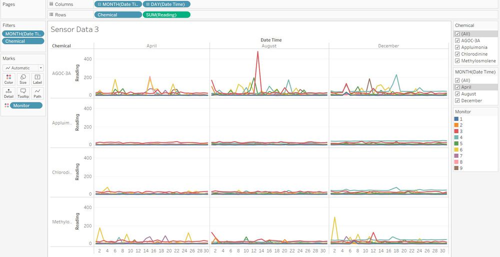
As can be seen above, there are readings recorded for all four chemicals, Appluimonia, Chlorodinine, Methylosmolene and AGOC-3A, hence all four are detected by the sensors throughout the three-month period.
Qn 2.b. What patterns of chemical releases do you see, as being reported in the data?
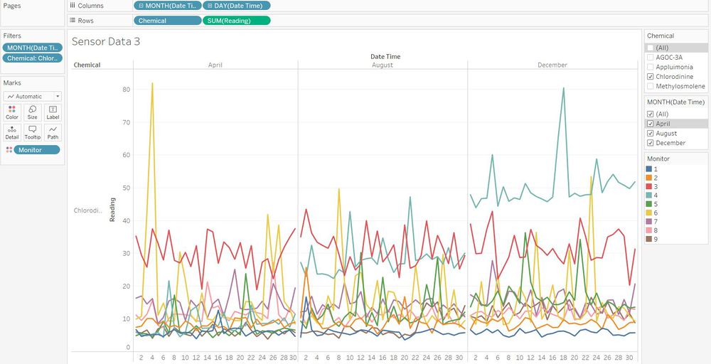
Chemical release patterns can be better observed by viewing the pattern of each chemical individually using the Chemical filter on the right.
AGOC 3-A
The visualization above shows the trend of readings of AGOC-3A. One pattern observed is that there are three spikes each month on the following days:
- April 6, 15 and 21
- August 1, 13 and 21
- December 5, 11 and 18
It could be that the factory (or factories) which release this chemical do so three times a month, approximately around the first, second and third weeks. In particular, the highest recorded reading was 481.2 on August 13, which was also the highest reading of any chemical in the 3 months.
Appluimonia
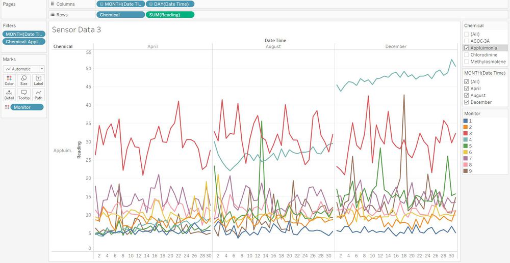
The visualization above is for Appluimonia. The most apparent observed trend is that of the increase in Monitor 4's readings across the three months. This could mean that the factory suspected to be expanding has this chemical as one of its main outputs.
Chlorodinine
The above visualization shows the patterns for Chlorodinine, the first of the two dangerous chemicals. The highest reading is a spike to 81.98 on April 4. It is possible that after this date, the factory releasing it became aware that chemical recordings had begun and limited their release of Chlorodinine. The increase in readings on monitor 4 also follows that of Appluimonia.
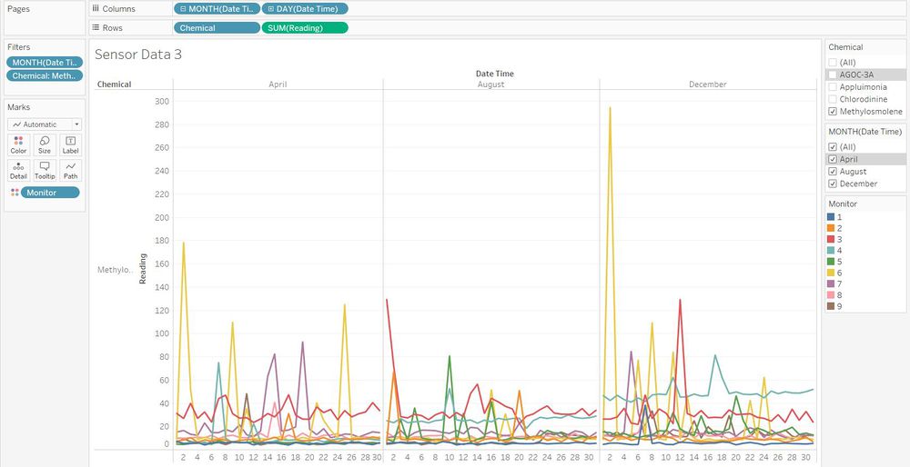
Methylosmolene
The above visualization of Methylosmolene shows the highest reading of 294.6 in a spike on 2 December, but apart from that shows no noticeable patterns. However, an interesting pattern is seen when observing these readings by the hour instead of by day, shown below.
It can be seen above that the highest readings for this chemical are around 12 a.m. across all three months. For example, in December, the highest readings are recorded between 10 p.m. and 3 a.m. This may be because the factories releasing this chemical do so around midnight.
Qn 3. Factories
Qn 3.a. Describe how you found which factories are responsible for which chemical releases
Tableau Public link for Qn 3a/3b: https://public.tableau.com/profile/yorisan.khosugi#!/vizhome/VAAssignmentYorisanKhosugi2/SensorData4?publish=yes Toggle between Sensor Data 4 and Sensor Data 5 under Metadata below the visualization. Tableau Public link for map created for Qn 3: https://public.tableau.com/profile/yorisan.khosugi#!/vizhome/VAAssignmentYorisanKhosugi3/Sheet1?publish=yes
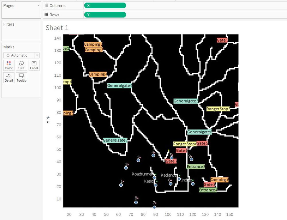
To visualize which monitor picked up which chemical readings, it is necessary to first plot the coordinates of the monitors and factories with respect to the map. This is done by first creating an excel file combining the coordinates of all monitors and factories, as shown below.
Next, these coordinates are given geographical roles (X: Longitude, Y: Latitude) and are plotted in tableau with the background image of the provided map (X in columns, Y in rows) as shown below.
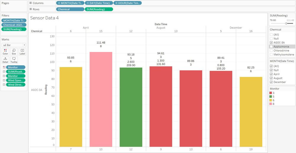
To assess which factories are the main culprits in contributing to the environmental levels of each chemical, only significant readings will be considered. To simplify analysis, only the highest readings of each month for each chemical will be assessed. The data relating to these readings will be noted and presented in a table below. To find the highest readings of each month, first create a visualization exactly like that used in Qn 2a/2b above. Add the excel file of Meteorological Data into the data sources, then merge that with the Sensor Data to obtain the wind speed and direction for each reading. However, there will be some null values for wind speed and direction as Metereological Data is recorded every 3 hours, unlike Sensor Data which is recorded hourly. To address this issue, the readings without wind speed and direction will use those from the previous 3-hourly reading before it (For example, for a reading at 10 a.m., use the meteorological data taken at 9 a.m.). If that value is also missing, then the meteorological data recorded closest to the time the reading was taken will be assumed as its wind speed and direction.
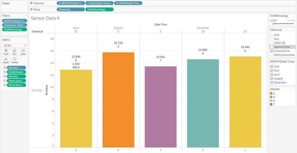
After creating the sheet like in Qn 2, change the line graph to a bar chart for improved readability, and add a filter of readings. In addition, a slider for that filter is added on the right for the user to slide until at least one reading each month can be seen. Finally, add all the relevant Labels (under Marks) to see the statistics of each reading of interest, such as Reading, Monitor no., Wind Speed and Wind Direction.
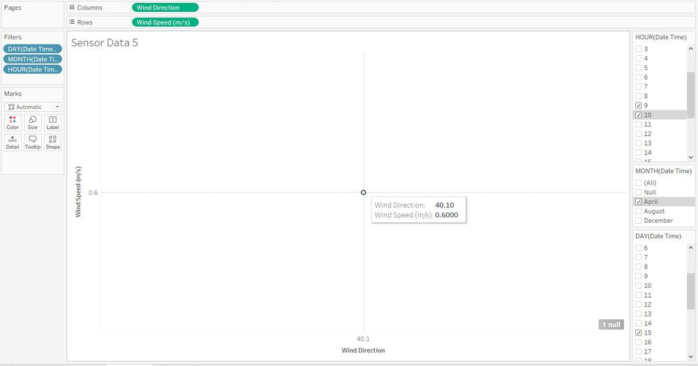
The visualization above shows the highest readings of AGOC-3A recorded in April, August and December. To find the missing Wind Speed and Direction (for example, for the 15 April reading at 10 a.m. above), a new sheet can be made. In this sheet, Wind direction will be added to columns and Wind speed to Rows, then the filters of Day, Month and Hour to filter the reading of interest, as shown below.
In this case, we filter the month to be April, Day to be 15 and Hour to be 10. Then, we add more hours upwards (backwards in time) until the latest reading for wind appears. In this case, that reading was at 9 a.m. as shown above.
This method is repeated for the other three chemicals. The visualizations showing their monthly highest readings is provided below.
The readings and statistics obtained from the method described above is summarised in the following table. Each of these readings will have a suspected source based on wind speed and direction, and by referring to the geographical map (Coords Mapped) above. In general, Wind direction shows the source(s) factory of the chemical picked up at a reading, and Wind speed denotes the maximum distance of that factory.
The abbreviations for Suspected Source mean the following:
RFE - Roadrunner Fitness Electronics
KOF - Kasios Office Furniture
RC - Radiance Colourtek
ISB - Indigo Sol Boards
| Chemical | Month | Reading | Monitor | Wind Speed | Wind Direction | Suspected Source |
|---|---|---|---|---|---|---|
| AGOC-3A | April | 111.48 | 8 | 0.6 | 40.1 | RFE/KOF |
| AGOC-3A | August | 94.61 | 3 | 1.3 | 131.6 | RFE/KOF |
| AGOC-3A | December | 89.41 | 3 | 0.8 | 155.2 | RFE/KOF |
| Appluimonia | April | 8.951 | 6 | 0.2 | 46.3 | RC |
| Appluimonia | August | 10.148 | 6 | 2.8 | 229.7 | KOF |
| Appluimonia | December | 8.517 | 9 | 1.9 | 174.5 | ISB |
| Chlorodinine | April | 12.844 | 6 | 1.2 | 306.6 | RFE |
| Chlorodinine | August | 15.723 | 2 | 2.8 | 229.7 | unknown |
| Chlorodinine | December | 15.040 | 6 | 2.6 | 296.2 | RFE |
| Methylosmolene | April | 94.35 | 6 | 2.4 | 265.4 | KOF |
| Methylosmolene | August | 75.96 | 3 | 2.8 | 229.7 | unknown |
| Methylosmolene | December | 100.78 | 6 | 3.0 | 271.4 | KOF |
These observations point to the following conclusions with regard to which factory is the most probable producer of which chemical:
| Factory | Chemical |
|---|---|
| RFE and/or KOF | AGOC-3A |
| unknown | Appluimonia |
| RFE | Chlorodinine |
| KOF | Methylosmolene |
Qn 3.b. Observed patterns of operation
Now that the factories have been linked to the chemicals, earlier observed patterns of chemical releases can be attributed to factories' patterns of operation. From the above Factory-Chemical table, it is not possible to pinpoint a specific factory to the chemicals AGOC-3A and Appluimonia, so they will not be considered in this segment. It is notable however that these two chemicals are the least dangerous of the four as stated before.
RFE has been found to be the main producer of Chlorodinine, and patterns of Chlorodinine in Qn 2b point towards the possibility that RFE could be on an year-long expansion project, which would explain the steady increase of Chlorodinine readings from April to December picked up by Monitor 4 (turquoise). It should be noted that RFE is the factory located closest to Monitor 4, as shown below (RFE=Roadrunner).
KOF is the main produce of Methylosmolene. As mentioned in Qn 2b, there is an observed patterned of heightened readings of this chemical around 12 a.m., which could be the time that KOF releases its Methylosmolene waste into the environment. It should be noted that the spikes around midnight are mostly recorded on Monitor 6 (yellow), and from the cropped image of the map above, it can be seen that monitor 6 is the monitor closest to KOF (Kasios).
Conclusion
In conclusion, the two companies most likely to be responsible for the downfall of the Rose-crested Blue Pipit bird populations are Roadrunner Fitness Electronics (RFE) and Kasios Office Furniture (KOF). This is because the two chemicals that these two companies are suspected to be the largest releasers of are the most toxic. Among the two, RFE is more likely to be the main culprit as Methylosmolene, the chemical tied to KOF, is required by law to be neutralised before release, and assuming that KOF is a law-abiding company as mentioned in the task overview, KOF may be releasing neutralised Methylosmolene which is much less likely to cause harm to the Blue Pipit birds.
