IS428 2017-18 T1 Assign Victoria Koh Wei Ting
Contents
Overview
Mistford is a mid-size city is located to the southwest of a large nature preserve. The city has a small industrial area with four light-manufacturing endeavors. The Rose-Crested Blue Pipit is a local bird popular for its attractive plumage and pleasant songs. Recently, there has been signs that the number of nesting pairs of the Rose-Crested Blue Pipit is decreasing. The decrease is sufficiently significant that the Pangera Ornithology Conservation Society is sponsoring researchers to undertake additional studies to identify the possible reasons.
The four factories in the industrial area are subjected to higher-than-usual environmental assessment, due to their proximity to both the city and the preserve. Gaseous effluent data from several sampling stations has been collected over several months, along with meteorological data (wind speed and direction) that could help us understand what impact these factories may be having on the Rose-Crested Blue Pipit.
Suspicion
Despite the four factories being quite compliant with recent years’ environmental regulations, there are doubts that the actual data has been closely reviewed. The noxious gases pouring out of the smokestacks from the four manufacturing factories south of the nature preserve are suspected to be the main contribution of the downfall of the Rose-crested Blue Pipit.
The Task
General Task
To visualize the given datasets and determine which (if any) of the factories may be contributing to the problems of the Rose-crested Blue Pipit.
Specific Tasks
Task 1
- Characterize the sensors’ performance and operation. Are they all working properly at all times?
- Detect any unexpected behaviors of the sensors through analyzing the readings they capture.
Task 2
- Determine which chemicals are being detected by the sensor group.
- Observe the patterns of chemical releases as being reported in the data.
Task 3
- Determine which factories are responsible for which chemical releases. Carefully describe how the deduction is made using all the data available.
- Describe any observed patterns of operation revealed in the data for the factories identified.
Data Analysis & Transformation
The following is the .xlsx files I have received:
- Meteorological Data.xlsx
- Sensor Data.xlsx
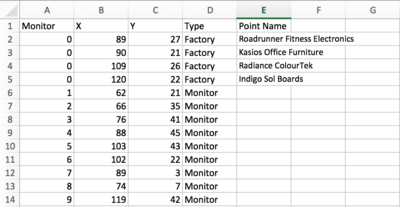
- Sensor Location.xlsx
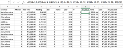
Before we visualize the data using Tableau, data cleaning is required to ensure all data works properly.
| Data | Problem | Solution |
|---|---|---|
| Meteorological Data.xlsx |
|
|
| Sensor Data.xlsx |
|
|
| Sensor Location.xlsx |
|
|
Data Import Structure & Process
| Process | Description |
|---|---|
| Importing and joining tables | Left joined Sensor Data and Meteorological Data |
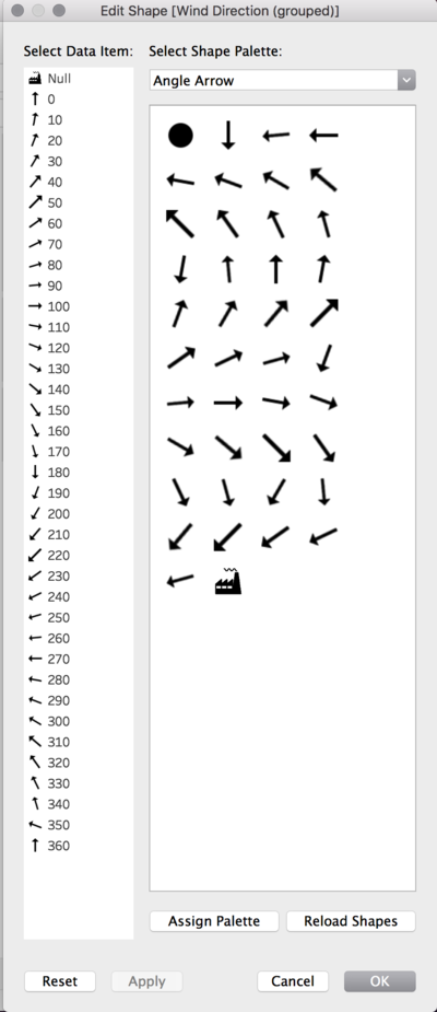
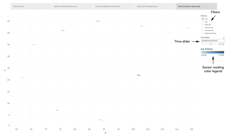
| Wind direction angles and factory coordinates | Creating custom shapes of the wind arrow angles and factories using Photoshop and adding them to Tableau Repository |
Interactive Visualization
The interactive visualization can be accessed here: https://public.tableau.com/profile/vick#!/vizhome/assignment1_62/MistfordVisualDetectiveStory
Interactive Techniques and Visual Guides
For the best experience, adjust your screen resolution to 2560 x 1600 and enable full screen on the browser. To help users navigate through the different filters and actions so that their analysis can be performed smoothly, the following interactivity elements and visual guides are added:
| Interactive Technique | Rationale | Brief Implementation Steps |
|---|---|---|
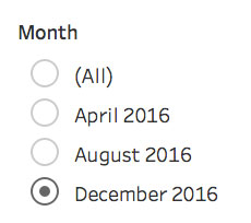
| Month Selector |
Allow the viewer to view the overall observation across all three months and be able to zoom in to the specific months. |
|
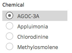
| Chemical Selector |
Allow the viewer to view the overall chemical concentration observation and be able to zoom in to the specific chemical types. |
|
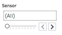
| Sensor Range Slider |
Allow the viewer to view the overall sensor observation and be able to zoom in to the specific sensors. |
|
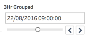
| 3-Hour Time Range Slider |
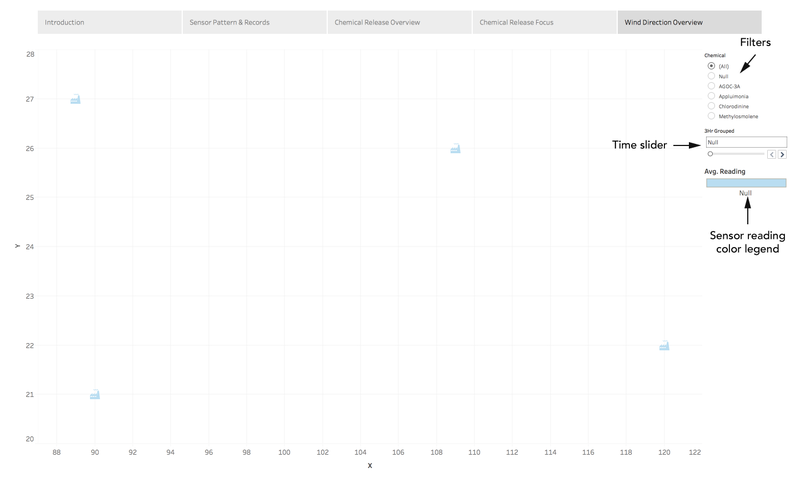
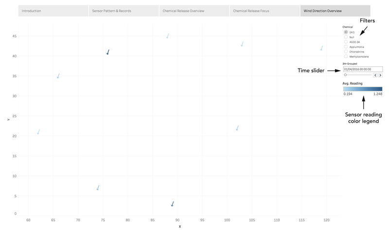
Allow the viewer to explore the wind direction observations through 3 hour time periods. |
|
| Visual Guide | Rationale | Brief Implementation Steps |
|---|---|---|
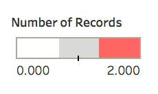
| Number of records color reference |
Allow the viewer to be able to identify the areas with none or duplicate records. |
|
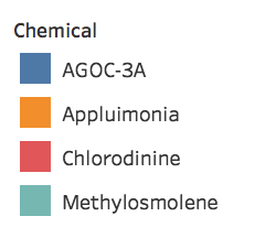
| Chemical legend |
Allow the viewer to be able to identify the 4 chemical types. |
|
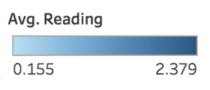
| Average Chemical Reading legend |
Allow the viewer to be able to identify the chemical concentration readings. |
|
The Story
The story mode is broken down into 5 “chapters” - Introduction, Sensor Pattern & Records, Chemical Release Overview, Chemical Release Focus, and Wind Direction Overview. The user should follow through the modes from right to left going along with the number tasks for Sensor performance and operations, Chemical concentration amount and records, and Factories’ chemical release relationship with environmental factors (i.e. Wind) .
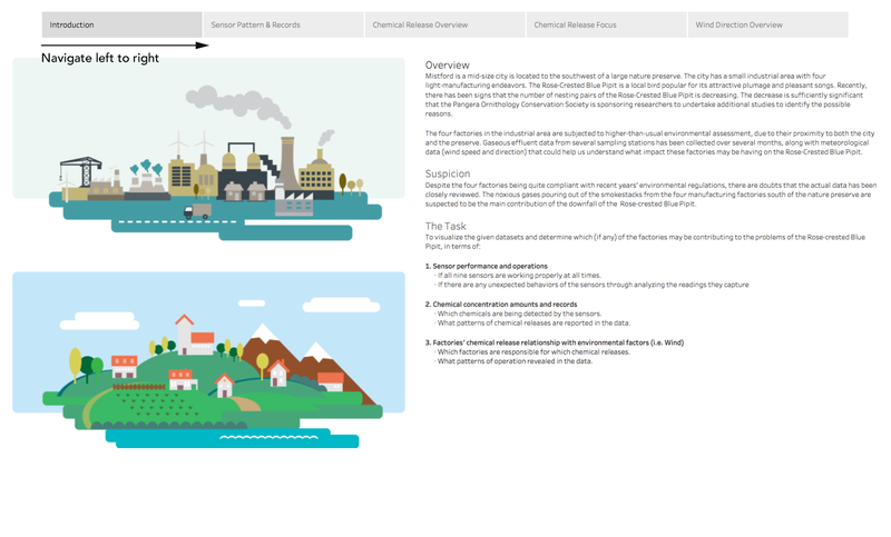
Story Introduction
Sensor Patterns & Records Dashboard
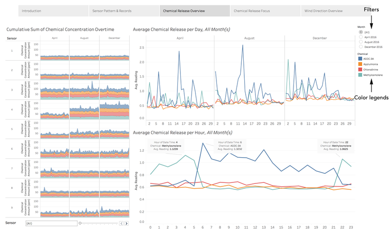
Chemical Release Overview
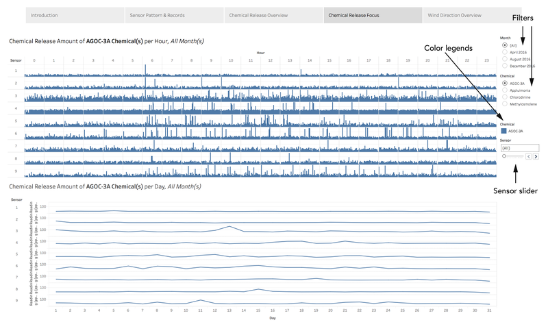
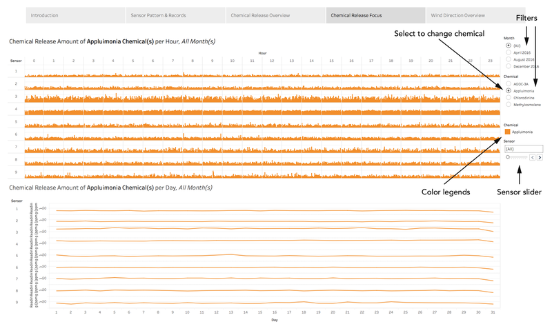
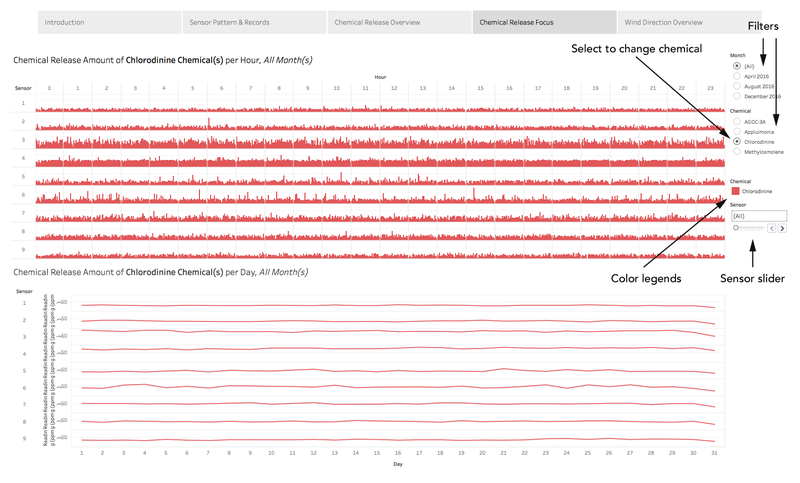
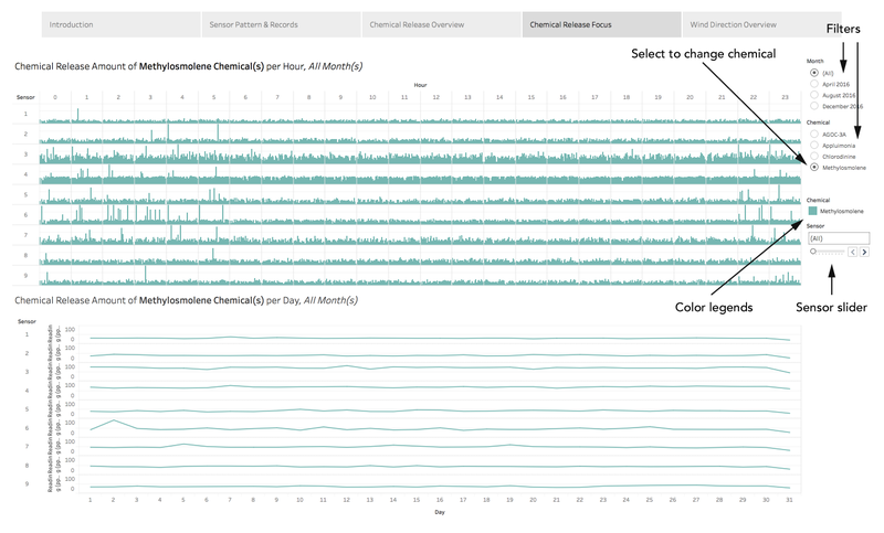
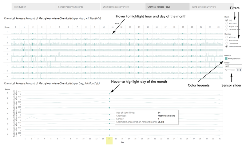
Chemical Release Focus
Wind Direction Overview
Analysis
Task 1: Sensors’ performance and operation
The 9 sensors measuring the 4 chemical concentrations (AGOC-3A, Appluimonia, Chlorodinine, Methylosmolene) each function largely across 3 months (April, August, and December), with readings logged 24 hours per day at hourly intervals. There are however, missing data for certain chemicals on certain days.
Observation 1: Missing data
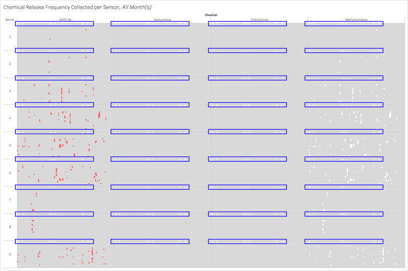
1. Consistent missing data at 00:00 at the first of each month across all months and all chemicals
Based on the record frequency graph, I observed that the missing data occurred on dates:
- 2 April 2016
- 6 April 2016
- 2 August 2016
- 4 August 2016
- 7 August 2016
- 2 December 2016
- 7 December 2016
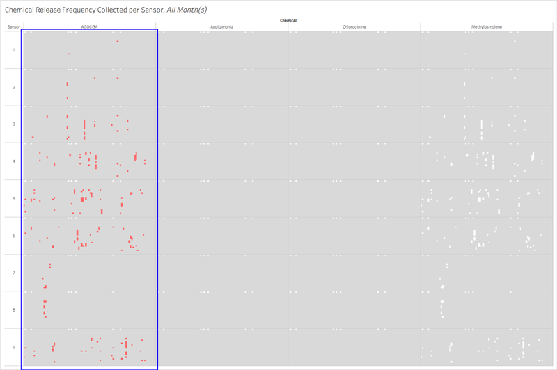
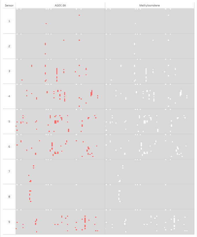
2. Numerous duplicate data for AGOC-3A for sensors 3, 4, 5, 6, 9
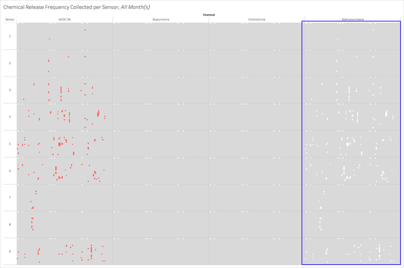
3. Numerous missing data for Methylosmolene for sensors 3, 4, 5, 6, 9
4. Duplicate data pattern for AGOC-3A is the same as missing data pattern for Methylosmolene for sensors 3, 4, 5, 6, 9
Observation 2: Sensor patterns
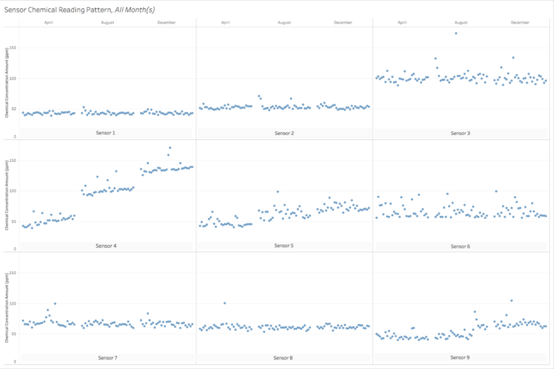
1. Generally stable patterns in sensors 1, 2, 7 and 8
Sensors 1, 2, 7 and 8 have some variations in their noise but have generally stable and horizontal trendline.
2. Pattern anomaly in sensors 4, 5 and 9
Sensor 4’s noise shifts linearly across the months, giving a diagonal trend line. Sensors 5 and 9 get noisier over the months, with sensor 5 having a gradual noise increase and sensor 9 getting significantly noisier in the second month.
3. Pattern anomaly in sensors 3 and 6
Sensors 3 and 6 have more variations in noise compared to the other sensors.
Task 2: Chemical concentration amounts and records
Observation 1: Readings in certain chemicals
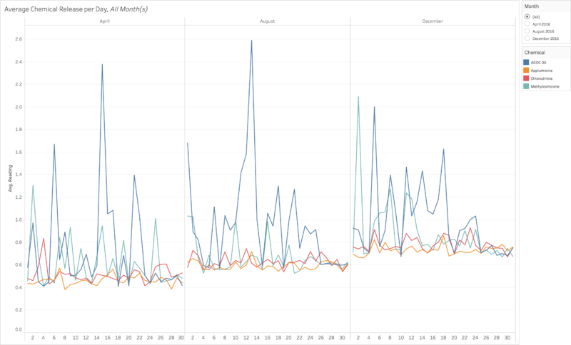
1. Significant readings for AGOC-3A and Methylosmolene on average per day across all 3 months
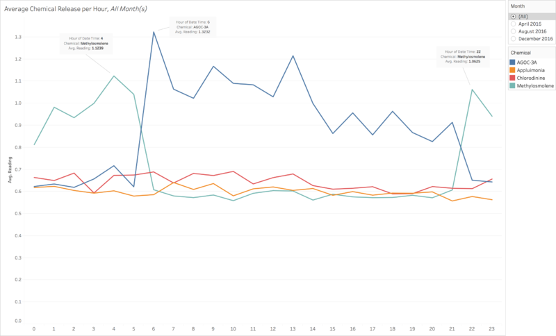
2. Unusual Methylosmolene readings from 22:00 to 04:00
Based on this graph, we can see that there are significant readings in AGOC-3A and Methylosmolene on an hourly average across the 3 months. However, Methylosmolene appears to have an unusually high average between the hours of 22:00 to 04:00 across the 3 months. Note: Methylosmolene was mentioned that factories have been required to discontinue using it for environmentally safer chemicals.
References
- Tableau Help - Create Advanced Highlight Actions (http://onlinehelp.tableau.com/current/pro/desktop/en-us/actions_highlight_advanced.html)
- Tableau Public – How to Make Control Charts in Tableau (https://public.tableau.com/en-us/s/blog/2013/11/how-make-control-charts-tableau)
