IS428 2017-18 T1 Assign Victor Tang Wing Ho
Contents
Assignment Details
IS428 Main Page: (https://wiki.smu.edu.sg/1718t1is428g1/Main_Page)
Assignment Overview: (https://wiki.smu.edu.sg/1718t1is428g1/Assignments)
Assignment Dropbox: (https://wiki.smu.edu.sg/1718t1is428g1/Assignment_Dropbox)
My DataViz link: (https://public.tableau.com/profile/victor4096#!/vizhome/Assignment_236/Dashboard1)
Problem & Motivation
Mistford is a mid-size city is located to the southwest of a large nature preserve. The city has a small industrial area with four light-manufacturing endeavors. Mitch Vogel is a post-doc student studying ornithology at Mistford College and has been discovering signs that the number of nesting pairs of the Rose-Crested Blue Pipit, a popular local bird due to its attractive plumage and pleasant songs, is decreasing! The decrease is sufficiently significant that the Pangera Ornithology Conservation Society is sponsoring Mitch to undertake additional studies to identify the possible reasons.
Mitch Vogel was immediately suspicious of the noxious gases just pouring out of the smokestacks from the four manufacturing factories south of the nature preserve. He was almost certain that all of these companies are contributing to the downfall of the poor Rose-crested Blue Pipit bird. But when he talked to company representatives and workers, they all seem to be nice people and actually pretty respectful of the environment.
In fact, Mitch was surprised to learn that the factories had recently taken steps to make their processes more environmentally friendly, even though it raised their cost of production.
Mitch is gaining access to several datasets that may help him in his work, and he has asked you (and your colleagues) as experts in visual analytics to help him analyse these datasets. These datasets includes air sampler data, meteorological data, and locations maps provided by the state government, which has been monitoring the gaseous effluents from the factories through a set of sensors distributed around the factories.
Task
General Task
The dataset provided several months of meteorological data (wind speed and direction) and chemical data emitted by four industrial factories and captured by nine sensing stations. To explore the spatio-temporal chemical readings and wind data, specifically which factories emitted what chemicals and how the nine sensors in the area were performing, the team developed a web-based analytics tool with interactive visualizations and path line analysis to reveal sensor errors and chemical reading spikes, as well as pinpoint possible sources of chemical reading spikes. The goal was to help the local ornithologist determine whether or not the factories were compliant with environmental regulations.
Specific Task
Specifically, we are to provide visualisation to identify these issues:
• Sensors: To find out if all sensors’ performance and operations are working properly at all times, by detecting unexpected behaviours of sensors from the readings captured. [Characterize the sensors’ performance and operation. Are they all working properly at all times? Can you detect any unexpected behaviours of the sensors through analysing the readings they capture? Limit your response to no more than 9 images and 1000 words.]
• Chemicals: To find out which chemicals are being detected by the sensor group, by identifying patterns of chemical releases. [Now turn your attention to the chemicals themselves. Which chemicals are being detected by the sensor group? What patterns of chemical releases do you see, as being reported in the data? Limit your response to no more than 6 images and 500 words.]
• Factories: To find out which factories are responsible for which chemical releases, to be able to pinpoint on the factories which are responsible for the Rose-Crested Blue Pipits. [Which factories are responsible for which chemical releases? Carefully describe how you determined this using all the data you have available. For the factories you identified, describe any observed patterns of operation revealed in the data. Limit your response to no more than 8 images and 1000 words.]
Dataset Analysis & Transformation Process
Datasets Provided (Sensor Data, Sensor Location, Meteorological Data)
- Sensor Data.xlsx
It contains 3 months of readings in the following format:
Chemical: Which one of the four chemicals detected by the sensors Monitor: Which one of the nine sensors picking up the reading Reading: The air sensor detected amount in parts per million Date Time: The date and time of day of the reading, local time with no change for Daylight Savings.
- Meteorological Data.xlsx
It represents 3 months of readings in the following format:
Date: The date and time of the readings, local time with no change for Daylight Savings. Wind Direction: The compass directions where the wind is originating from, using a north-referenced azimuth bearing where 360/000 is true north. Wind Speed: The speed of the wind in meters per second. Each of these reading is taken at the date and time provided.
- Sensor Location.xlsx
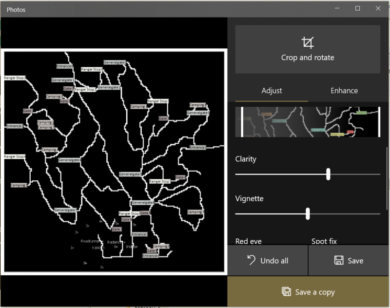
The factories and sensor locations are provided in terms of x,y coordinates on a 200x200 grid, with (0,0) at the lower left hand corner (southwest). The sensors map shows the locations of the sensors and factories by number for the sensors and by name for the factories.
Additional Information Provided
Importing & Configuring the Data
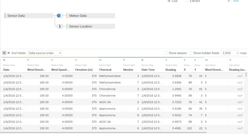
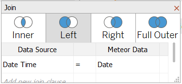
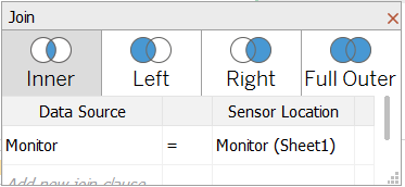
all the data are joined together as shown in Tableau, mapping monitor and datetime columns.
the picture map is decoloured to allow plotting easier to be seen on the image.
equation for the calculated field for number of records (cleaned) for Task 1.
equation to derive wind direction (North, South, East, West) based on the bearing values
Interactive Visualisation
Results
Task #1
Sensors: To find out if all sensors’ performance and operations are working properly at all times, by detecting unexpected behaviours of sensors from the readings captured. [Characterize the sensors’ performance and operation. Are they all working properly at all times? Can you detect any unexpected behaviours of the sensors through analysing the readings they capture?]
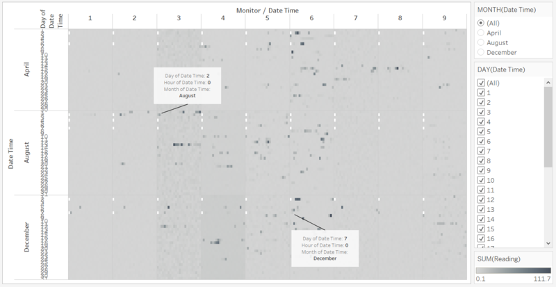
The sensors were not working at all times. As seen from Figure 1, there were missing data (as shown from the white blocks). The missing data are at 00 00 hours at 2 April, 6 April, 2 August, 4 August, 7 August, 2 December, and 7 December.
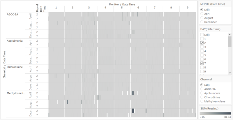
I zoomed in to the 2nd and 7th days of the months to investigate more.
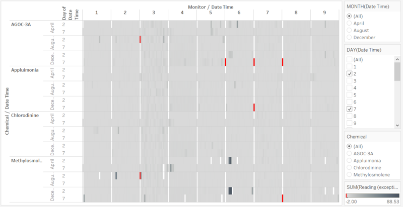
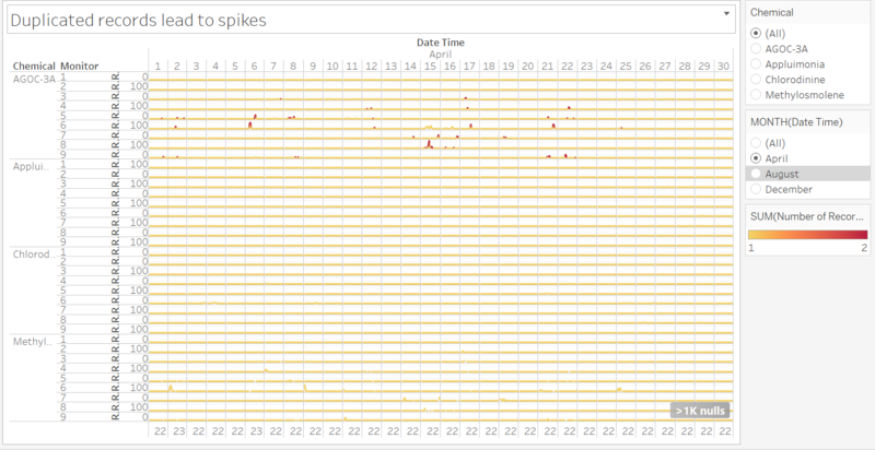
I made a calculated field in which i found out the exceptions from the periodic failure of the sensors which is marked in red.
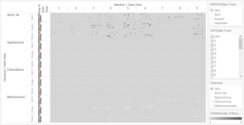
Turns out when i compare the data across chemicals, i realised the sensors have missing data on the chemical Methylosmolene and coincidentally, the duplicated data marked in blue matches the spaces of the missing data marked in white.
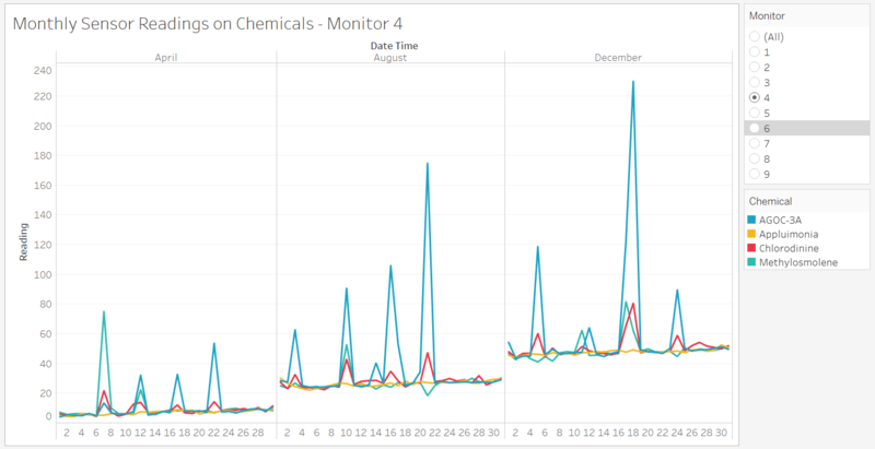
I plot a line graph to show how the spikes in the reading are mostly due to the duplicated data.
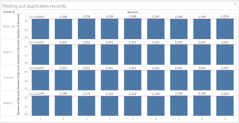
the bar chart is made to show the inconsistent number of records per sensors, implying that there is definitely duplication while detecting AGOC-3A.
Task #2
Chemicals: To find out which chemicals are being detected by the sensor group, by identifying patterns of chemical releases. [Now turn your attention to the chemicals themselves. Which chemicals are being detected by the sensor group? What patterns of chemical releases do you see, as being reported in the data?]
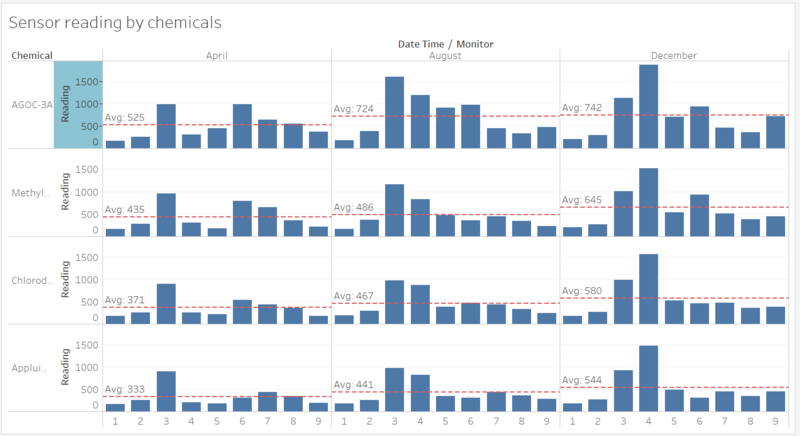
There is a consistent increase in the reading across the chemicals for the months as shown in Figure
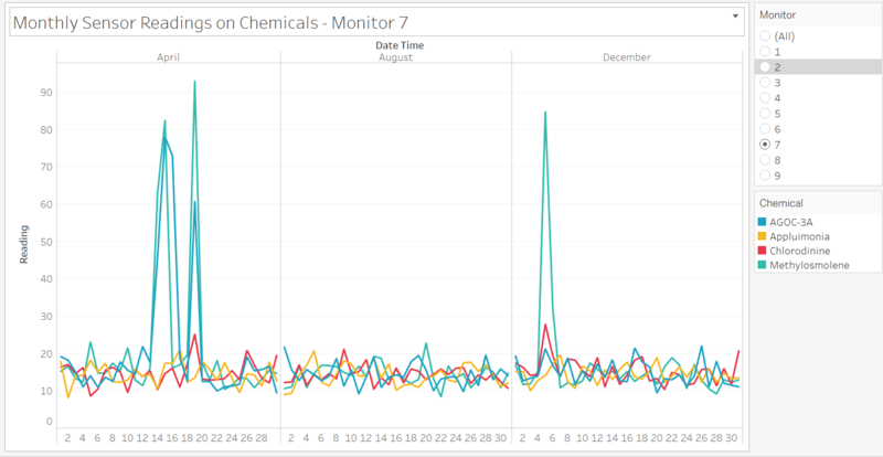
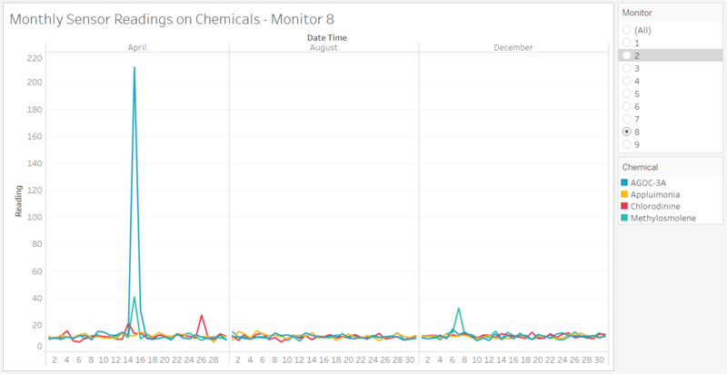
the spike in April is the reason why Sensor 7 has an above average reading in April and decreases subsequently.
Task #3
Factories: To find out which factories are responsible for which chemical releases, to be able to pinpoint on the factories which are responsible for the Rose-Crested Blue Pipits. [Which factories are responsible for which chemical releases? Carefully describe how you determined this using all the data you have available. For the factories you identified, describe any observed patterns of operation revealed in the data.]
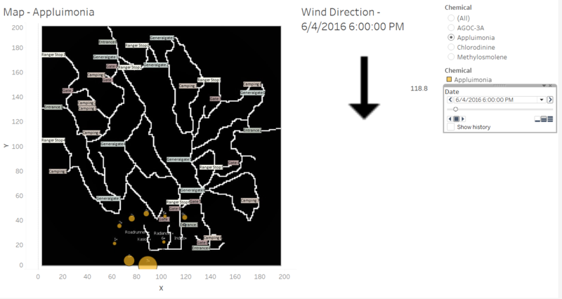
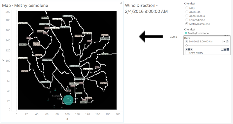
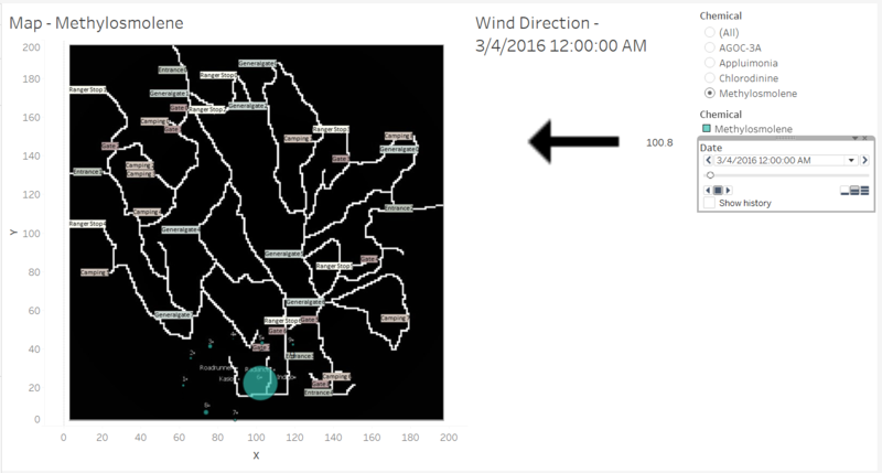
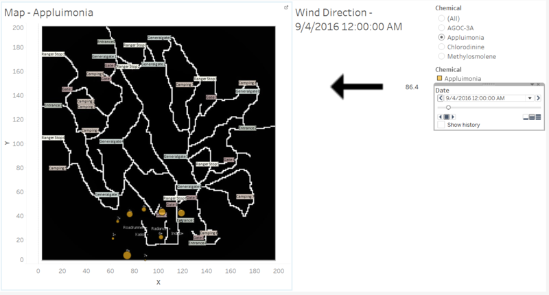
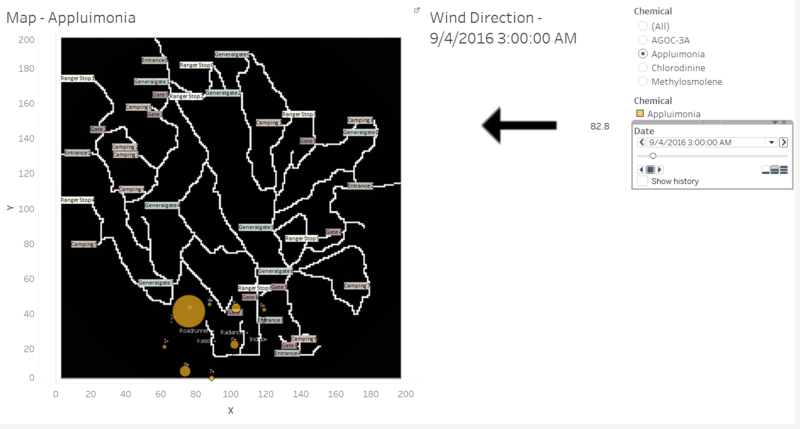
From Figure 11a and 11b, it seems that it is likely that Indigo produced Applumonia and the wind blows from Indigo to the other sensors.
