IS428 2017-18 T1 Assign Mark Ng Wei Jie
Contents
Links
Overview
Mistford is a mid-size city is located to the southwest of a large nature preserve. The city has a small industrial area with four light-manufacturing endeavors. Mitch Vogel is a post-doc student studying ornithology at Mistford College and has been discovering signs that the number of nesting pairs of the Rose-Crested Blue Pipit, a popular local bird due to its attractive plumage and pleasant songs, is decreasing! The decrease is sufficiently significant that the Pangera Ornithology Conservation Society is sponsoring Mitch to undertake additional studies to identify the possible reasons. Mitch is gaining access to several datasets that may help him in his work, and he has asked you (and your colleagues) as experts in visual analytics to help him analyze these datasets.
Mitch Vogel was immediately suspicious of the noxious gases just pouring out of the smokestacks from the four manufacturing factories south of the nature preserve. He was almost certain that all of these companies are contributing to the downfall of the poor Rose-crested Blue Pipit bird. But when he talked to company representatives and workers, they all seem to be nice people and actually pretty respectful of the environment.
In fact, Mitch was surprised to learn that the factories had recently taken steps to make their processes more environmentally friendly, even though it raised their cost of production. Mitch discovered that the state government has been monitoring the gaseous effluents from the factories through a set of sensors, distributed around the factories, and set between the smokestacks, the city of Mistford and the nature preserve. The state has given Mitch access to their air sampler data, meteorological data, and locations map. Mitch is very good in Excel, but he knows that there are better tools for data discovery, and he knows that you are very clever at visual analytics and would be able to help perform an analysis.
The Task
General task
The four factories in the industrial area are subjected to higher-than-usual environmental assessment, due to their proximity to both the city and the preserve. Gaseous effluent data from several sampling stations has been collected over several months, along with meteorological data (wind speed and direction), that could help Mitch understand what impact these factories may be having on the Rose-Crested Blue Pipit. These factories are supposed to be quite compliant with recent years’ environmental regulations, but Mitch has his doubts that the actual data has been closely reviewed. Could visual analytics help him understand the real situation?
The primary job for Mitch is to determine which (if any) of the factories may be contributing to the problems of the Rose-crested Blue Pipit. Often, air sampling analysis deals with a single chemical being emitted by a single factory. In this case, though, there are four factories, potentially each emitting four chemicals, being monitored by nine different sensors. Further, some chemicals being emitted are more hazardous than others. Your task, as supported by visual analytics that you apply, is to detangle the data to help Mitch determine where problems may be. Use visual analytics to analyze the available data and develop responses to the questions below.
The specific tasks
Sensors' Performance and Operation
Characterize the sensors’ performance and operation. Are they all working properly at all times? Can you detect any unexpected behaviors of the sensors through analyzing the readings they capture?Limit your response to no more than 9 images and 1000 words.
Exploratory Data Analysis
Sensor Data.xlsx
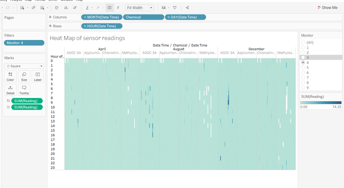
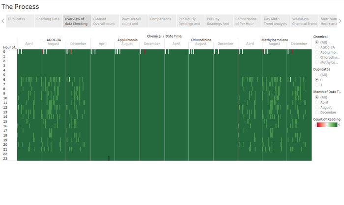
To check the data's integrity, we have to have an overview of the readings. I did this by plotting a heat map of the readings of individual days and hours.
From this visualization one can see the presence of the missing values in the white spaces. We can also see that these missing values only appear in the Methylosmolene readings.
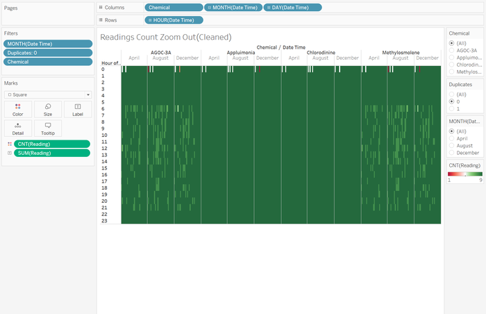
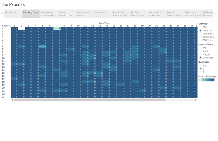
Next I wanted to explore more closely these missing values by looking at the exact count of values occurring in each hour to explore the link between the chemical and the missing values.
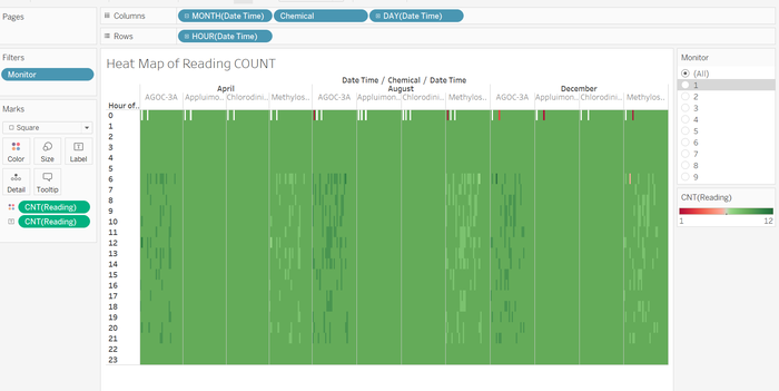
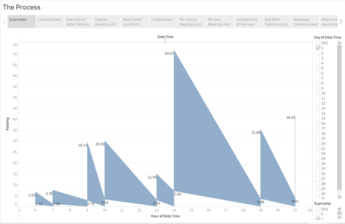
From this heat map, readings showed another unexpected trend of additional values on the readings in the AGOC-3A values.
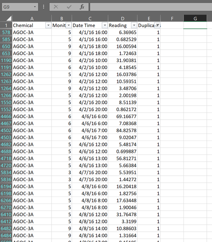
A closer analysis on the specific sensors' readings it is clear that the missing Methylosmolene readings were the additional AGOC-3A readings.
However, on closer analysis of these values, these duplicated AGOC-3A values have little to no correlation to its surrounding values and thus cannot be placed back into a "original" Methylosmolene readings, some of the values were extremely large. The only trend i could get out was that the top were larger than the bottom values. if one was not careful using Excel's remove duplicates only the bottom values would be removed. The adding of these values in could cause issues to the results. Especially if these large values were pure errors.
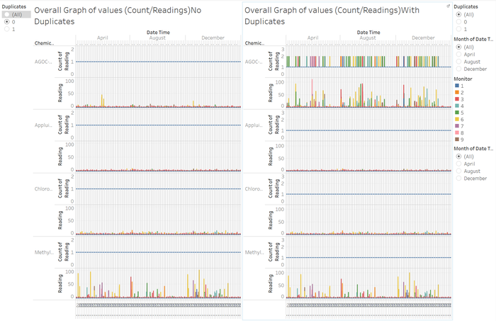
Overall
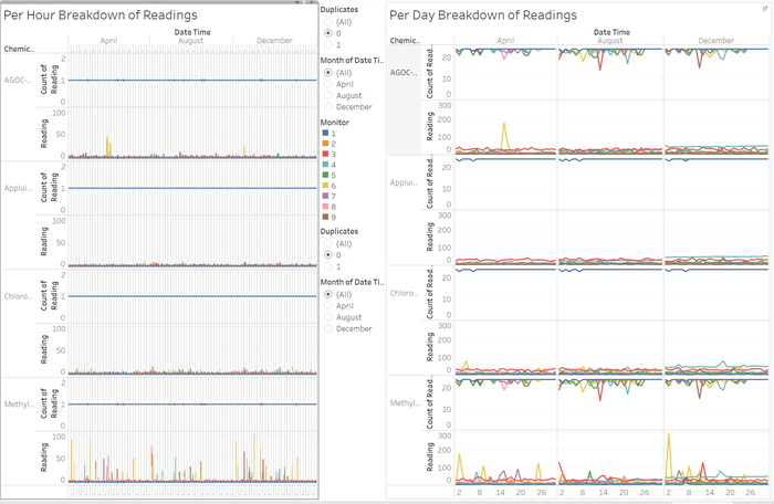
This overview comparison shows how the data with the duplicates removed is much more manageable and understandable by observing the trend of consistent counts as well as the much less volatile readings we are more able to analyse actual trends of real clean data, without the fear of inaccurate readings.
However, a key point to note is that missing data is not visually represented here in these graphs instead they are completely ignored and un represented as those values instead distract from the accurate data.
Meteorological Data
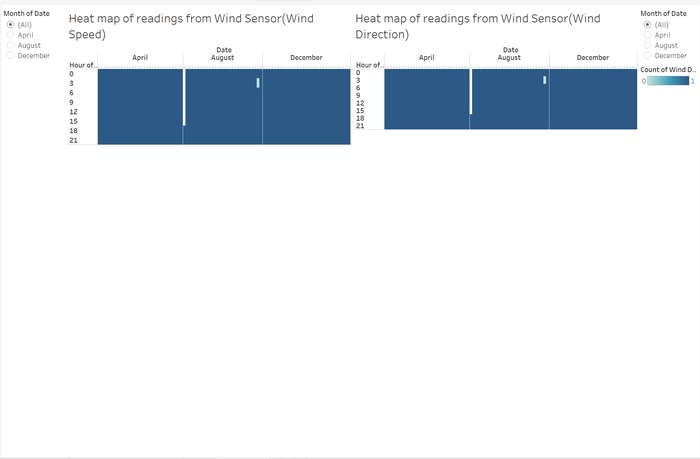
Once again I performed the same analysis by visualizing the data in the form of a heat map to check for missing and or additional data.
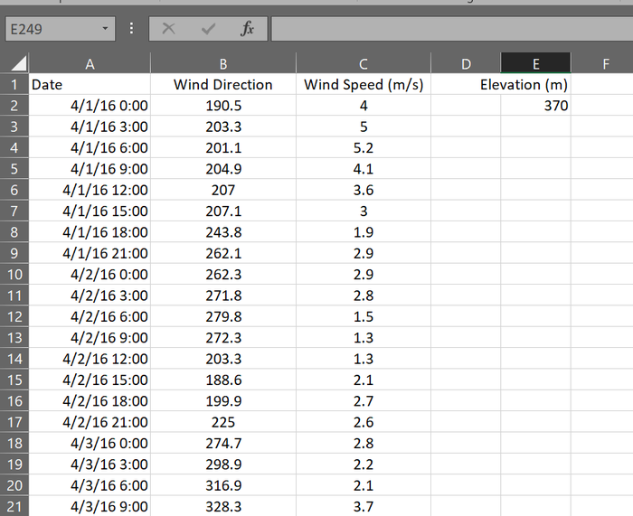
As we can visually see the hour of recordings is different from the chemical sensors as this is in 3 hour intervals, as well as there are missing readings for both wind speed and wind direction from the 1st of August 0000h till the 4th of August till 1800h.
Chemicals
Now turn your attention to the chemicals themselves. Which chemicals are being detected by the sensor group? What patterns of chemical releases do you see, as being reported in the data? Limit your response to no more than 6 images and 500 words.
Analysis of Methylosmolene
As we look at an overview of all the chemicals detected by the sensors from the cleaned data
We can clearly observe that Methylosmolene readings are the most outstanding with AGOC-3A coming in 2nd having a few minor spikes. Considering both the daily and hourly breakdown the hourly breakdown seemed to provide more detailed data. Also ase we can see the peaks tend to be from the early days to the middle of the months tapering off toward the end of the month.
the trend of the tapering off to the ends of the month are more apparent in this summing up of the readings of the days in the month
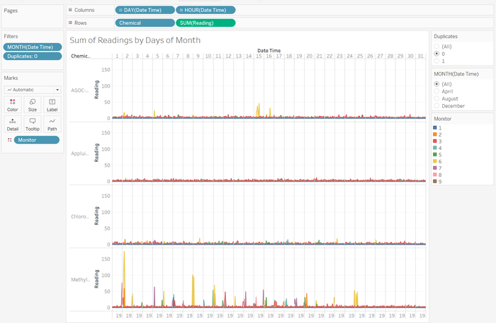
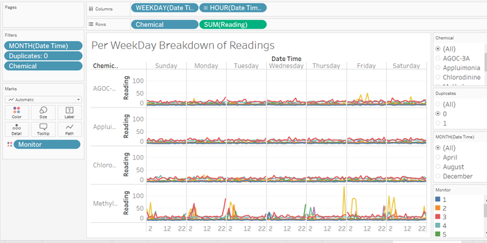
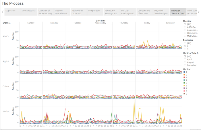
Now this would lead me to want to see a deeper breakdown of this trend and it turns out when analysing the Weekday breakdowns we can see a clear trend in Methylosmolene. We can see here that the chemical is detected mostly in the late nights and into the early mornings.
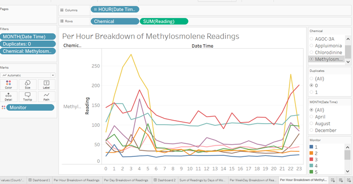
This would call for an hourly analysis into the Methylosmolene readings and sure enough there is a trend of increased Methylosmolene detected in the late evenings and early mornings..
Analysis of AGOC-3A
Now for a closer look at AGOC-3A
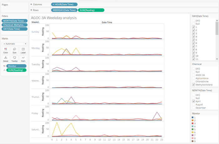
Now it turns out that similar to Methylosmolene, AGOC-3A also does show signs of the same trend where early mornings and late nights experience a peak in readings.
Factories
Which factories are responsible for which chemical releases? Carefully describe how you determined this using all the data you have available. For the factories you identified, describe any observed patterns of operation revealed in the data. Limit your response to no more than 8 images and 1000 words.
Methylosmolene Analysis
From many of the charts above as we can observe the chemical Methylosmolene seems to be the most prominent chemical detected. Looking closer into the effects of the wind from its variables direction and speed we are able to observe very interesting trends.
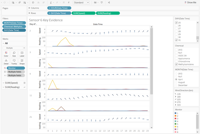
By observing the Chart I have isolated we can see that there is a pattern between the wind’s direction as well as we will see later the speed as well.
Looking at the Chart of the wind direction represented by the arrows we can see that as it turns toward an east ward blowing wind sensor 6 indicated by the yellow, tends to pick up substantial amounts of the Methylosmolene chemical. Also just as it turns out of that east ward wind these readings drop. We can also see these trends present in December.
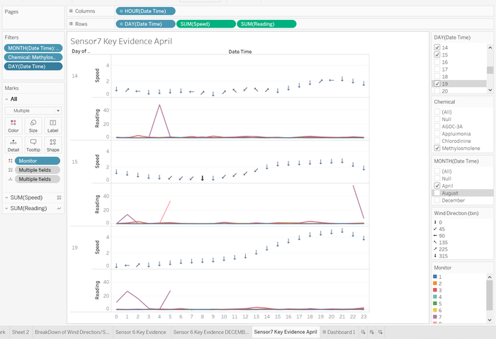
Now there are also similar trends in other sensors like sensor 7 where a southward wind would cause it to detect a spike in the Methylosmolene readings.
A spike in Sensors 4 readings also suggests that there is a link as sensor 4’s position is the north most sensor.
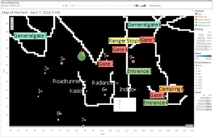
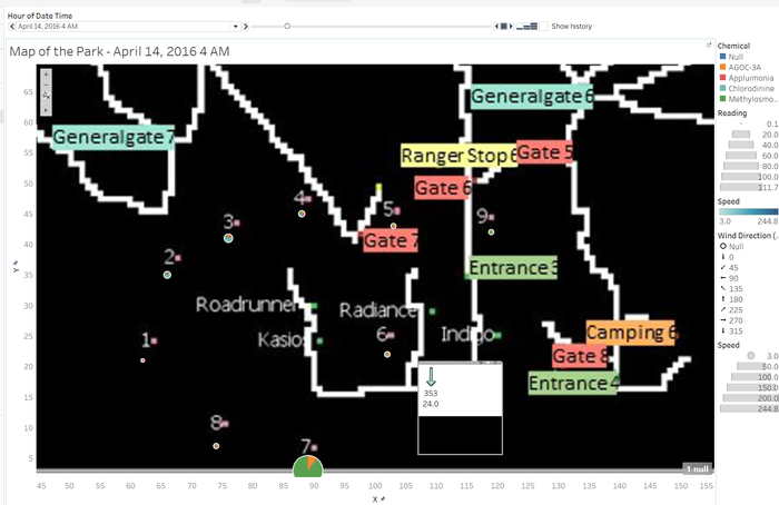
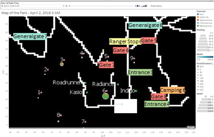
I ploted a map along along with tracking the sensors readings by a pie chart as will as modeling a wind compass to show where the wind blows at any one time. By watching the compass one can see that as the wind changes certain sensors would specifically spike just as the change occurs.
By using sensors 4, 7 and 6 I am able to triangulate that the probable source of the Methylosmolene readings are from the Kasios Office Furniture factory
AGOC-3A Analysis
The triangulation for AGOC-3A sources were much harder.
Initially from the charts it confused me as data from charts below made me feel that once again the Kasios Office Furniture factory for sure.
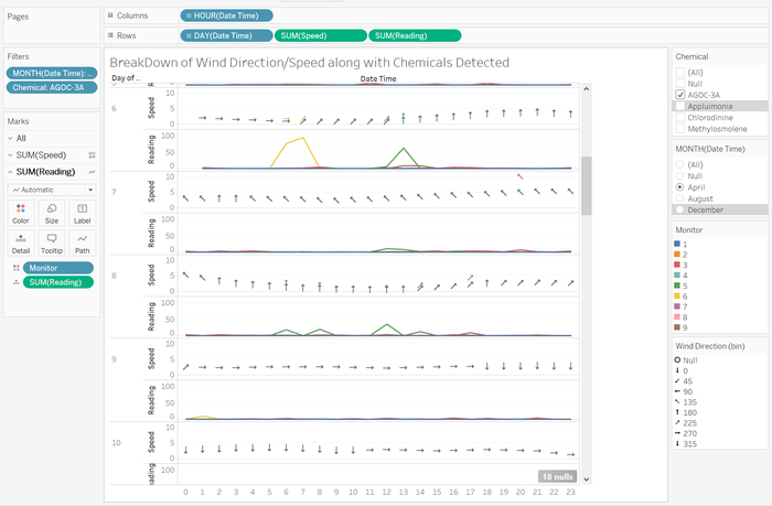
However, on closer inspection with graphs like that of the 22nd of April it made me think there was another source of the AGOC-3A possibly Indigo Sol Boards or Radiance ColourTek.
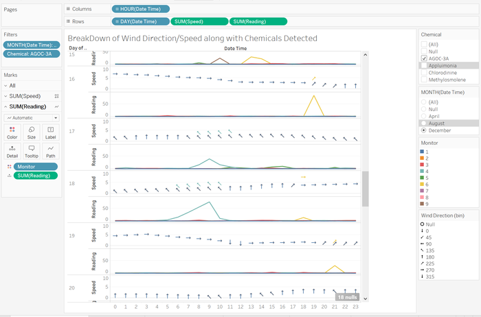
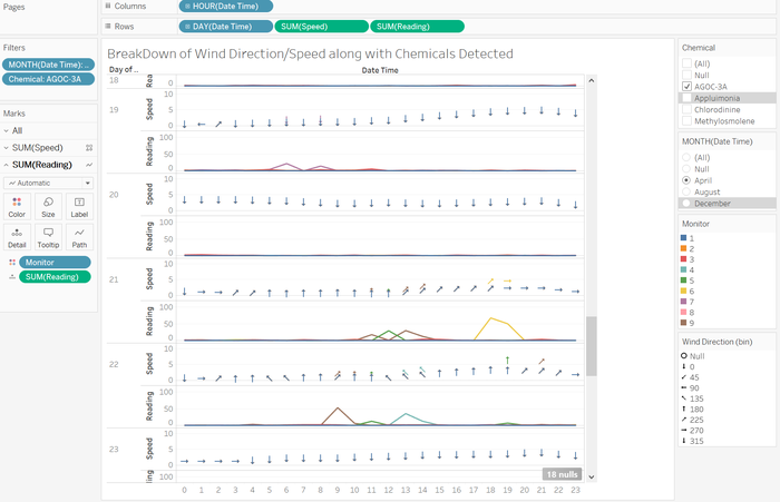 However readings from the 17th and 18th of December made me sure that it another soruce of the chemicals is Indigo Sol Boards or Radiance ColourTek. As on the 18th of December the consistent direction of the wind indicates that only factories producing from the south-eastern direction could be the source of the readings.
Dataset Analysis & Transformation Process
Cleaning Data
In order to properly remove duplicated values we have to remove both duplicated AGOC-3A readings. Not doing so could leave an erroneous value in the readings.
In order to isolate a rows duplication I would join the cells that define its duplication which are the cells of the Chemical, Sensor and the Date Time variables using the formula
=<Chemical>&" "&<Sensor>&" "&<Date time>.
By using the formula
=IF(COUNTIF(<start cell>:<end cell>,<reference cell>)=1,0,1)
in excel i was able to make a dummy variable column to indicate the observations duplicated presence. This would allow me to isolate and filter out all duplicates in Tableau.
I wanted to see if they could be placed back into their correct positions.
By filtering the duplicate variable(dummy variable) it allows me to see if there are trends in the data.
Resulting Excel: Sensor Data - Duplicated Values.xlsx
However, there is little to no correlation in the readings except that there are usualy 2 values 1 much larger than the other duplicate reading.
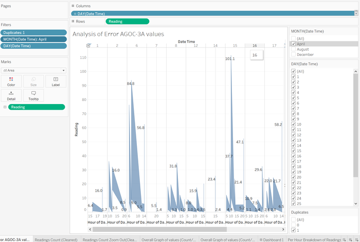
Once cleaned, the data of the AGOC and Methylosmolene values exactly mirror indicating that both values have been removed and now a proper analysis of the present and vaild data can be analysed.
Data Preperation
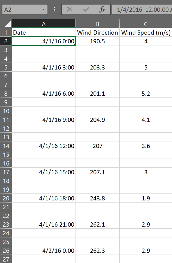
This was crucial for the Meteorological data. Due to its different binning of data to 3 hour bins and also its missing values it would cause issues when importing into tableau.
Firstly, the elevation column is redundant as not much use can be attained if no other elevation of the factories or other sensors can be compared. It is therefore removed.
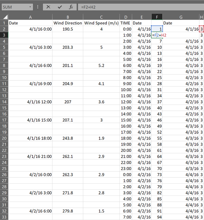
Next, I would require the adding of per hour measurements of both wind speed and wind direction. I will be using the average of the readings to determine the in between values. I require rows to be created in between the rows of data. Firstly I number the rows.
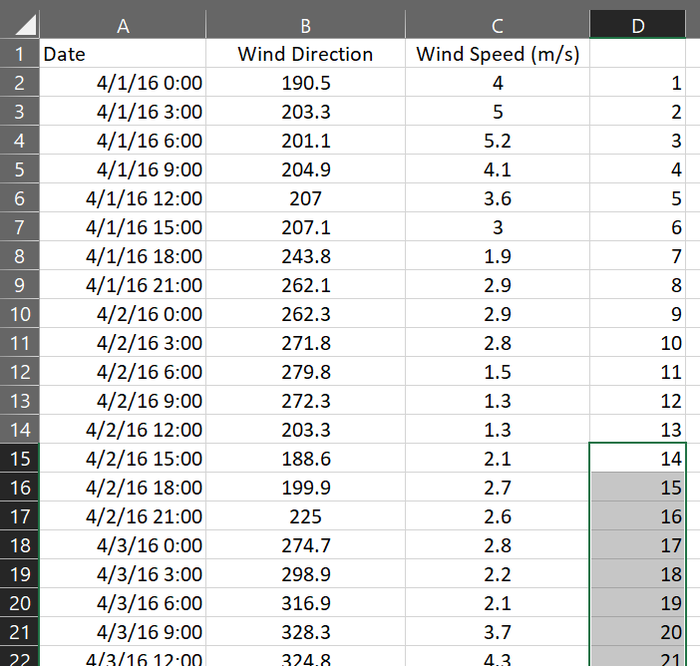
In the next column E, I repeat this numbering by 3 so as to have 2 subsiquent num berings that have no bordering rows and I sort the rows by collumn E so as to have for example all the 1s at the top causeing 2 blank rows to be added under each row.
Now I create a duplicated column of the old dates that are compressed this is in preperation to replicate each Date by the number of added rows since the date repeats numerous times for each hour.
Now that the rows are added I need to repeat the date values the number of rows it has to be which is 3. I first create a column of how many each row should repeat.
Now I create a column next to the dates that add all these counters a basic
=<first>+<second> formula.
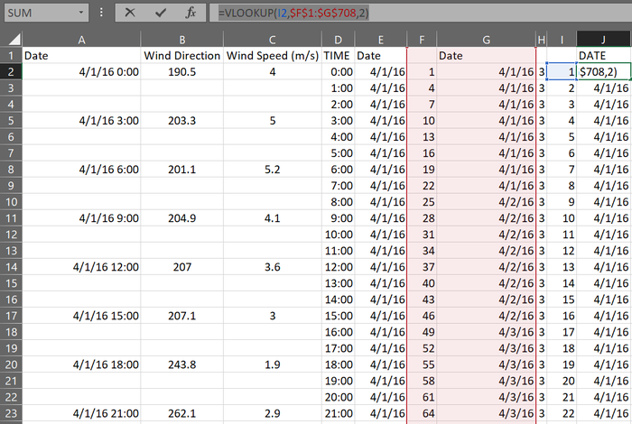
Now that the column is prepared using the formula
=VLOOKUP(<Number of refrence Column>,$<first repeater counter column>:$<last date column>,<lookup range>)
I can replicate each reference column by the number of stated times.
Now that dates are repeated isolate the time and drag the first hour down an it will match as hours will add per hour.
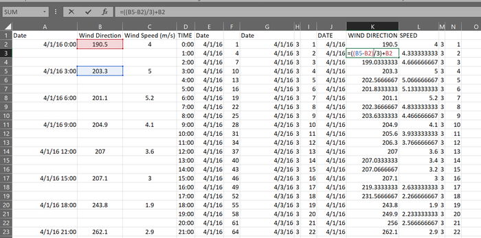
Now the caluation of the values of the wind speed and direction, they will be averages of the readings that surround them. I used
=((<Bottom Value>-<Top Value>)/3)+<Top Value>
in order to gradually account for the hours between the 3 hours.
Now I transpant the values to an new sheet.
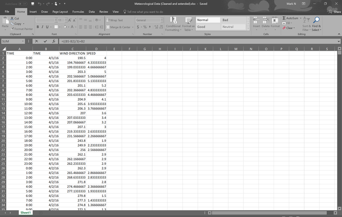
Last but not least the filling of missing dates was done by dragging the already present rows to fill in the missing dates.
Do note that some data is still missing as without any comparison bottom data we are unable to calculate suitable values and extrapolation would be inaccurate as based purely on assumptions
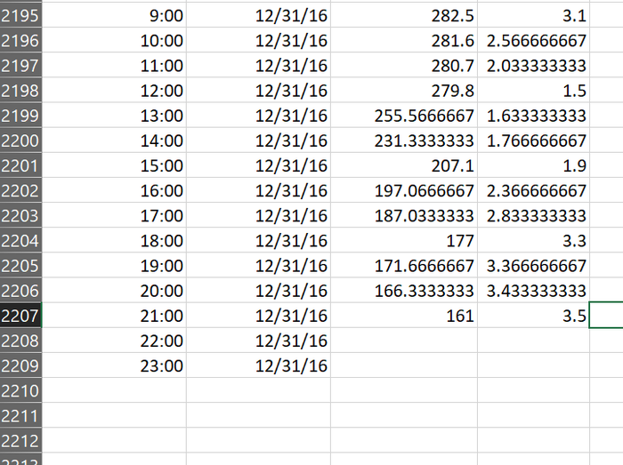
Result: Meteorological Data (Cleaned and extended).xlsx
Sensor Location.xlsx
For the coordinates excel I added in the coordinates of the Factories
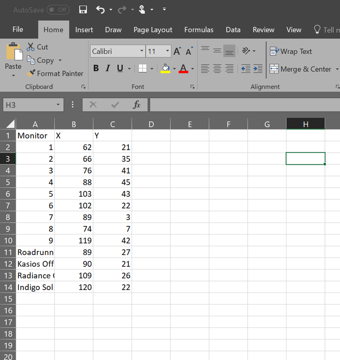
Result: Sensor and Fatory Location.xlsx
Dataset import structure/ Process
Analysing the Sensor Data
I analysed each data set individually before combining the anaylsis for the final deductions.
I began by looking at the duplicated AGOC readings seeing if there was a way to correct these error values, with little to go on and no real trends to analyse my final deduction was that it was better to leave these values out than risk the rest of the data’s integrity.
Next, I had to ensure that my data was now accurate. By running another heat map I was able to check that no additional values were present expecially in the Agoc readings.
The overview of all the readings was another proof that all duplicates were removed as the mirroring of missing values was clear.
What I did next was to compare the old raw data versus the cleaned data and clearer trends were much more visible right from the start.
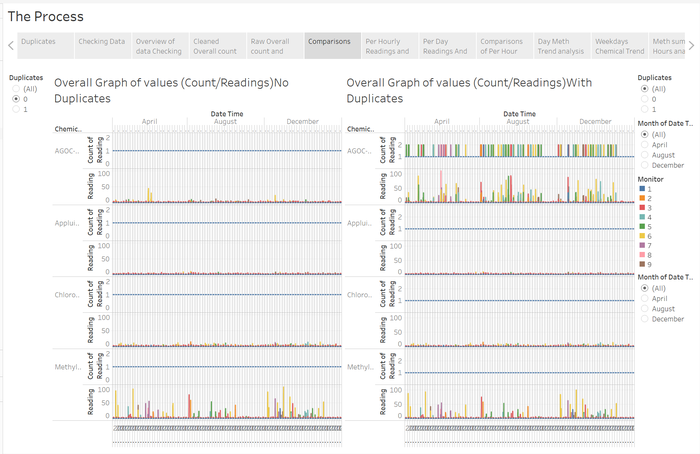
Looking through the hourly and daily reports both showed trends of tapering chemical readings but per hour readings seemed to show greater volatility and detail.
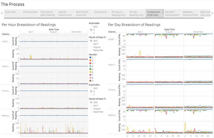
Next I began drilling down into the daily looks of the data
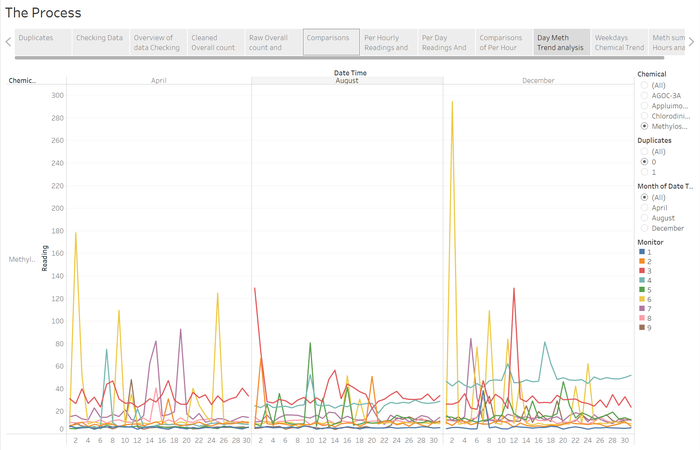
Then the Weeekday analysis to see if there were trends in the type of days that chemicals were produced but instead time seemed to be the obvious trend.
Lastly the sum of hours of readings showed the clearest trend in term of Meth
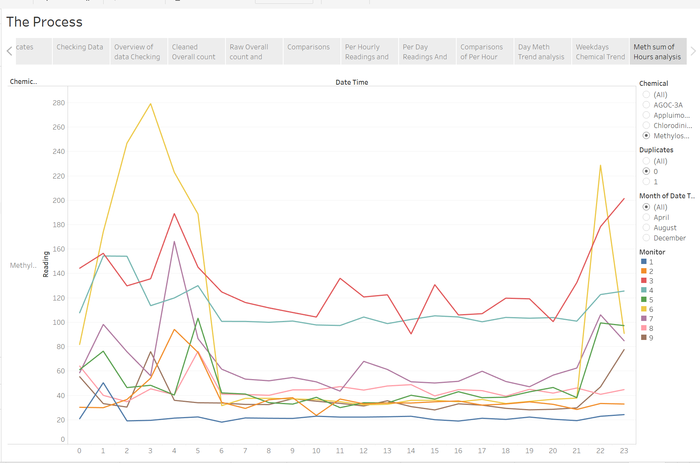
This was repeated for my AGOC analysis as well.
Analysing the Meteorological Data & Chemical Along with Location data
I began by joining all the datasets
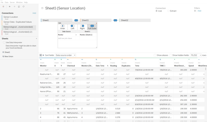
Chemical readings and Location data by the monitor numbers this made the factory data I added go null but this was not very crucial as you will see.
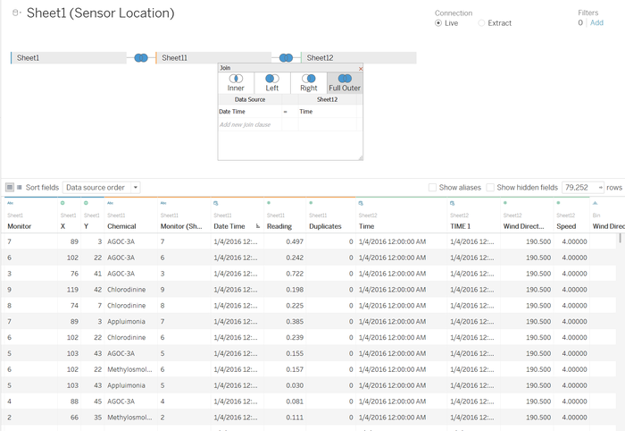
Next I merged the Chemical readings dataset with the meteorological dataset by date times, I cam across some issues with null values but this was solved with proper typing of the data in the excel.
Now began the fun part where I mapped the image to a map and then mapped the coordinates of the sensors to the image and map.
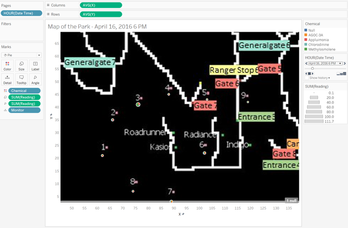
Next I used a pie chart to represent the chemical readings of the sensors.
Now the next interesting bit, making a wind compass.
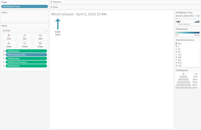
I used the binning of the wind direction values along with the shapes Marks to make arrows align to the direction the wind blew to for better understanding. Paging allowed me to watch as the compass turned in accordance with the hours. And by setting the wind speed to the size of the arrow I effectively am able to see how far the wind can travel in an hour according to the size of the arrow by scaling it accurately.
Now with a visual understanding of the position of the sensors on a map and the direction of the wind. I could plot this.
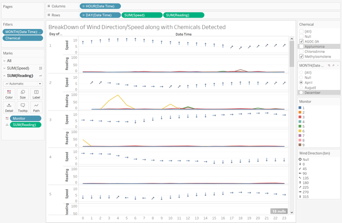
This chart visually plots the wind direction and speed in parallel with the readings of chemicals. This allowed me to visually see the patterns of wind direction and readings. Broken down by days and hours I can clearly observe which directions and readings are detected together.
However, the most fun was designing this live wind compass and readings dashboard that allows you to observe the changing wind directions and the readings fluctuate. From this I was able to better check my hypothesis in a more visual way.
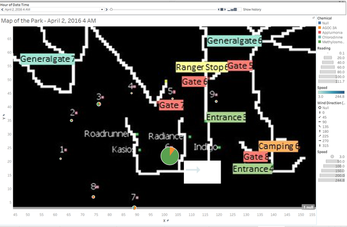
Interactive Visualization
Part 1 Chemical Analysis
https://public.tableau.com/shared/QW524X43M?:display_count=yes
Part 2 In depth anaysis
https://public.tableau.com/shared/Y653774W3?:display_count=yes
Part 3 Live Wind compass
Due to the large processes that go on in this dashboard it may cause the browser to crash useing th filer will help with the data overload
Also for some reason it does not auto play Please download to try to use the auto play
https://public.tableau.com/views/MAPLATEST/Dashboard1?:embed=y&:display_count=yes&publish=yes
Comments/ Observations
This was a wonderful learning experience after going through so many rounds of analyzing and looking at the data. Finding little kinks in the data and realizing the connections between them it was a great experience.
It was difficult to draw the line where reality and the academic part of this assignment ended. From analyzing too much detail and realizing it was overthinking the assignment it felt disappointing but it could also be that i hadn't dug deep enough.
Really wish there was more time to do this assignment and a wider array of data to analyze.
If there was more time i feel i could have delved more into the other analysis tools.
