IS428 2017-18 T1 Assign Lucas Leong Li Heng
Contents
Links
- IS428 Main Page
- Assignments
- Assignment Dropbox
- My Visualization: https://public.tableau.com/profile/lucas6531#!/vizhome/VAAssignment_0/Home
(Aspect ratio is 1800*1000. Might need to zoom out abit for the graphs to fit)
The Task
General Task
The four factories in the industrial area are subjected to higher-than-usual environmental assessment, due to their proximity to both the city and the preserve. Gaseous effluent data from several sampling stations have been collected over several months, along with meteorological data (wind speed and direction), that could help Mitch understand what impact these factories may be having on the Rose-Crested Blue Pipit. These factories are supposed to be quite compliant with recent years’ environmental regulations, but Mitch has his doubts that the actual data has been closely reviewed. Could visual analytics help him understand the real situation?
The primary job for Mitch is to determine which (if any) of the factories may be contributing to the problems of the Rose-crested Blue Pipit. Often, air sampling analysis deals with a single chemical being emitted by a single factory. In this case, though, there are four factories, potentially each emitting four chemicals, being monitored by nine different sensors. Further, some chemicals being emitted are more hazardous than others. Your task, as supported by visual analytics that you apply, is to detangle the data to help Mitch determine where problems may be. Use visual analytics to analyze the available data and develop responses to the questions below.
The Specific Tasks
- Characterize the sensors’ performance and operation. Are they all working properly at all times? Can you detect any unexpected behaviours of the sensors through analyzing the readings they capture?Limit your response to no more than 9 images and 1000 words.
- Now turn your attention to the chemicals themselves. Which chemicals are being detected by the sensor group? What patterns of chemical releases do you see, as being reported in the data? Limit your response to no more than 6 images and 500 words.
- Which factories are responsible for which chemical releases? Carefully describe how you determined this using all the data you have available. For the factories you identified, describe any observed patterns of operation revealed in the data. Limit your response to no more than 8 images and 1000 words.
Data Preparation
Location Data
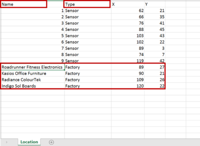
The location of the factories is not stored within any of the data sheets given. We will append the coordinates of the factories locations into the file "Sensor Location". A new column is added called "Type" which classifies the records into either "Sensor" or "Factory. The column name "Monitor" is changed to "Name". The output is as shown below.
Meteorological Data
In this file, there is a column called "Elevation". We will remove it since it does not contribute to the visualisation process. In row 445, at time 8/30/16 3:00, Wind Direction and Wind Speed values are missing. A value of 0 is assumed and added into the row. In row 460, there is a blank row. This entire row is removed to facilitate the data import process into Tableau.
Task 1
Firstly, we will explore the sensor performance and operation, and check for unexpected behaviour. We will check for missing sensor readings, and construct highlight tables to visualize these missing readings.
Hours with missing sensor readings (Excluding Chemicals)
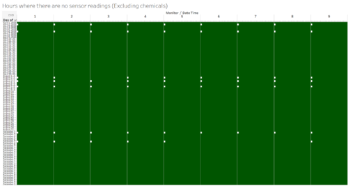
Firstly, we will find out if there are times when the sensor stops working, without introducing chemicals yet to get an overall high level view. In figure 3 below, dates/hours which have at least one record are coloured in dark green, while dates/hours without any record are white. These white boxes represent the date/hour where there are no sensor readings.
Figure 3 shows an interesting pattern, where the timings at which there are no sensor readings are all at 12AM. The specific dates are 2 April, 6 April, 2 August, 4 August, 7 August, 2 December and 7 December. Possible reasons might be scheduled maintenance for the censors.
Adding chemicals into visualization
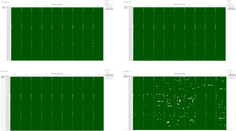
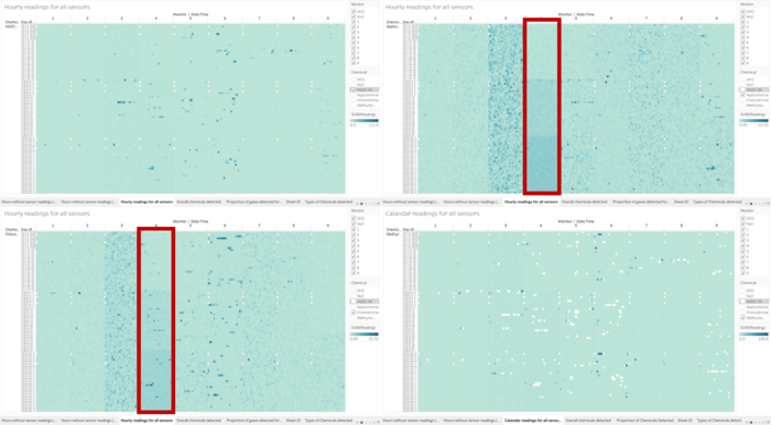
Next, we will dive deeper into sensor performance by adding chemicals into the visualisation. The respective highlight chart for each chemical is shown below.
- At first look, it is obvious that Methylosmolene has a lot more missing sensor reading compared to the other 3 chemicals. We will explore these missing sensor readings later on.
- For AGOC-3A, there are no additional missing sensor readings to those already revealed in figure 3.
- For Appluimonia, there are 3 additional missing sensor readings compared to figure 3. These are for sensor 3 on 2nd August, and sensor 6 and 8 on 7th December. All of these missing sensor readings are at 12 AM.
- For Chlorodinine, there are 4 additional missing sensor readings compared to figure 3. These are sensor 3 reading on 2nd August, and sensor 6,7, and 8 readings on 7th December. All of these missing sensor readings are at 12 Am.
Exploring missing readings of Methylosmolene
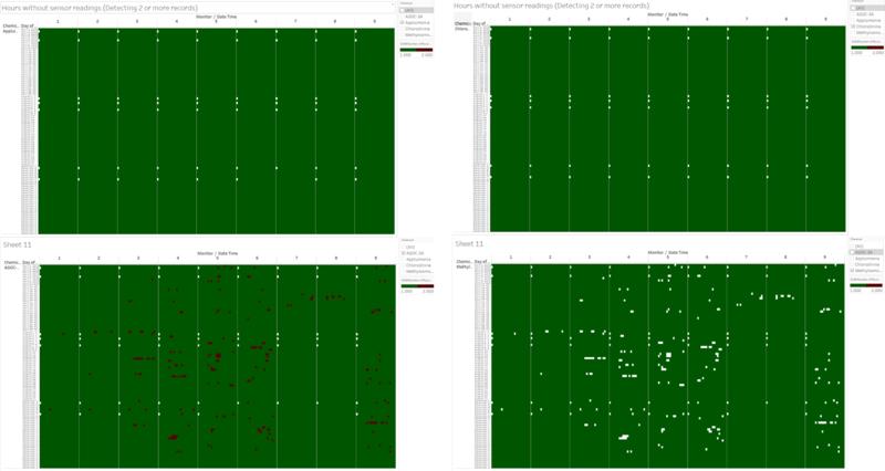
Now we will attempt to explore the missing readings for Methylosmolene. To do that, we will edit the colours so that different colours represent the different number of records. Red will be used to represent hours containing 2 records, while green represents hours with 1 record.
There are no changes to Appluimonia, Chlorodinine and Methylosmolene. However, an interesting pattern appears in AGOC-3A. When compared with Methylosmolene, it can be seen that hours with 2 records in AGOC-3A fits in perfectly into Methylosmolene. This might mean that the readings for Methylosmolene were intentionally classified as AGOC-3A in order to reduce the total levels of Methylosmolene recorded.
Task 2
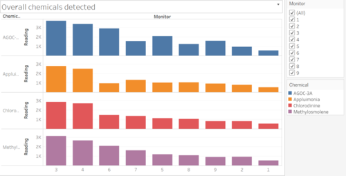
Next, we will explore the chemical's levels and release patterns. Firstly, we will visualize the total amount of each chemical detected by each sensor. This will allow us to determine which sensor picks up the most amount of chemicals.
Overall detection rate
As seen from the chart, sensor 3 has the overall highest detection rate among all the sensors, while sensor 1 has the lowest detection rate. The factory contributing to the high level of readings detected will be explored later in task 3.
Proportion of Chemicals Detected
Next, we will explore the proportion of chemicals detected by each sensor.
In the chart above, we can see that most of the sensors have an equal proportion of gases detected. However, there are a few exceptions to this, most notably in sensor 4,5,6 and 9, where there are much higher levels of AGOC-3A detected compared to the other chemicals. For example, for sensor 6, AGOC-3A makes up 39.22% of the proportion of gases detected and only 12.63% of Appluimonia.
Calandar readings for all sensor
We will now plot out the readings of each gas detected into a highlight table.
- For AGOC-3A, there are spikes in readings for 3,4,5 and 6, while the other sensors remain consistent. These spikes do not seem to have a pattern, and it looks like it occurs on a random basis.
- For Appluimonia and Chlorodinine, the readings are consistent across most of the sensors. One exception is sensor 4, where the readings for both chemicals increase gradually from April to December. This might hint at an increase in production of the factory near sensor 4 which contributes to this increased detection rate.
- Lastly for Methylosmolene, the release pattern is also fairly consistent other than a few spikes in sensor 6. However, the presence of a large number of missing records makes it difficult to conclude anything about the detection rates of Methylosmolene.
Detection Patterns throughout a day
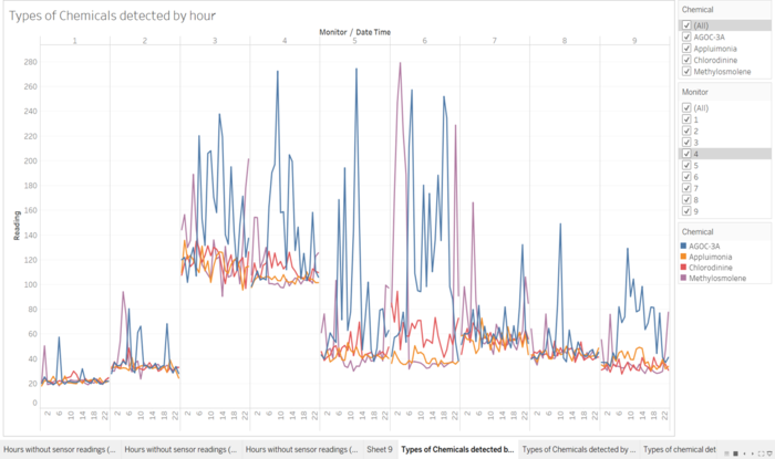
We will now explore the detection patterns throughout the day. To do that, we have plotted hour against reading level on a line chart, using colours the represent the 4 chemicals.
- From the chart, we can see that most sensors detect a high level of readings for AGOC-3A. The amount of AGOC-3A detected also fluctuates widely, and its release pattern is usually from 6 am onwards till 9 pm.
- For Appluimonia, the release patterns are pretty constant throughout the day without many fluctuations.
- For Chlorodinine, there are small fluctuations throughout the day as well, but the release pattern is pretty stable for every sensor.
- For Methylosmolene, a large amount of the gas is released early in the morning, usually from 1 am to 4 am. It then decreases sharply after 4 am, before rising sharply again around 8 pm to 10 pm. This is especially evident in sensor 6, where an extremely high reading of 279.3 at 3 am, before dipping to 31.6 at 6 am, and increasing to 228.9 at 10 pm.
- One interesting thing to note is that this dip in Methylosmolene readings usually corresponds to a spike in AGOC-3A. This is especially obvious for sensor 3,4,5 and 6. This might be due to the misclassification of Methylosmolene as mentioned in the previous section.
Task 3
We will now attempt to identify the companies responsible for the chemical releases. Firstly, we will build a windstick to illustrate the wind direction and wind speed more clearly.
Data Preparation
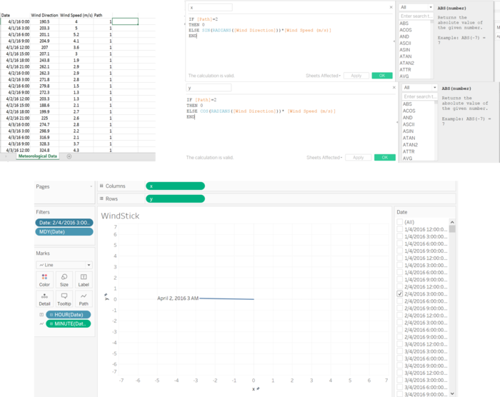
To do that, we will first create a duplicate of the file "Meteorological Data", and name it "Meteorological Data Windstick". Inside this file, We will then make a duplicate of all the rows so that there are two rows for each timestamp. Then, we will add in a new column called Path. Assign Path a value of 1 for original data, and a value of 2 for the duplicate data. Import the sheet into Tableau. Then, create a new calculated field called x and y. The values for x and y are shown in the figure below. Lastly, drag the values into the respective areas as shown below.
We will now create the trend of detection for each monitor over the 3 month period. We will plot a line chart which shows the readings hourly over 3 months, and filter it by monitor. This will allow us to look at peaks in chemical readings, which we can combine with the wind stick to identify the corresponding factory. This is combined with the windstick and location map to form the dashboard.
Identify Company: AGOC-3A
We will now attempt to find out which factory contributes the most to AGOC-3A. As seen from figure 6 previously, sensor 3 has the highest total chemical readings out of all, and so we will begin with sensor 3. These are the peak readings for sensor 3 for AGOC-3A:
All of the peak readings were picked up when the wind is coming from the southeastern direction. This could be either Roadrunner or Kasios, and this sensor is inconclusive.
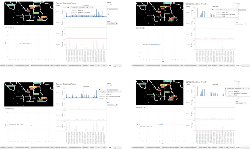
The next highest reading of AGOC-3A would be sensor 4, but since 4 is located beside 3, we would not choose it since it would not be able to distinguish whether Roadrunner and Kasios. Hence we would pick the 3rd highest readings, which is sensor 6. These are the peak readings for sensor 6.
Out of the 4 peak readings shown, 3 of the winds originate from Kasios, while 1 of it originates from Roadrunner. This shows that the main factory responsible for AGOC-3A is probably Kasios.
Identify Company: Appluimonia
Once again, sensor 3 has the highest readings, so we will begin investigating sensor 3.
The peaks in Appuluimonia actually occurs when the wind coming from the opposite direction of the factories. Hence probably none of the factories causes this chemical, which might have originated from the cities.
Identify Company: Chlorodinine
Once again, we will begin by investing sensor 3 which has the highest levels of Chlorodinine.
All this points to the factories southeast of sensor 3, which is inconclusive. We will now take a look at sensor 6 to identify the company since sensor 4 (2nd highest reading) would be as inconclusive as 3.
All these 3 figures show that the company responsible for Chlorodinine is southeast of sensor 6. This leaves Indigo as the only possibility. Hence Indigo is responsible for Chlorodinine.
Chemical: Methylosmolene
Since sensor 3 and 4 has proved inconclusive for the past few chemicals, we will skip sensor 3 and 4, which has the two highest readings, and proceed straight to sensor 6.
It can be seen that the company responsible for high levels of Methylosmolene is directly east of sensor 6. This leaves Kasios as the main contributor to the high levels of Methylosmolene.
Conclusion
In conclusion, the main contributors for each chemical are:
- AGOC-3A: Kasios
- Chlorodinine: Indigo
- Methylosmolene: Kasios
- Appluimonia: None
Even though Indigo is the main contributor to Chlorodinine, the levels of Chlorodinine detected is far below that of AGOC-3A and Methylosmolene. Hence it is likely that the decline in the local bird is caused by excess pollution by Kasios.
When considering our findings in task 1 that some of the readings of Methylosmolene might have been intentionally misclassified as AGOC-3A, Kasios appears the most suspicious since it contributes the most to both of these chemicals. Hence the recommended plan of action would be to investigate Kasios for dishonest environment practices and encourage Kasios to reduce its environmental footprint.
