IS428 2017-18 T1 Assign Kong Song Wei
IS428 Assignment: To be a Visual Detective
Contents
Overview
Mistford is a mid-size city is located to the southwest of a large nature preserve. The city has a small industrial area with four light-manufacturing endeavors. Mitch Vogel is a post-doc student studying ornithology at Mistford College and has been discovering signs that the number of nesting pairs of the Rose-Crested Blue Pipit, a popular local bird due to its attractive plumage and pleasant songs, is decreasing! The decrease is sufficiently significant that the Pangera Ornithology Conservation Society is sponsoring Mitch to undertake additional studies to identify the possible reasons. Mitch is gaining access to several datasets that may help him in his work, and he has asked you (and your colleagues) as experts in visual analytics to help him analyze these datasets.
Mitch Vogel was immediately suspicious of the noxious gases just pouring out of the smokestacks from the four manufacturing factories south of the nature preserve. He was almost certain that all of these companies are contributing to the downfall of the poor Rose-crested Blue Pipit bird. But when he talked to company representatives and workers, they all seem to be nice people and actually pretty respectful of the environment.
In fact, Mitch was surprised to learn that the factories had recently taken steps to make their processes more environmentally friendly, even though it raised their cost of production. Mitch discovered that the state government has been monitoring the gaseous effluents from the factories through a set of sensors, distributed around the factories, and set between the smokestacks, the city of Mistford and the nature preserve. The state has given Mitch access to their air sampler data, meteorological data, and locations map. Mitch is very good in Excel, but he knows that there are better tools for data discovery, and he knows that you are very clever at visual analytics and would be able to help perform an analysis.
The Task
General task
The four factories in the industrial area are subjected to higher-than-usual environmental assessment, due to their proximity to both the city and the preserve. Gaseous effluent data from several sampling stations has been collected over several months, along with meteorological data (wind speed and direction), that could help Mitch understand what impact these factories may be having on the Rose-Crested Blue Pipit. These factories are supposed to be quite compliant with recent years’ environmental regulations, but Mitch has his doubts that the actual data has been closely reviewed. Could visual analytics help him understand the real situation?
The primary job for Mitch is to determine which (if any) of the factories may be contributing to the problems of the Rose-crested Blue Pipit. Often, air sampling analysis deals with a single chemical being emitted by a single factory. In this case, though, there are four factories, potentially each emitting four chemicals, being monitored by nine different sensors. Further, some chemicals being emitted are more hazardous than others. Your task, as supported by visual analytics that you apply, is to detangle the data to help Mitch determine where problems may be. Use visual analytics to analyze the available data and develop responses to the questions below.
Task 1: Sensor performance
Tableau link: https://public.tableau.com/profile/kong.song.wei#!/vizhome/Assignment_230/SensorStatusDashboard
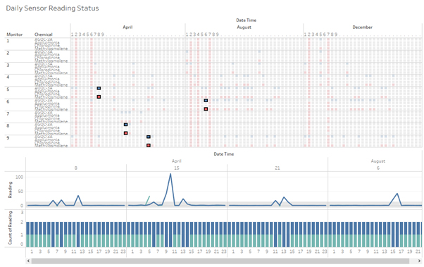
Based on the data exploration, each monitor sends a reading update every hour to the server. As such, the sensors’ hourly readings are bundled into 24 counts of readings to analyse the daily reliability of each chemical sensor across the different monitors. The sensors’ performances are generally reliable as the majority of the number of readings obtained from each sensor is close to the expected number of inputs as observed in Fig 1.1. However, some unexpected behaviours can be identified from the visualisations.
There appears to be a bug within the sensor system which is causing an error which records the Methylsomolene readings as AGOC-3A. The bug in question is can be observed across all sensors. In figure 1.1, almost every blue data point (having higher than the expected count of readings) for AGOC-3A is accompanied by a data point in red for methlsomolene (indicating less number of reading count than expected). Upon inspection of the data point with faulty status, it can be observed that there are 2 AGOC-3A and no Methylsomolene entry at the same date time as shown in Fig. 1.2. Each instance of the misclassification appears to be accompanied by a spike in the reading for AGOC-3A. It is likely that the bug which causes the wrong entry is triggered by a heightened reading of AGOC-3A levels. More investigation needs to be done to rule out foul play with regards to the tempering of data as Methylsomolene is highly toxic and volatile.
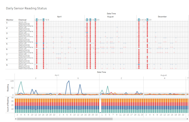
In Fig. 1.1, it can be observed that there are a number of days where the number of readings is all below the expected count across all sensors, barring the bug as discussed previously. Upon careful inspection of the visualization, all the days with widespread missing data appears to share the common characteristic of missing observations at 12am as seen in Fig 1.3. Furthermore, the downtime appears to happen on every 2nd day of the month followed by an addition incident or two within 5 days. Therefore, it is very likely to be some form of maintenance of the sensor system which rendered the sensor unable to record the readings at the affected timing.
Task 2: Chemical release patterns
Chemical Release Pattern Dashboard: https://public.tableau.com/profile/kong.song.wei#!/vizhome/Assignment_230/AggregatedReadingsDashboard
There are 4 different chemicals detected by the sensor groups, namely AGOC-3A, Appluimonia, Chlorodinine and Methylosmolene. In Fig 2.1.1, it can be observed that the average pollution reading for the across the month has increased with the interquartile range shifting upwards with each passing month in both the average and median readings. Additionally, Appluimonia and Chlorodinine levels appear to be relatively stable as compared to AGOC-3A and Methylosmolene levels.
In order to gain more insight into the chemical release pattern, the same data is analysed with aggregation at the weekly, daily and hourly level. One interesting pattern is that AGOC-3A pollution appears to follow a schedule which starts between 5 to 6 am daily and tapers off by 10 pm as shown in Fig 2.1.2. On the other hand, Methylosmolene pollution can be observed to be at higher levels between 10 pm to 5 am. However, we are unable to accurately tell if Methylosmolene levels are consistent throughout the day or only during these hours due to the bug highlighted in task 1.
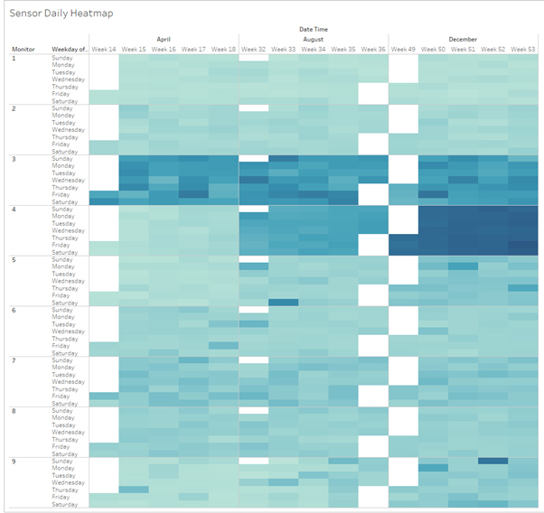
A calendar view is used to gain further insight into the chemical release pattern. There appear to be no distinct patterns for pollution due to weekdays or weekend. However, in Fig. 2.2.1, monitor 3 and 4 appear to pick up a significantly higher level of pollution readings as compared to other monitors. Upon closer inspection(Fig 2.2.2 and Fig 2.2.3), Appluimonia and Chlorodinine readings are disproportionally high for the 2 monitors. Further exploration and analysis will be conducted under task 3 to determine the source of the pollution.
Task 3: Pollution Origin Pinpointing
A scatter plot is plotted with the readings against the wind direction provided by the metrological station. The scatter plot is divided into regions of 45 degrees each with a reference band to visualize the wind direction region where the reading falls under. Each reading is represented by its monitor number to allow the easy identification of the most frequent monitor reading if possible.
Origin Pinpointing Dashboard: https://public.tableau.com/profile/kong.song.wei#!/vizhome/Assignment_230/PollutantSourceDashboard
AGOC-3A
Indigo Sol Boards appears to be a major pollutant of AGOC-3A. In Fig 3.1.1, the top 10 hourly readings belong to 6 different monitors and 7 out of the 10 readings originated from beyond the sensor cluster. The remaining 3 readings are from monitor 6 with a westward wind which suggests Indigo to the east as the source of pollutant. In Fig 3.1.2, it can be observed that monitor 6 has a disproportionally high number of high pollutant readings when the wind is westbound. As discussed in task 2, the average reading of AGOC-3A is 0.64 during the hours between 10pm and 5am. On the other hand, the average reading of AGOC-3A is 1.07 from 5am to 10pm. When we filter the records to observe only monitor 6, the difference is even starker with 0.592 against 1.64 for the 2 respective values. This finding corroborates with the finding from task 2 which suggest that AGOC-3A is released in a higher amount between the period of 5am to 10pm which is presumably the Indigo factory’s operating hour.
Appluimonia
Appluimonia readings appear to have lower variance with less distinctive outlier clusters as compared to the other chemical readings. Therefore, I decided to aggregate all data points from the 95th percentile and above to gain a better insight. A huge number of readings can be attributed to monitor 3 and 4 as shown in Fig 3.2. However, there doesn’t seem to be a clear source of pollutant as the high readings can be observed to come from all direction except the west. Therefore, it is highly likely that the pollutant is produced by other localised activities near the monitors instead of the 4 factories.
Chlorodinine
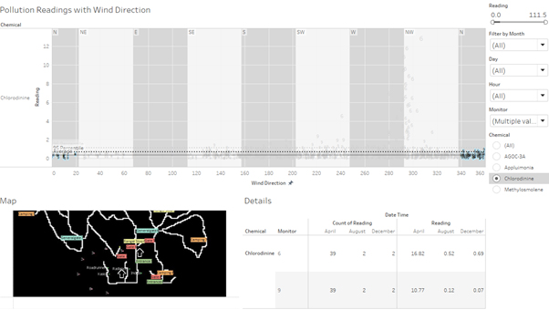
The chlorodinine readings appear to have 2 distinct clusters as seen in Fig 3.3.1. The first cluster consists of readings from monitor 3 and 4 with high levels of pollution during south and southeast bound wind which suggests that the origin is not from any of the 4 factories. The second cluster consists primarily of readings from monitor 6 during northwest and westbound wind. The origin of the pollution is unlikely to be from Indigo’s factory as monitor 9 has a very low and stable level of chlorodinine during times of northern winds as seen in
Methylosmole
High level of methylosmolene was recorded by monitor 6 with the westbound wind as seen in Fig 3.4.1 Therefore, the origin of the chemical is very likely to be from Indigo Sol’s factory. As highlighted in task 2, the high readings were all captured between the period of 10 pm to 5 am. In Fig. 3.4.2, the other outlying readings captured by other monitors originates mostly from the north of the monitor and factory cluster.
Summary
The monitors appear to have a reliable uptime with the number of readings reported being extremely close to the expected number of readings. Each double record of AGOC-3A can be linked to a missing record of the same time for methylosmole and is associated with a spike in AGOC-3A readings which suggests either a bug or data tampering. Other missing data at midnight can be attributed to scheduled maintenance.
The level of all 4 chemicals monitored has risen over the observed months which is worrying as some of the monitored chemicals are toxic and dangerous. Barring the bug, Methylosmolene levels appear to be highest during the period of 10 pm to 5am. On the other hand, AGOC-3A level is the highest during the period of 5am to 10pm. Monitor 3 and 4 appears to capture the highest reading of pollution as compared to other monitors which suggests that there are industrial activities to the north of the monitor and factory cluster. On the other hand, monitor 6 has captured high levels of AGOC-3A and methylosmole from westbound wind, indicating high amount of chemical release from Indigo Sol’s factory. Further investigation is needed to get a more accurate reading for AGOC-3A and methylosmole to accurately reflect the pollution status and ensure foul play is not involved.


