IS428 2017-18 T1 Assign He Xi
Contents
Links
Overview
Background
Mistford is a mid-size city is located to the southwest of a large nature preserve. The city has a small industrial area with four light-manufacturing endeavors. Mitch Vogel is a post-doc student studying ornithology at Mistford College and has been discovering signs that the number of nesting pairs of the Rose-Crested Blue Pipit, a popular local bird due to its attractive plumage and pleasant songs, is decreasing! The decrease is sufficiently significant that the Pangera Ornithology Conservation Society is sponsoring Mitch to undertake additional studies to identify the possible reasons. Mitch is gaining access to several datasets that may help him in his work, and he has asked you (and your colleagues) as experts in visual analytics to help him analyze these datasets.
Mitch Vogel was immediately suspicious of the noxious gases just pouring out of the smokestacks from the four manufacturing factories south of the nature preserve. He was almost certain that all of these companies are contributing to the downfall of the poor Rose-crested Blue Pipit bird. But when he talked to company representatives and workers, they all seem to be nice people and actually pretty respectful of the environment.
In fact, Mitch was surprised to learn that the factories had recently taken steps to make their processes more environmentally friendly, even though it raised their cost of production. Mitch discovered that the state government has been monitoring the gaseous effluents from the factories through a set of sensors, distributed around the factories, and set between the smokestacks, the city of Mistford and the nature preserve. The state has given Mitch access to their air sampler data, meteorological data, and locations map. Mitch is very good in Excel, but he knows that there are better tools for data discovery, and he knows that you are very clever at visual analytics and would be able to help perform an analysis.
General Task
The four factories in the industrial area are subjected to higher-than-usual environmental assessment, due to their proximity to both the city and the preserve. Gaseous effluent data from several sampling stations has been collected over several months, along with meteorological data (wind speed and direction), that could help Mitch understand what impact these factories may be having on the Rose-Crested Blue Pipit. These factories are supposed to be quite compliant with recent years’ environmental regulations, but Mitch has his doubts that the actual data has been closely reviewed. Could visual analytics help him understand the real situation?
The primary job for Mitch is to determine which (if any) of the factories may be contributing to the problems of the Rose-crested Blue Pipit. Often, air sampling analysis deals with a single chemical being emitted by a single factory. In this case, though, there are four factories, potentially each emitting four chemicals, being monitored by nine different sensors. Further, some chemicals being emitted are more hazardous than others. Your task, as supported by visual analytics that you apply, is to detangle the data to help Mitch determine where problems may be. Use visual analytics to analyze the available data and develop responses to the questions below.
Data Preparation
| Issue:
Combining Factory and Monitor location into a file |
|---|
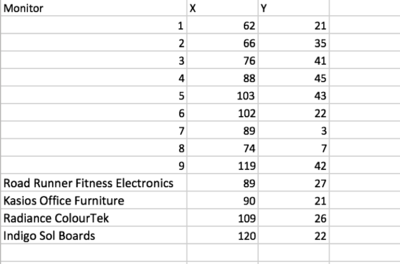
| Factory locations are provided in the word document but not inside the Data, the factories location data and monitors location data are combine into a file call All Location. The following are the factory locations: |
| As the screen shot below, the factory data and monitor data are combine into one file. |
Meteorological Data
| Issue:
Extra column of - Elevation(m) causing null value in tableau |
|---|
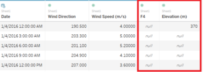
| there is a elevations(m) column in the data set, and an unknown header F4
|
| to solve the problem, remove the the elevation in meteorological data file. |
The specific tasks
Task 1
Characterize the sensors’ performance and operation. Are they all working properly at all times? Can you detect any unexpected behaviors of the sensors through analyzing the readings they capture?Limit your response to no more than 9 images and 1000 words.
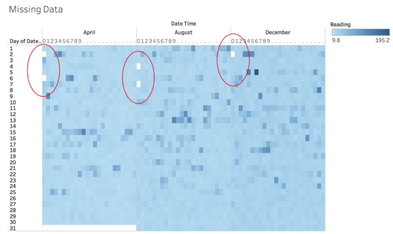
First, to understand whether the sensors are working properly, I think we should look at the data in a holistic view first. From diagram 1 above, we can tell that there are dates with no data, and they are the following.
list of missing data:
As the missing data only happen in 00:00 for all the dates, and happen on almost the same date each month, chances of either a system maintenance is going on, or monitor maintenance is going on. However, as I searching through the missing value, I observe some abnormal data, for example, on 5 Dec, 05:00 the reading was 0.64, but on the next our, it spikes up to 35.82. Let’s look into detail
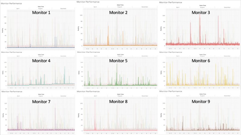
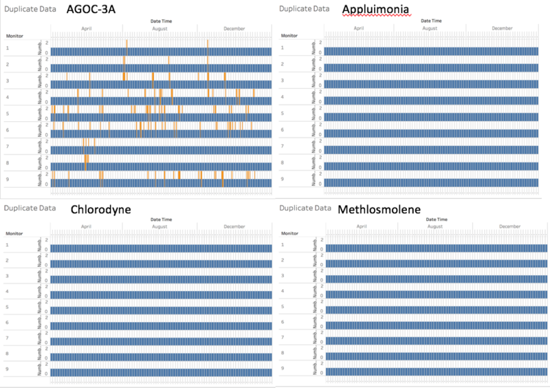
The spike is referring to the sudden change in reading that is not a constantly increase without a time- series pattern. The 9 monitors can split into 2 categories, quiet and noisy. Quiet: monitors: 1, 2, 7, 8. These monitors have a little spike during the 3 months, and throughout the 3 months, the readings are constants during the normal period. Noisy monitors: 3, 4, 5, 6, 9 These monitors are noisy, have a lot of spikes during the 3 months, we find out the especially monitor 4, have a constant increase in the reading throughout 3 months. Base on reading from other monitor, we can infer that monitor 4 is not functioning correctly. As the graph use the sum of reading of the four chemicals, I was wondering whether the reading is cause by duplicate data. The following diagram explain whether there are duplicate data.
The diagram shows that only for chemical AGOC-3A, there are a lot of duplicate data. However, the spikes are not cause by the duplicate reading. We can conclude that the monitors sometimes might experience abnormal reading due to hardware or software failure, but It won’t affect the overall performance.
Task 2
Now turn your attention to the chemicals themselves. Which chemicals are being detected by the sensor group? What patterns of chemical releases do you see, as being reported in the data? Limit your response to no more than 6 images and 500 words.
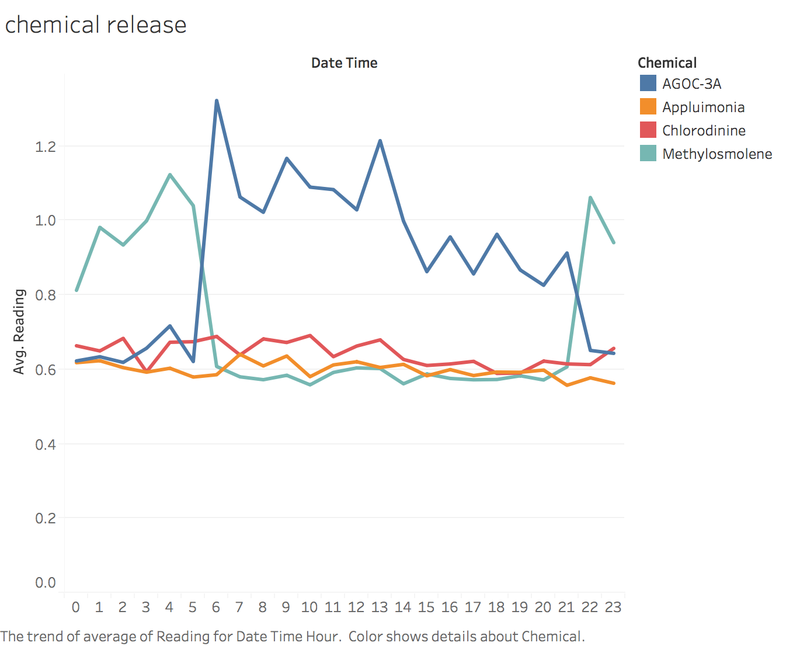
Let’s take a look into the chemicals. First, let’s examine the chemical patterns for each day.
The diagrams shows above, we can observe that for AGOC-3A. the reading goes up from 6am, drop half at 3pm, and eventually drop to lowest at 10pm. For appluimonia, the reading are pretty constant throughout the day. There is a sudden drop of chlorodyne at 3am, however it back to normal after 3. For methylosnolene, the trend is it go up from 10pm to next day 5am, we can assume that’s the working hour.
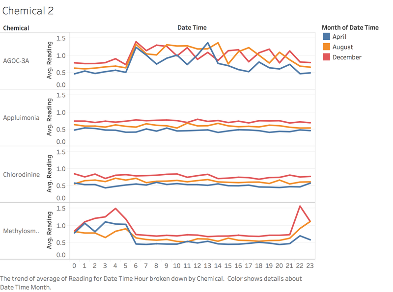
And now, lets split the trends and see whether each month follows the trend mention above.
The diagram indeed follows the trend of diagram 4, although there are some variation but I think the data pattern are still pretty constant for each chemicals.
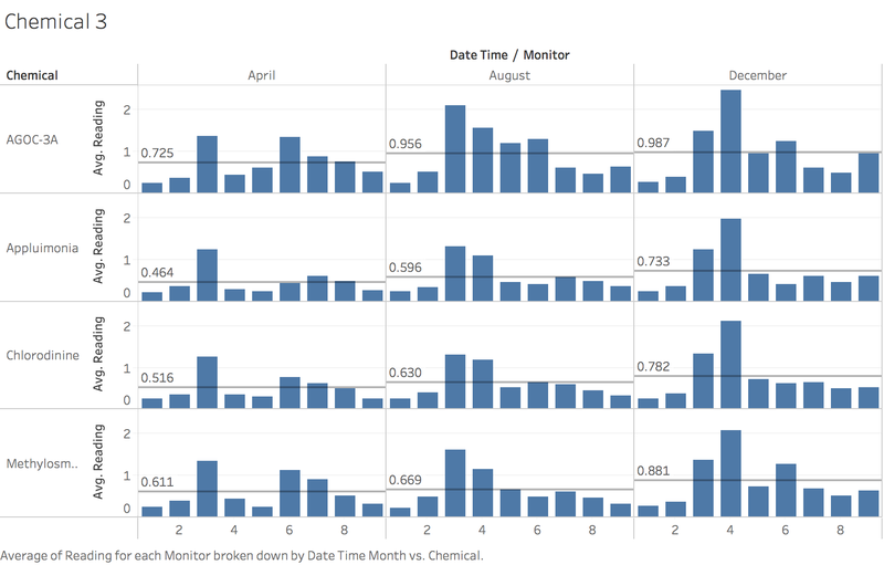
Let’s take a further look into the data.
As we can see from the diagram above, each chemical have a small increase in average value for each month, we can assume that either there are chemical residual in the air are getting intense, or the performance of the monitor is getting bad due to aging.
Task 3
Which factories are responsible for which chemical releases? Carefully describe how you determined this using all the data you have available. For the factories you identified, describe any observed patterns of operation revealed in the data. Limit your response to no more than 8 images and 1000 words.
To find out the how the monitors detect the chemicals, is good to use the wind direct and wind speed, as well as the location of each monitor, the readings of each chemical of each monitor per day.
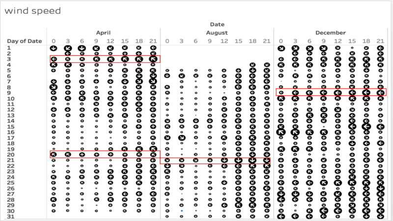
Let’s look at the wind speed
to examine the how the win spread, i had picked a few days where the wind direction are pretty constant and the wind speed are relatively high.
the dates are:
April 2, wind direction towards northwest
April 20, wind direct towards north
August 21, wind direct towards south
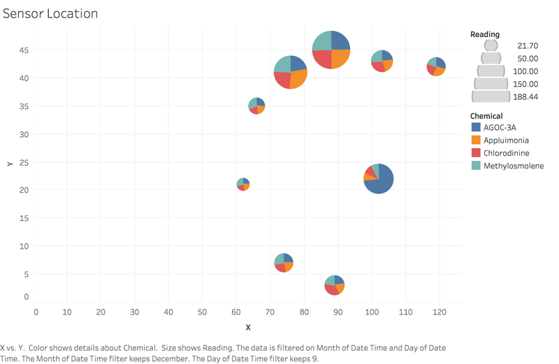
December 9, wind direct towards west
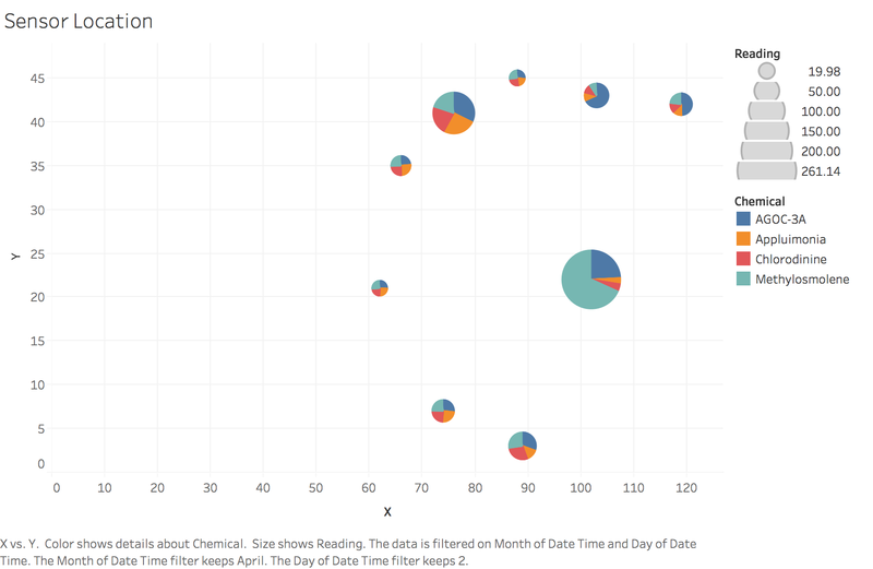
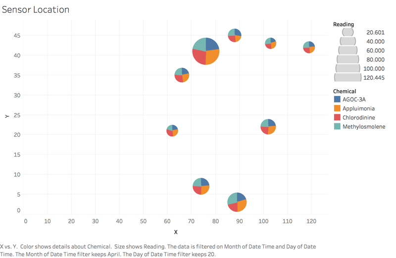
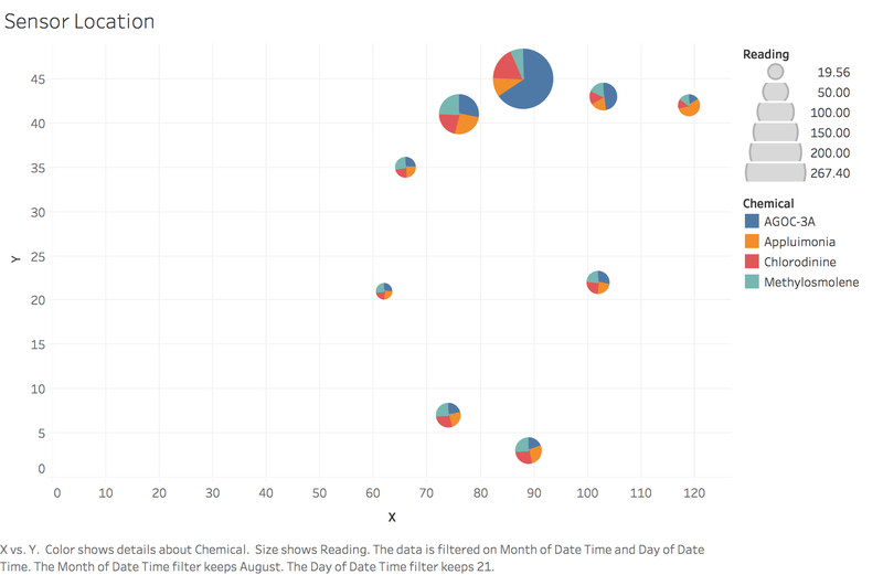
the next step, select the respective date and the chemical readings of each monitor.
April 2:
April 20:
August 21:
December 9:
Overall observation: when the wind blow towards west to north, the monitors pick up readings when win direction is north, methylosmolene and AGOC-3A increase. the monitors that pick up the readings ( 2,3,4) when wind direction is northwest, methylosmolene and AGOC-3A increase.(1,2,3) when win direction is west, methylosmolene and AGOC-3A increase.(1,2,3,4) when win direction is south, overall chlorodinine and appluimonia increase.
lets look at the extreme case on April 2, monitor 6 detect a great reading of methylosmolene, as monitor 6 is in the middle of all factory, i believe that indigo and kasios might be responsible for this. on December 9, monitor 6 detect a great reading of AGOC-3A, i believe that radiance and indigo might be responsible for this. on August 21, the overall level of chlorodine and applumonia increase, i believe that roadrunner and indigo might responsible for it.
on summary
however, is not possible that indigo responsible for every single chemical release, after further look into the other dates with different direction the following conclusion had been made
