IS428 2017-18 T1 Assign Gary Quek Jian Zhang
Contents
Links
- IS428 Main Page
- Assignment Dropbox
- https://public.tableau.com/views/assignment_87/Story?:embed=y&:display_count=yes&publish=yes
Overview
Mistford is a mid-size city is located to the southwest of a large nature preserve. The city has a small industrial area with four light-manufacturing endeavors. Mitch Vogel is a post-doc student studying ornithology at Mistford College and has been discovering signs that the number of nesting pairs of the Rose-Crested Blue Pipit, a popular local bird due to its attractive plumage and pleasant songs, is decreasing! The decrease is sufficiently significant that the Pangera Ornithology Conservation Society is sponsoring Mitch to undertake additional studies to identify the possible reasons. Mitch is gaining access to several datasets that may help him in his work, and he has asked you (and your colleagues) as experts in visual analytics to help him analyze these datasets.
Mitch Vogel was immediately suspicious of the noxious gases just pouring out of the smokestacks from the four manufacturing factories south of the nature preserve. He was almost certain that all of these companies are contributing to the downfall of the poor Rose-crested Blue Pipit bird. But when he talked to company representatives and workers, they all seem to be nice people and actually pretty respectful of the environment.
In fact, Mitch was surprised to learn that the factories had recently taken steps to make their processes more environmentally friendly, even though it raised their cost of production. Mitch discovered that the state government has been monitoring the gaseous effluents from the factories through a set of sensors, distributed around the factories, and set between the smokestacks, the city of Mistford and the nature preserve. The state has given Mitch access to their air sampler data, meteorological data, and locations map. Mitch is very good in Excel, but he knows that there are better tools for data discovery, and he knows that you are very clever at visual analytics and would be able to help perform an analysis.
The Task
The four factories in the industrial area are subjected to higher-than-usual environmental assessment, due to their proximity to both the city and the preserve. Gaseous effluent data from several sampling stations has been collected over several months, along with meteorological data (wind speed and direction), that could help Mitch understand what impact these factories may be having on the Rose-Crested Blue Pipit. These factories are supposed to be quite compliant with recent years’ environmental regulations, but Mitch has his doubts that the actual data has been closely reviewed. Could visual analytics help him understand the real situation?
The primary job for Mitch is to determine which (if any) of the factories may be contributing to the problems of the Rose-crested Blue Pipit. Often, air sampling analysis deals with a single chemical being emitted by a single factory. In this case, though, there are four factories, potentially each emitting four chemicals, being monitored by nine different sensors. Further, some chemicals being emitted are more hazardous than others. Your task, as supported by visual analytics that you apply, is to detangle the data to help Mitch determine where problems may be. Use visual analytics to analyze the available data and develop responses to the questions below.
Interactive Visualisation
Data Cleaning & Transformation
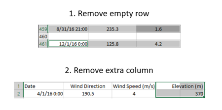
Meteorological dataset has empty row and extra column.
Dataset Import Structure & Process
| Step | Screenshot |
|---|---|
| 1. | Import the 3 excel files into Tableau. Sensor Data, Wind Data, Sensor Location are renamed as 'chemical', 'dMonitor' and 'wind' respectively.
 |
| 2. | Change the datatype of X and Y from table 'dMonitor' to Latitude and Longitude.
|
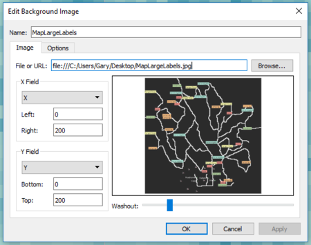
| 3. | Import custom map.
 |
Custom Calculated Fields & Parameters
| Filter | Screenshot |
|---|---|
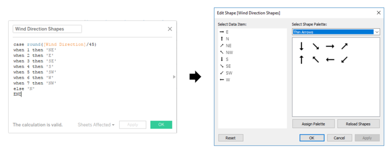
| Wind Direction Shape | Create Wind Direction Shape to visualise the direction of the wind.
 |
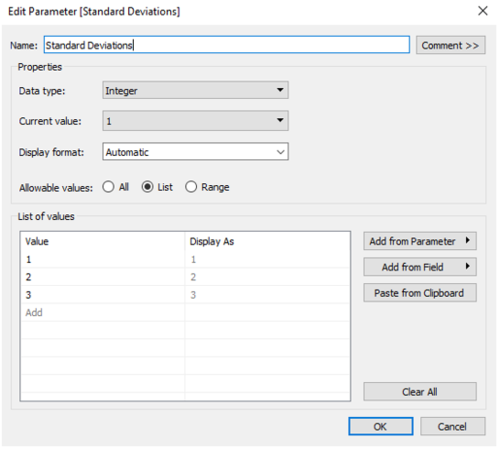
| Control Chart I Standard Deviation Parameter |
Create Wind Direction Shape to visualise the direction of the wind.
 |
| Control Chart II Lower Bound, Upper Bound, Outliers |
Create Wind Direction Shape to visualise the direction of the wind.
 |
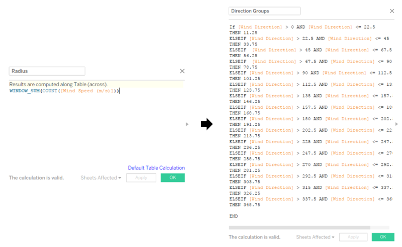
| Wind Rose Chart I Radius & Direction Group |
Create Wind Direction Shape to visualise the direction of the wind.
 |
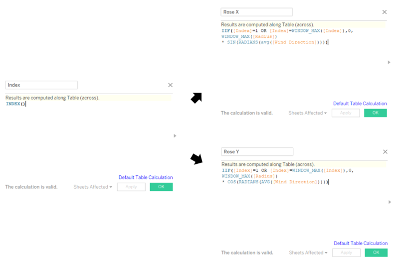
| Wind Rose Chart II X Y Coordinates |
Create Wind Direction Shape to visualise the direction of the wind.
 |
| Time Interval Parameter & Field | Create Wind Direction Shape to visualise the direction of the wind.
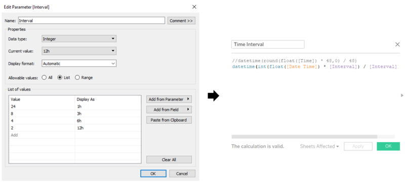 |
Story, Dashboards & Filters
Story will contain these 4 dashboards that will help provide insights to the data.

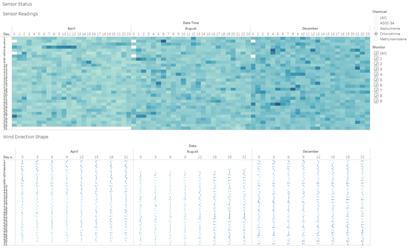
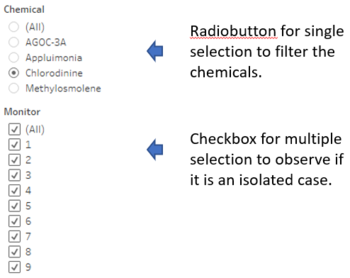
Dashboard: Sensor Status
This dashboard is to have an overview of the data collected during the month of April, August and December.
| Dashboard | Filters |
|---|---|
 |
 |
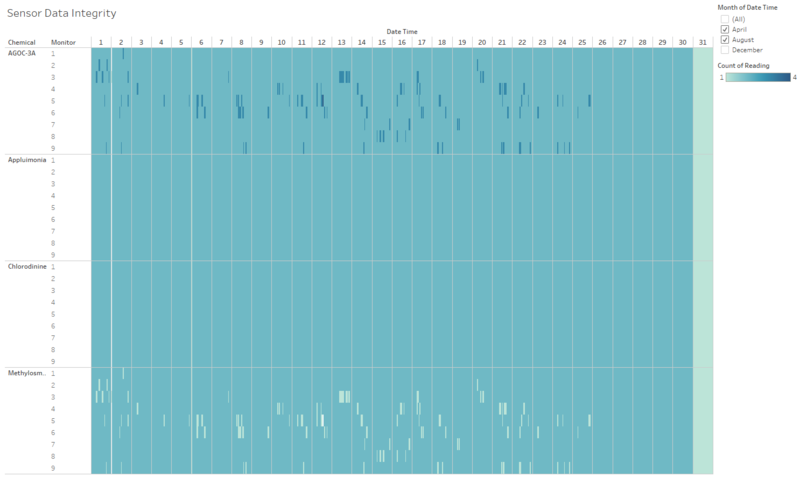
Dashboard: Sensor Data Integrity
This dashboard is to observe if there is any inconsistency within the data collected.
| Dashboard | Filters |
|---|---|
 |
 |
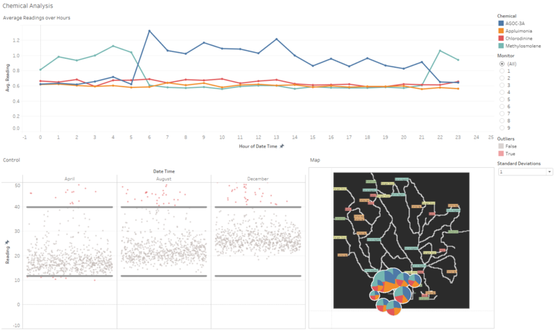
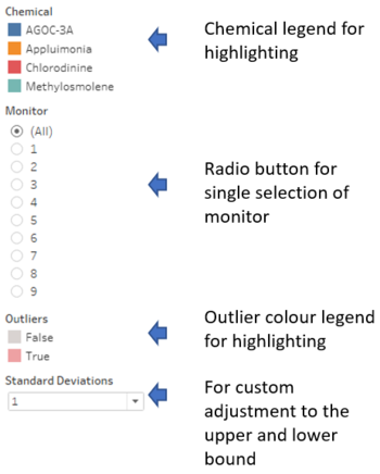
Dashboard: Chemical Analysis
This dashboard aims to provide a timeline view of the chemical data.
| Dashboard | Filters |
|---|---|
 |
 |
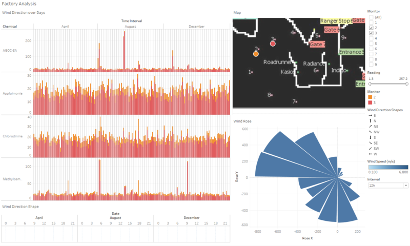
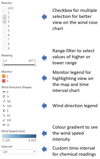
Dashboard: Factory Analysis
This dashboard aims to observe the wind direction + chemical data to find out the origin of the chemical release.
| Dashboard | Filters |
|---|---|
 |
 |
Task #1: Sensors' Performance & Operation
Characterize the sensors’ performance and operation. Are they all working properly at all times? Can you detect any unexpected behaviors of the sensors through analyzing the readings they capture?Limit your response to no more than 9 images and 1000 words.
The following screenshots are from dashboard 'statusCheckDash' and 'dataIntegrityDash'. These dashboard aims to observe the sensor operational status and the integrity of the data collected.
Assumptions:
- If none of the chemical is detected at that time, sensor is not working at that time.
- If any one of the chemical is detected, sensor is working.
| Type | Screenshot | Observation |
|---|---|---|
| Chemical Sensors | 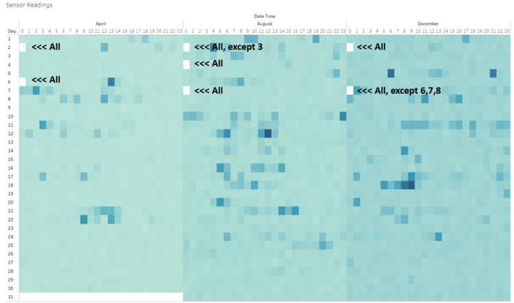 |
We can observe the following:
|
| Wind Data | 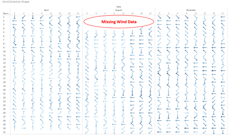 |
We can observe the following:
|
| Duplicate Data | 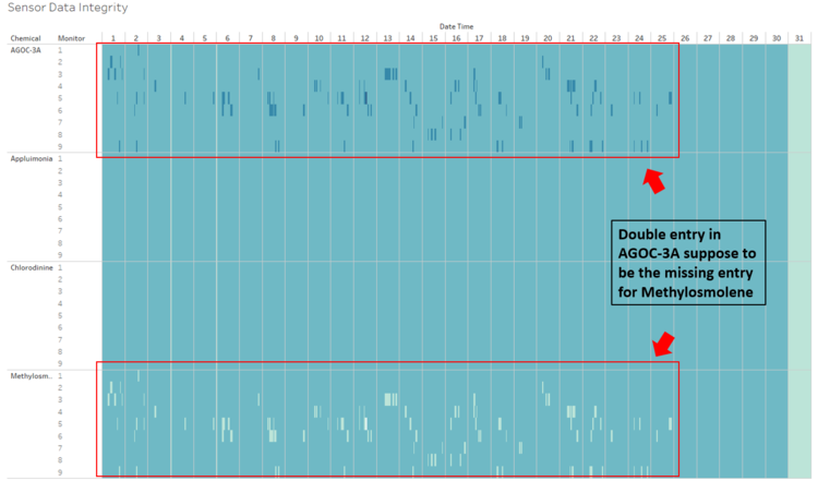 |
When looking through the data, some abnormalities are noted. Example above, you can see the double entry for AGOC-3A and a missing entry for Methylosmolene.
|
Task #2: Chemicals
Now turn your attention to the chemicals themselves. Which chemicals are being detected by the sensor group? What patterns of chemical releases do you see, as being reported in the data? Limit your response to no more than 6 images and 500 words.
The following screenshots are from dashboard 'chemicalDash'.This dashboard aims to further breakdown the readings collected and gain insights.
| Type | Screenshot | Observation |
|---|---|---|
| Average Readings | 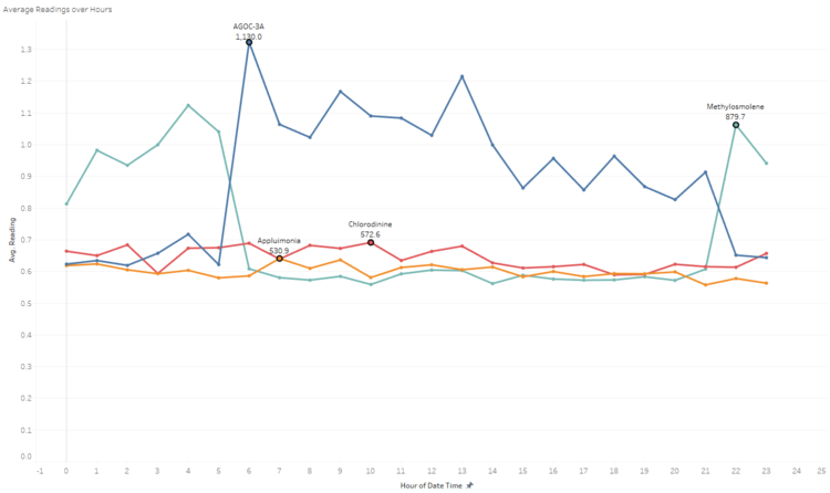 |
This chart shows the average reading for each chemical across the hour daily. The marked labels are the highest average point for each chemical.
|
| Control - All | 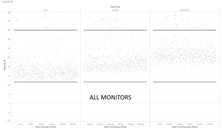 |
We can observe a general increase in readings along the month. The variance of each month is quite high and several data points are way off the mean. |
| Control - 4 | 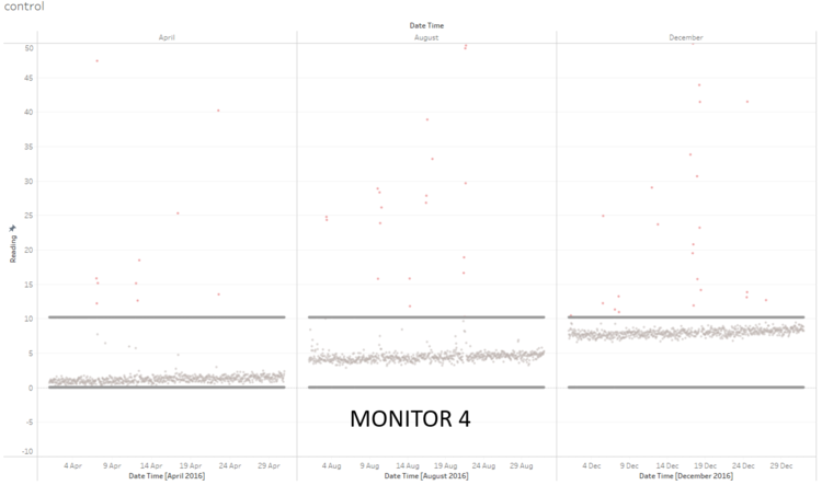 |
Monitor 4 is showing a different baseline for each month. The data is more tightly clustered. |
| Control - 9 | 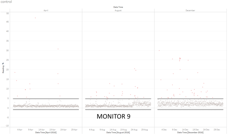 |
Monitor 9 is relatively clustered from April to the 3rd week of august. Data are 24 August is becoming increasingly noisy and it follows through into December. |
| Map - All | 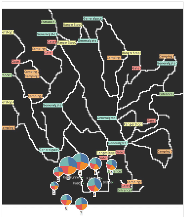 |
Monitor 3 and 4 has significantly higher read overall, follow by monitor 6 and 7. |
Task #3: Factories
Which factories are responsible for which chemical releases? Carefully describe how you determined this using all the data you have available. For the factories you identified, describe any observed patterns of operation revealed in the data. Limit your response to no more than 8 images and 1000 words.
The following screenshots are from dashboard 'factoryDash'.This dashboard aims identify the origin of the chemicals.
| Type | Screenshot | Observation |
|---|---|---|
| AGOC-3A | 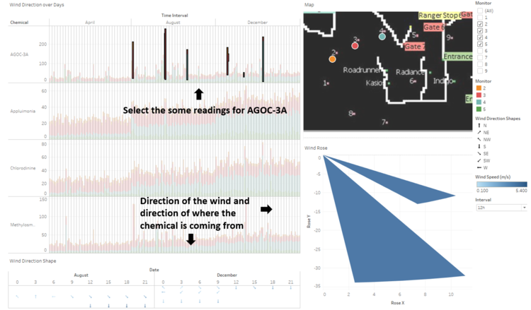 |
Based on the high readings from sensor 2, 3, 4 and the reading from wind rose chart shows a strong wind speed coming from south east, AGOC-3A seems to be coming from Roadrunner and Radiance. |
| Appluimonia | 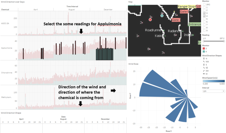 |
High readings from sensor 3 and 4 plus the wind rose chart. The only valid wind direction are those that are in the south east segment. Thus appluimonia might be coming from Roadrunner and Radiance. |
| Chlorodinine | 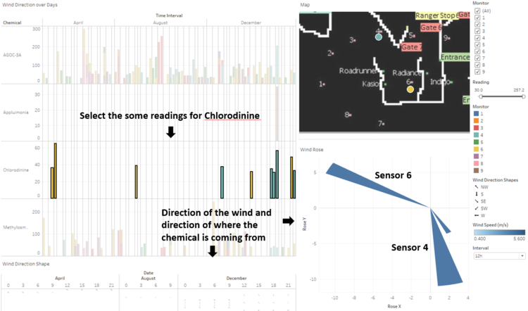 |
Sensor 6's reading and its corresponding wind rose direction shows north west, pointing in the direction of Roadrunner and Kaisos. Sensor 4's reading and its wind rose direction shows just about south, pointing to the direction of Roadrunner and Kasios. |
| Methylosmolene | 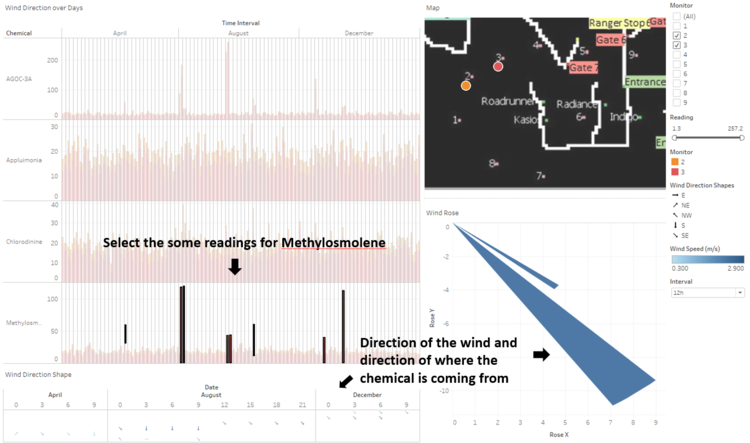 |
High readings from sensor 2 and 3 plus the wind direction from wind rose chart pointing towards the south east shows that methylosmolene is probably coming from Roadrunner or Kasios. |
Findings:

References
https://community.tableau.com/thread/214339
https://community.tableau.com/thread/209697
https://public.tableau.com/en-us/s/blog/2013/11/how-make-control-charts-tableau
https://onlinehelp.tableau.com/current/pro/desktop/en-us/maps_howto_filledpiechart.html
https://community.tableau.com/thread/122640
http://onlinehelp.tableau.com/current/pro/desktop/en-us/help.htm?context=Tableau_Online_Help&file=Tableau%2520Online%2520Help-23-2.html#bkimages.html