IS428 2017-18 T1 Assign Foo Ru Jia
Links
Assignment Description
Assignment_Dropbox
Interactive Data Visualisation Task1
Interactive Data Visualisation Task2
Interactive Data Visualisation Task3
Overview
Mistford is a mid-size city is located to the southwest of a large nature preserve. The city has a small industrial area with four light-manufacturing endeavors. Mitch Vogel is a post-doc student studying ornithology at Mistford College and has been discovering signs that the number of nesting pairs of the Rose-Crested Blue Pipit, a popular local bird due to its attractive plumage and pleasant songs, is decreasing! The decrease is sufficiently significant that the Pangera Ornithology Conservation Society is sponsoring Mitch to undertake additional studies to identify the possible reasons. Mitch is gaining access to several datasets that may help him in his work, and he has asked you (and your colleagues) as experts in visual analytics to help him analyze these datasets. Mitch Vogel was immediately suspicious of the noxious gases just pouring out of the smokestacks from the four manufacturing factories south of the nature preserve. He was almost certain that all of these companies are contributing to the downfall of the poor Rose-crested Blue Pipit bird. But when he talked to company representatives and workers, they all seem to be nice people and actually pretty respectful of the environment. In fact, Mitch was surprised to learn that the factories had recently taken steps to make their processes more environmentally friendly, even though it raised their cost of production. Mitch discovered that the state government has been monitoring the gaseous effluents from the factories through a set of sensors, distributed around the factories, and set between the smokestacks, the city of Mistford and the nature preserve. The state has given Mitch access to their air sampler data, meteorological data, and locations map. Mitch is very good in Excel, but he knows that there are better tools for data discovery, and he knows that you are very clever at visual analytics and would be able to help perform an analysis.
General Task
The four factories in the industrial area are subjected to higher-than-usual environmental assessment, due to their proximity to both the city and the preserve. Gaseous effluent data from several sampling stations has been collected over several months, along with meteorological data (wind speed and direction), that could help Mitch understand what impact these factories may be having on the Rose-Crested Blue Pipit. These factories are supposed to be quite compliant with recent years’ environmental regulations, but Mitch has his doubts that the actual data has been closely reviewed. Could visual analytics help him understand the real situation? The primary job for Mitch is to determine which (if any) of the factories may be contributing to the problems of the Rose-crested Blue Pipit. Often, air sampling analysis deals with a single chemical being emitted by a single factory. In this case, though, there are four factories, potentially each emitting four chemicals, being monitored by nine different sensors. Further, some chemicals being emitted are more hazardous than others. Your task, as supported by visual analytics that you apply, is to detangle the data to help Mitch determine where problems may be. Use visual analytics to analyze the available data and develop responses to the questions below.
Specific Task
Task 1
Characterize the sensors’ performance and operation. Are they all working properly at all times? Can you detect any unexpected behaviors of the sensors through analyzing the readings they capture?Limit your response to no more than 9 images and 1000 words.
Preparation of Data:
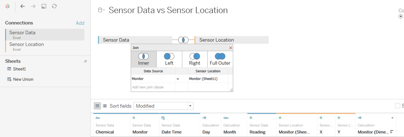
The inner join option is selected while using Monitor as the common variable for intersection between both data. This data preparation step will allow us to view the location of all the nine monitors as well as the factories.
Location of Monitors and Factories:
Figure 1.2 shows the location of the nine monitors and the factories. The label 1 to 9 indicates the monitor's identity. Beside each monitor, there is a small pie chart that is made up of four different colors. Each color represent a different chemical and the size of the pie chart is relative to the readings captured by the monitor. The higher the readings, the larger the size of the pie chart and vice versa.
Hourly HeatMap:
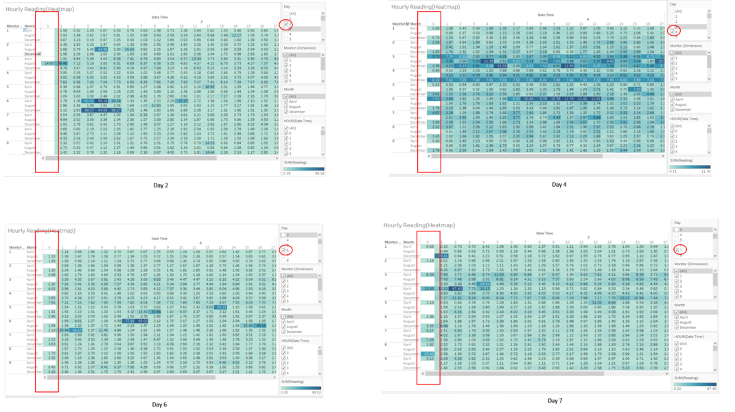
Figure 1.3 shows the hourly reading heatmap across April, August and December. Based on the data shown, on day 2, 4, 6 and 7, those were the days where the monitors are not working properly. The details are as follows:
Day 2
Only one reading was captured at 12am (hour 0) on August by monitor 3, the rest of the monitors were not able to capture any readings in April, August and December.
Day 4
All monitors in August failed to capture any readings at 12am (hour 0).
Day 6
All monitors in April failed to capture any readings at 12am (hour 0).
Day 7
Monitor 1, 2, 3, 4, 5 and 9 failed to capture any readings at 12am (hour 0) on August and December.
Monitor 6, 7 and 8 failed to capture any readings at 12am (hour 0) on August.
Based on the data, at 12am (hour 0) across all three months on different days, the monitors failed to work properly.
Behavior of the Monitors:
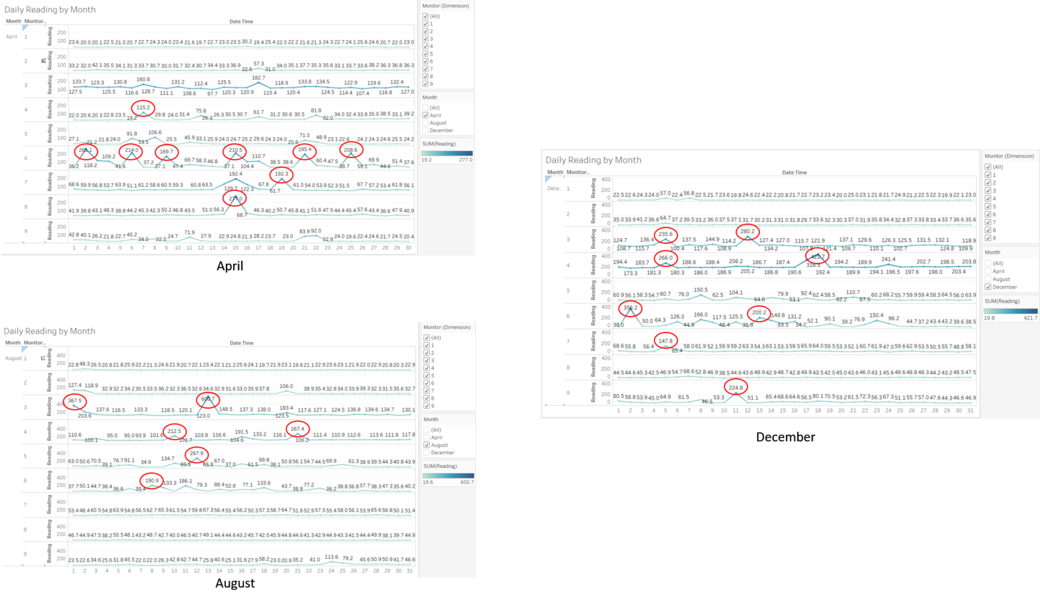
Figure 1.4 shows the hourly reading by month. The data points that are circled in red indicates the anomalies which the monitors have captured. In April, monitor 4, 6, 7 and 8 has indicated anomalies in its readings and monitor 6 has the highest number of anomalies readings captured.
In August, monitor 3, 4 and 5 has anomalies in its readings, with the highest reading captured at 600.7 on the 13th.
In December, monitor 3, 4, 6 and 7 has anomalies in its readings, with the highest reading captured at 421.7 on the 18th.
Across all three months, monitor 4 has the highest frequency of anomalies readings.
Task 2
Now turn your attention to the chemicals themselves. Which chemicals are being detected by the sensor group? What patterns of chemical releases do you see, as being reported in the data? Limit your response to no more than 6 images and 500 words.
Overall Readings of all Chemicals
Figure 2.1 shows the overall chemical readings captured by all nine monitors across April, August and December.
Monthly Reading by Chemicals
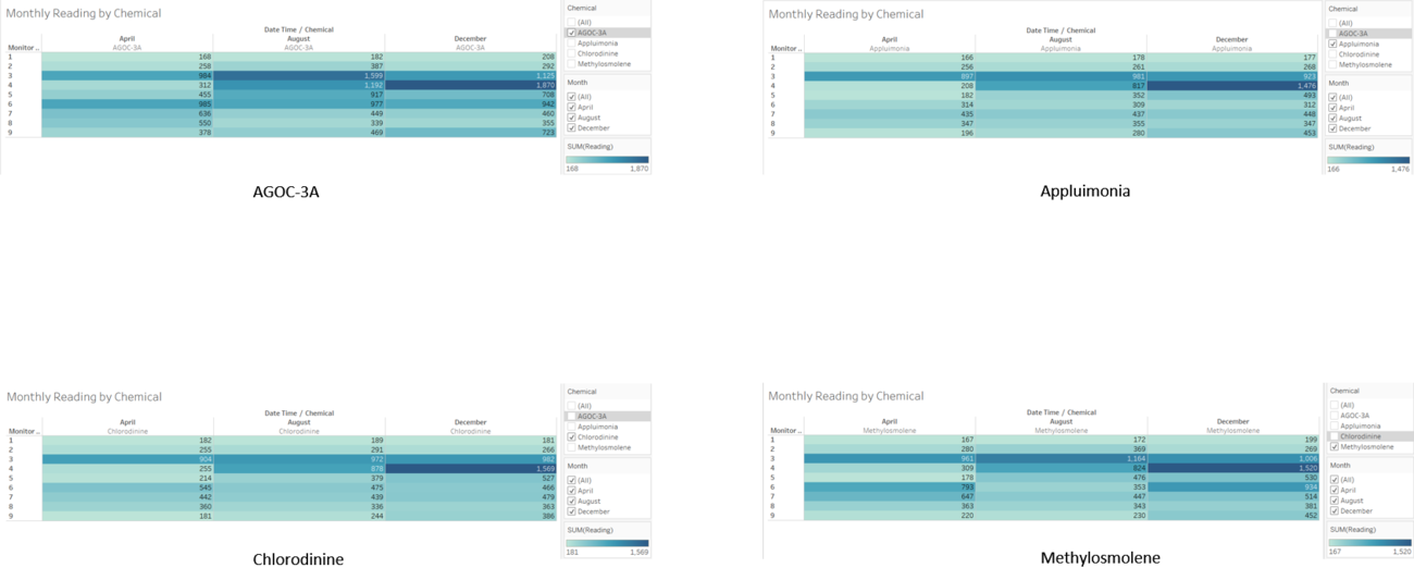
Figure 2.2 shows the breakdown of chemical readings by chemical types across all three months.
From both Figure 2.1 and Figure 2.2, it shows that all four chemicals, namely AGOC-3A, Appluimonia, Chlorodinine and Methylosmolene, are being detected by all nine monitors.
Daily Readings of Chemical
Figure 2.3 and Figure 2.4 shows the daily readings captured by all nine monitors daily. The darker purple tone indicates a higher readings captured and chemical Appluimonia has indicated the highest readings captured for monitor 3 and 4. Both monitors have also captured the highest readings for chemical Chlorodinine. Based on the readings, monitor 3 has a higher reading in April and August for chemical Appluimonia and balanced reading across all three month for chemical Chlorodinine. In the case of monitor 4, it has recorded the highest reading in December for both chemicals.
Monthly Readings of Chemical
Figure 2.5 shows the readings captured by all nine monitors in each respective months.
Based on Figure 2.3, 2.4 and 2.5, all nine monitors have detected the presence of all four chemicals and Appluimonia has the highest emittance based on the readings captured. Therefore, we may infer from the readings that the pattern of chemical releases by the factories, in descending order of emittance, are Appluimonia, Chlorodinine, Methylosmolene and AGOC-3A.
Task 3
Which factories are responsible for which chemical releases? Carefully describe how you determined this using all the data you have available. For the factories you identified, describe any observed patterns of operation revealed in the data. Limit your response to no more than 8 images and 1000 words.
Preparation of Data:
Since we require the data from all three excel files provided, we will use inner join between Sensor Data & Meteorological Data, and between Sensor Data & Sensor Location.
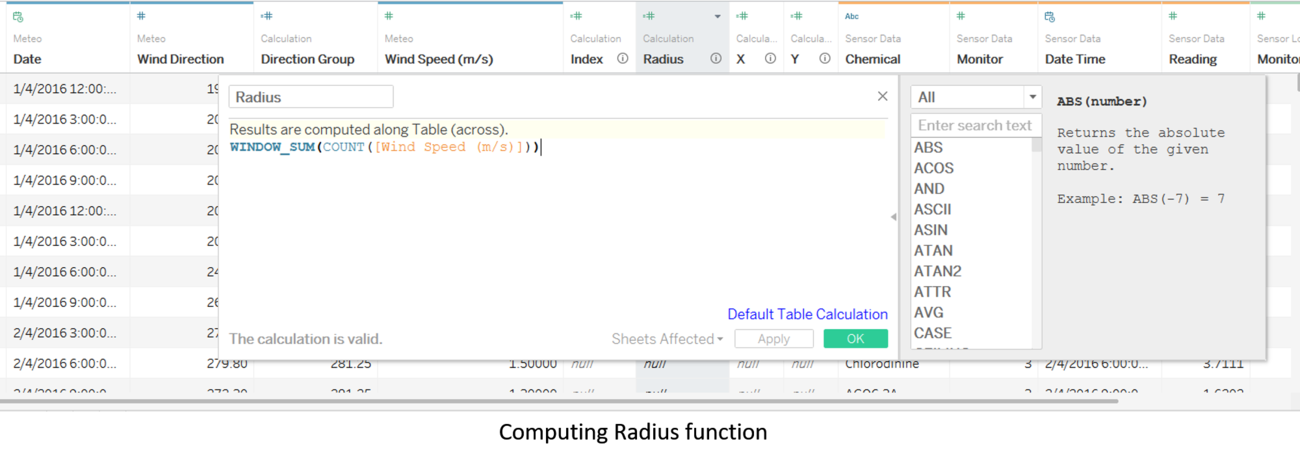
To compute the radius function which will be used to compute the X and Y coordinates, we will use the WINDOW_SUM function on Wind Speed variable.
The X and Y coordinates are computed using parameters such as Wind Direction, Wind Speed, Index, Radius and Date, therefore the result that is derived will allow us to trace the path of the wind direction and its corresponding speed.
WindRose by Month
Figure 3.4 shows the windrose diagram filtered by months and it indicates the path of the wind direction and its speed. Of all the three months, December has the highest wind speed recorded.
Based on Figure 1.2 and Figure 3.4, the observations are as follows:
AGOC-3A : RoadRunner Fitness Electronics
Appluimonia: Indigo Sol Boards
Chlorodinine: RoadRunner Fitness Electronics
Methylosmolene: Kasios Office Furniture
