IS428 2017-18 T1 Assign Fan Kaiyang
Contents
Links
Overview
Mistford is a mid-size city is located to the southwest of a large nature preserve. The city has a small industrial area with four light-manufacturing endeavors. Mitch Vogel is a post-doc student studying ornithology at Mistford College and has been discovering signs that the number of nesting pairs of the Rose-Crested Blue Pipit, a popular local bird due to its attractive plumage and pleasant songs, is decreasing! The decrease is sufficiently significant that the Pangera Ornithology Conservation Society is sponsoring Mitch to undertake additional studies to identify the possible reasons. Mitch is gaining access to several datasets that may help him in his work, and he has asked you (and your colleagues) as experts in visual analytics to help him analyze these datasets.
Mitch Vogel was immediately suspicious of the noxious gases just pouring out of the smokestacks from the four manufacturing factories south of the nature preserve. He was almost certain that all of these companies are contributing to the downfall of the poor Rose-crested Blue Pipit bird. But when he talked to company representatives and workers, they all seem to be nice people and actually pretty respectful of the environment.
In fact, Mitch was surprised to learn that the factories had recently taken steps to make their processes more environmentally friendly, even though it raised their cost of production. Mitch discovered that the state government has been monitoring the gaseous effluents from the factories through a set of sensors, distributed around the factories, and set between the smokestacks, the city of Mistford and the nature preserve. The state has given Mitch access to their air sampler data, meteorological data, and locations map.
The Task
General Task
The four factories in the industrial area are subjected to higher-than-usual environmental assessment, due to their proximity to both the city and the preserve. Gaseous effluent data from several sampling stations has been collected over several months, along with meteorological data (wind speed and direction), that could help Mitch understand what impact these factories may be having on the Rose-Crested Blue Pipit. These factories are supposed to be quite compliant with recent years’ environmental regulations, but Mitch has his doubts that the actual data has been closely reviewed. Could visual analytics help him understand the real situation?
The primary job for Mitch is to determine which (if any) of the factories may be contributing to the problems of the Rose-crested Blue Pipit. Often, air sampling analysis deals with a single chemical being emitted by a single factory. In this case, though, there are four factories, potentially each emitting four chemicals, being monitored by nine different sensors. Further, some chemicals being emitted are more hazardous than others. Your task, as supported by visual analytics that you apply, is to detangle the data to help Mitch determine where problems may be. Use visual analytics to analyze the available data and develop responses to the questions below.
The Specific Tasks
Task #1
Q1: Characterize the sensors’ performance and operation. Are they all working properly at all times? Can you detect any unexpected behaviours of the sensors through analyzing the readings they capture? Limit your response to no more than 9 images and 1000 words.
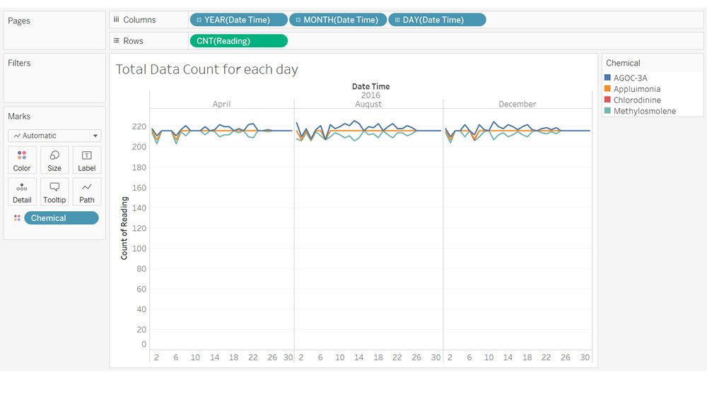
I started the assignment by detecting any unexpected behaviours for the sensors. I did a count for number of readings for each specific day as done in the picture below.
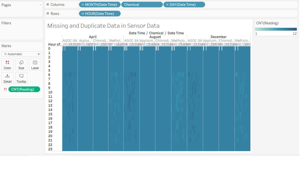
I realised there is a slight dispacency in the amount of data colleceted per day. Logically, each day, there should be an equal amount of count data received for each sensor. However, in the picture above, I found that chemicals seems to have a higher count than others. So I broke it further down into each hour as shown in the picture below.
I realised there are missing data in Sensor Data. From the picture above, I found more obvious clues with the count of each hour. I find it strange because each hour should only have 9 data (due to 9 sensors). However, the data shows a maximum of 12 data as well as less than 9 data. Meaning to say, there are both missing and duplicate data. Furthermore, I can see a certain pattern and trend between the decreased quantity of data count from Methylosmolene and the increased amount of data count in AGOC-3A.
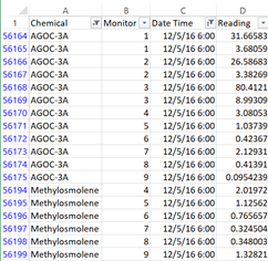
To investigate further, I went back to sensor data excel file to look at the specific data. I zoomed into a specific timing (5th Dec 2016 6am) to see what exactly happen to the data. From the picture above, I realised there are missing data from Methylosmolene across monitor 1 to 3 and duplicate data in AGOC-3A also from across monitor 1 to 3. For some reason, they looked like there is a certain pattern to it. Additionally, I found an interesting pattern. It seems like duplicates are created whenever there is spike in reading. For example, from the picture above, you can see Methylosmolene does not have any reading from monitor 1 to 3. On the other hand, AGOC-3A have duplicate data in monitor 1 to 3. Furthermore, one of the duplicate reading are all around 8 to 10 times more than the other data.
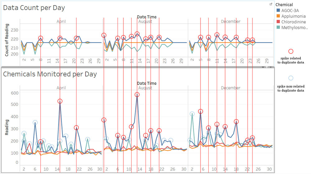
So, I went back to tableau see if my hypothesis is right. I placed data count per day beside chemicals monitored per data. From there, I can see there are some reading spikes that were correlated to the duplicate data, these are depicted as red circles and red line in the picture above. However, I also find some reading spikes that were not related to any duplicate data, these are depicted as teal coloured circles in the picture above. This probably means, as there are some reading spikes caused by data duplicates, there are also reading spikes that is not due to any data duplicate. With this understanding, I will have to clean up the data before I can actually use it.
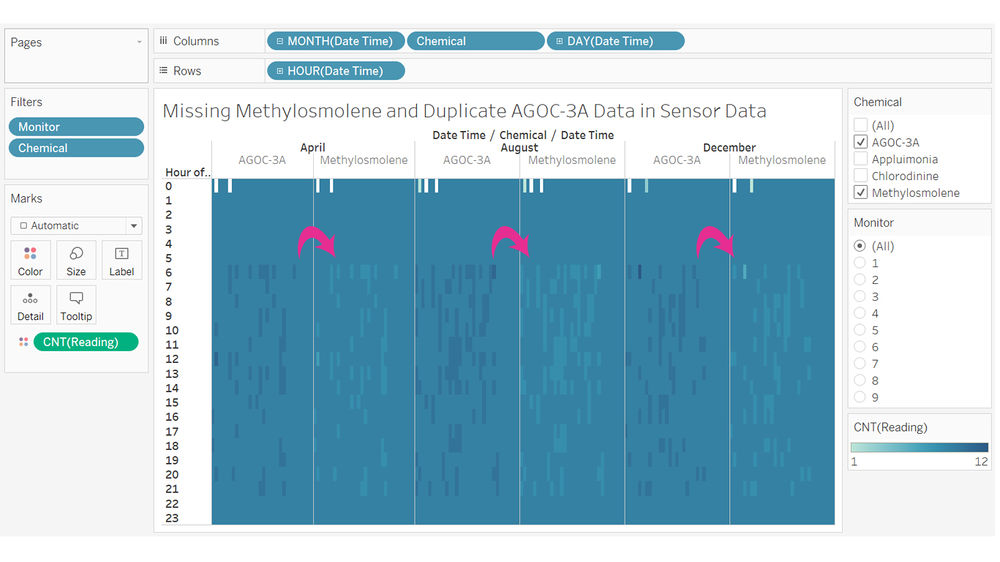
To find out a way to clean up the data. I start off by filtering the chemicals to only AGOC-3A and Methylosmolene. From the picture above, we can see the similar pattern clearer. Although, it is possible to assume that missing data from Methylosmolene is most likely being duplicated onto AGOC-3A as depicted with the pink arrows. However, there is no way to distinguish which data belongs to Methylosmolene or AGOC-3A as well as there is no correlation or reason behind why specifically Methylosmolene’s data is transferred to AGOC-3A. Therefore, I cannot translate duplicated data from AGOC-3A to Methylosmolene and I can only choose to ignore both missing data and duplicated data.
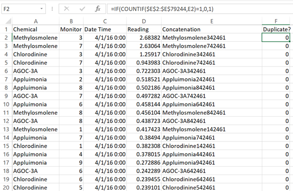
So in order to continue to use the sensor data, I need to have a field where I can filter out the duplicated data. This can be done with basic excel tricks. I start off first by concatenating the values of chemical, monitor and date time together in a new field call concatenation (using =CONCATENATE(A2,B2,C2)). This is so that, I will be able know which row is a duplicated row. Secondly, I create a new field with a formula to check the duplicate data within Sensor Data (using =IF(COUNTIF($E$2:$E$79244,E2)=1,0,1)). This will return me “0” if it is not a duplicated data and “1” if it is a duplicated data (both the original and the duplicated data). With this, I have successfully detected 428 duplicated data that we have to filter out. To keep file size small, I copied the duplicate column and saved as values as well as deleting the concatenation column. I then saved the new excel sheet as “Sensor Data Duplicate Found”.
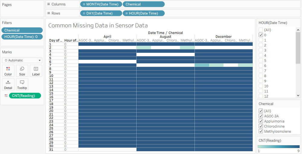
Other than the duplicate and missing data in AGOC-3A and Methylosmolene. I also realised that there is a common missing data on 12am in specific dates as seems in the photo above. The missing dates are as follows 2nd April, 6th April, 2nd August, 4th August, 7th August, 2nd December and 7th December.
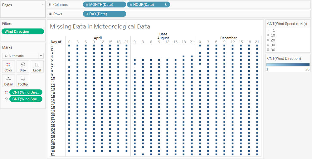
As for Meteorological Data, I set count for wind direction and wind speed. From the picture above, I realised there are missing data for the whole of August 1st to August 3rd, 12am to 3pm for 4th August and 3am for 30th August. However, there are also some missing wind direction and wind speed data in April 2nd, April 6th, August 7th, December 2nd and December 7th.
All in all, there are special missing data in both meteorological data and sensor data excel sheets.
Task #2
Q2: Now turn your attention to the chemicals themselves. Which chemicals are being detected by the sensor group? What patterns of chemical releases do you see, as being reported in the data? Limit your response to no more than 6 images and 500 words.
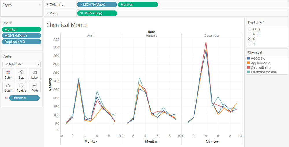
After cleaning up the data in sensor data excel sheet. I am now using “Sensor Data Duplicate Found” excel sheet. To find out which sensor detect which chemical, I first created a chart to visualise the total amount of chemicals detected by each sensor throughout the month.
From the picture, I quickly understand that in the month of April, sensor 3 has detected a large amount of all 4 chemical readings while sensor 6 has detected large amount of Methylosmolene followed by AGOC-3A and Chlorodinine. In the month of August, sensor 3 and 4 both detected huge amount of all 4 chemical readings with Methylosmolene having the highest total amount of reading. Additionally, sensor 5 and 6 also detected a large amount of AGOC-3A throughout the month. Lastly, in the month of December, sensor 3 has once again detected a large amount of all 4 chemical readings. However, this time, sensor 4 detected an enormous amount of chemical readings. Sensor 6 has also detected a slightly large amount of chemical readings. All in all, we can see that AGOC-3A has the most readings throughout the entire 3 months.
https://public.tableau.com/profile/kaiyang#!/vizhome/Task2-SensorData/ChemicalDaily?publish=yes
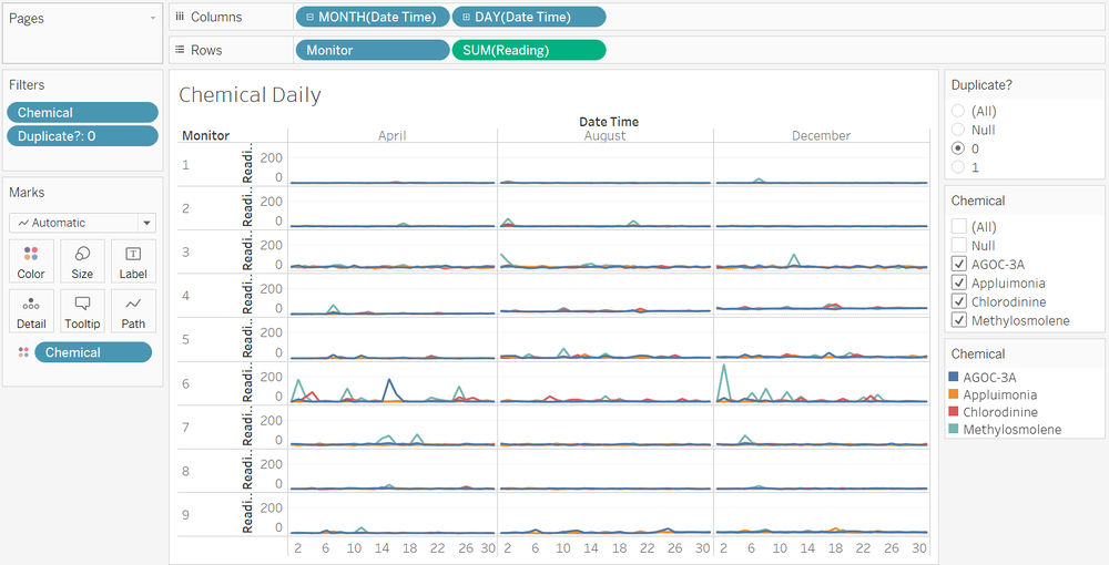
After understanding the readings based on each month. I broke the data further into each day, I realised there are individual spikes in specific dates of the year. For example, Sensor 1, 2, 4, 7, 8 and 9 have mostly small amounts of chemical readings with some spikes around. Out of these sensors, most of them have spikes of Methylosmolene, sensor 1 in December, sensor 2 in August, sensors 4 and 9 in April as well as sensor 7 in April and December. Furthermore, Sensor 3, 5 and 6 generally have very small spikes throughout all months. Sensor 3 has spikes of Methylosmolene in August and December. On the other hand, sensor 5 has a spike of Methylosmolene in August. Lastly, sensor 6 has many large spikes in the 3 months. In April, Sensor 3 has large spikes of Methylosmolene and AGOC-3A as well as spikes of Chlorodinine. In December, it has one enormous spike of Methylosmolene coupled with a few of spikes of Methylosmolene and Chlorodinine. This may be due to sensor 6’s location being in the middle of all 4 factory.
https://public.tableau.com/profile/kaiyang#!/vizhome/Task2-SensorData/ChemicalWeekday?publish=yes
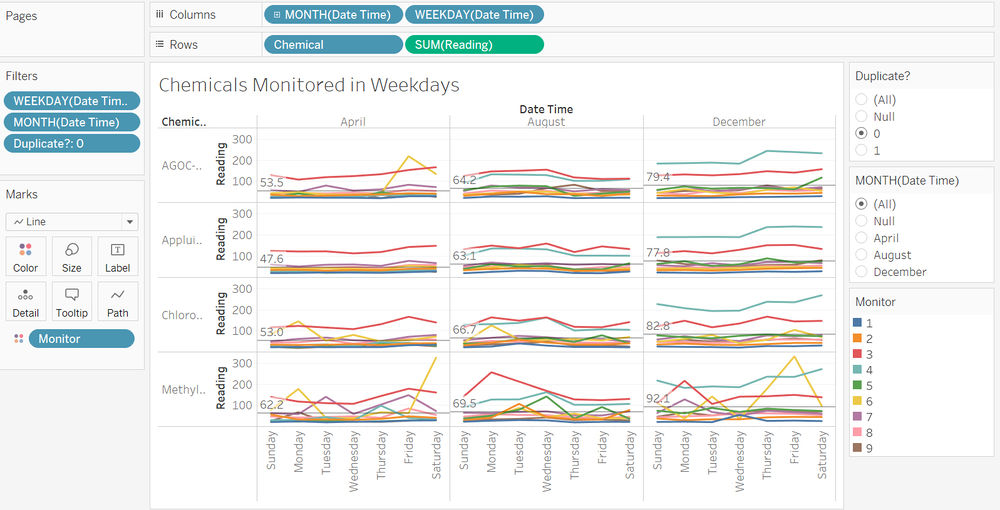
In order to find out if there is a pattern in the way chemical is released. I tracked the chemicals monitored on week days. I found a few interesting trends. In general, we can see that sensor 3 and 4 are commonly throughout all 3 months and in the later 2 months respectively. We can see a few peaks of AGOC-3A detected by sensor 6 on Fridays in April. We also can see large amount of Methylosmolene detected by sensor 6 on Saturdays to Mondays in April and on Thursday to Fridays in December.
https://public.tableau.com/profile/kaiyang#!/vizhome/Task2-SensorData/ChemicalHour?publish=yes
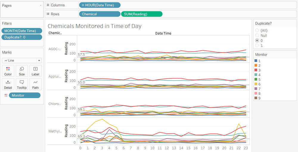
Interestingly, I found out that a large amount of chemical Methylosmolene is generally released from 10pm to 6am with sensor 6 having a significantly huge amount, followed by sensor 3 and 4. Sensor 7 shows a spike in chemical reading at 4am. As for AGOC-3A, Appluimonia and Chlorodinine, we can see a constant trend of high reading for sensor 3 and 4. There could also be a possibility where the factory that produced these chemicals are close to sensor 3 and 4. All in all, these trends may be due to the operating hours of the factories. However, if we want to find out which the factory is the cause of the chemical reading spikes, we will need to include wind direction as well as wind speed.
Task #3
Q3: Which factories are responsible for which chemical releases? Carefully describe how you determined this using all the data you have available. For the factories you identified, describe any observed patterns of operation revealed in the data. Limit your response to no more than 8 images and 1000 words.
In task 2, we have seen a few trends for the chemical readings. However, I realised that we cannot determine the chemicals were produced by which factory without using wind direction, wind speed and the locations of the sensors and factories. Therefore, in task 3, I’ll be focusing more and cleaning up on the meteorological data and sensor location excel sheet.
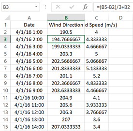
To start task 3, I made some changes to Meteorological Data excel sheet. Firstly, I duplicated the number of rows by 3 times. Instead of having data per 3 hours, I created Meteorological data per hour by extrapolating with the nearest hour with data. However, this method also has some flaws. I would not be able to extrapolate missing data. Such as 1st August to 4th August 3pm, I would also not be able to extrapolate end of month dates such as 30th April 10pm and 11pm as we do not have any data for May, September and January. Secondly, I have shifted the hours up by one row. The reason is because, the chemical readings we per hour were chemicals that flew with the wind direction and wind speed of the past. I would like to assume that it probably takes an hour to travel. I will explain why assumed an hour in the next image.
As the chemical data given were by per hour. We can safely assumed that each hour will have a new batch of chemicals brought in by the wind. However, there is still not enough evidence to ensure that the wind speed is strong enough to allow chemical to travel from any factory to any sensor. Therefore, I did a little calculation to prove my point.
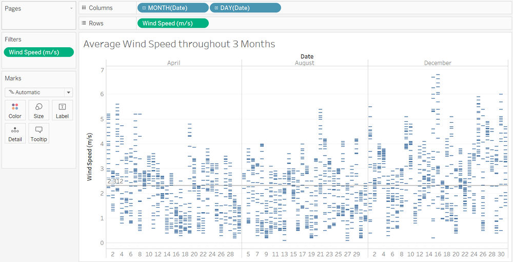
I start with creating a graph to show the average wind speed throughout the entire 3 months. I found the average wind speed to be 2.312m/s. If we were to multiply it by 60 twice, we can get the average distance covered by wind speed in an hour. Which will give us a total of 8323.2m in an hour. Additionally the map is in a 200 by 200 coordinates (12miles by 12miles), we will have to convert the metres over to coordinates. Hence, I multiplied 8323.2m with 0.000621371 to give us 5.17179671miles, followed by, multiplying 200/12 to give us 86.196611833 in coordinate unit. Technically, with a coordinate unit of 86, it means that the wind is strong enough to travel more than 1/3 of the map and definitely from any factory to any sensor.
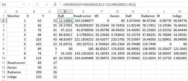
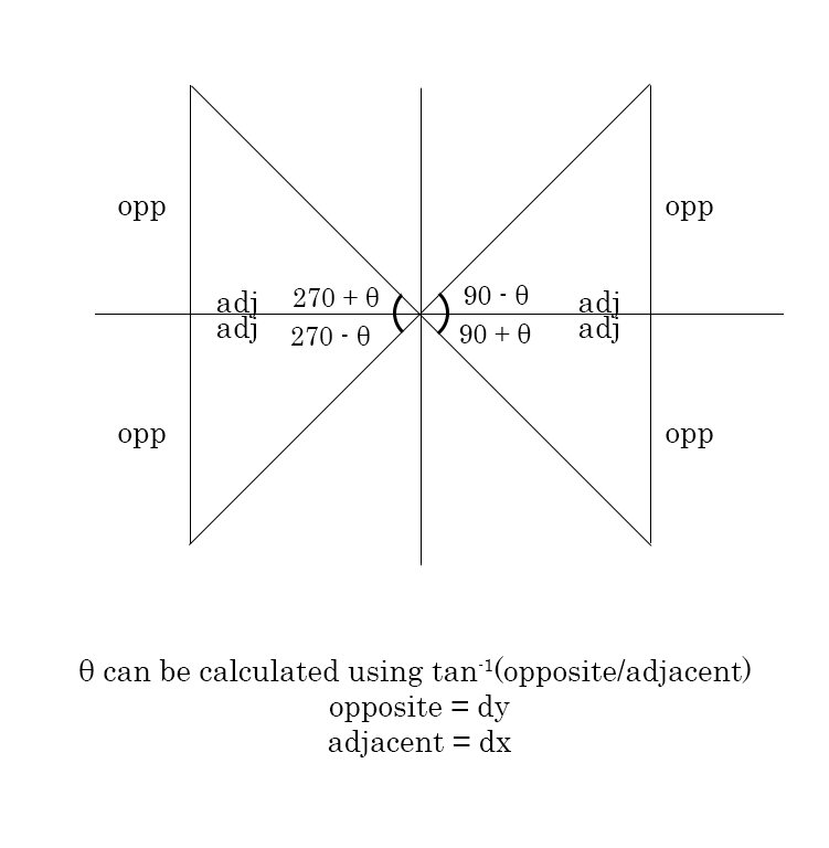
After preparing the Meteorological Data excel sheet, next I prepared the Sensor Location excel sheet. Firstly, I included the locations of the 4 factories as found in the word document given. Next, I calculated each angle of θ from monitor towards the factory. I used my trigonometry skills to calculate the angle of θ (using =DEGREES(ATAN(ABS($C$11-C2)/ABS($B$11-B2))) in excel) and further on to calculate the actual angle from each monitor to factory (using =IF(B2>$B$11,IF(C2>$C$11,270-D2,270+D2),IF(C2>$C$11,90-D2,90+D2)) in excel). I have named these variables as, “Roadrunner”, “Kasios”, “Radiance” and “Indigo” to indicate the direction from the monitors to the respective factories.
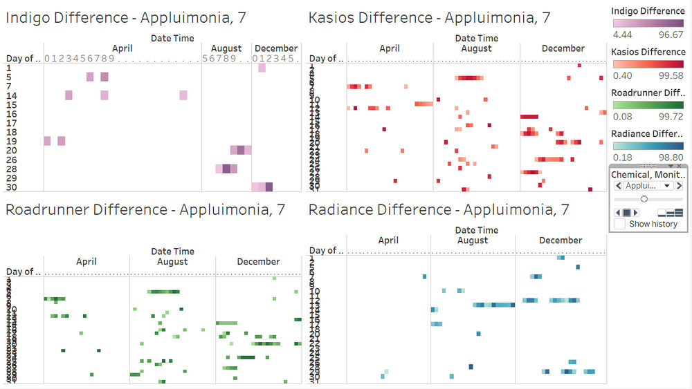
In order to find out if the wind is actually blowing in the direction of the sensor. I created 4 new variables, such as [Kasios Difference], [Indigo Difference], [Radiance Difference], [Roadrunner Difference]. Firstly, I used wind direction (direction of where wind is coming from towards the sensor) and the variable [Kasios] (direction of where Kasios Factory is, in reference to the sensor) that I have previous created in my excel sheet. Furthermore, I added an extra plus minus of 5 degrees as we do not expect wind to blow exactly in the same direction for the entire hour. At the start, I calculated the difference in [Wind Direction] and [Kasios], if the difference is less than negative 5 or more than 5, I’ll set the difference as 0% (to eliminate the possibility of chemicals reaching the sensor). Next, I used 5 minus away the difference in wind direction and finally divide it by 5 and multiply by 100 to have the difference as a percentage format. Afterwards, I repeated the steps for [Indigo Difference], [Radiance Difference] and [Roadrunner Difference].
https://public.tableau.com/profile/kaiyang#!/vizhome/Task3-Readings/WindAccuracy?publish=yes
I created a dashboard with specific hours and place the percentage difference. From this chart, the quantity of the squares in each chart will prove that more likely the number of times the wind is blowing from the respective factory to the direction of the sensor. Additionally, the denser the colours are, shows the accuracy of the wind directions are. Please ignore the size of the square box for now, it might be a little confusing. However this only shows on which timing the wind blows on the right direction. I would require to add in the actual reading of the sensors to know if it actually affect
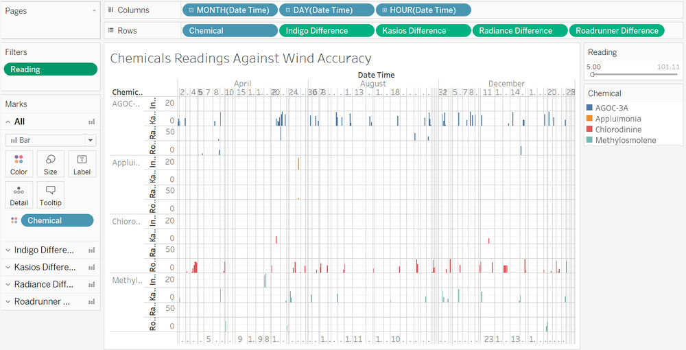
Since we are finding out which factory is the culprit of which chemicals released, I have filtered the readings to reading value above 5 to remove the insignificance amount of chemical reading as they could be just resident chemicals floating around the atmosphere that got detected by the sensors. Furthermore, with the use of the variable [Kasios Difference], [Indigo Difference], [Radiance Difference] and [Roadrunner Difference], we can accurately track both the spikes in chemical reading and wind direction. This way, we are reaching our goal in determining each factory produced which chemical.
Kasios is likely to create large amount of AGOC-3A, small amount of Chlorodinine and large amount of Methylosmolene
Indigo is likely to create very small amount of Appluimonia and small amount of Methylosmolene
Radiance is likely to create small amount of AGOC-3A and insignificant amount of Appluimonia
Roadrunner is likely to create small amount of AGOC-3A, small amount of Methylosmolene and a large of Chlorodinine.
This analysis is based on the data I have received. There are still many factors that can cause this analysis to be inaccurate. Such as, wind direction and wind speed is not constant throughout the entire hour and chemicals data given was not entirely accurate in the first place.
Programs used
- Tableau 10.3
- Microsoft Excel
- Photoshop
